The drink’s emblem evokes home comfort and universal love. This brand’s wine is drunk in sincere company and leaves an unforgettable aftertaste. The Dom Perignon logo is a tribute to traditions and recipes passed down from generation to generation.
Dom Perignon: Brand overview
| Founded: | 1921 |
| Founder: | LVMH |
| Headquarters: | France |
| Website: | domperignon.com |
Dom Perignon is a prestigious champagne brand introduced in 1921 by a French company with almost 300 years of history – Moët & Chandon (Champagne). Today, the winery is part of the Louis-Vuitton-Moët-Hennessy concern, which owns many well-known brands, including Tiffany, Dior, and Givenchy. Dom Perignon is a completely dry wine (brut) made from chardonnay and Pinot Noir. Available in two variations:
- white;
- pink (since 1959).
Each batch is made from grapes of the same year. Before entering the shelves, the wine is aged for at least seven years. Each blend is presented on the market greatly: 9, 18, and 25 years after harvesting. They are labeled (P1, P2, and P3).
Meaning and History
Moët began selling even before the invention of fermentation, remuage, and the concept of “vintage champagne.” He supplied wines to the court of Louis XV. Connoisseurs of his drinks were Napoleon and Jefferson. The famous house is also mentioned in Pushkin’s poems. And today, champagne from the house of Moet is served at the table of the Queen of Britain. Therefore, the words “elite” and “antique” are perfectly combined with the products of this company.
Manufacturers also chose a loud name for their brand. Perignon is the name of a monk who improved the technology of champagne production. The prefix “House” – appealed to a clergyman (from the word dominus – Lord). The monk was responsible for the monastery’s food and paid close attention to wine, as the abbey owned large vineyards. His inventions include blending and preserving carbon dioxide bubbles through bottling. Moët & Chandon bought the vineyards from the abbey of Perignon in the early 19th century, so the owners decided to associate their drink with the monk’s name.
The brand was immediately positioned as vintage, as it appeared before prohibition in 21 and hit the foreign shelves only in 1936. This played a role in the popularity of sparkling. The visual image was selected as the most elite on the advice of Lawrence Venn, an English advertiser for a company that imported the product. A year before the first delivery, copies of the wine were sent personally to the best customers who advertised champagne even before it appeared.
The logo is the brand’s name, made in softly rounded capital letters as if Perignon signed the bottles. Below is an image of an English heart-shaped shield. The shield reminds us:
- heart (a symbol of the love of the monk and the company for their business and product)
- tulip (as an association with the elite royal flower. In Europe in the 17-18th century, when the company appeared, bulbs could cost an entire estate, and only very rich seniors could afford to buy them)
- a glass of champagne because the drink gives a whole bouquet of taste
- grape brush.
The logo hints at knightly prowess, the era of tournaments, and kings. It also symbolizes the vine, a royal drink with a noble past.
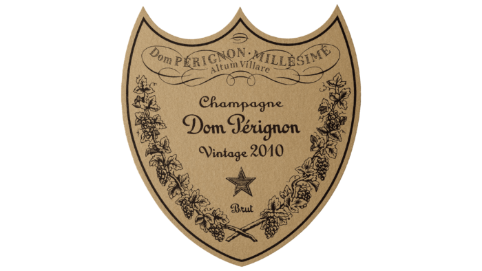
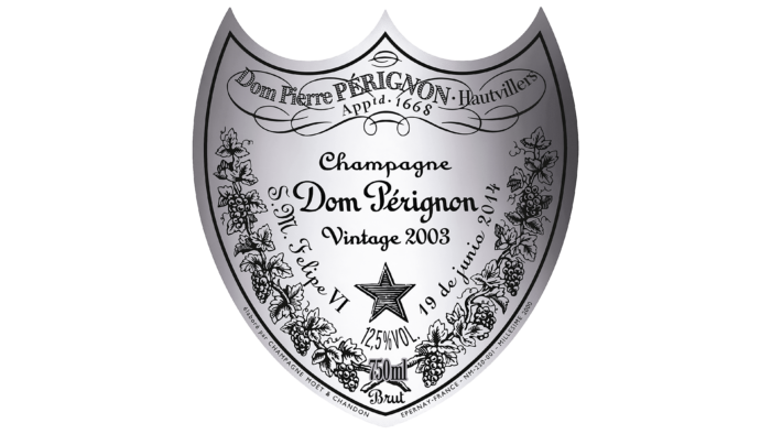
The brand’s label uses the same heart shape. The shield is decorated with vines and bunches of grapes and has the color of old oak corks, with which Perignon first began to close his products. The brand’s name is written on the label; it indicates that the champagne comes from the Abbey d’Ovillers. The inscriptions are made in the ornate old style. Along the edges of the label, it says that this is a French product made in Moët & Chandon Champagne.
The brand constantly emphasizes its exclusivity. For example, 2007 for Christmas, a set of six bottles and three glasses of champagne was sold in a Lagerfeld-designed bass and lambskin guitar case. It cost about 100,000 dollars.
Font and Colors
The handwritten font French Script MT is used for the emblem, which should resemble the handwriting of a monk. The noblest colors are also used for the emblem – black and gold: Black – honor, power, a way to stand out, show the company’s power. In addition, black hints at the monastic attire. Gold is the color of kings, a symbol of luxury. This is how champagne, an elite brand, positions itself. A bottle of Dom Perignon on the table is an indicator of luxury.

