The Dr Pepper logo is like a bubble of gas rising. The emblem evokes a sensation of bright and sweet taste unlike any other. The sign speaks of the original perfectly balanced and light recipe that has survived.
Dr Pepper: Brand overview
Meaning and History
Whatever was made from the first Dr. Pepper, all of these ingredients were once in the Morrison’s Old Corner pharmacy. In 1885, a new pharmacist, Charles Courtice Alderton, began working there. He loved experimenting with different fruit extracts and sweeteners, mixing soft drinks based on them. Soda sold quickly, but one composition of drinks sold the fastest. Customers especially liked the Waco drink, which in the future became known as Dr. Pepper. Wade Morrison, the pharmacy owner, gave him this name.
Why Dr. Pepper? There is still no definite answer to this question. Someone is trying to connect the brand name with real personalities, such as the famous surgeon Charles T. Pepper or a certain Dr. William Alexander Reed Pepper, who is believed to have lived next door to Morrison.
According to another version, the word “Dr” was used without reference to the profession. Skeptics believe it was only added to inspire consumer confidence. After all, the mention of a doctor is associated with a healing effect; that is, the drink is automatically equated to a useful medicine.
There are legends behind these assumptions, but none have real evidence. It is only known that Wade Morrison named the trademark Dr. Pepper after Charles Courtice Alderton handed him the Waco recipe. The drink was in great demand, so the pharmacy owner was forced to expand production. Now, the famous brand belongs to the Dr. Pepper Snapple Group. His museum has preserved old logos that have served as a model for modern design.
What is Dr Pepper?
Dr. Pepper is a soft drink that contains water, sweeteners, and flavors. There is no alcohol in it.
1885 – 1906
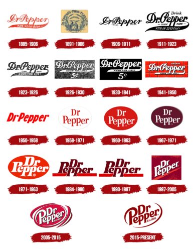
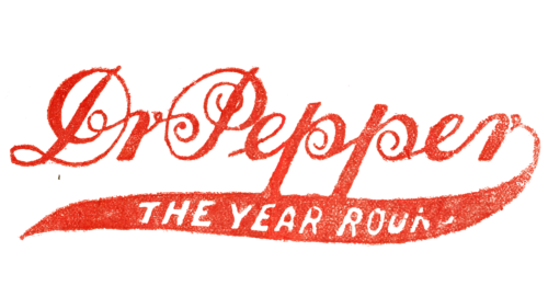
The foundation for mass production was laid in the 1890s when Wade Morrison received the Waco soft drink recipe and named it Dr. Pepper. At the same time, one of the first emblems began to be used: the name of the trademark, written in a vintage font with curls. All letters were red and connected in a continuous chain. A wide, uneven line stretched from the last “r,” which curved to the left. It was long enough to accommodate THE YEAR ROUND motto.
1891 – 1906
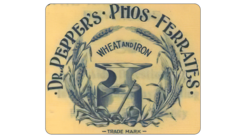
After a simple logo, the Dr. Pepper trademark has a very complex one. It contains many small details showing the product’s main essence: its quality, safety, reliability, uniqueness, and usefulness. To this end, the designers depicted a massive anvil on the emblem so the beholder would not doubt that there was iron. And at the top, they placed an arched inscription, “Wheat end Iron.” The central part is surrounded by a wreath of wheat, tied at the bottom with a thin ribbon. The text with the title is in a large capital font with curly serifs in the form of dots.
1906 – 1911
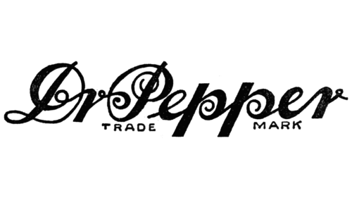
The logo reverted to the 1885 design. It consists of a handwritten line with the name, where the letters are connected in a single chain. But another row appeared at the bottom – with the phrase “Trade Mark,” typed in printed characters, thin and chopped.
1911 – 1923
Later, designers simplified the lettering by removing the spiral elements. The word “Drink” appeared in the upper right corner. At the bottom, the phrase “TRADEMARK” was added, divided into two parts by long legs “pp.” The slogan has changed to “KING OF BEVERAGES.” At the same time, the official version of the logo was black and white.
1923 – 1926
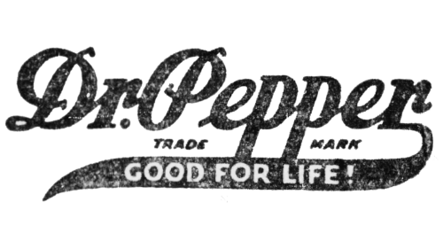
The capital “D” and “P” are distinctly similar, and the rest of the inscriptions are more compact than before. They are maximally simplified and moved to each other. At the same time, the lines of the letters became wider, adding boldness. The word “Drink” disappeared, and simultaneously, the slogan “Good for Life” appeared.
1926 – 1930
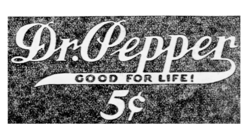
The price of the original drink was immediately indicated on the Dr. Pepper logo of these years: 5 c. The number is large so that it can be seen on the bottle from afar, and the contrast of white and black adds to its catchiness. The designers gave her the central part under the wide curved tail “r.”
1930 – 1941
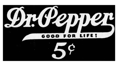
The changes affected the font: bold ones are now used instead of bold glyphs. The term with the slogan has slightly decreased, as has the designation of cents. The background turned jet black.
1941 – 1950
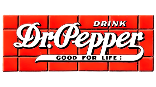
The center lettering font has become more accurate. The background looked like an orange brick wall. The “TRADE MARK” superscript disappeared, and the word “DRINK” was moved to upper case. The brand’s new slogan was “GOOD FOR LIFE!” in black on the horizontal strip. The main text elements have been repainted in white.
1950 – 1958
In the mid-1950s, there was a wordmark without a dot after “Dr.” Firstly, it helped the manufacturer avoid legal problems because the buyers were sure that the abbreviation for the word “doctor” indicated the drink’s medicinal properties. Secondly, simplifying the logo made the image less cluttered than it used to be. The red “DR PEPPER” lettering was straightforward, and even bold italics didn’t worsen things. But we cannot say that the point has completely disappeared: in memory of it, the designers decorated both letters “r” with small circles at the top.
1958 – 1971
The brand name was inside a white oval. The red letters were written in an even serif typeface. Slightly below were three numbers in multi-colored circles: a dark red “10”, a pink “2,” and a white “4”. The bubbling bubbles symbolized the refreshing soda and matched the color with the main background because the logo was depicted on dark cans with yellow and red vertical stripes.
The mysterious numbers were to be understood as 10:00, 14:00, and 16:00. Dr. Pepper’s research has shown that people experience a drop in blood sugar during these hours. The company advertised this fact, offering to make up for the glucose deficiency with something sweet—a soft drink.
An inverted version of the emblem was also used with the light logo. The main color can be white; the same was true for the “DR PEPPER” lettering. At the same time, the oval with the brand name turned red and acquired a shiny golden edging. Ten, two, and four were removed because the company decided to change its approach to advertising.
In the late 1960s, the designers changed the color scheme. They made the oval burgundy and surrounded it with a silver stripe. The lettering remained white. The same color combination was used to decorate the can.
1971 – 1984
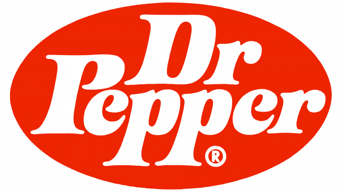
In 1971, the logo appeared in bold italic type. The oval became elliptical and became bright red.
1984 – 1990
The designers removed the oval but added an underline as a wide dark orange stripe. They placed it on the sides of the “PP” legs, converting these letters to upper case. The serifs on the glyphs were shortened and sharpened.
1990 – 1997
All “P” and “e” got intra-letter extensions, which made the glyphs solid (without breaks). At the same time, the developers modernized the color of the inscription, painting it in cherry.
1997 – 2005
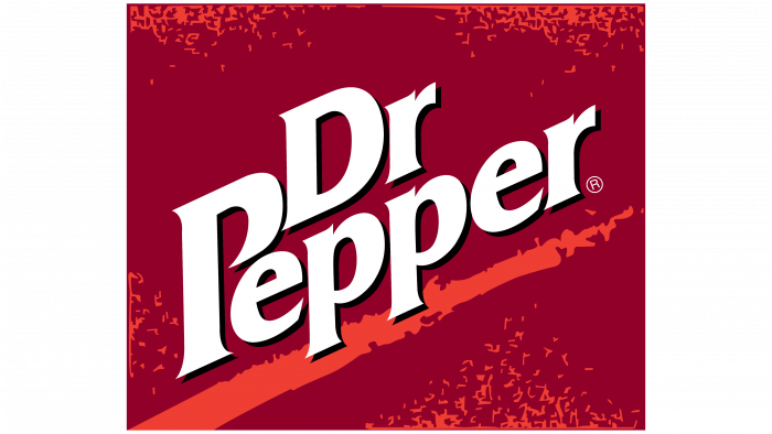
The letters are clearer, with sharp corners and black shadows. The underline, on the other hand, was blurry. The designers repainted it orange and added spots of the same color around the entire perimeter.
2005 – 2015
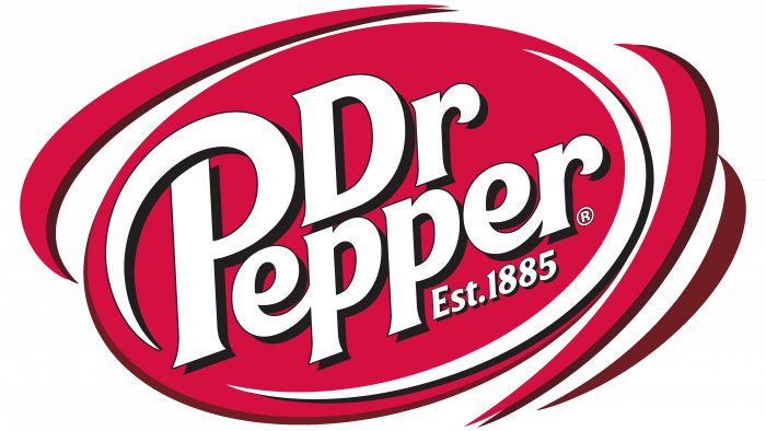
In 2005, the inscription was again in the red oval, but it was uneven and unevenly colored this time. Curved lines around the edges created the illusion of a cycle. The year of its appearance was under the brand name: “Est. 1885.”
2015 – today
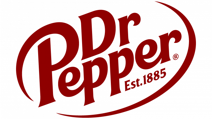
The designers have simplified the logo and removed the oval. There is a burgundy inscription located at an angle. A long, curved line is drawn from the first P in Pepper. It forms a semi-oval ring around the text.
Dr Pepper: Interesting Facts
Dr Pepper is one of the oldest soft drink brands in the U.S., known for its unique taste and interesting history.
- How It Started: In the 1880s, Charles Alderton, a pharmacist from Waco, Texas, created Dr Pepper. He aimed to make a drink that smelled like his soda fountain, which led to the invention of Dr Pepper.
- The Name: “Dr Pepper” doesn’t have a clear origin. One story suggests it was named after Dr. Charles Pepper, a doctor Alderton admired, but the company has not confirmed this.
- Big Break: Dr Pepper got big exposure at the 1904 St. Louis World’s Fair, making it popular alongside other American foods and drinks.
- Unique Taste: The drink is known for having 23 different flavors, a secret mix that gives it a special taste unlike any other soda.
- Logo Change: The name used to have a period after “Dr” but dropped it in the 1950s for a modern look. Now, it’s simply “Dr Pepper.”
- Marketing Itself: In the 1960s, Dr Pepper promoted itself as “not a cola” with the slogan “Dr Pepper Time,” highlighting its uniqueness.
- Museum: The Dr Pepper Museum opened in 1991 in Waco, Texas, in the original bottling plant. It celebrates the drink’s history and the soft drink industry.
- Company Changes: Dr Pepper was part of Cadbury Schweppes until 2008, then became part of Dr Pepper Snapple Group, and in 2018, merged with Keurig Green Mountain to become a big name in beverages.
- Hot Dr. Pepper: In the 1960s, they suggested drinking Dr Pepper hot with lemon as a winter treat, a unique serving suggestion.
- Distribution: It is unique because Coca-Cola or Pepsi does not own it. Both distribute it, plus its network, making its distribution rights complex.
Dr Pepper’s mix of 23 flavors and long history make it stand out in the soft drink world. Its legacy is over a century old.
Font and Colors
The wordmark looks dynamic as if hinting at the drink’s refreshing properties. This is the most likely version because the “Pepper” in the brand name can symbolize the stimulating effect of caffeine in the soda. However, conspiracy theorists suggest that “pep” refers to pepsin, a digestive enzyme supposedly part of the product’s secret formula.
Unique typography has been designed specifically for the logo. The Dr. Pepper font, created by High-Logic Erwin Denissen, is available for those who want to replicate the lettering’s style. The color scheme is monotonous: the wordmark is completely burgundy, and the white background.
FAQ
What is the Dr Pepper font?
The logo uses a special font created specifically for the brand. This bold, italic font and sans serif give it a modern and energetic look. The design stands out, especially against a white background, where the logo’s bright colors are more visible, helping to attract people’s attention.
Choosing bold and italic fonts makes the logo more noticeable and impactful. This helps the brand stand out and maintain a consistent look and feel across advertising and packaging. Using a unique font is a strategy that many large companies use to make their brand easily recognizable, helping customers remember the brand and stay loyal to it.
What is the Dr. Pepper slogan?
Over the years, the brand has introduced several slogans to grab people’s attention and showcase its unique taste. Initially, it called itself “the world’s most misunderstood soft drink” to draw attention to its distinct flavor, which was not as well known as other mainstream carbonated drinks. Later, in the 1970s, it adopted the slogan “the world’s most original soft drink,” emphasizing its uniqueness.
The slogan “Be a Pepper” was launched in 1977 and encouraged people to show their individuality through their choice of drink. This slogan evolved into “Be You,” focusing on personal expression. Each slogan played a crucial role in defining the brand’s uniqueness and helping it stand out.
Did Dr. Pepper change their logo?
The brand has repeatedly updated its logo to keep looking fresh and attractive. The last update was in 2015. Each change helps it stay modern while maintaining familiar elements that fans recognize. These updates are important because they help a brand stay relevant and appealing in a competitive market.
Why is there a 10, 2, and 4 on Dr Pepper?
The numbers 10, 2, and 4 on the drink’s bottles have a unique history. They were used to encourage people to drink at 10:00, 14:00, and 16:00, corresponding to times when people may experience decreased energy and blood sugar levels.
The campaign promoted the brand as a quick way to boost energy during these lows. It described the drink as refreshing and energizing, which helped increase its popularity.
What is the original Dr Pepper logo?
The first logo was very different from what we see today. It featured an anvil surrounded by a wheat wreath, highlighting the drink’s nutritious ingredients, believed to have health benefits. The words “WHEAT AND IRON” were placed in the center and curved to emphasize the beneficial properties of the drink. Above this, “DR. PEPPER’S PHOS-FERRATES” was written, pointing out the components of phosphoric acid that were considered beneficial. This logo represented the brand as a delicious drink and a health tonic, a common strategy in the early days of soft drink marketing.
What color is a Dr Pepper bottle?
Bottles are made of transparent plastic or glass, which preserves the drink’s caramel brown color. The labels on the bottles are red, making them easy to spot. This combination of caramel brown liquid and bright red label is well known and closely associated with the brand, making it easy to recognize on store shelves. Design and colors are very important to a product’s appearance and personality.
