


![]() Durham Bulls Logo PNG
Durham Bulls Logo PNG
The Durham Bulls logo emphasizes the regional identity and sports traditions of the North Carolina baseball club. The bull imagery symbolizes strength, perseverance, and team spirit, which are closely associated with the club’s history and its stable league position.
The Durham Bulls were founded in 1902 by William Bramham, owner of the Durham Tobacconists team. Ten years later, the club became the Bulls, inspired by the popular Bull Durham tobacco brand, which featured a bull on its packaging. In 1926, El Toro Park opened and was later renamed Durham Athletic Park. In 1932, the Bulls affiliated with the Philadelphia Phillies for the first time.
The team’s symbol remains a bull. In 1951, the Bulls made history when Percy Miller became the team’s first African-American player. The club experienced a revival in the 1980s after being featured in the movie “Bull Durham,” starring Kevin Costner.
In 1995, the Bulls moved into the modern Durham Bulls Athletic Park. By 1998, they had reached Triple-A, beginning a long-term affiliation with the Tampa Bay Rays. Since then, the Bulls have regularly won International League championships and national Triple-A tournaments.
An important part of the team’s identity is the mascot, Wool E. Bull, who is actively involved in Durham’s community life. Today, the Bulls draw thousands of fans annually and remain a leader in minor league baseball.
Meaning and History
![]()
What is Durham Bulls?
It is a Triple-A baseball club based in Durham, North Carolina, playing in the International League as a farm team for the Tampa Bay Rays. The team gained fame in the movie “Bull Durham,” which showcased its home field, Durham Bulls Athletic Park. The club is highly recognizable in minor league baseball and regularly wins International League championships.
1998 – today
![]()
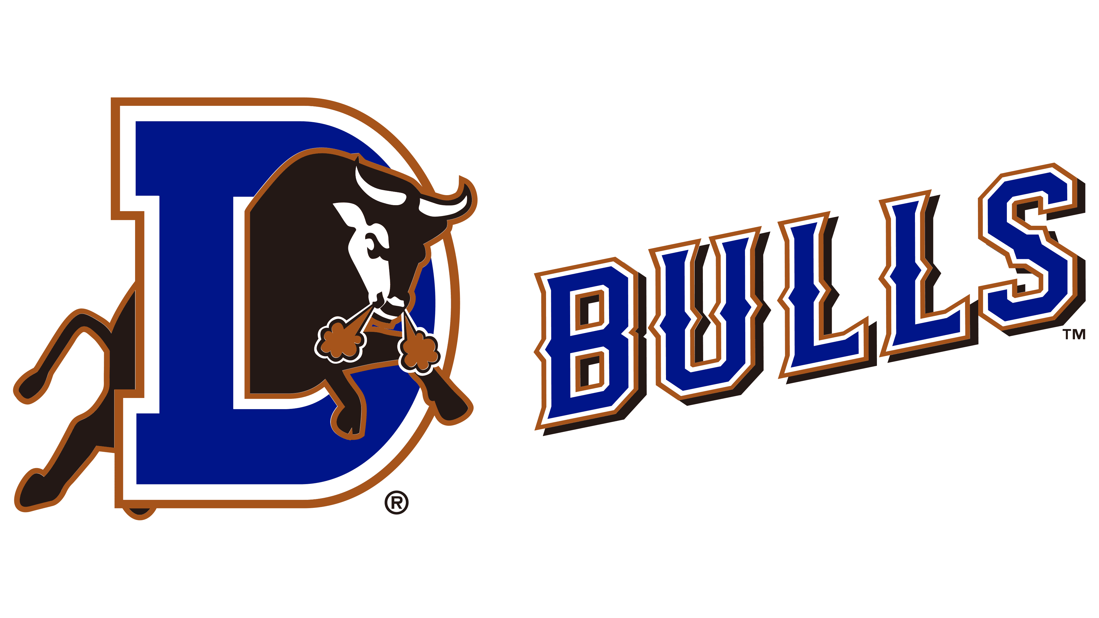
The Durham Bulls logo debuted when the franchise moved up to the highest level of Minor League Baseball, Triple-A, and joined the International League. The club’s new status required a new visual identity.
At the center of the composition is a large symbol, a stylized letter “D” in deep blue, outlined in white on the inside and bronze on the outside. The letter’s design uses a modified slab-serif typeface characterized by bold forms and geometric proportions. Its strokes are thick, creating an impression of strength and stability.
Bursting through the “D” is an aggressive black bull in powerful forward motion. The design conveys tension and energy: the bull’s head is lowered, clouds of bronze-colored steam emerge from its nostrils, the front legs are extended forward, and the hind legs push off the ground, creating the effect of a dynamic charge. The lines of the body and limbs highlight the musculature and physical strength of the animal. White accents on the horns and face add contrast, enhancing the image’s expressiveness.
The bull directly connects to the team’s name and reflects the historical identity of the city of Durham. The dynamic, forceful style symbolizes the team’s fighting spirit and competitive mindset, underscoring the traditional cultural values of the American South.
The emblem’s color palette includes deep blue, black, white, and bronze. Blue represents tradition and reliability, bronze signifies a link to the past and classic sports associations, and black conveys the team’s strength and determination. The contrasting colors ensure the logo’s visibility and recognition across formats and media.
The logo was created by the Durham Bulls’ in-house design group under the oversight of Capitol Broadcasting Company. Some design elements were borrowed from the 1980s version, emphasizing continuity and respect for the club’s history.
The logo’s visibility was significantly enhanced by the film Bull Durham, which helped establish the team’s image as widely recognized. The emblem is used across all franchise materials and in the interior of Durham Bulls Athletic Park, where a large neon sign features animated steam clouds coming from the bull’s nostrils, echoing the official logo. Over time, this logo has become one of the most recognizable and enduring in Minor League Baseball.
Symbol
Before the early 1980s, the Durham Bulls did not have a logo in the modern sense, a defined symbol consistently used across all elements of the team’s identity, such as player uniforms, merchandise, promotional materials, and printed products. However, the team did have distinctive visual markers that served as identifiers.
For many years, the main identifier was a large letter “B” displayed on players’ caps. The letter’s design varied over time, sometimes changing in shape and style, but it remained a simple, stable element. On the uniforms, the word “Bulls” appeared in either a straight or slightly arched sans-serif typeface. These simplified elements created basic recognition through typography and placement rather than through complex symbolic or metaphorical imagery.
Using simple typographic symbols was common for lower-league baseball teams throughout the first half and middle of the 20th century. This was due to limited branding needs and a lack of strong marketing focus at the time. Fully developed emblems featuring characters, animals, or combinations of letters and images became widespread in Minor League Baseball only in the late 1970s, when marketing became more important, and selling team merchandise became a commercial priority.
It was during this period that the Durham Bulls adopted their first full-fledged bull-themed mark, which became the starting point for the club’s visual evolution. This composition later served as the basis for the logo still used today.