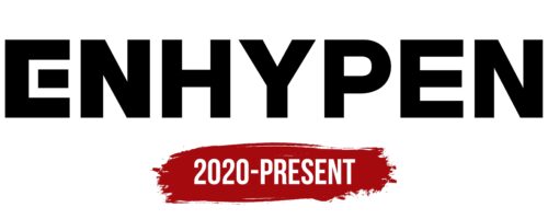
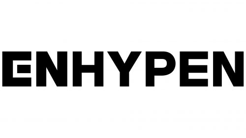
The ENHYPEN logo is confident and stylish, much like the group members. Each letter represents one of the seven members. The symbols, designed in a unified style, create a cohesive ensemble. The emblem reflects the group’s mission to connect people, musical styles, and ideas, creating unique and memorable works.
ENHYPEN: Brand overview
South Korean boyband ENHYPEN is a musical phenomenon making a splash on the world stage! The seven-member group was formed through the fiery trials of the survival reality show “I-Land,” organized by Belift Lab, a joint venture between CJ ENM and Hybe Corporation.
The thrilling “I-Land” competition aired on Mnet on June 26, 2020. Viewers worldwide were mesmerized by the exciting confrontation that revealed the future stars of the K-pop scene. The contestants went through grueling challenges, testing their singing, dancing, and rapping skills and their ability to unite. The question on everyone’s mind was: who would emerge as the winner?
After months of difficulty, the curtains came down on the show on September 18, 2020, and the names of the seven boyband members, Heeson, Jake, Jay, Seonghoon, Sunoo, Jungwon, and Ni-Ki, were revealed. Each has made it through the intense competition and is now ready to enter the world!
After a hectic competition, the seven I-Land winners were officially proclaimed ENHYPEN on November 30, 2020. In honor of their long-awaited debut, they unveiled their first mini album, “Border: Day One,” much to the delight of their fans.
Despite their recent emergence in the music industry, ENHYPEN has skyrocketed to the dizzying heights of fame in K-pop, quickly gaining attention and fervent fans. Their meteoric rise has led to them being called the “4th generation of K-pop”.
ENHYPEN’s first album, “Border: Day One,” and its star single, “Given-Taken,” were a resounding success both in South Korea and abroad. Their talent and efforts have been recognized with several awards, such as “Best New Male Artist” at the 35th Golden Disc Awards and “Rookie of the Year” at the Gaon Chart Music Awards 2021. The promising start to their journey has fans and critics eager to see what the future holds for this budding K-pop sensation.
A promising start marked by stunning achievements makes ENHYPEN’s future trajectory highly anticipated by fans eager to see what feats the band will accomplish in the coming years.
Meaning and History
What is ENHYPEN?
They are a South Korean boyband created by Belift Lab, a joint venture between CJ ENM and Hybe Corporation. The group appeared on the competitive survival show I-Land, demonstrating their talent, tenacity, and charisma. The seven-member collective offers a diverse and exciting blend of musical styles. Through their charismatic performances and creative music videos, they have gained a worldwide audience of fans, making them a success in the K-pop industry.
2020 – today
The first letter “E” in the ENHYPEN logo mirrors the letter “E” from Iconian Fonts’ Earth Orbiter font, with its middle horizontal stroke separated from the vertical bar. This design choice plays off the word “hyphen,” a punctuation mark resembling a short dash. Here, it represents the unity of several people coming together to create something new. The rest of the word appears in a bold sans serif font, similar to Gymkhana Bold by Typodermic Fonts Inc. or Typold Black by The Northern Block.
This design is quite thoughtful. The special “E” gives the logo a unique feel, suggesting it is more than just letters. It feels like a secret handshake or a wink, adding something extra to decipher. The bold letters make the logo vibrant and distinct, avoiding the look of a typical, boring logo. It is like wearing your favorite cap or sneakers, making you stand out more.
The separated horizontal stroke in the “E” creates visual interest, drawing the eye and sparking curiosity. The bold sans serif font enhances readability and gives the logo a modern, strong appearance. This combination of unique and bold elements makes the logo memorable.

