


 Etnies Logo PNG
The Etnies logo conveys a key message to its audience: pursue your goals despite difficulties and obstacles. The athlete’s direction is the only right; the brand’s emblem symbolizes this idea. The identity is complex, incorporating multiple visual effects and techniques that together convey deep meaning. These elements allow the visual mark to convey important information, reflect the company’s philosophy, and emphasize its high status.
While the logo doesn’t stand out with bright colors, its minimalism and monochrome nature give it a sense of completeness and unity. It creates a clear impression and is highly specific, enhancing its visual expressiveness and making the brand’s image cohesive.
Etnies was founded in France in 1986 by professional skateboarder Pierre André Senizergues. Originally called Etnics, the label began with shoes made for skateboarding, using reinforced uppers and tougher soles for grip and durability. In 1989, Senizergues moved to California to enter the US market, where trademark issues led to the Etnies name.
Growth accelerated in the early 1990s through sponsorships of professional skaters. Natas Kaupas received one of the first signature models in 1991, and clothing followed in 1993 with pants, hoodies, and T-shirts. Sole Technology, Inc. became the parent company in 1995, supporting new brands, international offices, and distribution across Europe and Asia by the end of the decade.
Product development expanded in the 2000s. STI Foam arrived in 2000 for added cushioning, snowboard boots followed in 2003, and a major skatepark opened in Lake Forest, California, in 2006. A 25th-anniversary collection appeared in 2010. Evolution Foam and Geo-Hex technologies were introduced between 2011 and 2015, while cycling footwear launched in 2016 with input from professional riders and gained use among BMX athletes.
Collaborations with artists and other labels followed in 2018 and 2019. From 2020 to 2022, the company expanded e-commerce and digital marketing while continuing athlete sponsorships and skate events. By 2023, its range covered skate shoes, clothing, BMX footwear and products for other action sports.
Meaning and History
What is Etnies?
This California-based footwear and apparel company has become a key player in global skateboarding culture. The brand, which combines street style with practicality, grew out of a passion for skateboarding and has become a lifestyle icon. The company is known for its high-performance, durable skate shoes that not only withstand the harsh conditions of skating but also feature creative designs that blend comfort and style. The brand has also expanded its range to include casual clothing and accessories while maintaining its recognizable cool, functional vibe, appealing to people on and off the board.
Before 1986
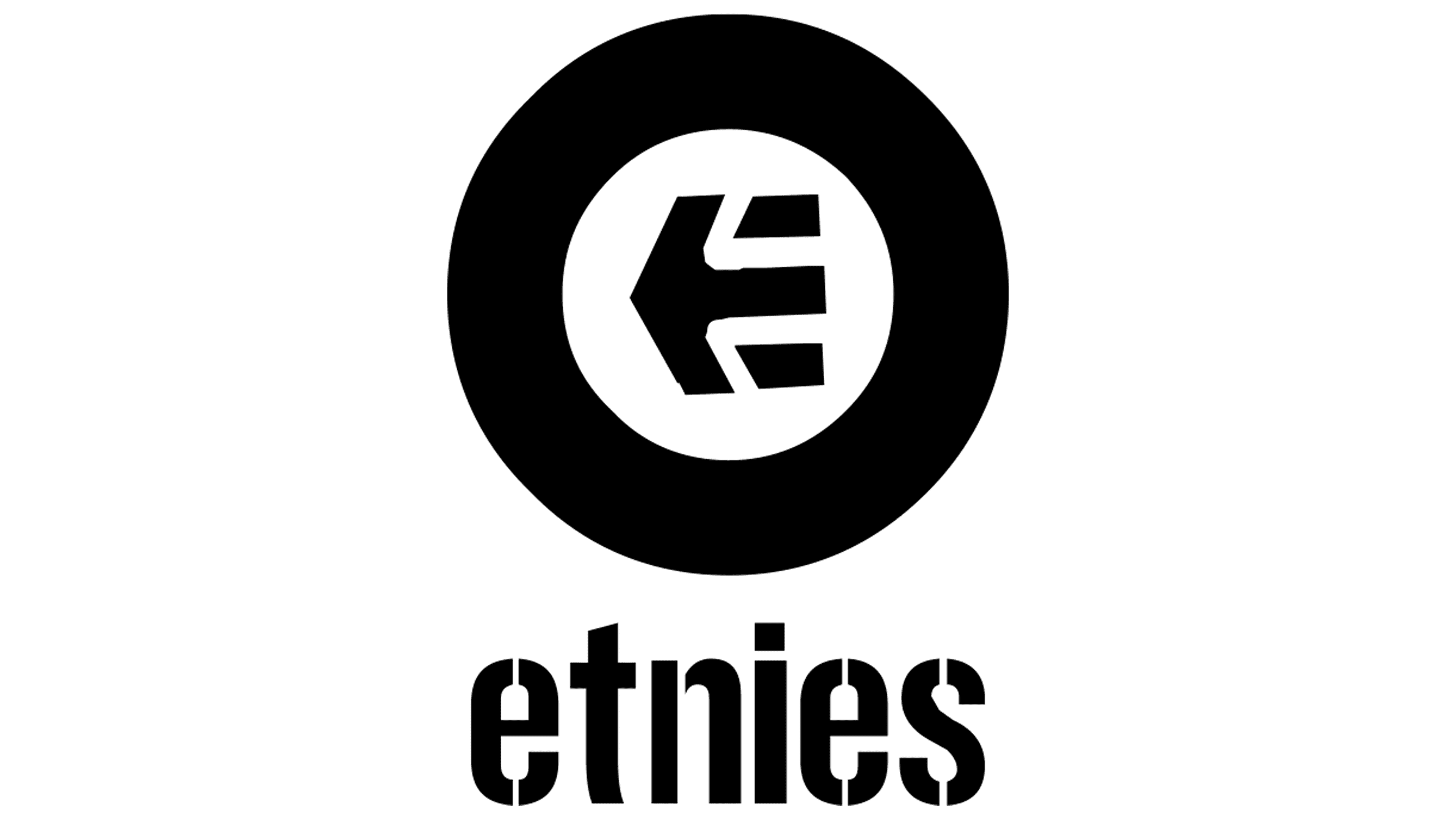
The brand introduced its first logo, which immediately sparked increased interest among potential audiences. The identity was complex and multilayered. A textual element was placed on a white background, but it was not the main focus. The primary attention was drawn to the geometric shape and arrow positioned in the center, which served as the key focal point.
The symbols held significant meaning according to the creators’ intent and added a certain complexity to the design. The circle with a thick black outline acted as a frame for another symbol, representing infinity. Some saw this element as a target, while others perceived it as a metaphor for the company’s path to achieving its goals.
The arrow inside the circle consisted of three parts, with its sharp tip pointing to the left. For skateboarders, this symbol represented victories and achievements, explaining its importance in the identity created by Pierre André Senizergues, a well-known and successful skater in the past.
The company name was written in large, slightly rounded capital letters, set on a single horizontal line and of equal height.
1986 – today
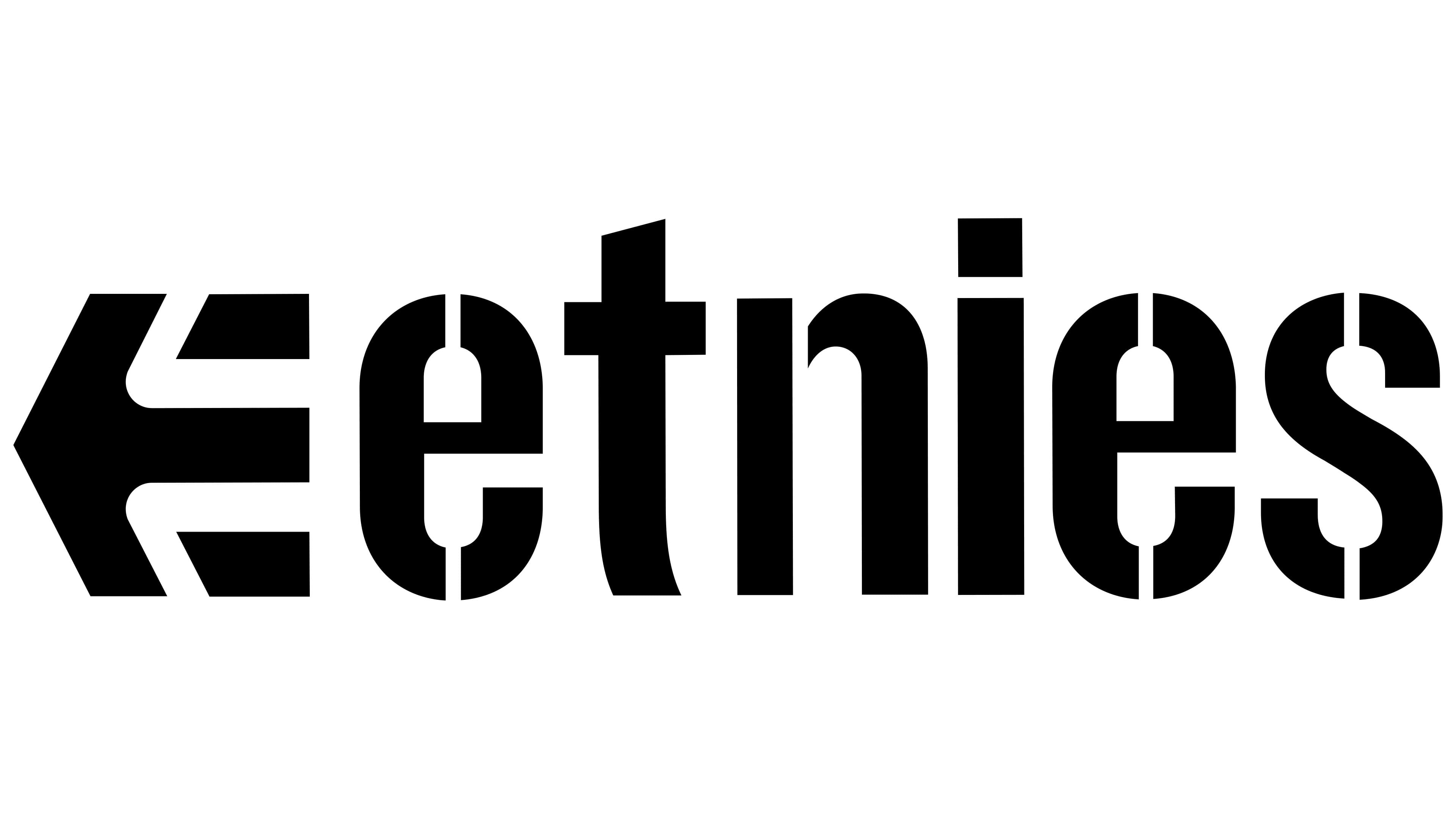
The Etnies logo stands out for its simplicity, with each element conveying the brand’s philosophy. It consists of two key components: the recognizable arrow and the company name. The black-and-white color scheme emphasizes the design’s restraint and minimalism. The white background enhances contrast, making the black elements more noticeable and easier to interpret.
The arrow on the left symbolizes movement and forward momentum. Its multi-layered structure conveys depth and dynamism, closely aligned with the spirit of skateboarding culture, which is deeply connected to the brand. The arrow represents speed and the freedom to choose one’s path, even if it is filled with obstacles.
The brand name on the right is set in a bold, solid font. The clear, heavy letters emphasize stability and confidence. An original touch is the partial fragmentation of some letters, adding a sense of movement and uniqueness. This highlights that the company does not conform to conventional boundaries, just like its audience, those who live at their own pace: skaters, surfers, and other active lifestyle enthusiasts.
The black color underscores strength and reliability, while the white background creates a sense of lightness and purity, making the logo stylish and modern. This visual balance reflects the harmony of strength and lightness, which is important to the brand.
Etnies became one of the first brands aimed at skateboarders and quickly gained recognition thanks to its innovative approach to footwear design. The emblem represents the company’s independent spirit and commitment to staying true to street culture.