The Evian logo demonstrates the special origin of the mineral water. The drink is refreshing and energizing. The snowy mountain peaks of the Alps, depicted on the emblem, create a feeling of cold and purity, which distinguishes the brand’s water.
Evian: Brand overview
| Founded: | 1970 |
| Founder: | BSN Group |
| Headquarters: | Évian-les-Bains, France |
| Website: | evian.com |
Evian is a healing alpine mineral table water from springs in the south of France, which has been bottled in bulk since 1826 without undergoing industrial processing. In addition to ordinary mineral water, there is a children’s series and a series of Evian + flavored drinks with four flavors.
Danone currently owns the brand. Under this brand, the corporation produces:
- bottled water at the Evian factory;
- natural cosmetics.
The resort complex near the springs, owned by the Danone group, also has the name Evian (Evian Resort).
Meaning and History
The benefits of water and its healing abilities were noticed at the end of the 18th century. The springs began to attract tourists and local residents who came to drink water and bathe in it. Therefore, at the beginning of the 19th century, a spa was opened, a factory was built for bottling valuable liquid, and an anonymous company, Société des Eaux Minérales (1829), was organized to manage the business.
In 1970, the parent company Danone (Boussois-Souchon-Neuvesel) took over the sale of Evian water, acquiring the Evian Mineral Water Company, which owned the springs at that time. BSN organized the export of mineral water and ensured its popularity outside the country.
The brand name comes from the Celtic word uva (water). A small settlement at the springs on the shores of Lake Geneva was also called Evian (the commune of Évian-les-Bains). Now it is an elite vacation spot with luxurious villas and sanatoriums. Royals and celebrities get well here.
The brand positions itself as elite, expensive water. From the beginning of export to America, mineral water was served in luxury restaurants, and Hollywood cemented its reputation as a star drink. To support this idea, limited editions of Evian in designer bottles are produced, and expensive advertising campaigns are carried out with the involvement of stars.
It is believed that the springs originate in the Alps in the form of snow and rain. Passing through the ancient rocks for fifteen years, the water is filtered and saturated with minerals, poured in its natural form. Therefore, the main emphasis in advertising and the visual sign of the brand is on naturalness and benefits.
1973 – 1994
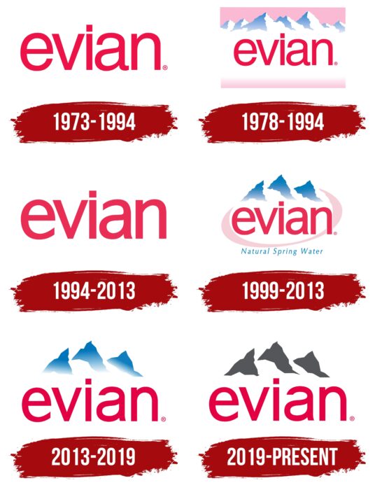
The main sign of the brand is alphabetic. The brand’s name is written with a small letter in bright scarlet. Soft curved lines of different thicknesses without serifs symbolize the mild taste of mineral water in which there are no unpleasant aftertastes. Of the distinguishing features – a drop enclosed in the lower part of the letter “a.” It is a hint that the brand is related to the water element. Red is a symbol of power and health. It attracts attention, emphasizing the importance of the brand. It also indicates the unity of the pH of the water with the pH of the blood, which improves the absorption of the liquid.
1978 – 1994
Starting with the year of the export of mineral water to the USA (1978), the image of the snowy peaks of the French Alps began to be used along with the capital logo. This introduced foreign buyers to the essence of the product. Pointed to the place of birth of water and created an association with coolness, cleanliness, and freshness. These sensations were enhanced by a foggy white stripe in the center of the emblem, which housed the brand name. The background of the logo is pink. It looks like dawn against the backdrop of mountains; morning dawn, which complements the impression of purity, lightness, and cold, shows the heyday of the brand’s popularity.
1994 – 2013
Since 1993, water has been supplied to maternity hospitals in France and is recommended for women in childbirth, and babies and small children are actively used in brand advertising. All this is reflected in the logo. The lettering remained unchanged, and the color scheme became crimson. More childish and tender. This color symbolizes creativity, dreams, and creativity.
1999 – 2013
The visual sign of this time has changed its form. The pink background of the emblem was limited to an oval strip, inside which three mountain peaks with bright blue shadows rise against a white background. The word Evian is on top of the image, extending beyond the edges of the oval on the right. It shows the brand’s drive forward. Expansion beyond its place of origin and worldwide distribution (the product has become popular in 120 countries).
The oval shape is an allusion to Lake Geneva, on the banks of which there are springs. An indication of the Earth’s movement trajectory, which is constant and unchanging like the composition of water and the spread of the mark. There are not many permanent, stable products with more than 200 years of history in the world. And, despite the active use, nature fills the sources repeatedly.
The oval also creates a sense of harmony and completeness. After all, Evian contains the necessary minerals for health and well-being. Nothing needs to be added to the composition. Water is perfect in itself.
Also, the oval line surrounding the brand name is a sign of protection. In the nineties, the Association for the Protection of the Evian Water was born. It regulates the work of agricultural and local enterprises to avoid pollution of sources.
The three peaks may point to the three most famous ski resorts in the French Alps, the three continents where water is sold. There is also a version that this is a real mountain landscape observed in the Chamonix valley.
The appearance of blue on the tops is not accidental. Blue is present on the coat of arms of the commune of Evian-les-Bains, where the balneological resort is located. This is the color of Lake Geneva and streams. It is associated with the water element, depth, and purity. Blue is also a nod to the parent company. In the 90s, the BSN group was renamed Danone. Its logo is made in blue tones. The white background of the logo is the snowy coolness that comes from the water from the mountain peaks.
2013 – 2019
In 2005, the main goal of Danone was formulated – to bring health through food and water to as many people as possible. On the mineral water logo of this period, only the main elements have been preserved – the brand name and three mountain peaks with blue shadows. Symbols of water, purity, health, and the Alps. Key message: Evian is pure water that cares about health.
2019 – today
In 2018, Danone set 9 goals to improve the planet’s health and people. For Evian, this means the start of a journey towards safe packaging and a zero carbon footprint:
- use of bottles made from recycled materials
- removal of labels
- production of dispensers with minimal plastic content
- a new modern eco-friendly platform for bottling mineral water
- transportation only by railway tracks.
The new brand logo is concise, clear, and minimalist. It has only three mountain peaks and at their foot the brand’s name. The rise of mountains symbolizes the fact that nature is higher and more significant than everything that a person does. At the same time, the brand name seems to be standing on water, and the lower part of the letters is slightly rippled. This shows that the brand arose born from the water of mountain streams. The peaks are marked in gray, which embodies constancy, maturity, and a long history of existence (the age of the mineral water is 230 years). The company is stable, firmly on its feet, and mature enough to take responsibility for keeping the planet clean.
Font and Colors
The brand’s main colors are scarlet, white, blue, and gray.
- Scarlet – this is the unity of mineral water with blood, the benefits of water for health.
- White – snow from which water is formed.
- Blue – purity, and coolness of the springs.
- Gray – stability, and reliability.
The logo font is Arial.
Evian color codes
| Crimson | Hex color: | #e50043 |
|---|---|---|
| RGB: | 229 0 67 | |
| CMYK: | 0 100 71 10 | |
| Pantone: | PMS 1788 C |
| Davy’s Gray | Hex color: | #54565a |
|---|---|---|
| RGB: | 84 86 90 | |
| CMYK: | 7 4 0 65 | |
| Pantone: | PMS Cool Gray 11 C |
