 Extra Space Storage Logo PNG
After renovations, a move, or an office upgrade, you often need temporary storage when space is limited. In such cases, people rent storage units to store furniture, archives, and personal belongings. The Extra Space Storage logo represents a company that provides storage services and manages a network of storage facilities for private and corporate clients.
Extra Space Storage was founded in 1977 in Billings, Montana. The company began operations as a self-storage facility operator. The first locations served residents who needed additional space to store personal belongings and small business goods. By the late 1990s, the network included about 20 facilities in the western United States.
In 2004, the company held an initial public offering on the New York Stock Exchange. It received REIT status, which allowed it to distribute profits to shareholders and accelerate business expansion. In the following years, Extra Space Storage acquired facilities from independent operators. By 2007, the company had 500 locations.
After a brief decline during the 2008 financial crisis, the company resumed growth. In 2015, it acquired 122 properties from SmartStop Asset Management. The deal was valued at $ 1.4 billion.
By 2019, the network included more than 1,700 facilities. Digitalization allowed customers to manage rentals through a mobile app and use contactless locks.
In 2021, the company acquired Life Storage. The deal amounted to $ 12.7 billion. After that, it became the largest self-storage operator in the United States. By 2023, the company began automating facility management and implementing access systems without staff involvement.
Extra Space Storage manages more than 3,600 facilities in 43 states. The company serves about 2 million customers and remains a leading player in the country’s self-storage market.
Meaning and History
What is Extra Space Storage?
It is the largest self-storage operator in the United States and operates as a real estate investment trust. The company manages thousands of facilities nationwide, offering tenants spaces ranging from compact lockers to large business suites. The system is based on a self-service model, with clients having 24-hour access to secure, climate-controlled storage units and flexible payment terms. Both individuals and companies use the services to store personal belongings, furniture, equipment, or inventory.
1977 – 2003
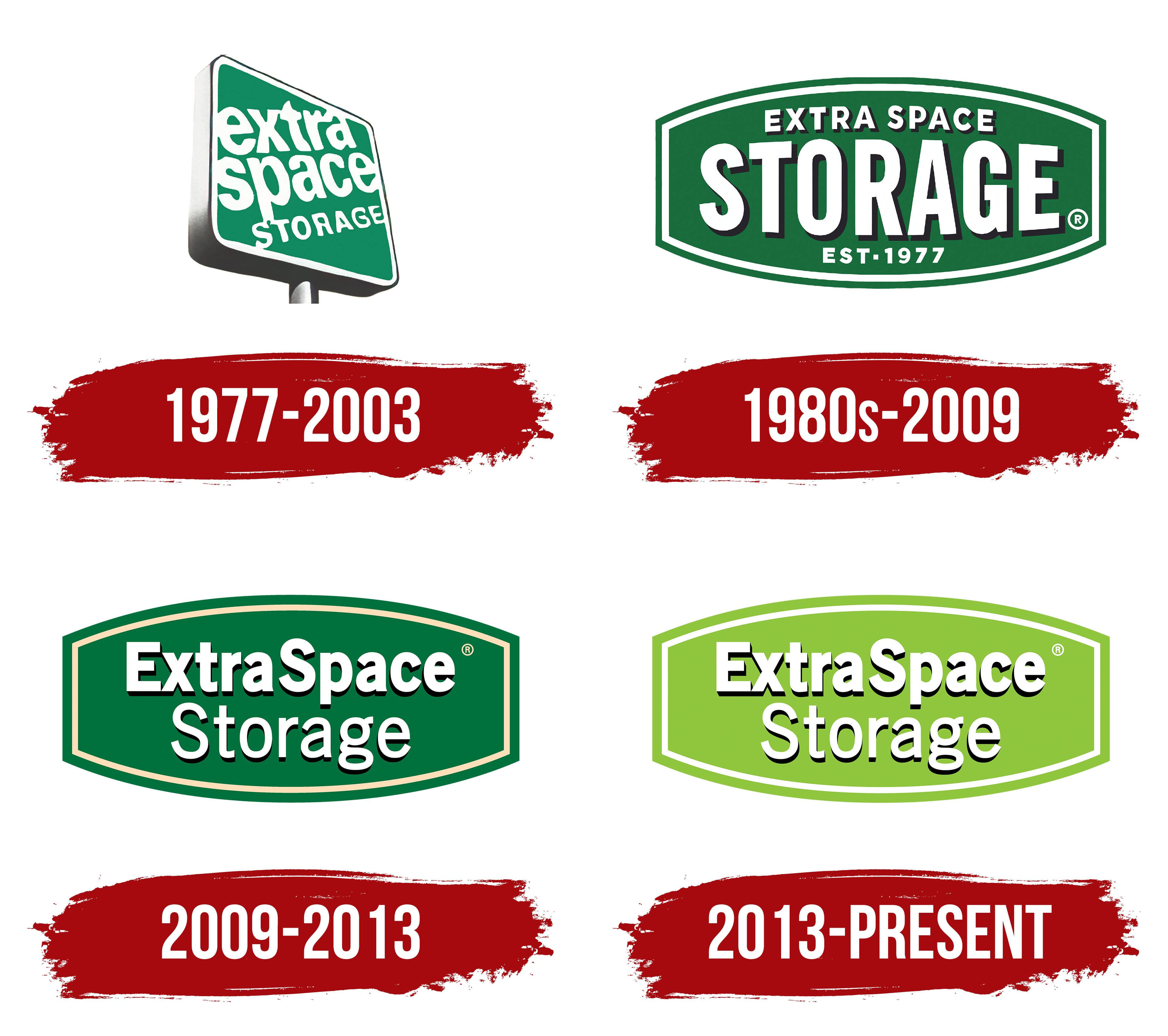
The first Extra Space Storage sign was angled for motorists. The company explained that the sign was tilted to make the name visible to drivers passing by. On building facades, the placement looked different and sometimes made the sign appear unevenly installed.
The brand’s history began in 1977. Kenneth M. Woolley became interested in the self-storage business during a research project at Stanford Graduate School of Business. He built the first facility in Billings, Montana, in May 1977. The English name Extra Space Storage described a service offering additional room for personal belongings. Extra Space became the company’s shortened name.
The 1977 logo resembled a dimensional billboard tilted back about 20 degrees to the right. Its front panel was elongated with rounded corners. A white border surrounded the green field and separated the sign from its gray support. The heavy base had rounded contours and soft shadow transitions that created depth.
The name occupied 3 lines. The large white words Extra and Space appeared one above the other in lowercase letters. STORAGE occupied the lower line in smaller uppercase characters. The scale difference emphasized the shortened Extra Space name, while the lower word identified the company’s business.
1980s – 2009
During the 1980s, the self-storage market was still developing, and many customers were unfamiliar with the service. Extra Space Storage changed the word order in its logo and made STORAGE the primary word. The large word helped viewers identify the company’s business at a glance.
An elongated horizontal shape with convex upper and lower edges replaced the early 4-sided panel. Extra Space Storage compares its silhouette to an American football. Rounded edges softened the form, while a light interior line followed the outer boundary. The background received a solid dark green fill and a flat appearance.
STORAGE occupied most of the space. Large angular letters used a heavy sans-serif typeface resembling Impact. A dense black shadow accompanied the cream-white characters, separating the service name from the green field.
The smaller EXTRA SPACE line appeared above. Its uppercase letters used a light geometric style similar to Futura Bold and received the same shadow treatment. EST. 1977 appeared at the bottom and identified the year the company began. The 3-level composition presented the service first, followed by the brand and founding date.
2009 – 2013
As the brand developed, Extra Space changed its logo hierarchy. The company name moved to the upper position, while Storage shifted to the second line. The corporate history associates the change with growing brand recognition. Customers already associated Extra Space with storage services, reducing the need to explain the company’s business.
Extra Space became larger and moved to the upper section. The smaller Storage line appeared below. Both lines used white sans-serif letters resembling Helvetica Rounded Bold or a modified Arial Rounded. Rounded terminals softened the heavy type. A dense black shadow created depth and separated the lettering from the green field. Removing the Established in 1977 line made room for the larger company name.
The emblem retained its elongated green form with curved upper and lower edges. Its outline resembled a horizontal shield or extended hexagon. A light beige line ran inside, while the outer border used a dark green matching the background. Both frames followed the primary shape’s curves.
A rich evergreen green replaced the darker shade used in the previous version. Extra Space associates forest green with prosperity and security. The company links the color to 1977 fashion, reflecting the period when the business began. Extra Space became the primary part of the logo, while Storage remained an explanatory line.
2013 – today
Extra Space Storage updated its corporate identity in 2013, focusing on color. Bright wasabi green replaced dark evergreen green. The change accompanied the company’s growing position in the American self-storage market. It continued the established system featuring the familiar emblem.
The yellow-green color was associated with clean, bright, and secure storage facilities. Extra Space used it to communicate support for customers during periods of personal change. Multimedia Design Manager Adam Day explained the color through associations with nature, growth, calm, and energy.
The logo’s structure remained unchanged. The elongated green shape with curved upper and lower edges continued the line of earlier signs. A white border followed the field’s outline. The name appeared inside across 2 lines. The large Extra Space occupied the upper section, while the smaller Storage line sat below. The letterforms, proportions, and word order remained unchanged.
The logo combined the sign silhouette, green background, and white company name. The 2013 version developed the earlier identity through a new color.