


The company updated its brand and brought EyePromise, PRN Vision Group, and Avenova under a single name. It rebuilt its digital services and logo, making it easier for the brand to explain its core idea. The new system brings together scientific grounding, doctors’ guidance, and eye-health products.
The key change is tied to the logo. The previous mark felt closer to dietary supplement advertising from the early 2000s. The new version is more closely aligned with medical services and clinical practice. The old slanted type, decorative details, and “Upgrade your eyes” tagline gave way to a calm wordmark with careful typography and a small symbol above the word “eye.”
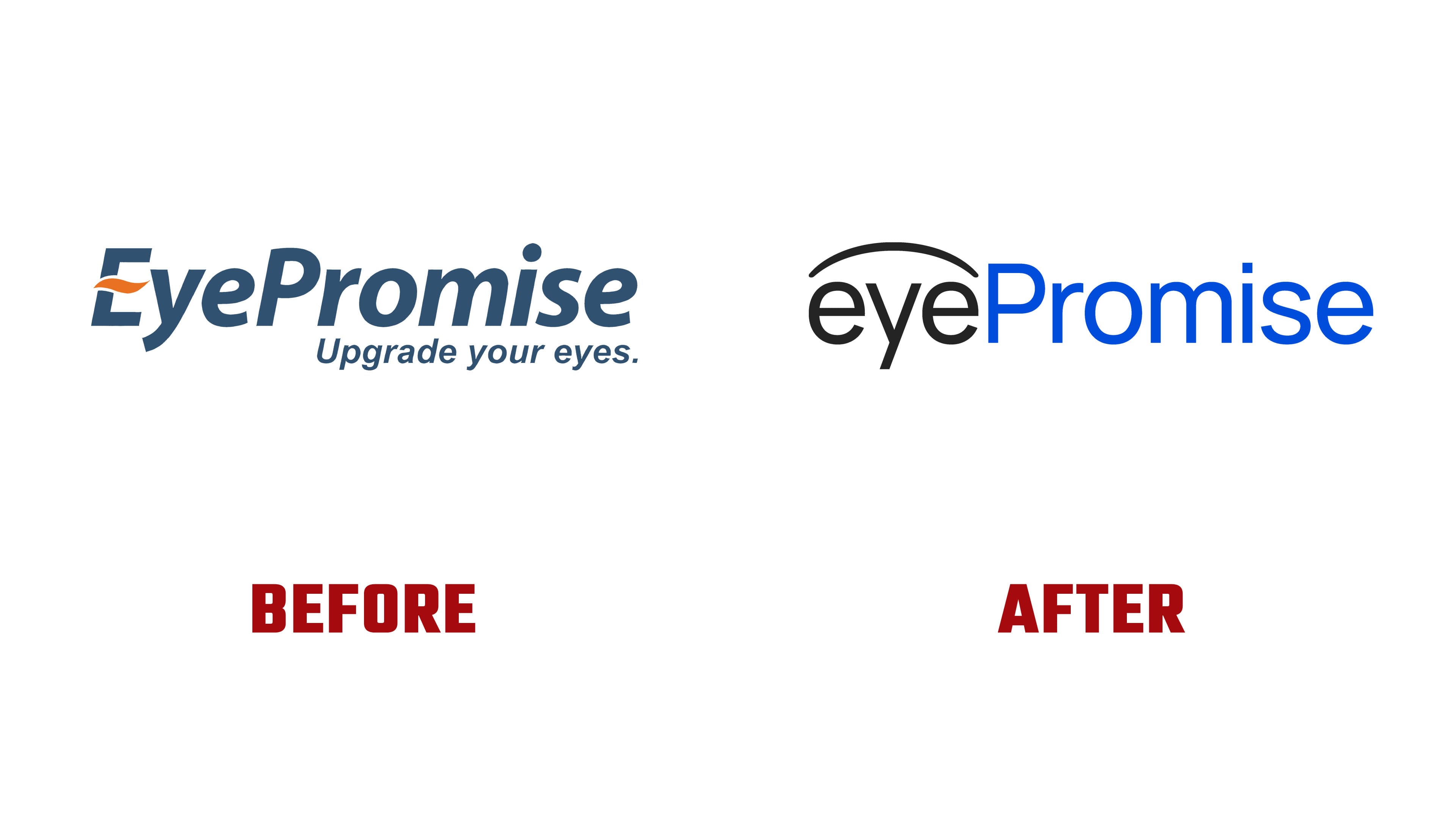
The smooth arc recalls the outline of an eye or an upper eyelid. It is based on the image of a doctor’s handwritten mark. The symbol is connected with a specialist’s recommendation and a doctor’s personal responsibility. The logo reflects the relationship between doctor and patient, in which trust is built on knowledge, experience, and verified data.
The meaning of the rebrand comes through as “promise made, promise kept.” For EyePromise, the phrase describes the company’s attitude toward products, research, and patient support. The new mark conveys that idea with restraint. It connects medical practice, evidence-based work, and long-term eye health care.
The name in the logo is split into two parts. The black “eye” and blue “Promise” help clarify the brand name’s meaning through color and typography. Alice created the logo update. The team needed to consolidate several brands, services, and audiences into a single system.
Today, the brand builds on more than twenty years of experience, collaboration with thousands of specialists, and a product line for different vision care needs. The new logo shows the company’s development.