


![]() Faberlic Logo PNG
Faberlic Logo PNG
Simplicity and lightness are read in the subtle elements of the emblem. The Faberlic logo embodies the complete affinity of cosmetics with the skin. The components are embedded in the epidermis, strengthening it and filling it with youth.
Alexey Nechaev and Alexander Davankov met in childhood and later studied at Moscow State University. In the early 1990s, they worked together in business, starting with subscription books, privatization deals, and water filters. Direct sales were first tested through filters before moving into cosmetics.
The turning point came after they learned about oxygen-based formulations. Nechaev focused on perfluorocarbon emulsions derived from perftoran, developed by Soviet scientists under the direction of Felix Beloyartsev. Originally used as artificial blood during the Afghan war, the compound could carry oxygen.
In 1997, Nechaev founded “Russian Line”. In 1998, the partners acquired a patent for the topical use of perftoran. They launched the first oxygen cosmetics line in Russia. The timing coincided with the 1998 financial crisis, during which imports from brands such as Oriflame, Avon, and Mary Kay declined.
In 2001, the company rebranded as Faberlic to prepare for international markets. Expansion followed across CIS countries, then into Europe between 2002 and 2004.
In 2004, Faberlic acquired a factory originally built in 1989 for a joint project linked to L’Oréal. The deal included further investment in modernization.
In 2008, its R&D center, working with Moscow State University, introduced the Rala formula and secured patents. The company released over 60 products and ranked 86th in the WWD Beauty Report.
Between 2011 and 2012, Faberlic added Edelstar and Sengara. In 2015, it expanded into apparel and reported rapid sales growth. By 2016, total revenue reached 23 billion rubles, with cosmetics and fragrance accounting for nearly 13 billion.
Meaning and History
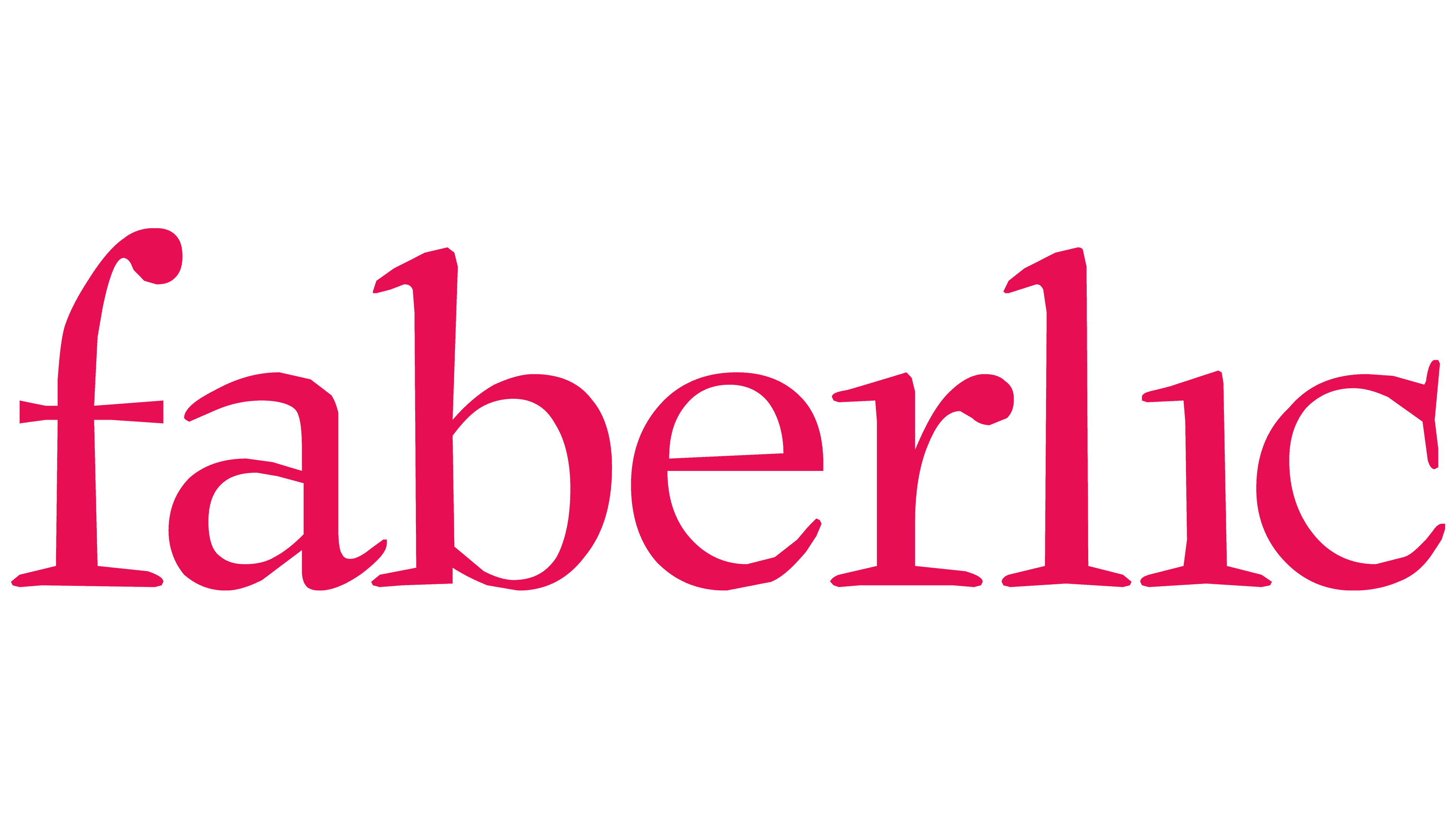
Initially, the enterprise had a completely different name, Russian Line. After several years of successful work, it began to break into the international market, prompting a rebrand and a change in its image in 2001. The result was the Faberlic trademark with a unique and well-recognized symbolism. It is minimalistic and understandable, and it has remained unchanged throughout the brand’s long history.
The corporate logo is an example of a focus on business. It contains only the information that is necessary for quick visual perception of the brand. The upper part is graphic; the lower one is text. Although it is still an abbreviated company name in the first tier, it is presented as an image. The lowercase “f” at the top is connected to the uppercase “L.” The second tier contains the brand’s full name in lowercase. The styles of the two elements differ.
What is Faberlic?
Faberlic is a Russian company that manufactures and sells cosmetics, clothing, footwear, and various accessories. Products are sold directly, hand-to-hand. It was established in 1997 under a different name. The official transition to the current name occurred in 2002. The founder of the brand is Alexey Nechaev. The headquarters is located in Moscow.
Font and Colors
The word “faberlic” is written in block letters, but the letters are slightly sloppy. The uneven lower serifs create this impression: the disproportionately bent upper section of “f” and the too-long tail of “a,” which extends over the adjacent “b.” The color palette, on the contrary, is restrained: it consists of black and white.