


 Fairlife Logo PNG
The Fairlife logo is dynamic and memorable. The identity creators put a lot of effort into its development, formulating a precise concept and considering it the calling card of premium products. When the pricing policy for dairy products is nearly double that of competitors, the company places even greater obligations toward its target audience.
Fairlife began in 2012, when the McCloskey family at Fair Oaks Farms in Indiana developed a milk product with a stronger nutritional profile. Their method, called ultrafiltration, reduced lactose and sugar content while increasing protein and calcium content. The idea first reached the market through Select Milk Producers and the Core Power brand, a high-protein dairy drink aimed at athletes and fitness consumers.
After Core Power showed market potential, Select Milk Producers entered a partnership with Coca-Cola in 2012. Fairlife LLC was formed in 2013, and the brand prepared for a wider launch. In 2014, Fairlife introduced its ultrafiltered milk line in the United States, positioning it as a lactose-free premium milk with lower sugar and higher protein and calcium levels.
The early years were not easy, partly because the product cost more than regular milk and some buyers were unsure about filtered dairy. In 2015 and 2016, the range expanded to include new varieties, children’s milk, chocolate milk, and tests in ice cream and yogurt. In 2018, a new plant in Coopersville, Georgia, increased production and improved East Coast distribution.
In 2019, Fairlife entered the Canadian market, adapting its products to local regulations and tastes. In 2020, ownership changed, giving the brand access to a wider distribution system, and the line added oat-based dairy drinks. In 2021, Fairlife entered the Chinese market. In 2022, it introduced packaging made with recycled materials and functional dairy drinks with probiotics. In 2023, a new Arizona plant strengthened West Coast distribution and supported further international plans.
Meaning and History
Each element of the logo is multifaceted and expressive. The color scheme seems simple but effectively reflects the essence of the brand’s activities. Fonts, graphics, and symbols enhance its presentability. If the logo could be described in one word, it would be “perfection.” This also applies to the brand’s lactose-free products and luxurious dairy goods, which have existed since 2012.
Since its founding, the logo has remained unchanged, attesting to its attractiveness and drawing customers for over ten years.
What is Fairlife?
It is a dairy company known for producing milk and milk-based products. The brand is a subsidiary of The Coca-Cola Company. The company uses a unique filtration process to improve the nutritional profile of milk, resulting in products that contain more protein and calcium and less sugar than regular milk. The product line includes ultra-filtered milk, protein shakes, and creamers. The brand focuses on sustainability and animal welfare, sourcing milk from farms that adhere to strict standards of cow care and environmental protection. The brand’s products are available in supermarkets, grocery stores, and online retailers, appealing to consumers seeking nutritious, responsible dairy products.
2014 – today
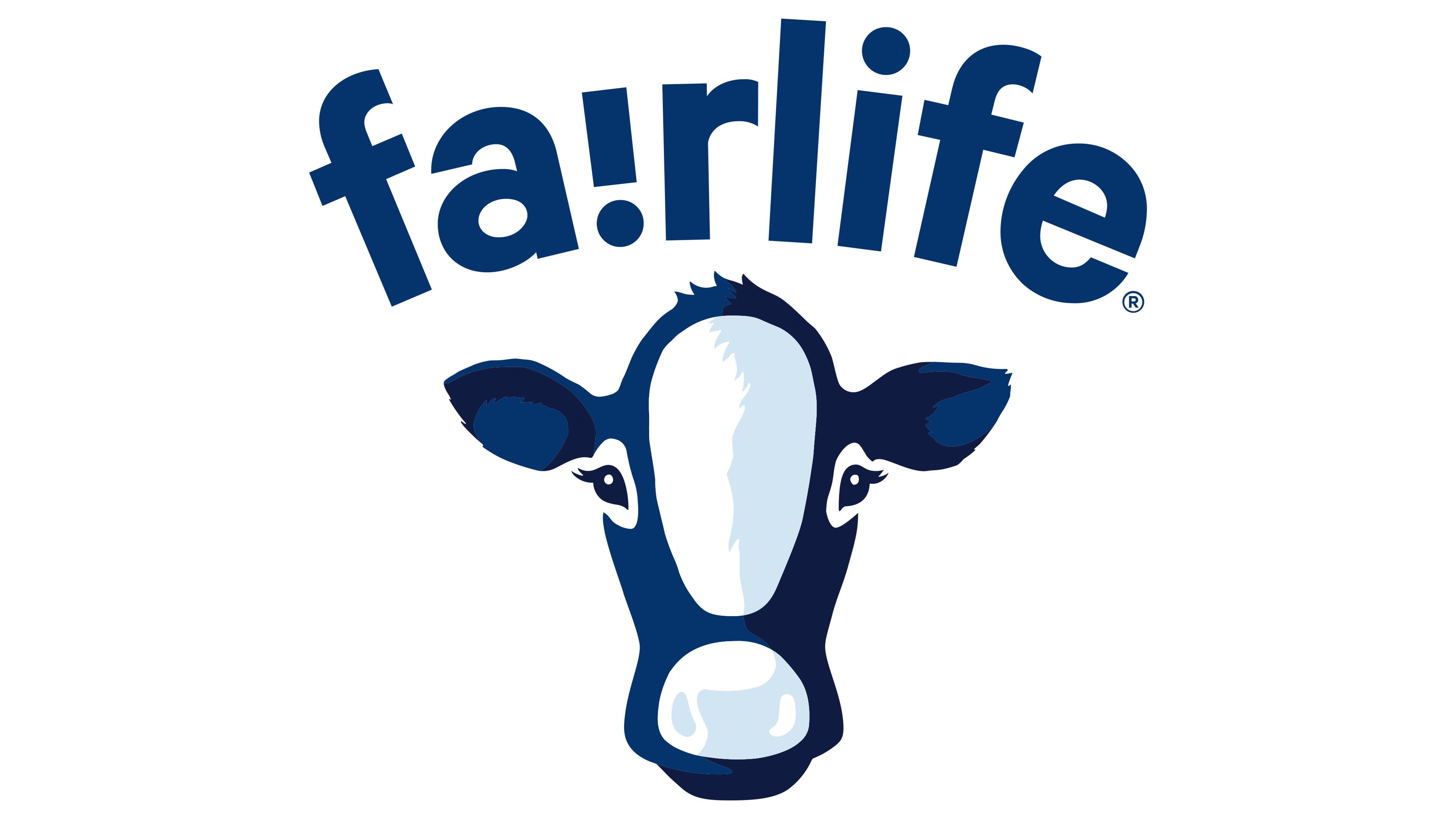
The Fairlife logo emphasizes the brand’s connection to naturalness and milk, then presents information about dairy products with many competitive advantages. This effect was achieved through the successful arrangement and combination of elements. The logo, created at the company’s founding, remains unchanged, highlighting its uniqueness.
The cow’s head in the logo is perceived positively and with a touch of fun, complemented by a simple signature. Together, these two elements symbolize quality and uniqueness.
Two shades of blue, white, and black make the logo’s color scheme clear and graphic. The shadow effect adds realism to the image. The cow, resembling a calf, appears kind and cute, with beautiful ears, dark, highlighted eyes, and a tuft of hair, giving it a cartoonish look. At the same time, a hint of seriousness is noticeable in the animal’s gaze.
The brand name features interesting typography, with two attention-grabbing elements: an inverted “i” and semi-circular letter placement.
All letters are the same size, and the font resembles the trendy TT Commons Pro. The dark blue color is expressive and noticeable, while the white background enhances the visual effect. The unconventional letter shapes, with pointed edges, give the logo a sense of dynamism and movement, similar to arrows.