The Fairyseason logo captures the spirit of fashion and self-expression, reflecting the brand’s commitment to offering stylish and affordable clothing for diverse tastes. The emblem’s design conveys a sense of lightness, playfulness, and individuality, highlighting the variety and creativity of the company’s collections.
Fairyseason: Brand overview
In 2012, Fairyseason, an e-commerce platform from Hong Kong, emerged in the world of fast fashion. The company’s mission is to cater to the modern woman’s needs, delivering modern clothing and accessories straight to her closet.
Just two years after its inception, Fairyseason has forged alliances with over 200 suppliers, mostly from China, offering chic fashions at budget-friendly prices. The brand did not stop there; in 2015-2016, it expanded its range, adding various items ranging from stylish swimwear to sparkling jewelry.
Recognizing the importance of fast delivery in the e-commerce era, the company opened its first fulfillment center in Hong Kong in 2017, setting the stage for faster worldwide shipping. Around the same period, the company embarked on a mission to connect more closely with its European audience, creating dedicated platforms and payment solutions for regions such as the UK, France, and Germany.
The digital age called, and Fairyseason responded. Since 2018, the company has actively embraced the power of social media, collaborating with influencers on platforms like Instagram to strengthen its brand. By 2020, at the turn of the decade, their international presence had become undeniable: their customers came from 180 countries, with 85% of their orders coming from overseas.
Looking at Fairyseason in 2023, we can see that the brand continues its global march, shipping fashion favorites from several Asian branches. Two key moments in the company’s history can be highlighted: the birth of the distribution center in Hong Kong in 2017 and maneuvering on the social media chessboard as of 2018.
Meaning and History
What is Fairyseason?
Founded 2012 in Hong Kong, China, Fairyseason is the quintessential shopping center for stylish women looking to keep up with the latest fashion trends. Its user-friendly online platform offers an endlessly updated collection of stylish clothing, shoes, and accessories. Fairyseason is growing globally, delighting fashion enthusiasts with its chic yet affordable clothing range.
2012 – 2016
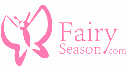
The Fairy Season logo catches the eye with its delicate and whimsical design. The main element of the emblem is a stylized pink butterfly figure. The butterfly represents lightness, femininity, and magic, perfectly aligning with the brand’s name. The outline of a woman’s figure is subtly visible within the butterfly, emphasizing the connection to fashion and beauty.
The font used for the “Fairy Season” text is elegant and refined, with slight serifs that add a touch of sophistication. The pink color in the logo symbolizes romance, softness, and appeal, resonating with the brand’s target audience—young women looking for stylish outfits.
2016 – 2022
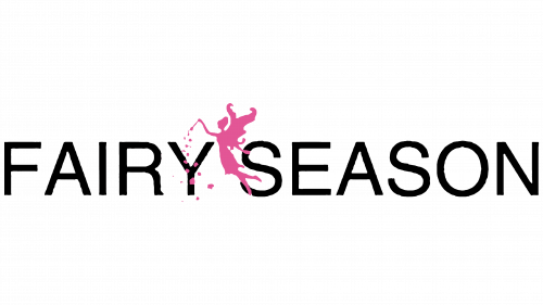
The updated logo used during this period symbolized lightness and magic. The central element of the emblem is the image of a pink fairy. The fairy symbolizes magic, wonder, and childhood dreams, fully reflecting the brand’s idea of creating fashion inspired by fantasies and fairy tales. The fairy is depicted in flight, surrounded by scattering stars, adding a sense of dynamism and enchantment.
The font used for the “Fairy Season” text has a classic, slightly curved style, giving the inscription elegance and fluidity. Pink evokes associations with romance, softness, and femininity—qualities the brand aims to highlight in its products.
2022 – today
Beauty can be discreet. This is emphasized by the Fairyseason logo, which is fashionably simple, minimalist, and two-dimensional. The tall letters look elegant, and the lack of serifs makes them modern. Despite the black color, the lettering seems light and unobtrusive. The online store’s name occupies one line and consists of two words: “Fairy” and “Season .”These words are separated by a wide space, much wider than the space between the individual letters. The font is uppercase, sans-serif, even.
The wide space between the words “Fairy” and “Season” creates a pause, as if taking a breath between the words. The word “Fairy” brings to mind something magical, while “Season” hints at change or a certain time of year. The logo seems to say, “Feel the magic in every season,” but in a calm, relaxed manner.


