


American coffee equipment maker Fellow has introduced an updated logo designed by Mouthwash Studio. The company wanted to bring together people who enjoy making coffee and find pleasure in everyday routines at home. Fellow’s brand director, Lauren Case, led the project internally. The studio’s portfolio dates the work to 2025, while the team began sharing rollout news in 2026.
Fellow earned customers’ trust through thoughtful engineering, quality materials, and careful attention to product appearance. Customers appreciated the equipment’s ease of use and precision. As its audience grew in the premium market, the company needed a consistent identity across markets, partners, and sales channels. The team also wanted to build on the attachment customers develop after discovering a Fellow kettle or another coffee appliance. Mouthwash Studio cofounder Alex Tan describes the goal as turning a love for an individual product into a lasting relationship with the company.
The project centered on the idea of “Everyday Magic,” celebrating small daily pleasures, the enjoyment of household routines, and the personal connections people form with the objects around them. Lauren Case connects this idea to moments of pleasure in familiar routines. At home, making coffee becomes a ritual, with kitchen appliances helping people enjoy the process. Fellow positions the brand as a companion for brewing coffee and exploring kitchen ideas, while staying committed to precision.

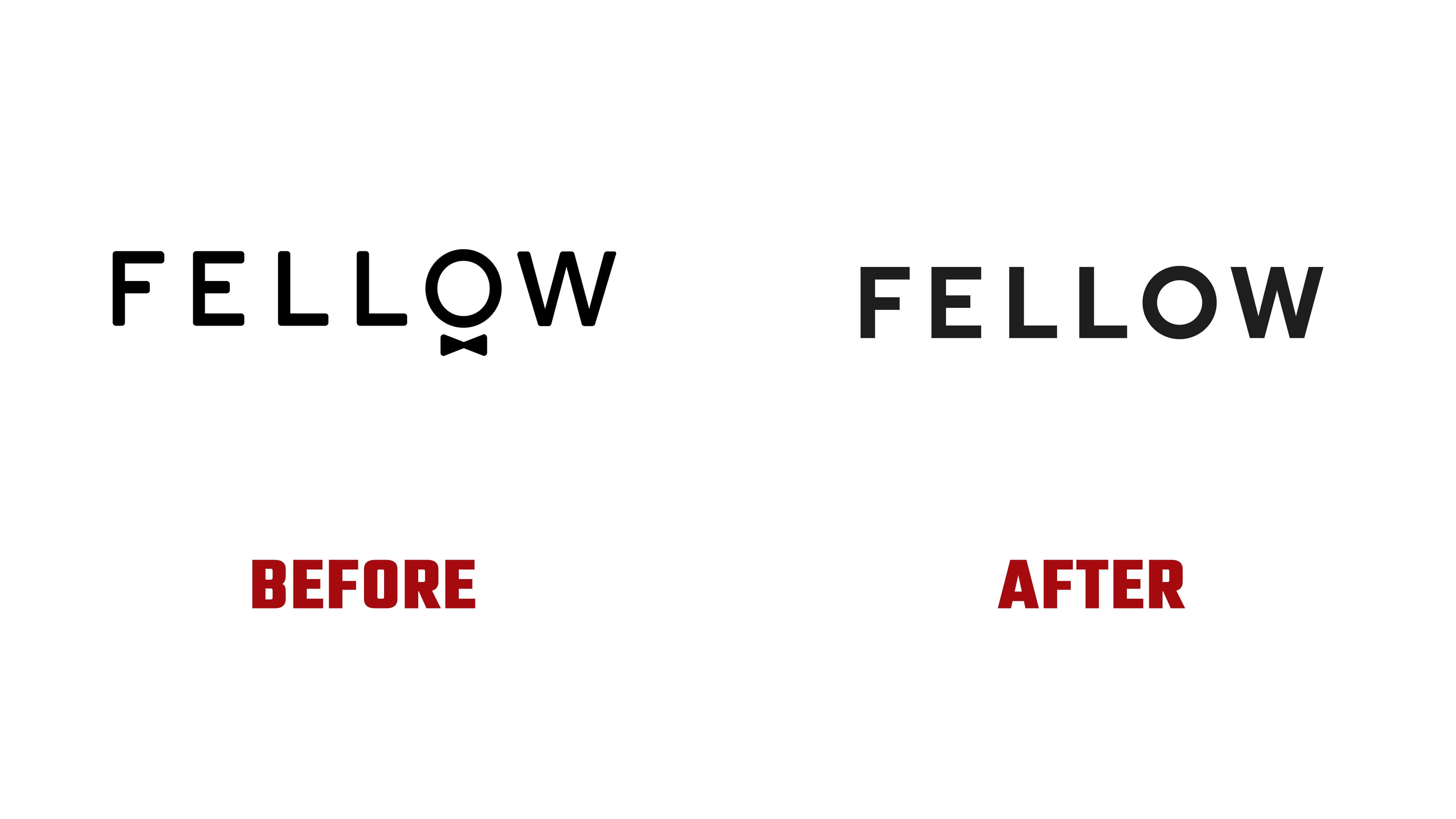
For the new logo, Mouthwash Studio drew on Fellow’s industrial-design geometry. The FELLOW name still appears in a single line of six uppercase letters. The strokes are heavier, and the spacing is tighter. The “F,” “E,” and “L” have flat terminals and right-angle joints. A nearly circular “O” sits beside the diagonal strokes of the “W.” Circles, verticals, horizontals, and diagonals create a compact wordmark. The designers connect its construction to the precision engineering of Fellow’s products.
The previous logo felt more open, with thin strokes and generous spacing. A small bow tie sat beneath the “O.” Together, the round letter and bow tie suggested the head of a person dressed in formal attire, giving the name a human presence. The updated logo emphasizes the shapes and proportions of the letters. Its black-and-white treatment maintains a connection to the earlier identity.
The bow tie remains a separate emblem. The studio reworked its geometry to align with the new lettering. The wordmark and bow tie now serve different purposes. The wordmark represents Fellow on its kitchen appliances and across digital platforms. At the same time, the bow tie provides an additional accent and preserves a reference to the brand’s history.