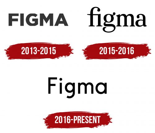
The Figma logo conveys the idea of the creative process, which involves interaction between team members. The simplicity of the lines reflects the accessibility of the web application for everyone who needs convenient tools for interface design.
Figma: Brand overview
Brown University students Dylan Field and Evan Wallace first envisioned a collaborative design tool for the browser in 2012, which is how Figma came to be. Dissatisfaction with the state-of-the-art design tools prevented efficient real-time cooperation and gave rise to the idea.
Field was awarded a Thiel Fellowship in 2013, with $100,000 to help him launch a firm if he left the university. This allowed him to concentrate entirely on creating the project. After graduating in 2015, Wallace became a full-time member of the project.
For the firm, 2015 was a pivotal year. By raising $3.8 million in seed money, the business was able to speed up the development of new products and grow the development team. The company also started its tool’s closed beta testing that same year.
The company revealed in December 2015 that $14 million in Series A funding had been raised, indicating strong investor interest in the idea.
The product was officially launched in 2016. Its novel browser-based idea and real-time collaborative editing features quickly drew attention from the design community.
The vector editor released in 2017 greatly increased the platform’s functionality. As a result, designers could produce increasingly intricate graphics and symbols inside the platform without having to transition between many tools.
2018 saw rapid growth for the enterprise. The business raised $25 million in Series B financing. The Figma Platform was introduced in the same year, enabling programmers to create plugins and extensions.
The Auto Layout function, released in 2019, automated the creation of adaptive designs. This invention made designing responsive layouts much easier for designers.
FigJam, an application for making interactive boards and working together on ideas, was released in 2020. FigJam enhanced the tool’s functionality by enabling teams to plan and generate ideas for projects all inside the same environment.
In 2021, the enterprise continued improving its products and included several new features, such as improved prototyping tools and closer developer collaboration.
The platform underwent several noteworthy changes in 2022. “Automatic layer naming” was introduced, simplifying the arrangement of design elements. Additionally, the “component variants” capability was enhanced to enable the development of more adaptable and flexible design systems.
The business held its first offline user and developer conference, Config, in April 2022. This occasion marked a significant turning point in the community’s growth.
A revised version of FigJam featuring enhanced collaborative capabilities, such as better tools for sprint planning and retrospectives, was unveiled in the summer of 2022.
In September 2022, it was revealed that Adobe would pay $20 billion to acquire the company. This incident had a significant impact on the user community and the industry.
After the Adobe arrangement was announced, the company made it clear that it would stay independent and concentrate on developing new products for the duration of the agreement.
By the end of 2022, the enterprise had expanded its interactive prototype tools, enabling designers to produce more lifelike mockups for websites and applications.
The business announced integration with well-known project management systems at the beginning of 2023, which would improve the synchronization of designers’ work with development processes.
In the spring of 2023, the firm expanded the scope of its educational endeavors by introducing new courses and developer and designer certification programs.
The corporation worked to develop its collaborative tools during 2023, emphasizing increasing efficiency when working on complicated and large-scale projects.
Additionally, the enterprise increased its market share in the corporate sector by launching new features and solutions designed to meet the needs of large enterprises.
Despite Adobe’s much-anticipated acquisition, the company persisted in its aggressive growth and innovation, winning over new clients and keeping its user base loyal.
The firm has continuously enhanced its product by listening to customer feedback and keeping up with design and software development trends. The enterprise competed with well-established market rivals by providing a cutting-edge cooperation and design strategy.
The company changed how digital product creation and teamwork are approached, starting as an ambitious project between two students and evolving into one of the top tools in the design sector.
Meaning and History
What is Figma?
This cloud-based design platform has completely transformed how teams and designers collaborate on digital projects. With the ability for multiple users to work on a single file in real time, this tool combines powerful design features with the convenience of teamwork. The platform operates in the browser, making it accessible from any device without additional installations or updates. It offers many tools for creating vector graphics, prototypes, and user interfaces. Additionally, it supports a plugin system that extends its capabilities. With component libraries and design systems, teams can easily maintain consistency in large projects.
2012 – 2013
Figma was founded in 2012 but did not have an official logo until 2013. The company was entirely focused on developing the application of the same name, so it had no time to consider its visual identity or pay attention to branding.
2013 – 2015
Although the Figma software had not yet been released in 2013, users were already showing interest in it, as this revolutionary development was expected to simplify the interface design process. The company introduced its debut logo to attract more attention to the new product. It looks very plain because it consists of a single black inscription.
The word “FIGMA” is rendered in a standard bold sans-serif font, whose restrained severity emphasizes the seriousness of the startup. The symmetrical shape of the letters creates a sense of balance, reflecting a pursuit of equilibrium. All lines have the same thickness, yet this does not reduce the emblem’s dynamism—in this form, the glyphs still appear to have movement. The internal energy is expressed in subtle details, from the swift curve of the “G” to the angular center of the “M.”
Designers chose a standard font for the logo, with many analogs, such as Hurme Geometric Sans 4 Black by Hurme Design or Azo Sans Black by Rui Abreu. The inscription’s style is formal and unsuited for a progressive startup on the brink of discoveries. The black capital letters look conservative and generic as if the brand had not fully defined its visual identity.
2015 – 2016
In December 2015, a preview version of the Figma web application was released by invitation only. The company updated its emblem for its debut, as the previous wordmark failed to generate interest and did not reflect the brand’s essence. The designers kept the inscription but completely changed it, creating the opposite of what had been before.
The logo now consists only of lowercase letters, which is meant to convey the accessibility of the software. As Figma simplifies interface design, soft, curving lines symbolize ease and comfort. The contrasting thickness of the strokes adds dynamism to the logo, hinting at faster processes. This visual movement is present in other elements of the inscription:
- Tapering serifs;
- Bold droplets at the ends of “g,” “a,” and “f”;
- Smooth arched curves of “m”;
- Rings and half-rings of “a” and “g.”
All these details highlight the brand’s uniqueness, commitment to growth, and modern technologies. Another interesting emblem feature is the merged “f” and “i.” A horizontal line connects them, and the top of the “f” also overlaps the dot above the “i.” This close connection symbolizes project teamwork, as Figma allows users to collaborate in real-time.
The designers chose a graceful font to help the newly established company stand out among competitors. Yet, the logo still does not fully convey the concept of the software, leaving it a mystery. The monochromatic color scheme combined with the standard inscription indicates the brand’s immaturity, simultaneously trying to appear original and minimalist.
2016 – today
In 2016, Figma was publicly released. Along with the web application, the final version of its emblem was introduced, marking the end of a long search for a visual identity. The company had matured, as its logo finally carried meaning: a colorful icon was added to the simple black inscription, consisting of multicolored geometric shapes.
The elements are arranged in pairs in three rows, resembling a cell division diagram. At the top is a red, pink capsule, in the middle is a purple half-oval and a blue circle, and at the bottom is a turquoise drop. They symbolize small building blocks that make up a larger design project. The bright colors and unusual shapes evoke associations with children’s games, where creativity is key. The multi-component structure of the icon represents the expanded possibilities for those developing user interfaces.
The brand could not part with the black wordmark, but it managed to make it more expressive. Now, the inscription combines uppercase (the initial “F”) and lowercase letters, creating a sense of correctness and balance. The font resembles Pitchland Regular by JC Design Studio, a simple sans-serif without unnecessary decorative elements. Its restrained design emphasizes the company’s authority and confidence, while the black color reinforces this visual effect, as it is associated with aristocratic calm.
The glyphs comprise basic geometric shapes: circles, quadrilaterals, and straight and curved lines. This looks very simple, especially with uniform stroke thickness, but minimalism helps the brand remain noticeable. With such a serious logo, Figma creates the impression of a professional assistant in interface design.

