 FlixBus Logo PNG
The FlixBus logo reflects the brand’s key aspects: dynamism, reliability, affordability, and modernity. These qualities create an appealing and recognizable image that helps the German company stand out in the intercity bus transportation market.
FlixBus was founded in Munich in 2013 by André Schwämmlein, Daniel Krauss, and Jochen Engert after Germany’s intercity bus market was liberalized. The company first operated as GoBus on several Bavarian routes. Instead of buying a bus fleet, the founders built a digital platform for ticket sales, route planning, and customer management. In contrast, local bus operators supplied vehicles and drivers.
The first months brought strong competition for passengers, but the platform model helped the company expand. In 2014, GoBus became FlixBus, and the network spread across much of Germany. In 2015, international operations began in the Netherlands, France, and Italy, requiring adjustments to different laws, transport rules, and market conditions.
In 2016, FlixBus joined with Megabus, expanding its European route map. In 2017, it entered Eastern Europe with routes in the Czech Republic, Poland, and Hungary, while adding long-distance links between major European cities. In 2018, the company entered the United States through California and then began building a wider American network. In 2019, it launched an electric intercity bus on the Paris-Amiens route, acquired Eurolines, and introduced FlixTrain in Germany.
The 2020s brought wider global growth. FlixBus opened routes in Brazil and Turkey, bought Greyhound Lines in 2021 for $172 million, and entered Canada in 2022. The company expanded electric and hydrogen-powered buses, added more North American routes in 2023, updated its mobile app with multimodal booking and real-time tracking, and announced plans for South Korea and Japan in 2024 through partnerships with regional transport operators.
Meaning and History
What is FlixBus?
It is a German bus company offering affordable, convenient intercity travel across Europe and the United States. The company operates an extensive network of routes connecting many cities and towns, providing an economical alternative to rail and air travel. The brand is known for its comfortable buses, free Wi-Fi, power outlets, and toilets, making long-distance travel even more enjoyable. The company offers a convenient online booking system and a mobile app for buying tickets and managing trips.
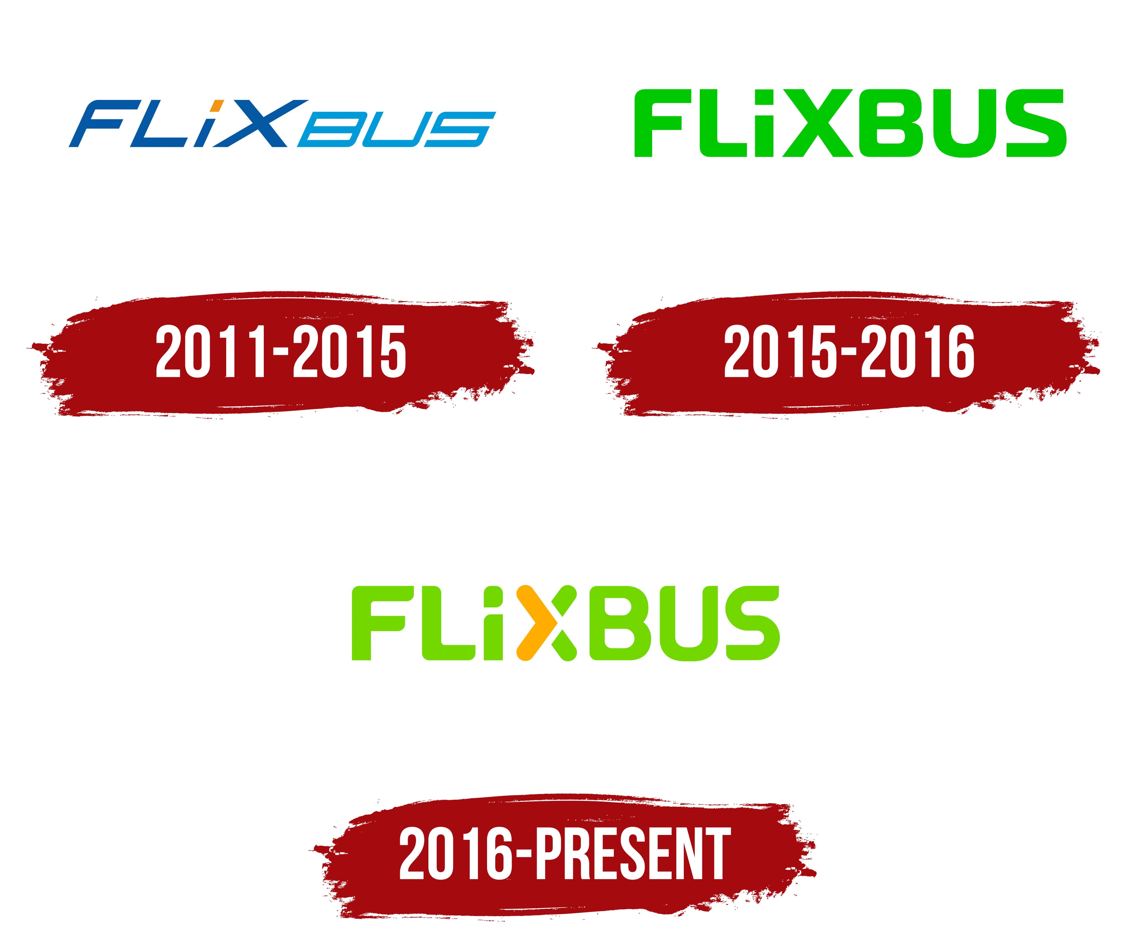
2011 – 2015

The old FlixBus logo features the name of a transportation company that was, at the time, an emerging startup. The designers presented the wordmark in a minimalist style, with clean forms, simple geometry, a limited color palette, and no three-dimensional effects. This design approach creates a positive impression of the brand and aligns with modern design trends.
Despite the minimalist approach, the emblem reflects the dynamism and movement central to fast travel. The energy is conveyed through an italic font, which evokes a sense of lightness and airiness. This weightlessness is associated with the comfort of traveling on intercity routes. The clean, straight lines create a sense of reliability, defining FlixBus as a responsible passenger carrier.
The modern style of the logo emphasizes the company’s innovation. This is evident in several details, including:
- The contrast in letter sizes, where “FLIX” is taller than “BUS.”
- The use of a lowercase “i” instead of an uppercase one
- The combination of sharp and rounded corners (as seen in “F,” “B,” and “S”)
The designers used visual accents to make the wordmark unique and memorable. In this regard, the “i” is the only lowercase letter in the text. The developers deliberately chose lowercase to creatively highlight the dot above the “i”. This small element catches the eye with its square shape and orange color, enhancing the logo’s dynamism.
The rest of the emblem is dark blue or light blue. Two different shades separate the words “FLIX” and “BUS,” as they could appear bulky together. The company needed to create a sense of lightness to reflect the convenience and accessibility of its services.
The blue palette symbolizes the calmness, reliability, and comfort provided by the intercity carrier. The small orange dot adds a touch of vibrant emotion, representing the energy of fast-moving buses, the joy of satisfied passengers, and the dynamism of a growing company focused on expanding its route network.
2015 – 2016

This logo was used for a very short time, so its design can be considered experimental. It appears as an interim version between the old FlixBus wordmark and the new emblem adopted in 2016. The company name is set in a pleasing, vibrant green that evokes a mix of lightness and strength. The chosen shade signals the passenger carrier’s innovation and a strong sense of responsibility toward customers.
Green is the best color to represent the brand’s connection to travel. It’s the color of the planet itself, its vast landscapes, forests, and fields. Green inspires people to use FlixBus services and embark on a journey to enjoy the beauty of nature comfortably.
The font enhances the logo’s dynamism, with wide lines and rounded corners reminiscent of mini-roads. Each letter looks like a piece of a road: the “X” resembles an intersection, the “S” a winding serpentine, the “U” a sharp turn, and the “B” a complex highway interchange. Together, they create a sense of rapid movement, reflecting the company’s field of operation.
Notably, the “i” remains lowercase, even though all the other glyphs are uppercase. However, in this version, the dot above the “i” is not highlighted; it’s colored the same green as the rest of the wordmark. This makes the emblem cohesive, emphasizing FlixBus’s commitment to harmony, stability, and balance.
2016 – today
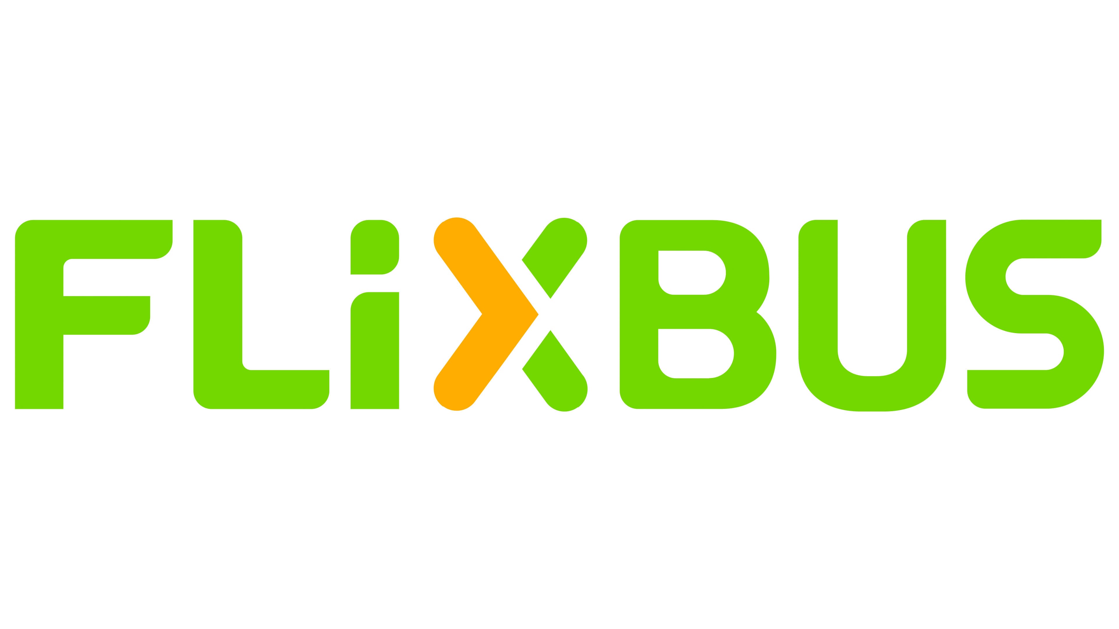
In 2016, the company underwent a global rebranding to create a unified system for all Flix sub-brands, including FlixTrain, FlixMobility, and FlixBus. The new visual identity reflected the passenger carrier’s evolution and its status as one of Europe’s largest. The logo embodies dynamism, illustrating the continuous expansion of its intercity route network.
Everything is infused with energy, from the vibrant color to the fluid forms. The company name appears flexible due to an unusual font that blends sharp angles and rounded letter ends. Soft and sharp lines alternate evenly, creating a sense of smooth motion. This serves as a subtle invitation to travel.
The emblem doesn’t contain obvious symbols related to passenger transportation. However, it features some interesting details about FlixBus’s progressiveness and activity.
- The dot above the “i” has a teardrop shape, with its pointed part toward the lower corner. Due to this unique design, it resembles a comic book speech bubble, typically used to illustrate dialogue. This interactive element speaks directly to the company’s customers, inviting them to ride in a comfortable bus.
- The letter “X” comprises three elements: an orange shape resembling a closing angle bracket and two short green lines. The angle looks like an arrow, pointing to the right and breaking the adjacent line. This symbolizes the absence of boundaries and obstacles, suggesting that all routes are open to FlixBus.
The designers intentionally split the “X” into several segments to give the impression that the nearby lowercase “i” with its dot is an uppercase “I,” with its top part separated from the bottom by an elegant white line. All the other letters still evoke the idea of roads, reflecting the company’s extensive route network. The modern font with smooth curves makes the text visually dynamic without compromising readability.
The neon green color enhances the logo’s dynamism. It appears fresh and optimistic, conveying the positive emotions associated with travel. Green also symbolizes growth, aligning with the transportation company’s commitment to continuous development. The small orange element creates a bold contrast, drawing attention to the brand name. It adds a sense of movement, especially when combined with the arrow’s triangular shape. This symbolizes the fast buses that operate along FlixBus routes in Europe, Asia, and America.