


![]() Eurolines Logo PNG
Eurolines Logo PNG
Today’s identity shows the close connection among the logo, slogan, and the company’s concept. An example is the Eurolines logo, where the visual elements directly correlate with the company’s activities. It symbolizes the different directions of the bus service supported by the organization and shows the coherence of the work. The bright palette is a powerful marketing tool that attracts passengers’ attention.
Eurolines traces its roots to 1951, when 11 European national railway companies formed the URF consortium and created Europabus. The idea was to coordinate cross-border coach routes as an extension of railway travel in postwar Europe.
The Eurolines brand appeared in 1985, when private coach operators from several countries formed a Belgian-registered nonprofit association based in Brussels. It was not a single transport company, but a network of national operators working under one name. National Express handled routes in the United Kingdom, Deutsche Touring in Germany, and the French partner later became part of Transdev.
A major shift came in 1989, when the collapse of the Eastern Bloc opened new routes across Central and Eastern Europe. Eurolines expanded into Poland, Czechoslovakia, Hungary, Bulgaria, and other countries. By the late 1990s, the consortium included 31 member companies from 25 European states. In the early 2000s, the network reached Morocco and carried more than four million passengers a year.
The structure weakened in the 2010s. Lux Express left in 2010, and National Express exited in January 2018. On April 30, 2019, Transdev sold Eurolines operations in France, the Netherlands, Belgium, Czechia, and Spain to FlixBus. In July 2020, the French Eurolines companies were declared bankrupt. By then, only Lithuania’s UAB Kautra still operated independent routes under the Eurolines name.
Meaning and History

This broad transport structure did not appear out of nowhere: Europabus existed before it, founded in 1951 by a consortium of eleven European rail operators, URF (Union des Services Routiers des Chemins de Fer Européens). Leveraging their experience, the founders created a new-format transport network.
After many years of operation (mainly in the 2010s), bus services in some countries have spun off and partnered with competing firms. Today (data for 2022), Eurolines cooperates with 29 specialized companies, supporting an annual passenger flow of 4 million people. All operators operate under a common brand, adhere to the same standards, and offer the same package of services.
What is Eurolines?
It is an international bus company operating in Europe and Morocco. It has several carriers from 36 countries and serves more than 600 locations. The brand has existed since 1985 and is managed by Flixbus from its headquarters in Brussels, Belgium.
Such vehicles are well recognizable by their distinctive logo, a bright, elongated design that covers almost the entire body of the buses. It fits perfectly into the format of large vehicles and stands out brightly against a white background since the merged design is also common. This is a wordmark harmoniously complemented by a graphic element.
The visual identity of this international bus network consists of a name combined with an icon. Despite the minimum spacing between characters, the text is horizontal, single-row, and incoherent. The letters have a slight rightward slope and distinct rounding. The only exceptions are “L” and “i,” which are decorated with straight lines and even corners. Moreover, all glyphs are lowercase, except for “R” and “L,” which are in uppercase.
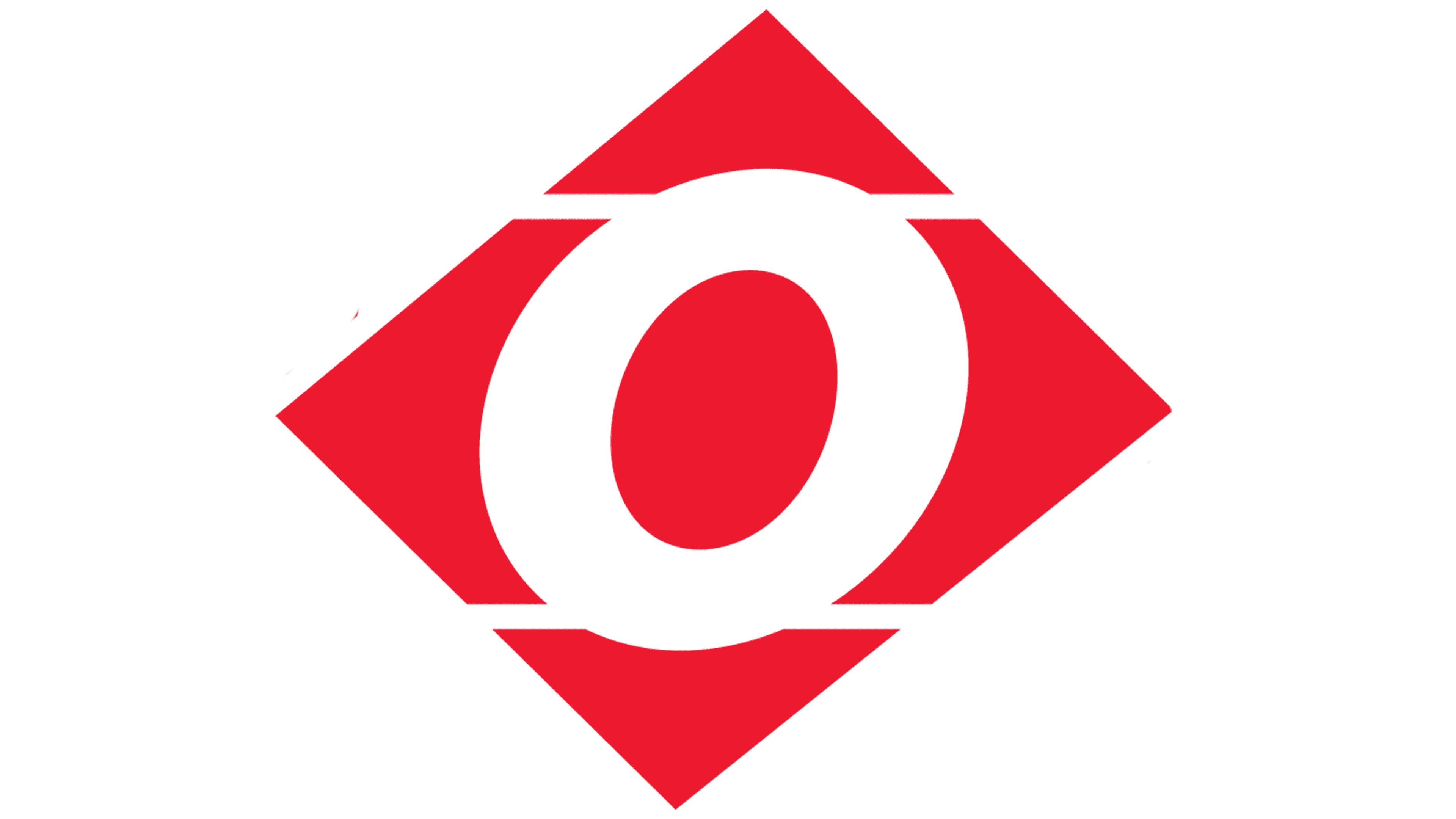
The dot above the “i” is bold and red, as is the center “o,” located in the middle of an improvised rhombus. At the same time, the letter itself is reflected in negative space, visible on a white background, and well-read in the overall inscription. Four triangles are depicted around it, one of whose planes is arcuate: curved with an arc. The result is red arrows pointing to all four cardinal directions: south, north, west, and east. This concept was made possible by two horizontal stripes. They divide the geometric figure proportionally into the upper, central (largest), and lower parts.
Font and Colors
The inscription in the Eurolines logo is an interesting combination of uppercase and lowercase letters. There are only two large glyphs. They are located to the right and left of the diamond, so the arrows partially overlap them. These are “R” and “L.” However, it may seem that “u” and “s” are also in uppercase; this is erroneous and does not align with the designers’ concept. The text is in a sans serif typeface reminiscent of Aileron Black Italic and Sequel Sans Disp Bold Oblique (created by OGJ Type Design).
In terms of color, I would like to note the brightness of the bus and passenger network’s palette. The dot above the “i” is red, the “o” is white, and all other glyphs are blue. The icon is also red and white.