 Found Logo PNG
The Found logo hints at the transformation process that awaits anyone using the company’s services. The dynamic shape of the elements reflects the effectiveness of a personalized weight-loss program that includes physical activity, proper nutrition, and medication.
FOUND was founded in 2019 in San Francisco, California, by Emily Yatkan, Swati Chawla, and Varun Poturachi. The founders came from technology and healthcare, and their initial plan focused on a digital weight-management service for people whose needs were not fully met by standard diet programs.
The idea grew out of the obesity problem in the United States and the lack of consistent support for many weight-loss methods. During its first months, the team interviewed potential clients, dietitians, and medical specialists. By late 2019, FOUND had built its prototype, combining behavioral therapy, personal nutrition planning, and, when needed, physician-supervised medication through a mobile app.
In early 2020, FOUND received initial venture funding, hired developers, and started small user tests. The platform launched for selected users in California in summer 2020. By the end of that year, the company had added medical, nutrition, and behavioral psychology experts, giving its programs a broader clinical base.
In 2021, FOUND expanded outside California and formed partnerships with major insurance companies to reach a wider user base. The app then added virtual doctor consultations, progress tracking, personal meal and exercise tools, and a social support system in 2022. By late 2022, the service operated in most U.S. states and began studying the United Kingdom and Canada. In 2023, FOUND added DNA-based nutrition plans, gym system integrations, endocrinologists, and sports medicine specialists. In early 2024, it launched corporate wellness pilots with large U.S. employers. It began testing a virtual reality platform for meetings and discussions.
Meaning and History
What is Found?
It is a digital health and wellness platform offering customized weight loss programs. The platform combines medical expertise, personalized coaching, and community support to help people achieve their weight loss and wellness goals. Programs may include taking prescription medications as needed and individualized diet and exercise plans tailored to each person’s needs and lifestyle. The company focuses on improving health rather than a quick fix.
2019 – today
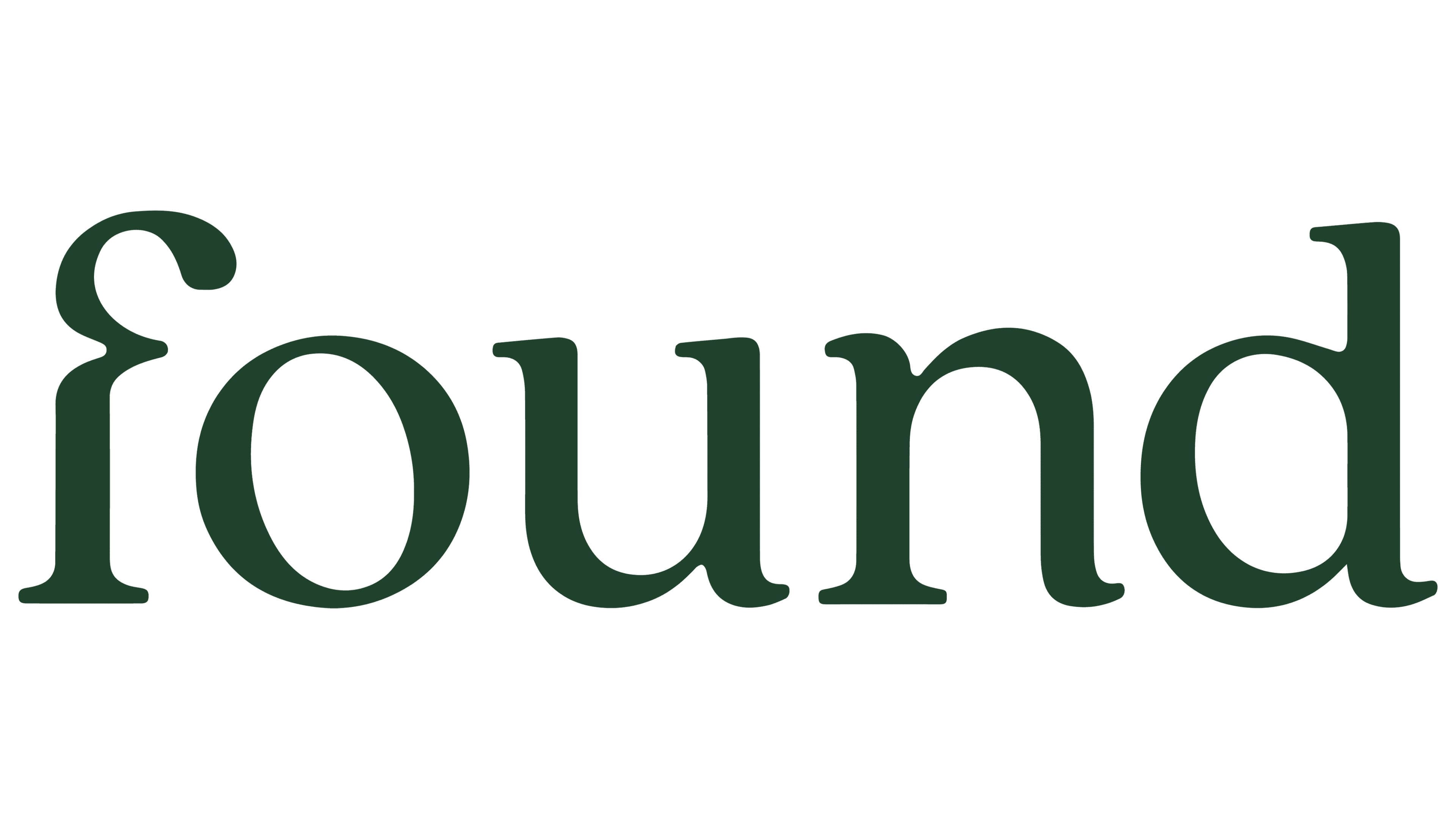
At first glance, the Found logo doesn’t indicate the brand’s area of expertise. It features a single word in lowercase letters, colored dark green. The elegant serif font leaves a pleasant impression, but it’s hard to guess that this American startup offers weight loss programs.
The name “Found” is too generic and abstract, so it doesn’t convey the company’s purpose. To address this flaw, designers tried to play with the five-letter word, incorporating subtle hints that link the brand to weight-loss products. These include:
- Graceful, rounded serifs;
- An unusual curve on the “f”;
- A slightly tilted “o”;
- The absence of sharp corners.
The soft form of the letters evokes a sense of lightness and weightlessness, the goal of all Found clients. Meanwhile, the long serifs at the ends of the letters add a dynamic element to the logo, giving the static text a sense of movement. This emphasizes the importance of an active lifestyle in combating obesity.
The tilted “o” is also full of energy. Its slanted inner space makes it appear to sway in place. It symbolizes the pursuit of development, change, and progress, all of which are impossible without constant self-improvement.
But the letter “f” best represents the idea of weight loss. There’s a significant indentation where a horizontal stroke should extend. This curve visually hints at weight reduction, as it resembles a slim waist, which is the result that the company promises its clients. The logo reflects everything Found offers:
- The uneven shape of the letters reflects the flexibility of a personalized weight-loss program.
- The smooth lines symbolize the natural process of weight reduction.
- The elegant, classic font conveys confidence, suggesting that the brand provides expert support.
- The visual dynamics of the text highlight the importance of physical activity for overweight individuals.
Even the emblem’s dark green color carries a hidden meaning. It’s associated with healthy eating, in which plant-based foods should dominate. Additionally, the calm palette subconsciously influences Found’s clients, instilling trust in the prescribed medications. The green color suggests that all weight-loss drugs are made from natural, safe ingredients, though this isn’t true.