It is easy to navigate among thousands of hotels and inns with the help of the application represented by the emblem. The Foursquare logo is based on the idea of simplicity, choosing from a given number of options, and displaying the most closely spaced options.
Foursquare: Brand overview
| Founded: | March 11, 2009 |
| Founder: | Dennis Crowley, Naveen Selvadurai |
| Headquarters: | New York City, New York, United States |
| Website: | foursquare.com |
Meaning and History
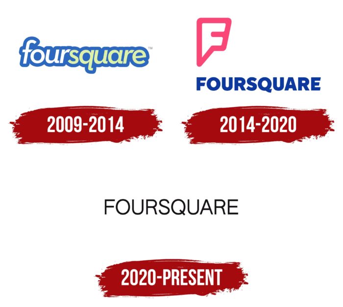
Foursquare remains a relatively young project, so it’s not surprising that the logo has changed only once. Travelers around the world actively use the project. Pleasant, bright colors attract the target audience and help to remember the name of the application.
What is Foursquare?
First of all, this application allows you to quickly and efficiently find a place to spend the night and rest anywhere in the world. An intuitive interface and 12 language versions allow the user to solve the problem as soon as possible.
2009 – 2014
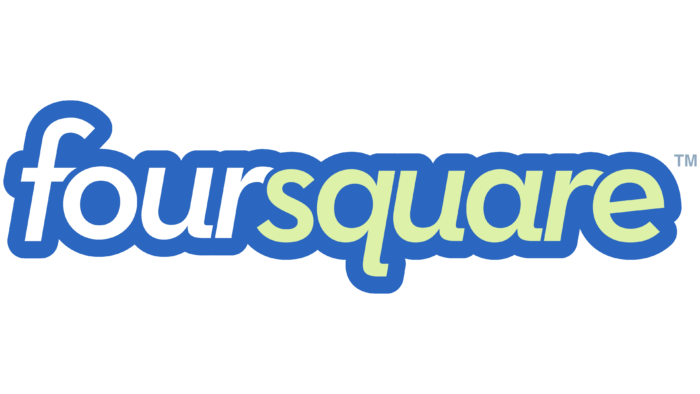
The original version of the logo lasted five years. Lowercase “foursquare” was used as the basis. Moreover, the first four characters are depicted in white, when “square” has a barely noticeable green fill. The title is in classic italic font. All letters at the end had a barely noticeable rounding. The font shadow has been greatly expanded. Thus, a sense of volume of the name was created. Given that after the launch of the application, it was not very popular among users, the project logo did not help potential customers since all the elements presented in the image had nothing to do with the selection of hotels.
2014 – 2020
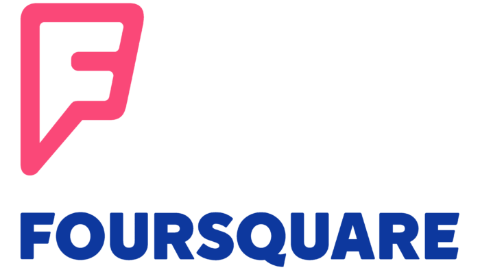
Gaining popularity worldwide, the application developers decided in 2014 to radically change the logo. To solve this problem, Ren Antler specialists were involved. As a result, a new version was obtained, more stylish and intuitive. Changes were made not only to the color palette but also to the style of writing the name. In addition, an emblem was added to the logo. It, in turn, is used separately for the software and the project’s official website.
The main title is in classic bold sans-serif type. Dark blue was chosen as the color palette. Shadows in symbols have been removed because they worsened the readability of the application name in the previous version.
The emblem was the first letter of the name, namely “F.” Visually, it resembles a pin, made in white with a pink, bold outline. A potential customer of the company may feel that the Foursquare logo resembles the symbol of a superhero. Indeed, the application’s functionality allows you to solve the problem of housing anywhere in the world.
Surprisingly, the blue name and the white and pink emblem go well together. They convey to clients a message about the prospects of the project. Together they look bright with a clear sense of focus on the younger generation of travelers.
The main title is in classic bold type using capital letters. Visually, it is closest to Times New Roman, with slight changes in the spelling of some characters. For example, the horizontal lines in the letter “E” differ in length.
The latest variant for today uses a blue color palette for the main title. Despite the classic “foursquare” writing style, this logo variation looks more stylish than the original. It does not interfere with the fulfillment of the main goal, namely the visual recognition of the brand, and the emblem, made in white and pink colors.
2020 – today
The current Foursquare logo is simple and minimalist. It has nothing but a single title. It is made with a thin grotesque and is located horizontally. The letters are painted in black and placed on a white background, ensuring ease of reading and quick brand recognition. In addition, all signs are large and expressive, with a narrow inter-character space.
Font and Colors
The debut logo used an analog of Biotif Semi Bold Italic – an italic font with elongated tails for lowercase “u,” “q,” and “a.” Then, there was a bold typeface with ledges cut diagonally at the capital “F” and “E.” The modern format of the inscription is different from all the others: it is a thin, strict sans serif, similar to Nimbus Sans L Regular and FreeSans Medium (RW++ developed the first, and GNU FreeFont created the second). The corporate palette is simple, with a predominance of blue and black on a white background.
Foursquare color codes
| Black | Hex color: | #000000 |
|---|---|---|
| RGB: | 0 0 0 | |
| CMYK: | 0 0 0 100 | |
| Pantone: | PMS Process Black C |
