


 FreeForm Logo PNG
The FreeForm logo conveys a sense of freedom and creativity through unusual, asymmetrical shapes that successfully resonate with the channel’s name. Visually, the emblem reflects a lack of rigid boundaries and limitations, emphasizing the brand’s focus on a modern generation of viewers seeking self-expression and new ideas.
The symbol represents the channel’s values, offering a fresh perspective on reality, breaking stereotypes, and creating space for individuality and experimentation. Every line and curve of the logo exudes dynamism and movement, indicating the channel’s constant growth and adaptation to the current youth demands.
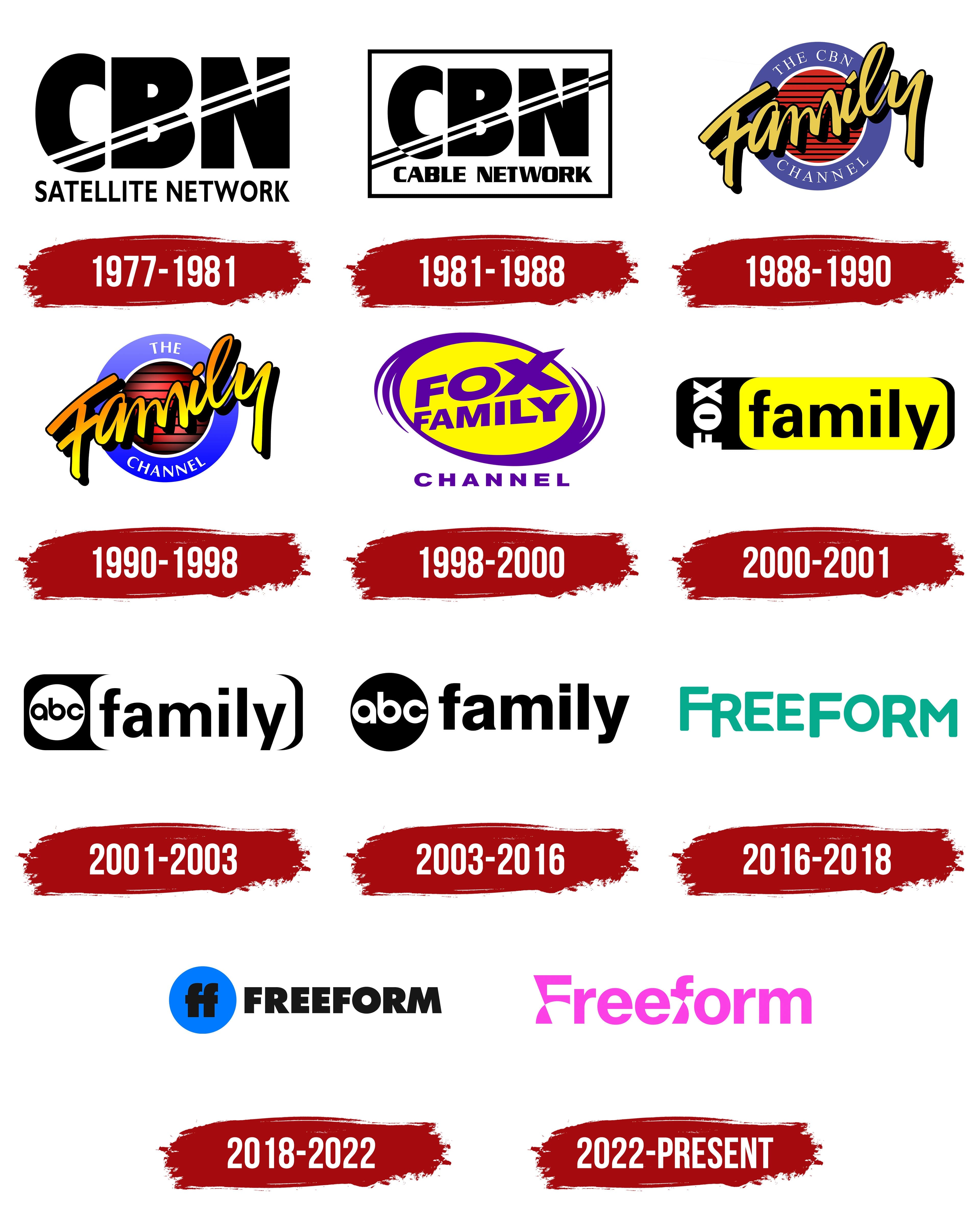
The channel began on April 29, 1977, as CBN Satellite Service, a religious cable network founded by televangelist Pat Robertson. Its early schedule mixed faith-based broadcasts with family programming. In 1981, it became CBN Cable Network as more secular shows, classic series, and films entered the lineup. In 1988, the name changed again to The Family Channel, marking a broader family entertainment focus.
In 1990, the channel separated from the Christian Broadcasting Network, and International Family Entertainment was created to manage it. In 1997, News Corporation and Saban Entertainment bought Family Channel for $1.9 billion. They renamed it Fox Family, adding more teen dramas and children’s programming. In 2001, Disney acquired Fox Family Worldwide for $5.3 billion and relaunched the network as ABC Family in November.
ABC Family shifted toward younger viewers with series such as Kyle XY and The Secret Life of the American Teenager. In 2006, the channel introduced the long-running 25 Days of Christmas movie event. In 2007, the slogan “A New Kind of Family” reflected its updated approach. In 2010, Pretty Little Liars became one of its strongest hits, and by 2014 the channel ranked sixth in prime time among women aged 18 to 34.
On January 6, 2016, ABC Family was rebranded as Freeform, targeting viewers aged 14 to 34. The new lineup included Shadowhunters, The Bold Type, and grown-ish. In 2018, the channel launched the “A Little Forward” strategy, followed by Good Trouble and Motherland: Fort Salem in 2019. In 2021, Cruel Summer became the most-watched series debut in the channel’s history.
Meaning and History
What is FreeForm?
This is a lively television network aimed at youth and teens. The Disney-owned channel initially debuted under a different name but eventually became a leading force in the youth television industry. The channel’s lineup of original shows, popular movies, and acquired content is carefully selected to capture the interest of its core audience. The network is known for taking risks in its storytelling; many programs address relevant topics and present diverse perspectives. Among the available entertainment is a variety of content, from Christmas specials to spooky thrillers and quirky comedies, which keeps viewers engaged and makes the network appealing to a broad audience.
1977 – 1981
The channel was launched as a religious one in 1977. The first logo consists of the name’s abbreviation: three capital letters, massive black letters, and CBN, which stands for Christian Broadcasting Network. The monumental and impressive letters conveyed firmness in beliefs and clarity about the channel’s mission, rooted in Christian values.
Two diagonal lines run through the inscription, directed upwards. This element can be interpreted in different ways:
- The lines may be associated with rays of light, as if descending from the heavens, symbolizing faith and divine blessing.
- The lines also resemble antennas or satellites, referring to the modern technologies used to transmit signals at the time.
Under the main title was an additional inscription, “Satellite Service,” which highlighted the channel’s technical aspects and its connection to satellite broadcasting.
1981 – 1988
The channel shifted its focus to family content, prompting a logo update. The CBN abbreviation was now placed inside a rectangle, symbolizing a television or computer screen. This rectangle represents a closed and unified structure, emphasizing unity when the family gathers to watch programs.
Diagonal lines run across the entire rectangle, symbolizing television waves or wires connecting devices, ensuring the flow of information. These lines add a sense of movement and progress, reflecting the channel’s technological aspect.
The inscription “Satellite Service” was replaced with “Cable Network,” reflecting the channel’s development and change in its broadcasting format. The bold font for the main inscription retains the brand’s monumentality and significance while harmoniously fitting into the overall design, adding balance and modernity to the logo.
1988 – 1990
The emblem was changed to emphasize the focus on family values. The logo is now designed as a circle, symbolizing the globe and the close connection within the family circle. This element adds symbolism, highlighting the channel’s core concept.
The channel’s name, “The CBN Channel,” is written in thin white letters on the purple outer field above and below the logo. The elegant font is delicately incorporated into the overall design, reflecting the family’s commitment to Christian values.
In the center, the bright word “Family” draws attention, highlighted in large yellow letters with black shadows. This element emphasizes that the channel offers family- and children ‘s-viewing programming. The bright shades add individuality to the logo and underscore the uniqueness of the content.
In the background, black stripes run through the center, symbolizing the transmission of broadcast and television signals. The brick color of the background resembles house siding, hinting at the home’s warmth and family hearth, which are key ideas of the channel.
1990 – 1998
After the channel was spun off into International Family Entertainment, a rebranding took place, which was reflected in the logo. The main elements retained their original features, but significant changes were made, giving the emblem a fresh and modern look. One of the key innovations was the gradient, which touched all the emblem colors.
Now, the purple ring transitioned into a blue-purple tone, creating a more dynamic and appealing visual effect. The word “Family” gained new depth thanks to lighting from below, causing the letters to shift from bright yellow to deep orange. This effect adds energy to the logo and enhances the impression that a powerful spotlight illuminates it.
The logo’s previously flat background is now a striped sphere with dark edges. This adds dimension, making the emblem visually richer and more expressive. Such updates symbolize modernization, the channel’s desire to meet contemporary demands, and the emphasis on the rich, diverse programming it offers viewers.
1998 – 2000
After a change in ownership, the channel was renamed Fox Family Channel to complement Fox Kids Network. The updated logo embodies energy and dynamism, perfectly reflecting the spirit of change. The central element of the emblem is a bright purple vortex swirling like a powerful current. From the very center of this figure, reminiscent of a portal, bursts the channel’s new name, written in large capital letters across two lines. This effect enhances the sense of motion and vitality, conveying the essence of what the channel aims to bring to its viewers.
The yellow background inside the ring creates an impression of light, joy, and positivity, adding warmth and friendliness to the logo’s overall atmosphere. It emphasizes that Fox Family Channel is focused on spreading positive emotions and good vibes, particularly through children’s programming. The logo’s composition evokes light, energy, and comfort, reflecting the channel’s mission to entertain and nurture its young audience.
2000 – 2001
The emblem has been transformed into a bright, memorable symbol resembling a power switch. The design is based on a black, elongated rectangle with rounded corners, with a smaller yellow rectangle inside. The vertical white “Fox” inscription points to the channel’s connection with the Fox media group, while the word “Family” is written in lowercase black letters inside the yellow block. The logo invites viewers to turn on the TV and dive into a world of fun and family shows.
This design emphasizes the channel’s dual format: during the day, the audience enjoys children’s programs, and in the evening, family shows for all to watch together. The contrast between black and yellow represents the transition from day to night, conveying the idea of constant content availability for all ages at any time. The logo combines simplicity and functionality, remaining vibrant and appealing to viewers of all generations.
2001 – 2003
After Disney acquired the brand, the channel was renamed ABC Family to connect it with the well-known ABC network, which is part of Disney. The new logo retained its basic structure but changed. Now, a white circle bearing the new name “ABC Family” has replaced the previous “Fox” logo, and the yellow slider has been changed to white, giving the emblem a more streamlined, cleaner look.
The logo became more minimalist and symbolic. The black-and-white color scheme highlights the channel’s shift toward a more mature and diverse audience. The design resembles a building block, symbolizing the new owners’ strategy of combining beloved old sitcoms with popular programming from Disney’s flagship channel. The new look of the emblem neatly reflects the changes in the brand’s positioning, which became a bridge between familiar family content and a more adult audience.
2003 – 2016
The logo was changed to a black sphere with white ABC letters, creating a sense of harmony and balance that perfectly fits the channel’s programming theme. This figure symbolizes the channel’s unique universe, filled with educational and developmental programs aimed at students and young adults. Initially, a plan was to rename the brand to “XYZ,” but it was ultimately decided to keep the original name.
The black “Family” letters became more prominent, reflecting the channel’s strengthened position within a major corporation. Interestingly, the logo design visually separates “ABC” from “Family,” hinting at disagreements with the founder, who insisted on mandatory broadcasts of certain shows. This nuance is highlighted by the channel’s disclaimer before each program, clarifying that ABC is not responsible for the content provided by CBN.
2016 – 2018
The channel’s name was changed to Freeform, and the new logo design better aligns with Disney’s aesthetic and image. The core audience of the rebranded network is young people aged 14 to 34. The name “Freeform” reflects the idea of self-discovery, shaping perspectives on life and personal values through youth experiences. Interestingly, the letters in the logo are placed at varying heights, creating a sense of movement, change, and continuous transformation, characteristic of this stage of life. The green color chosen for the emblem emphasizes themes of growth, development, and vitality, highlighting the pursuit of discoveries and personal progress.
2018 – 2022
The new emblem is a blue circle with two “f” letters at its center, symbolizing the creation of an independent universe and the gradual transformation of programming, with a focus on new and promising series. This change marked the first step toward moving away from old contractual obligations with CBN, although Disney has not fully freed itself from these agreements. The channel’s name is displayed in bold, black capital letters, highlighting its updated positioning and demonstrating a commitment to growth. This approach resonated with a broad audience, ensuring consistent support from viewers.
2022 – today
The Freeform logo reflects the channel’s transformation, adaptation to a new audience, and modern content. The bright pink font color highlights the focus on a younger, primarily female audience. This reflects the launch of animated series and programs such as “Betches” and “Woman World,” which support themes of female self-realization, humor, and everyday situations. The pink color symbolizes fun, lightness, and openness.
Special attention is drawn to the modified shapes of the letter “f.” They appear “pulled” in the middle, evoking hair ties or belts on dresses, which points to the feminine theme. These elements emphasize the softness and fluidity inherent in the channel’s main programs while demonstrating the flexibility and changes it has undergone throughout its history.
The name is written in capital letters yet in a smooth, friendly style, creating a sense of openness and friendliness. The stylization of the letters highlights both the channel’s name’s separation and its unity, showing its ability to evolve and adapt to current trends.
The emblem symbolizes progress, reflecting the channel’s desire to remain relevant in the entertainment world, stay on trend with its audience’s new demands, and maintain its unique identity.