Thanks to the commercial success of the cartoon, the Frozen logo became known worldwide. The inscription, consisting of letters in the form of pieces of ice, first adorned the posters of the first animated film. Over time, the emblem was adapted for all the following parts, including Olaf’s Frozen Adventure (2017). The “frozen” wordmark conveys the winter atmosphere that underlies the story.
Frozen: Brand overview
| Founded: | November 2013 |
| Founder: | Chris Buck, Jennifer Lee |
| Headquarters: | United States |
| Website: | frozen.disney.com |
Meaning and History
The name and the Frozen logo are associated with the frost that wraps the magical story. After all, the original plot is based on a heavily modified fairy tale by Hans Christian Andersen – Snow Queen. The scriptwriters came up with a story about two princesses trapped in eternal winter because one of them can freeze everything around them. The rest of the cartoon characters are also related to the cold in one way or another: a snowman, a reindeer, and an ice ax. Therefore, it is not surprising that the emblem of the animated film reflects the “snowy” theme. The sequel, presented in 2019, received a similar word mark but with the Roman numeral II, indicating the order of the part.
What is Frozen?
Frozen is a franchise based on the fictional story of two Disney princesses, a snowman, a reindeer, and an ice pick. First came the animated film of the same name, shot as a musical and becoming one of the highest-grossing films in the world. Its first part was released in 2013, and in 2019 a full-length sequel, Frozen II, was released. The concept of cartoons was borrowed from the fairy tale Snow Queen, which Dane Hans Christian Andersen wrote.
2013
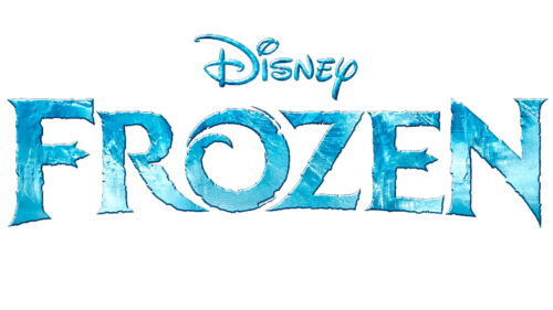
The development team of the first Frozen cartoon created a logo with inscriptions for it. The top line is occupied by the word “Disney” – the name of the studio that owns the rights to the media product. It is decorated in a traditional style and looks exactly like on the emblem of The Walt Disney Company: the letters look like handwritten ones, but each has an individual design. As far as is known, this typeface was inspired by the personal signature of American animator Walter Elias (Walt) Disney.
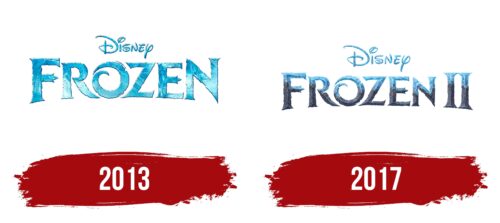
The second line contains the name of the animated film. It also consists of unusual glyphs, which have many remarkable elements. For example, “O” is shaped like a spiral, “F” and “E” have notches at the ends, and “R,” “Z,” and “N” have pointed extensions. In this case, the first “F” and the last “N” increase. The edges of all the letters are jagged as if they had been carelessly carved from pieces of ice. A light blue gradient with white and blue flecks creates a frozen texture feel. Designers specifically sought such an effect so that the emblem was associated with the cartoon’s plot, which tells about the onset of eternal winter.
2017
In 2019, Frozen had a sequel – Frozen II. The emblem of the sequel is designed in the same way as the logo of the first part. It also consists of a two-level inscription, where the Disney sign is in the first line, and the cartoon’s name is in the second. But now the bottom word is reduced, and all the letters in it are aligned in height. The designers had to do this to fit the Roman numeral II on the right. Colors have become darker, especially in the lower half, which now has a stone-like texture. At the same time, the effect of ice was preserved at the top. Due to the smooth transition from blue to gray, the lettering seems to be gradually frozen.
The Frozen logo has a lot of dynamic elements, the purpose of which is to arouse the viewers’ interest. For example, the spiral letter “O” looks like it’s spinning. A similar effect is created not only because of the twisted shape but also because of the thin speedline drawn next to it. In this case, “O” symbolizes the cycle of magic or a strong wind during a snow blizzard. And the “tridents” at the ends of the horizontal lines “F” and “E” resemble crowns turned sideways. This is a reference to the main cartoon characters – the two princesses, Anna and Elsa.
Font and Colors
If, in the first emblem, there was an impression that the letters were cut out of pieces of ice, then on the Frozen II logo, one can observe the process of “freezing.” The designers made it so that the bottom was stylized as a stone and the top as an ice texture. It turns out that one material turns into another.
Frozen wordmarks use a custom font designed specifically for cartoons. This is a stylized bold serif with sharp and long serifs. Australian artist Kustren created the Ice Kingdom font family based on the first logo. The closest version to the original is Ice Kingdom Bold.
Released in 2013, the logo for Frozen features a mix of colors to create an icy texture. The designers used a gradient of different shades of blue for the letters, complementing it with white spots and a dark outline. But the 2019 sequel has a dark gray tone in the logo, similar to the color of the stone.
Frozen color codes
| Picton Blue | Hex color: | #55b2e9 |
|---|---|---|
| RGB: | 85 178 233 | |
| CMYK: | 64 24 0 9 | |
| Pantone: | PMS 2995 C |
| Marengo | Hex color: | #555e73 |
|---|---|---|
| RGB: | 85 94 115 | |
| CMYK: | 26 18 0 55 | |
| Pantone: | PMS 7545 C |
