The Garuda Indonesia logo reflects the airline’s deep connection with the country’s mythology and its commitment to hospitality. Inspired by the legendary Garuda bird, a powerful symbol in Indonesian culture and mythology, the logo represents national identity and the airline’s commitment to embody qualities such as strength, speed, and service.
Garuda Indonesia: Brand overview
Garuda Indonesia, Indonesia’s national carrier, began its journey in 1949, emerging shortly after gaining independence. On January 26, 1949, the airline took to the skies as Indonesian Airways, using a Douglas DC-3 named “Seulawah” (Golden Mountain).
The airline rebranded to Garuda Indonesian Airways on December 28, 1949, inspired by the mythical bird Garuda, a deeply rooted symbol of Indonesian culture.
1950, the brand embarked on its first international flight, connecting Jakarta and Singapore. By 1956, it had launched its inaugural hajj flight, ferrying pilgrims to Mecca, thus broadening its scope of operations.
The 1960s marked the company’s expansion into Europe, with new routes to Amsterdam, Frankfurt, and Rome. By 1965, it had introduced its first jet aircraft, the Convair 990 Coronado, into its fleet.
The 1970s saw significant growth, with 1976 marking the beginning of flights to Los Angeles via Honolulu. This period of expansion continued into the 1980s, with the airline simplifying its name to Garuda Indonesia in 1980. The following decades witnessed rapid growth, with the acquisition of Boeing 747s and Airbus A300s, solidifying its international presence.
However, the Asian financial crisis in 1997 dealt a severe blow to the airline, leading to route and fleet reductions. The early 2000s brought further challenges. In 2001, safety concerns led to the European Union banning Indonesian airlines, including this company, from its airspace.
Between 2007 and 2009, the brand underwent a comprehensive restructuring, modernizing its fleet, enhancing services, and stabilizing its finances. The ban was lifted in 2009, and by 2010, it had resumed flights to Amsterdam. 2011, the company went public, listing its shares on the Indonesian Stock Exchange.
The company’s global presence was further solidified in 2014 when it became the 20th member of the SkyTeam alliance. In 2015, it achieved a prestigious five-star rating from Skytrax, placing it among the world’s top airlines.
2016 the airline returned to the UK market directly from Jakarta to London. In 2017, Skytrax recognized its cabin crew as the world’s best, further enhancing its reputation for excellence.
The fleet saw further expansion in 2018 with the addition of Boeing 737 MAX and Airbus A330neo aircraft. By 2019, the brand had served over 90 destinations worldwide and had a more than 140 aircraft fleet.
Garuda offers a range of service classes to suit different passenger needs, including First Class, Business Class, Premium Economy, and Economy. The airline is celebrated for its exceptional cabin service, which is deeply rooted in Indonesian hospitality and has garnered several accolades over the years. In 2014, Garuda secured its place in the prestigious SkyTeam airline alliance, sharing the platform with other significant players such as KLM, Delta, and Aeromexico.
Meaning and History
What is Garuda Indonesia?
Indonesia’s national airline, based in Jakarta, operates an extensive network of domestic and international flights, serving destinations in Asia, Australia, Europe, and the Middle East. Known for its high service, safety, and security standards, it offers various classes of service, including economy, business, and first class. The airline has a modern fleet that makes for a comfortable and enjoyable travel experience. The company is a member of SkyTeam and is expanding its global reach through partnerships with other international airlines.
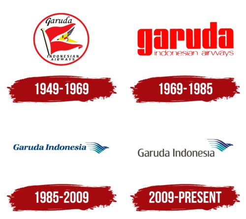
1949 – 1969
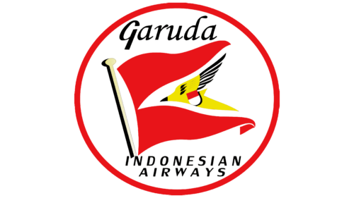
From 1949 to 1969, Garuda Indonesia, the national airline of Indonesia, used its first highly symbolic logo, representing the country on the international stage. The emblem featured a white circle with a red border, where each element had significance and reflected the company’s core principles.
The logo’s central element, the white circle, symbolizes perfection and safety, highlighting the airline’s ideal balance that ensures timely arrivals at destinations. The circle’s red border harmonizes with Indonesia’s national flag, emphasizing Garuda Indonesia’s status as the national carrier and its role in representing the country internationally.
Inside the circle is a pennant of three triangles associated with victory, conveying the idea of flight’s lightness and possibility. The sharp angles of the triangles symbolize speed and rapidity, underscoring the dynamism and efficiency of the airline’s operations.
The Garuda bird is at the circle’s center, after which the company is named. The Garuda, an important symbol in Hinduism and Buddhism, represents strength, power, wisdom, and freedom. These qualities perfectly align with the image of Garuda Indonesia as a reliable and modern carrier. The Indonesian flag depicted on the side of the bird further emphasizes the airline’s national affiliation.
The brand’s name is placed above the image of the bird in the circle, and below it, the main focus of the company’s operations is indicated.
1969 – 1985
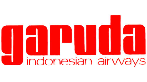
As part of its restructuring process, Garuda Indonesia took significant steps to expand its business, as reflected in the update of its corporate emblem. This change symbolized a new phase in the company’s development, including expanding its route network with new destinations in Europe and Australia, aligning with the growing needs of its customers and a globalization strategy.
The updated logo features large red letters spelling the company’s name, emphasizing ambitions for growth and development. The choice of color and size of the letters is deliberate—red traditionally represents energy, strength, and passion, aligning with Garuda’s aspiration to be a leader in the aviation industry and signaling a flourishing period in the company’s activity. Interestingly, despite the dominant presence of uppercase letters, the first character in the name remains lowercase. This design choice highlights Garuda Indonesia’s commitment to impeccable service and customer orientation, signifying the company’s efforts to meet its clients’ demands and provide comfortable flight conditions.
The logo is complemented by the phrase “Indonesia Airways” in a smaller font, which fits harmoniously into the overall composition. This design element helps create a more compact and modern visual identity in line with current trends in branding and marketing.
1985 – 2009
In response to reaching a significant milestone of five million passengers, the company updated its emblem to reflect its achievements and ambitions. The new logo was designed to appear more modern and technologically advanced, highlighting the company’s dynamic development and innovative approach.
The updated logo’s color palette of pleasing blue-green shades symbolizes the company’s professional growth and reliability. These colors were chosen deliberately as they are associated with confidence, calm, and stability, important attributes for an airline aiming to strengthen customer trust.
At the center of the new logo, the exotic Garuda bird reappears, crafted from thin line stripes that give it the appearance of having hundreds of wings. This element symbolically represents the airline’s vast fleet, consisting of dozens of airplanes that travel to various parts of the world daily. The image of the Garuda, Indonesia’s national bird, plays a key role in reinforcing the company’s national identity. This symbol emphasizes the airline’s deep connection with Indonesia and its cultural heritage.
In Indonesian mythology, the Garuda is associated with protection and prosperity, making it an ideal symbol for an airline that strives to associate itself with a positive and progressive image.
2009 – today
The airline’s latest logo update was prompted by developing a new strategy to grow and modernize operations. In this context, changes to the emblem’s design carry a clear symbolic meaning, reflecting the company’s new ambitions and strategic goals.
In the new version of the logo, dark gray letters are now elongated upwards. This design emphasizes the company’s aspirations to elevate and expand its influence. The vertical direction of the letters symbolizes strength and growth, indicating an increase in the number of aircraft in the fleet and the expansion of the network of ports it serves. These design changes aim to visually convey the company’s dynamic development and adaptation to changes in the global aviation industry.
The logo now features a bird ascending above the company’s name. This design element symbolizes limitless development and power. The bird’s flight above the name emphasizes the airline’s ambition to overcome obstacles and reach new heights in its development.
