The Aeroméxico logo is quite authentic. The emblem is a synthesis of modern and ancient. It represents a carrier proud of its roots and seeks to tell the world about its country’s history.
Aeroméxico: Brand overview
On September 14, 1934, Aeronaves de México, which later became Aeromexico, was established. Initially, the company operated with four Stinson SR aircraft, offering mail and passenger services between Mexico City and Acapulco. This marked a significant milestone in the early stages of Mexico’s aviation industry growth.
In the 1940s, the airline expanded its domestic route network, connecting major Mexican cities. It ventured into international flights, including routes to Los Angeles and Havana.
By the 1950s, the brand upgraded its fleet with advanced aircraft like the Douglas DC-3 and DC-4, enhancing operational efficiency and passenger service quality.
In 1959, the company became the first Mexican airline to introduce jet aircraft, the De Havilland Comet 4C, ushering in a new era for the airline and Mexican aviation.
Throughout the 1960s, the brand continued to grow its international route network, adding destinations in Europe and South America.
1962, the airline began flights to Frankfurt, marking a significant milestone.
In 1972, the company was rebranded as Aeroméxico and was nationalized by the Mexican government, aligning with a broader state control policy over key economic sectors.
In the 1980s, Aeroméxico faced financial challenges due to Mexico’s economic crisis and poor management. The company filed for bankruptcy in 1988 but restructured and resumed operations shortly after. Partial privatization in the following years led to increased efficiency and stability.
By the 1990s, the airline renewed its fleet with Boeing aircraft and expanded its route network, ultimately becoming a founding member of the SkyTeam alliance in 2000. In 2007, the Mexican government fully privatized the company by selling its remaining stake. The brand then focused on modernizing its fleet, purchasing Boeing 787 Dreamliner aircraft in 2011.
Partnerships, such as the one with Delta Air Lines in 2015, strengthened the company’s position in the North American market.
Introducing the Boeing 787-9 Dreamliner in 2017 improved service quality and opened new destinations.
In response to the global aviation crisis in 2020, the brand initiated a financial restructuring process to adapt to the changing market conditions.
Meaning and History
The images on the company’s logo fully resonate with the country’s national symbols. The emblem shows that the carrier’s planes represent Mexico on other continents. As a flagship company, Aeroméxico tried to reflect the history of the homeland, a deep connection with roots, in every sign. From all heraldic images, those chosen embody flight and combine strength, courage, and leadership qualities. Numerous rebrandings are connected with bankruptcy, nationalization, and privatization, which occurred several times. However, regardless of who owned the company, one of the ancient symbols of the country was always preserved in each of its logos.
What is Aeroméxico?
The main airline of Mexico, with flights within the country and to Europe, Asia, the Caribbean, and North and South America. The company’s headquarters are located in the 27-story Torre MAPFRE building in the center of Mexico City. In 2020, Aeroméxico filed for bankruptcy. Delta Air Lines bought its debts.
1934 – 1953
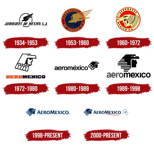
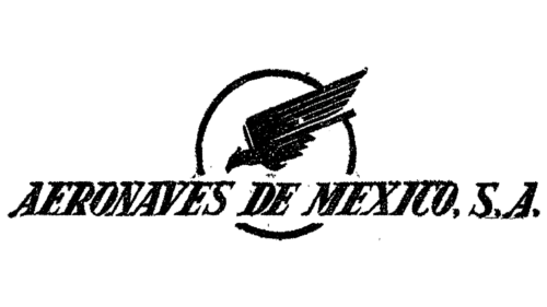
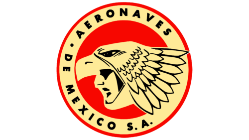
The carrier was founded as Aeronaves de México S.A. The name is indicated in black capital letters right in the center of the emblem. The symbols in the words are placed close, demonstrating solidarity and mutual support within the company. The elements seem to have grouped for a start and are ready for flight.
In the background, a sun circle is visible, against which an eagle swiftly flies. The composition is associated with flights and Mexico. The bird is depicted on the country’s coat of arms and is connected with the city’s history, where the carrier’s headquarters and main airport are located. The ancient Aztecs decided to build Mexico on a hill where they saw an eagle eating a snake.
1953 – 1960
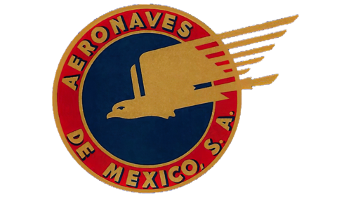
A transformation took place in the country’s air transport system. Aeronaves de México acquired several small market companies, expanding its influence. The changes were reflected in the logo, which acquired saturated colors.
The emblem resembled a seal. The round blue sign has a wide red edging in which the company’s name is written. The letters and the image of the flying eagle are done in gold. The precious metal resonated with the stars of the ancient flag of the Army of the Three Guarantees. The army was formed by uniting troops to fight for the country’s independence and unity.
Since Aeronaves de México merged with its competitors, becoming stronger and tougher, the hint at historical events quite suited the situation.
The company’s new logo looked very stylish and noble. The drawing demonstrated the speed of flights and trips to various parts of the world.
1960 – 1972
By the 1960s, Aeronaves began replacing their fleet with jet-engine planes, and the company needed a logo that would reflect the new speed and reliability of the flights.
The newly developed logo further tied the carrier with Mexico and its history. For the first time within the circular logo, the image of Eagle Knights was used – knights who were part of the ancient Aztec army. This subdivision consisted of the strongest, bravest, and most dangerous soldiers. They wielded special wooden weapons with obsidian blades and brought in the most prisoners.
The logo portrays the knight in his usual gear – a bird’s beak helmet covered in feathers. In the emblem, the image of the Eagle Knights conveyed bravery and leadership, the carrier’s aspiration to become the best. It demonstrated the strength and safety of the new planes and the power of their engines. The symbol resonated with respect for the homeland and the desire to be its pride.
1972 – 1980
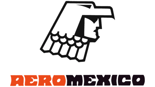
In 1972, after the nationalization of all airlines under the supervision of Aeronaves de México, the company changed its name to Aeroméxico. The name in the updated logo is written in orange and black, which were adopted as the carrier’s primary shades. The colors separated the two composite parts of the name, Aeronaves and México, combining to form Aeroméxico.
The Eagle Knights were positioned above the name. The picture replaced the brightness of colors and naturalness with a schematic representation.
1980 – 1989
At the beginning of the decade, the company expanded, and the fleet of aircraft was updated to more modern DC models. The company’s main colors change to orange and silver, and the logo gains greater simplicity and schematic representation.
The name, written in lowercase, is in round, smooth characters. At the end of the name, there’s a small-sized head of the Eagle Knights. The carrier’s mission was to serve its people and country. The image of a knight and servant couldn’t have capitalized letters. After all, the client became paramount.
1989 – 1998
The government administration failed to manage, and Aeroméxico was declared bankrupt. After which the privatization process began. Having passed into private hands, the firm changed its name to the original Aerovias de Mexico SA de CV. It took over the hangar, headquarters, and several aircraft of the former Aeroméxico.
However, the name change was not reflected in the identity. The updated sign consisted of a large black-and-white head of the Eagle Knights. The eagle feathers on the helmet are made of stripes. The first part of the word Aeroméxico also received a striped image. The technique embodied airiness, lightness, and weightlessness. It was reminiscent of the movement of sound waves, the interference that occurs in the air during pilot and control point conversations.
The emblem showed that the new company planned to focus on flights and fulfill its duties qualitatively.
1998 – today
In the late 1990s, Mexico faced a severe economic crisis. To save the country’s main airlines from bankruptcy, their operations were taken over by the International Air Transport Corporation (CINTRA). The emblem of that time retained the image of the Eagle Knights, a small emblematic symbol, before the company’s name. This step showed respect for the past and a desire to move forward. The two parts of the name “Aeroméxico” were written in capital letters to emphasize the company’s Mexican origin. The blue color of the emblem indicated the sky and flights, symbolizing the company’s reliability and professionalism during economic hardships.
The Aeroméxico logo of the late 1990s features an image of an eagle’s head positioned to the left of the company’s name, which is written in blue capital letters.
The eagle’s head symbolizes the spirit and power of the Eagle Knights, ancient warriors of Mexico. This highlights respect for the country’s historical heritage and traditions. The eagle is associated with flight and freedom, making it an ideal symbol for an airline.
The logo reflects the company’s desire to connect with the past while looking towards the future. The eagle’s use as a symbol shows the company’s aspiration to reach great heights, literally and figuratively. The capital letters in the company’s name emphasize its Mexican origin and pride in national identity.
The font is simple and clear, with capital letters spelling “AEROMEXICO,” making it easily readable and memorable. The style is modern, focusing on minimalism and clarity.
Blue symbolizes the sky and flights, perfectly aligning with the airline’s activities. Blue is also associated with trust, stability, and professionalism.
2000 – today
In 2000, SkyTeam was founded. Aeroméxico was one of the four founding companies. Therefore, the alliance’s symbol was added to its logo. The red wavy underline of the word Mexico intensified the division of the name into two parts. The wave demonstrated air currents and evoked the feeling of flight.
Font and Colors
Blue is quite common in airline emblems as it matches the color of the sky in which the carriers’ vessels fly.
The font of the inscription is straight and strict. The absence of unnecessary elements and rounded corners embody the smoothness and streamlining of aircraft and their easy glide through the celestial expanse.
FAQ
What does the Aeromexico logo mean?
Aeromexico’s logo features the Eagle Knight, an important symbol from Mexican history. The Eagle Knight was a high-ranking warrior in the Aztec military, known as the Cuāuhtli. These warriors wore feathered coats, linking them to the eagle, a bird honored in Aztec culture for its strength and as a symbol of the sun and sky.
By using the Eagle Knight in its logo, Aeromexico connects to this powerful symbol from the past, representing bravery and excellence. The eagle symbolizes freedom and reaching great heights, which fits an airline that connects different parts of the world. This choice highlights Aeromexico’s Mexican roots and its role as a representative of Mexican culture globally. This logo makes Aeromexico distinctive in the international market while honoring an important part of Mexican heritage.
What is Aeromexico known for?
Aeromexico, founded in 1934, is Mexico’s flag carrier known for its extensive flight network. It flies to almost every major Mexican airport and many international destinations, including the U.S., the Caribbean, Latin America, South America, Europe, and Asia. This wide range makes it a key link between Mexico and the world.
As the national airline, Aeromexico promotes Mexican culture globally. Its logo, featuring the Eagle Knight, emphasizes its commitment to sharing Mexico’s rich heritage. The airline is recognized for its excellent customer service. It aims to improve the travel experience by providing in-flight entertainment, comfortable seats, and quality meals. Aeromexico works hard to keep high standards in all areas of service.
Aeromexico is part of the SkyTeam alliance, which helps it extend its global reach through partnerships with other airlines. This membership offers Aeromexico passengers more travel options and benefits like shared loyalty programs. The airline regularly updates its fleet with the latest aircraft to stay efficient and reduce environmental impact. Aeromexico is dedicated to sustainability, working on fuel efficiency, emissions reduction, and other environmental projects.
When did Aeromexico start flying?
Aeromexico took its first flight on September 14, 1934, marking the start of its operations. This day is significant for the airline and a landmark moment for aviation in Mexico. The first flight was on a Stinson Reliant SR-5A, a state-of-the-art single-engine plane at the time, flying from Mexico City to Acapulco. This route was the beginning of what would become Aeromexico’s wide-reaching network.
Now, over 85 years later, this date is celebrated as Aeromexico’s anniversary. Since that initial flight, the airline has been committed to delivering excellent service and showcasing Mexican culture and hospitality worldwide. Starting with just one plane and route, Aeromexico has grown into a major global airline, connecting more destinations yearly. The anniversary celebrates the first flight and Aeromexico’s ongoing dedication to linking Mexico with the global community and maintaining its status as a top airline in Latin America.
What is the Aeromexico code?
Several aviation industry codes know Aeromexico. The airline’s official legal name is Aerovías de Mexico S.A. de C.V., mainly used in formal and corporate settings.
For everyday use, Aeromexico is identified by a couple of different codes:
- The IATA designator for Aeromexico is AM. This is the two-letter code you see on boarding passes and luggage tags. It’s used to book flights and tickets and to communicate between airlines and airports.
- The ICAO Code for Aeromexico is AMX. This three-letter code is mainly for air traffic control and airline operations to keep flights organized and prevent confusion with similar flight numbers.
- Additionally, Aeromexico has an airline code, 139, used within the industry. It helps identify freight traffic and some booking systems.
Aeromexico operates in the Americas and offers flights within Mexico to international destinations in North, Central, and South America, Europe, Asia, and the Caribbean. These codes are crucial for smooth operations and effective communication across Aeromexico’s regions and airports.
