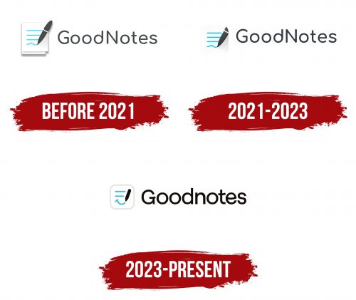
Goodnotes logo successfully harmonizes the app’s name with its visual representation. The design includes a notebook styled as a square with rounded corners, a pencil that seems to have made the inscriptions, and a smile created from an inverted arch line. A diagonal stroke on the left side enhances the resemblance to lips. Adjacent to these elements is the brand name, written in a sans-serif typeface. The curved lines in the letters’ G,’ ‘t,’ and ‘s’ parallel the welcoming smile.
The design elements speak volumes about what the app aims to offer. The notebook symbolizes organization and planning, cornerstones for users who seek to declutter their lives and thoughts. The rounded corners make the notebook look inviting and easy to approach, reflecting the user-friendly nature of the application. The pencil represents creativity and customization, emphasizing that users have the tools to make their notes truly their own.
The smile element warrants special attention. It introduces an emotional component, making the platform a tool and a friendly companion in one’s day-to-day life. It helps build a positive emotional bond between the user and the product, which is significant for customer retention and loyalty.
The choice of sans-serif typeface for Goodnotes’ brand name gives the logo a modern, clean look, aligning with the straightforward functionality of the app. The curvature in ‘G,’ ‘t,’ and ‘s’ extends the theme of friendliness and approachability, further resonating with the smiling element.
The color scheme would also play a pivotal role in shaping perceptions. While colors weren’t specified in the original description, they would likely aim to align with the platform’s purpose of simplifying and improving life.
The logo leaves a lasting impression by combining various design aspects into a cohesive whole. Each component, from the notebook and pencil to the uniquely styled brand name, contributes to the narrative of an app designed to make life organized yet joyful. The smile becomes the logo’s defining feature, emphasizing that dealing with daily tasks and notes doesn’t have to be tedious but can be, in fact, pleasant and fulfilling. It’s a smart mix of symbolism and utility, tailored to resonate with a diverse user base.
Goodnotes: Brand overview
| Founder: | GoodNotes Limited |
| Website: | goodnotes.com |
While attending college in Australia and studying math and physics, Steven Chan felt the existing options for digital handwritten note-taking on his iPad were insufficient. During a semester break in 2011, he tackled the issue head-on by developing the initial version of Goodnotes. The app quickly found a receptive audience, particularly among students, and Steven managed the project on his own for its first half-decade.
Feeling the need to expand his initial concept into something more expansive, Steven started assembling a global team in 2016. The Goodnotes staff has grown to include over 40 individuals, contributing to the app’s development and success. The platform has made a name for itself on the global stage as one of the premier apps for taking notes, boasting an active user base in the tens of millions.
To further broaden the app’s capabilities, Goodnotes secured $6 million in seed funding from Race Capital in 2020. This investment aimed to transform Goodnotes from a simple note-taking app into a platform for sharing notes. By 2022, the app’s popularity and influence were officially acknowledged when it received Apple’s “iPad App of the Year” award. What began as Steven Chan’s college side gig in 2011 has evolved over a decade into a global leader in the note-taking app space.
