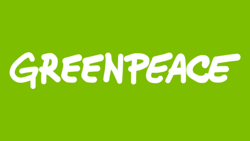
It is fundamentally important for an environmental organization to show its love for nature. She does this not only through direct actions but also at the level of visual identification. The Greenpeace logo is very conceptual, although it may seem childish and frivolous to some.
Greenpeace: Brand overview
| Founded: | 1969 |
| Headquarters: | Amsterdam, Netherlands |
| Website: | greenpeace.org |
Greenpeace is an ideological organization that advocates for the preservation of the climate, ecology, and species diversity of the planet. Headquarters in the capital of the Netherlands. The Greenpeace logo unites 26 regional offices with 3,000 employees.
The idea of the association came from a married couple of Canadian Quaker ecologists, Strasmich (later Stowe). They opposed testing nuclear weapons in Kamchatka, which could lead to a tsunami, calling themselves the Don’t Make a Wave Society (1969-71). Subsequently, the protest developed into a whole movement.
Meaning and History
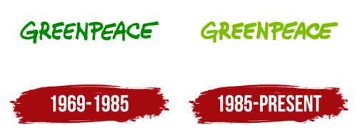
The organization’s logo appeared presumably in 1969 when Don’t Make Waves changed its name to the Greenpeace Foundation. After that, the company did not consider it important to spend money on non-essential things and updated the visual mark only once by changing the color.
What is Greenpeace?
A pacifist environmental organization with 3.2 million members and offices in 55 countries.
1969 – 1985
Greenpeace chose a simple word logo for itself. This is the title in green.
The word consists of two components: Green (green) and peace (peace). It reports that the organization is committed to keeping the world green. This is expressed as a “green peaceful future” on the society’s website. And this means stopping harmful emissions, reducing the aggressive use of resources, stopping deforestation, and killing rare animals. This is what the organization is protesting against.
The logo also informs that the company conducts exclusively peaceful protests. One of the core values is non-violence.
The letters of the visual sign are written carelessly. They are different sizes and disproportionate. This indicates that the Earth’s inhabitants are diverse and unlike each other. However, they form a single flora and fauna of the planet and are important for the continuation of life. Just as individual elements form letters and letters form a word, each representative of an ecosystem forms a planet. Therefore, Greenpeace accepts and protects everyone.
Supports the idea and uses only capital letters. This is how the idea of equal importance and value for all the planet’s inhabitants is conveyed.
The letters also hint that the organization needs a clearer structure. Most of its members are volunteers. Therefore, the number of protesters and actions is constantly changing. People choose what touches their hearts, what to participate in, and what to donate. The loose font of the lettering showcases the free spirit of Greenpeace.
The financial situation of the group is not constant either. Greenpeace is financially independent of parties and governments. It exists on donations and grants. The long and short strokes of the letters indicate different periods of abundance and lack of finance.
The choice of green color for the logo echoes the name and visually supports the theme of vegetation and scenic landscapes that Greenpeace wants to preserve.
1985 – today
In 1979, the Greenpeace International Organization appeared, which united scattered offices that existed on their own in different countries.
Changes in the logo touched the color. It became light green. Having found a common language after quarrels and misunderstandings among many communities, as well as finding the founders of the movement and determining the organization’s overall strategy, a new period began for Greenpeace. Youth, growth, and formation. It was they who were personified by light green.
In addition, in 1985, the French security authorities blew up a Greenpeace ship, on which people protested against nuclear tests and the killing of whales. It was the flagship of the protesters. As a result of the explosion, one expedition member died, who, despite the danger, went on board.
This caused sadness and a rethinking of goals also reflected in the logo. The visual sign has become lighter and airier due to the shade. Core values have crystallized, for which we must continue to move forward. They rise above all difficulties and hardships, leading the members of Greenpeace.
The letters of the logo are more voluminous and are located closer to each other. This suggests that the organization’s members have become even more established in their beliefs and are also moving towards strengthening internal relations. They are ready to support each other to transfer aggression in their direction. The offices of the updated organization are now linked together. They have a coordinating center that directs their work.
Font and Colors
Shades of green in the emblem carry the idea:
- Species diversity of flora. They personify green meadows, forests, jungles, and valleys.
- Health of the planet. The living growing covering is the lungs of the Earth. They allow you to save the life of all the inhabitants. Green is the color of growth, youth, and vitality.
All shades of green cause calm, normalize the work of the nervous system and give peace. The color symbolizes the absence of aggression, goodwill, and harmony.
The font, in its carelessness, resembles Rhodeport Regular or Onagri Regular but only partially corresponds to them, having original features.
Greenpeace color codes
| Apple Green | Hex color: | #7cbd00 |
|---|---|---|
| RGB: | 124 189 0 | |
| CMYK: | 34 0 100 26 | |
| Pantone: | PMS 802 C |
