


 Gymboree Logo PNG
The Gymboree logo radiates playfulness and sunny energy. Each letter appears to come to life, reminiscent of beloved cartoons, making the identity appealing to children and adults alike who enjoy examining its details.
The designers achieved their goal by creating a bright, memorable visual mark, subtly embedded with the brand’s core ideas and values. From the start, the company aimed to offer products for its youngest customers, creating safe, high-quality items across various categories. This is why the emblem’s primary purpose was to capture attention, communicate the brand’s reliability, and inspire deep trust. The shining visual mark has fulfilled this mission and now stands among the most recognizable in the world.
Gymboree began in San Rafael, California, in 1976, when Joan Barnes created parent-and-child classes for children aged 0 to 5. The program combined play, music, and physical activity in a shared setting for families. In 1979, she opened the first Gymboree Play & Music center, and franchising spread the format across California and other states during the early 1980s.
The company entered children’s apparel in 1983, first selling clothing through its activity centers. Its first dedicated clothing store opened in California in 1985. Bright designs and coordinated collections supported retail growth during the late 1980s, and the business listed on NASDAQ in 1993. International expansion began with a Canadian store in 1996.
Janie and Jack launched in 2000 for the higher-priced children’s market, while Crazy 8 followed in 2006 with lower-priced clothing. Bain Capital acquired Gymboree for $1.8 billion in 2010 and took it private. Debt, changing shopping habits and stronger retail competition later weakened the business.
Gymboree filed for Chapter 11 bankruptcy in 2017 and closed about 350 stores during restructuring. A second filing followed in January 2019, leading to the closure of all US and Canadian locations. The Children’s Place acquired the brand and intellectual property in March 2019, then relaunched the clothing line in 2020 through selected stores and its retail network. By 2023, Gymboree remained part of The Children’s Place portfolio.
Meaning and History
What is Gymboree?
This is a well-known American company specializing in children’s clothing and accessories. The brand offers a wide range of bright and lively apparel for infants, toddlers, and young children. Its designs are recognized for their colorful patterns, fun themes, and mix-and-match elements, making it easy for parents to create a variety of outfits from coordinated pieces. The brand is especially famous for its themed collections, often inspired by holidays, seasons, or creative ideas, encouraging children to express themselves through fashion. In addition to clothing, the brand also offers footwear, accessories, and some toys. It is popular among parents seeking high-quality, durable, and comfortable clothing for everyday and special occasions, with a focus on comfort and kid-friendly design.
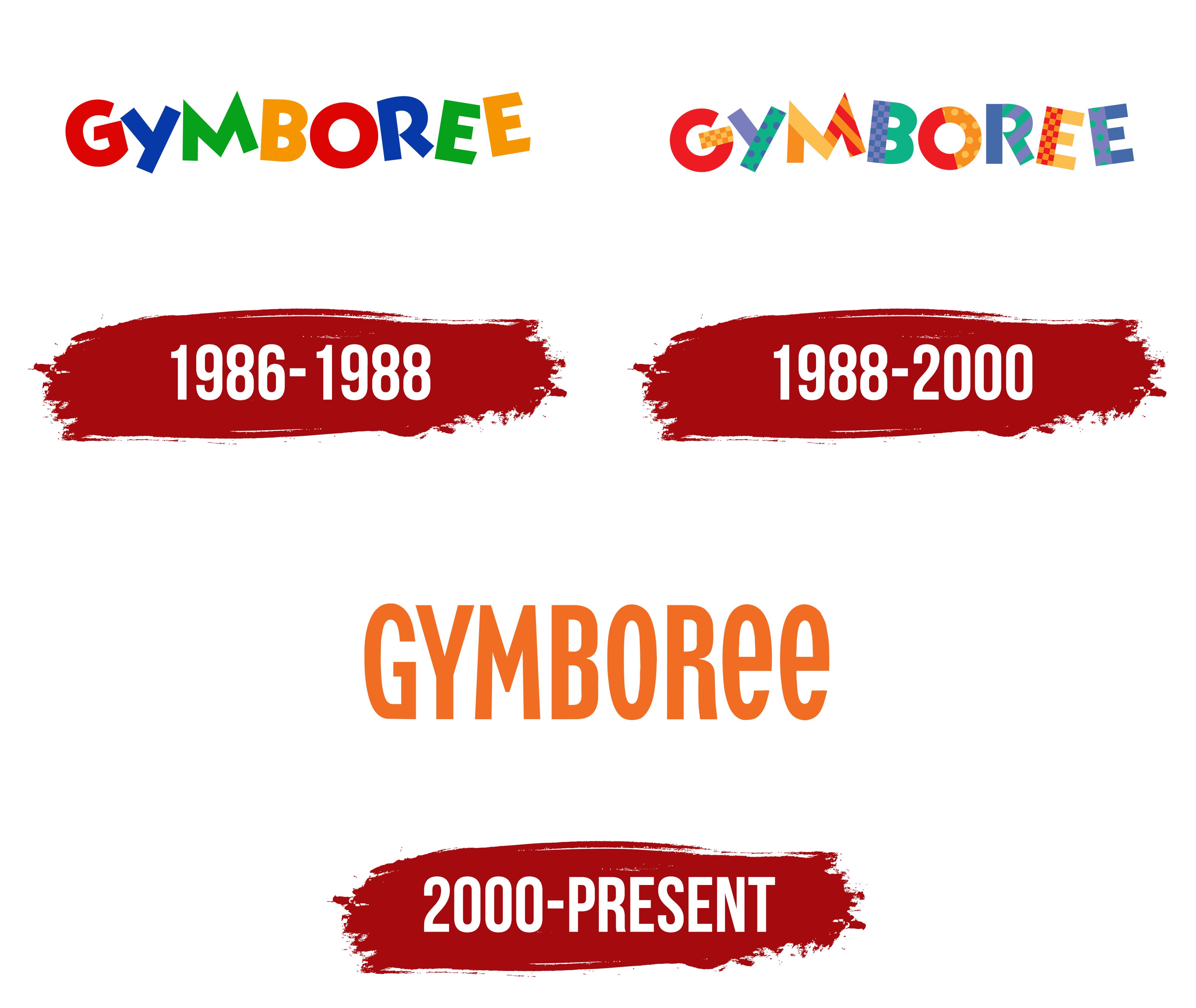
1986 – 1988
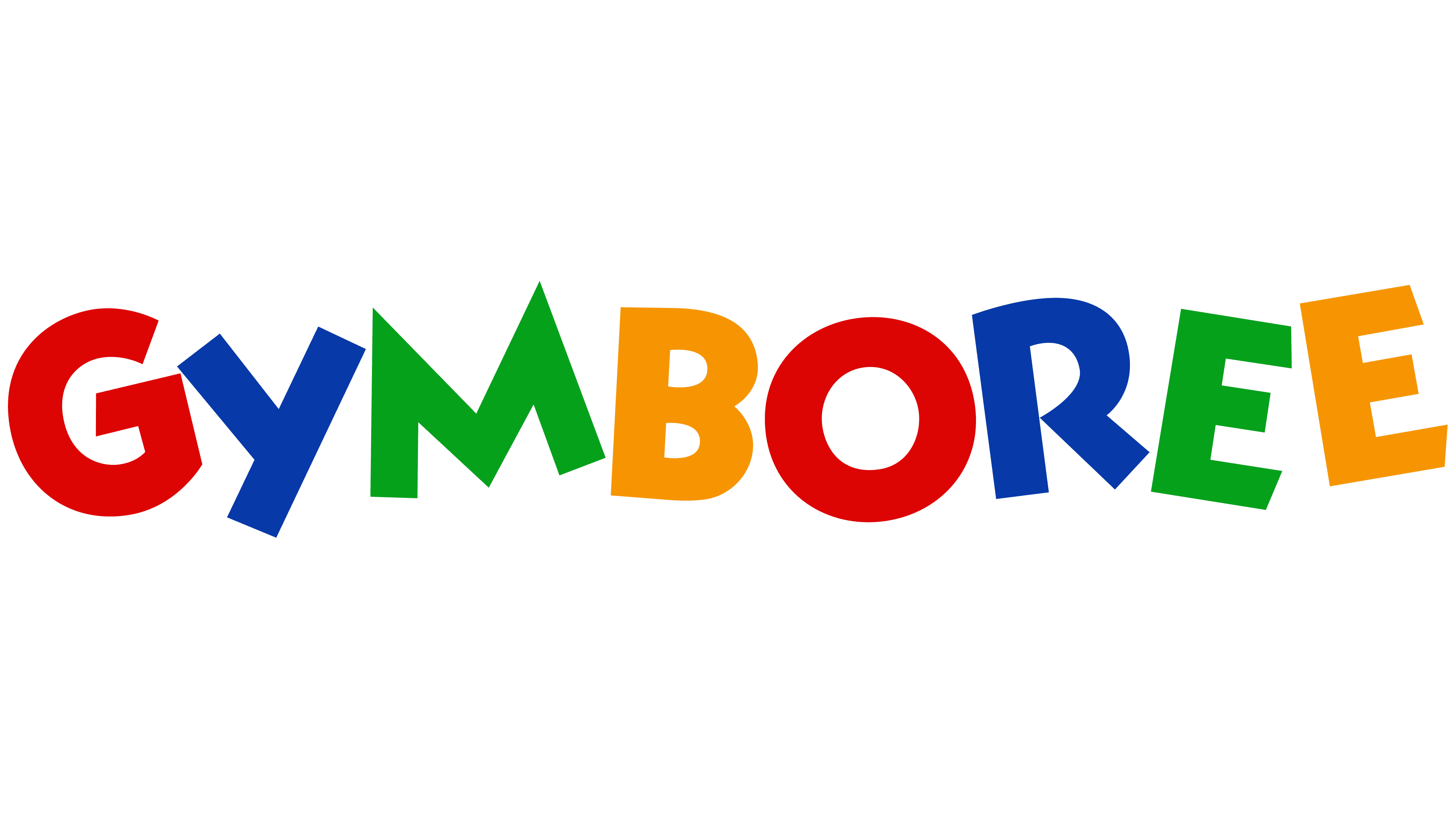
The bright and creative Gymboree logo was first introduced to the public in 1986, instantly sparking great interest and curiosity. As if brought to life on screen, each letter resembled cartoon characters: bold, colorful forms in a thick font. The emblem used the primary colors of the rainbow, establishing a clear association with childhood themes. This color choice emphasized that the company offers a variety of children’s clothing to satisfy a wide range of tastes and preferences. The brand’s assortment is as extensive as the color palette of its visual mark.
The logo includes an important accent that deserves special mention: the eight letters in the brand name are displayed not in eight colors but in just four. With repetition and variation, this duality effect creates an engaging visual element that holds the viewer’s gaze and sparks additional interest in the design.
All letters are the same size, yet some feature sharp, distinct lines, while others have smooth, rounded contours. The varied presentation of letters adds dynamism and liveliness to Gymboree’s identity, enhancing the overall effect of lightness. Different letter alignments lend the visual mark a playful, appealing character.
The colors red, blue, green, and yellow create a sense of sequence, interweaving and alternating. The white background serves as the base of the logo, bringing softness and expressiveness to the letters, highlighting the individual features of each symbol, and adding extra uniqueness and beauty to the entire composition.
1988 – 2000
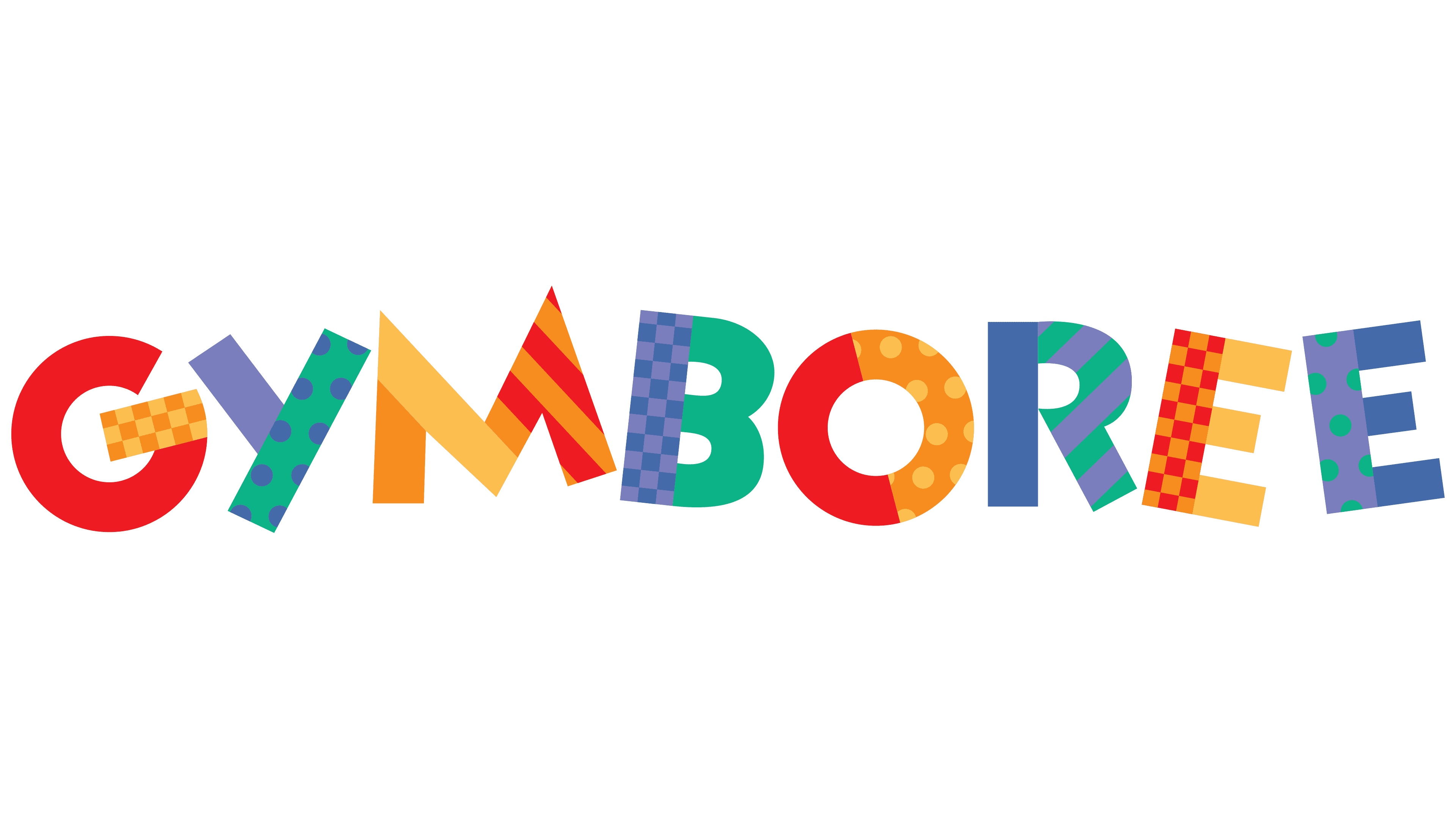
This version of the Gymboree emblem seemed even more childlike and original to the audience, evoking joy and a sense of well-being. Color variety was once again part of the identity, but now the letters have become multicolored. Each element of the letters resembled vibrant pieces of fabric, as if they were leftovers from garment production in factories and warehouses.
The new logo took on a childlike appearance through the bright “patches” that seemed to stitch each letter together, conveying a sense of varied textures and shades. This visual approach aligned perfectly with the image of Gymboree, a well-known American brand known for its bright, creative style.
Bold font and wide letter elements added dynamism to the logo. The cheerful, lively letters embodied joy while symbolizing the brand’s reliability. The repeated colors created a sense of unity in quality and aesthetics, reflected in every item Gymboree produced.
The white background gave the visual mark a sense of cleanliness and freshness, adding a touch of refinement.
2000 – today
In 2000, the brand stepped away from its usual standards, introducing an entirely new logo that was elegant and serious, quite different from previous versions. The identity took on a more realistic, substantial character, losing its former whimsical, cartoonish qualities. These transformations seemed extensive and somewhat unexpected but held special significance. By this time, the brand was well-known to children and parents across America, and the rebranding aimed to highlight the company’s high status.
The logo featured beautiful orange letters on a white background, embodying elegance and transforming into refined symbols in shape and style. All letters were the same size and height, exclusively in uppercase. The lively dynamics gave way to a more static form, and the brand name acquired a sense of solidity and permanence. A certain “mirrored” effect reflected the growth and expansion of the American children’s clothing brand.
The visual mark adopted monochromatic qualities and became more static, yet its recognizability remained unchanged. The emblem’s presentational beauty reached a new level, becoming more expressive.