



Hamilton Capital Partners updated its brand with ONBOX. The company operates in a market where financial firms often look almost identical. The new image is built around the phrase “Own the Unknown”. It presents investing as an environment of risk, speed, trust, and action during periods of market uncertainty.
Hamilton Capital Partners works as an independent investment advisory firm. The team manages client capital through a discretionary mandate. The previous style, with a blue square, an abbreviation, thin vertical lines, and a classic typeface, recalled an old financial school. It created a sense of order and distance, while keeping the brand close to the familiar language of private equity and wealth management.
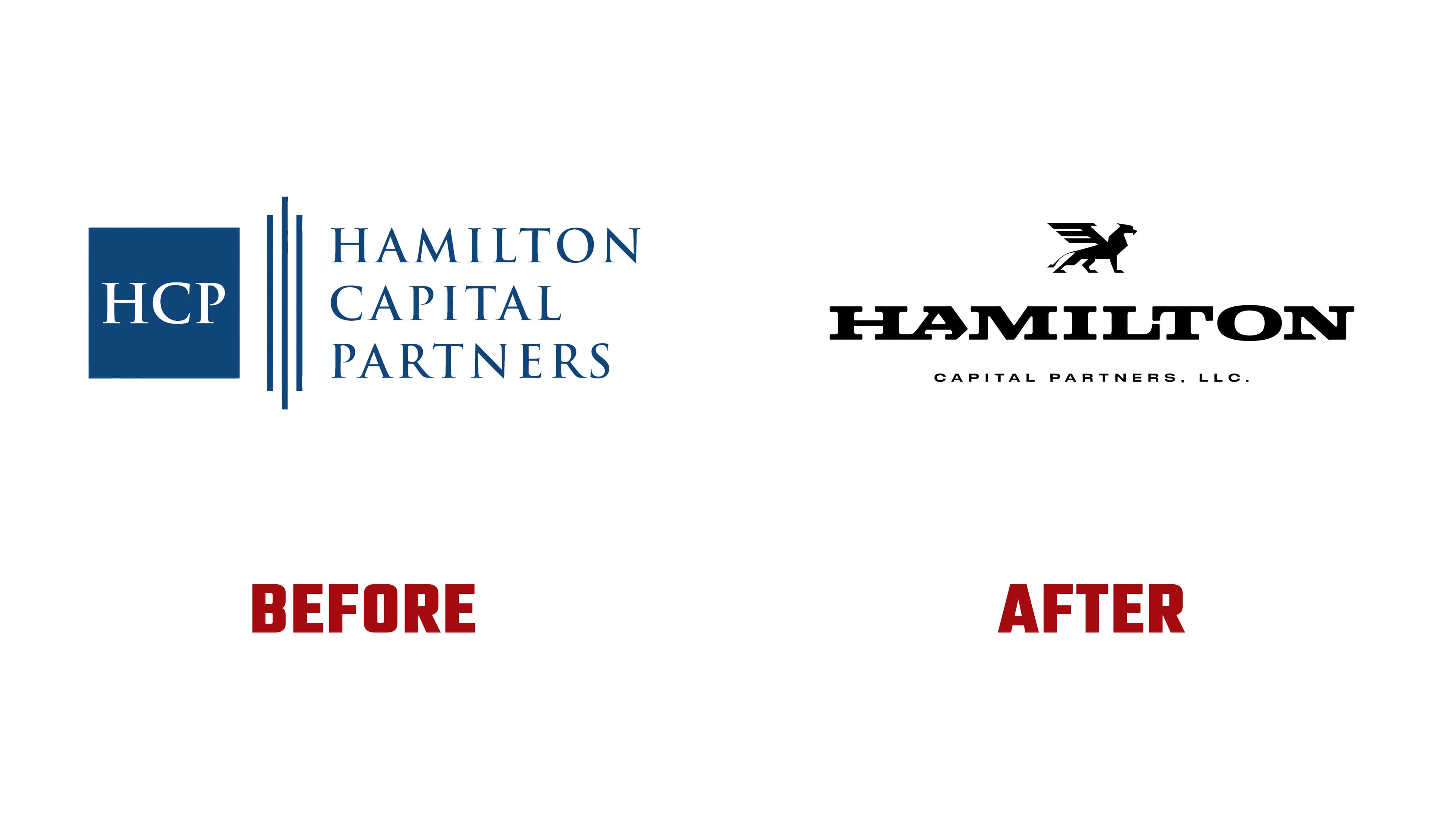
The new logo changes the first impression. The company’s full name moves to the foreground, set in a large, heavy typeface. The wordmark looks dense, composed, and high-status. On some applications, a griffin symbol appears beside it. It refers to strength, heritage, and heraldic aesthetics. Together, the symbol and typography move the brand away from neutral financial presentation and toward the image of a company with weight and a recognizable silhouette.
The large rendering of the name works as a calm foundation for the brand’s tougher tone. The impression comes from the mass of the letters, the balance of the lines, and the space around the name. Hamilton begins to sound like a guide through a complex investment environment, where hesitation can be costly.

The griffin strengthens the connection to heritage and status. Its image feels closer to club, university, or heraldic culture than to typical office identity for financial companies. It adds a sense of strength and protection while keeping risk integral to investment work.
Typography became the main tool of the new identity. Large headlines set the tone of communication. Different text scales guide the eye and help highlight key phrases. The color system remains restrained, with accents used for tension and meaningful pauses.

The new logo moves Hamilton out of the zone of quiet financial firms and into a stronger category. The image is built around the name, status, and readiness to act during periods when the market demands speed, conviction, and personal responsibility. The brand leaves a neutral shell behind and presents the market as a space of risk, timing, and the high price of delay.