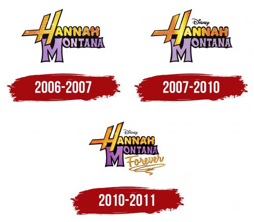
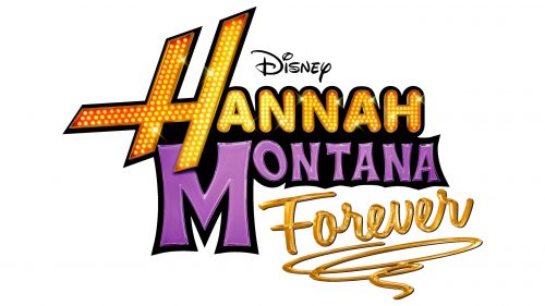
The Hannah Montana logo retains its consistent style, filled with bright colors that reflect teenagers’ energetic and dynamic life. The emblem combines the sparkle of the stage with the real challenges the main character faces. The shine of the spotlight symbolizes the success and recognition she strives for while emphasizing the importance of support, strong friendships, and inner confidence.
The logo’s bright colors highlight the heroine’s dual life—her stage life and everyday life—adding emotional depth and vitality to the emblem.
Hannah Montana: Brand overview
The story of Hannah Montana began in 2005 when Disney Channel announced a new show titled The Secret Life of Zoe Stewart. The concept, created by Michael Poryes, aimed to tell the story of a young girl living a double life. During the casting process, Miley Cyrus, daughter of country singer Billy Ray Cyrus, caught the creators’ attention. Although initially considered too young for the role, Miley’s talent and personality won them. She was cast in the lead role, and her father was invited to play her on-screen father.
The show debuted on Disney Channel on March 24, 2006, instantly attracting millions of viewers. The premise—about an ordinary teenage girl secretly living as a pop star—resonated deeply with its young audience.
Its success quickly expanded into a full-fledged franchise. In October 2006, the original soundtrack was released, debuting at the top of the Billboard 200 chart. Miley Cyrus launched her music career under both her real name and her character’s stage name.
By 2007, the series had reached new heights of popularity. Merchandise, including clothing, accessories, and school supplies, flooded the market. That same year, Miley embarked on the Best of Both Worlds Tour, performing as herself and her on-screen persona.
In 2008, the 3D concert film Best of Both Worlds Concert was released, and it became a box office success. The show’s second season premiered that year, drawing in even larger audiences.
In 2009, The Movie hit theaters, earning over $155 million worldwide despite receiving mixed reviews. The movie contributed to further franchise growth, including a new soundtrack and merchandise.
The fourth and final season, Hannah Montana Forever, aired in 2010. The decision to end the show was made to allow Miley Cyrus to pursue her career outside of Disney Channel.
The series finale aired on January 16, 2011, marking the end of a hugely successful five-year run. The show earned numerous awards on air, including several Teen Choice Awards and Emmy nominations.
Even after the show ended, its impact continued. Miley Cyrus frequently referenced her time on the show during interviews and appearances as she transitioned into a global pop star. In 2019, Miley delighted fans by briefly reviving her alter ego, sharing a video of herself singing songs from the series on social media, which sparked a wave of nostalgia.
In 2020, Miley wrote an open letter to her former alter ego to mark the 14th anniversary of the show’s premiere. This heartfelt tribute reignited interest in the series and its lasting impact on a generation of fans.
As of 2023, the show continues to hold a significant place in pop culture. It remains available on various streaming platforms, attracting new viewers while returning fond memories for longtime fans.
The series’ influence extends beyond children’s programming into the history of pop music. It launched Miley Cyrus’s career and created a unique franchise that blended music, television, and merchandise unprecedentedly for Disney Channel. It remains one of the most successful and enduring Disney franchises of the early 21st century, leaving a lasting mark on pop culture and the entertainment industry.
Meaning and History
What is Hannah Montana?
This cultural phenomenon captivated young people with its unique blend of comedy, music, and coming-of-age drama. The show’s main character is Miley Stewart, an ordinary teenage girl living a double life as a pop star. With the help of her alter ego, symbolized by a blonde wig, she enjoys the best of both worlds: the glamorous life of a celebrity and the everyday experiences of a regular girl. The plot explores friendship, identity, and the challenges of growing up under public scrutiny. The show gained popularity by addressing topics relatable to teens and skillfully combining humor and memorable music. Off-screen, the character became an icon, releasing hit songs, embarking on tours, and launching a wide range of merchandise, further amplifying the phenomenon’s impact.
2006 – 2007
The show’s emblem consists of the sitcom’s title, divided into two levels. “Hannah Montana” is based on the main character’s stage name, emphasizing her double life. At the top of the logo is the name “Hannah,” with the first letter highlighted. This symbol appears sharp, dynamic, and swift, representing the celebrity’s active, vibrant life. The size of the letter and the writing style emphasize the singer’s fame and busy lifestyle.
The other letters have soft, smooth curves, hinting at the heroine’s young age and her real, more modest personality hidden behind the public image. The bright yellow color with numerous LED lights creates the effect of stage glow, spotlights, and glittering concert outfits, immersing the viewer in the world of show business.
The lower part of the logo contains the purple word “Montana,” which refers to the girl’s calmer, everyday life. The font here is less precise, with varying glyph thickness, highlighting that her teenage life is no less important to her. The first letter of the last name is also enlarged, showing the significance of this part of her personality, symbolizing the real side of the heroine’s life.
Placing the last name at the bottom emphasizes that Miley Ray Stewart’s true self is the foundation of her stage alter ego. Without her personal views and characteristics, Hannah Montana wouldn’t exist. The use of two different styles and colors represents Miley’s double life. The entire logo is unified by a black background, symbolizing the mystery and hidden nature of the heroine’s dual life. The Disney logo above the show’s title indicates its connection to the channel where this popular sitcom aired.
2007 – 2010
By the second season, the logo underwent minor changes, making it more expressive. The primary transformations affected the word “Montana.” The letters gained volume, creating the impression that they were written with glossy lacquer, shimmering in the light. This visual effect is enhanced by a thin, mirrored outline, emphasizing the depth of the symbols. This choice highlights that as Miley’s popularity grows, her stage persona increasingly impacts her everyday teenage life.
In this season, the black outline of the first letter “H” is also expanded. This element hints at the difficulties the heroine faces. Fame brings success and problems: Miley experiences blackmail and loses her voice, revealing the negative sides of popularity.
The emblem now reflects the complexity of Hannah Montana’s roles and shows how the boundaries between the star’s career and the teenager’s ordinary life begin to blur. The logo symbolizes the heroine’s struggle to maintain her real life while her stage persona influences everything around her.
2010 – 2011
The logo for the fourth and final season of the show “Hannah Montana,” which was renamed “Hannah Montana Forever,” clearly reflects the conclusion of the heroine’s story. The main text is divided into several parts: “Hannah” is highlighted in large letters with bright lighting, mimicking the glow of stage lights. This symbolizes her career as a pop star and her performances on stage.
The logo’s color palette emphasizes important aspects of the story. The letters in “Hannah” shine with yellow-orange lights, reminiscent of life on stage and the glitter of fame. The purple part of the word “Montana” represents her other world—a calmer, more real side of life where she is simply Miley, a person, not a star. This division underscores the character’s inner conflict between her real life and stage life.
The key element of the emblem is the word “Forever,” written as if in liquid gold, symbolizing the end of the story. A line that fades out from this inscription hints that the life of a pop star is now in the past, and ahead lies a more ordinary life. The logo conveys the idea that the peak of fame will remain in the hearts of fans, but Miley herself chooses a future beyond the stage.
The visual style reflects the events and changes happening to the heroine in the final season.
