


 Herman Miller Logo PNG
The Herman Miller logo is an ode to quality and unwavering consistency. This emblem reflects the company’s elegance throughout its many years of operation. Every product created under this brand is a true work of art, combining comfort with stylish, refined design.
Gege Akutami, born on February 26, 1992, in Iwate Prefecture, entered professional manga in 2014 with Kamishiro Sosa in Shueisha’s Jump NEXT!. In 2015, Nonminato Keiji-han appeared in Jump GIGA. Neither one-shot became a major success. In 2016, Tokyo Metropolitan Curse Technical School introduced the setting later used for Jujutsu Kaisen 0 and drew wider reader interest.
Jujutsu Kaisen debuted in Weekly Shōnen Jump on March 3, 2018. Akutami built the story around Yuji Itadori, Megumi Fushiguro, Nobara Kugisaki, and Satoru Gojo, combining modern urban life with Japanese folklore, curses, and sorcery. The first tankōbon volume followed in December 2018, and circulation passed 2.5 million copies in 2019.
An anime adaptation was announced in November 2019. Produced by MAPPA, it premiered on October 3, 2020, and the first season ended on March 27, 2021. Manga circulation exceeded 25 million copies by late 2020 and 30 million in 2021, ranking second behind Demon Slayer. Crunchyroll distributed the series outside Asia in several languages, while Netflix released it in India and Southeast Asia during summer 2021.
The film Jujutsu Kaisen 0 opened in Japan on December 24, 2021, and earned over 13.5 billion yen. It became one of Japan’s highest-grossing anime releases. By 2022, manga circulation had passed 70 million copies, while a second anime season had been announced. By early 2023, the franchise covered manga, television, cinema, and international streaming.
Meaning and History
What is Herman Miller?
This well-known American furniture manufacturer gained fame for creating luxurious and ergonomic office and home furniture. Their iconic designs, such as the Aeron chair and the Eames Lounge chair, radically transformed the perception of furniture by emphasizing comfort and functionality. The company blends aesthetics and practicality in its designs, producing visually appealing and ergonomically crafted pieces. Collaborating with top designers, the brand creates furniture that often becomes museum exhibits and collectible items. Their product range includes modular office systems adaptable to changing work environments and chairs that support proper posture. The company’s products are renowned for their quality and often come with a lifetime warranty, underscoring the brand’s commitment to durability and high production standards.
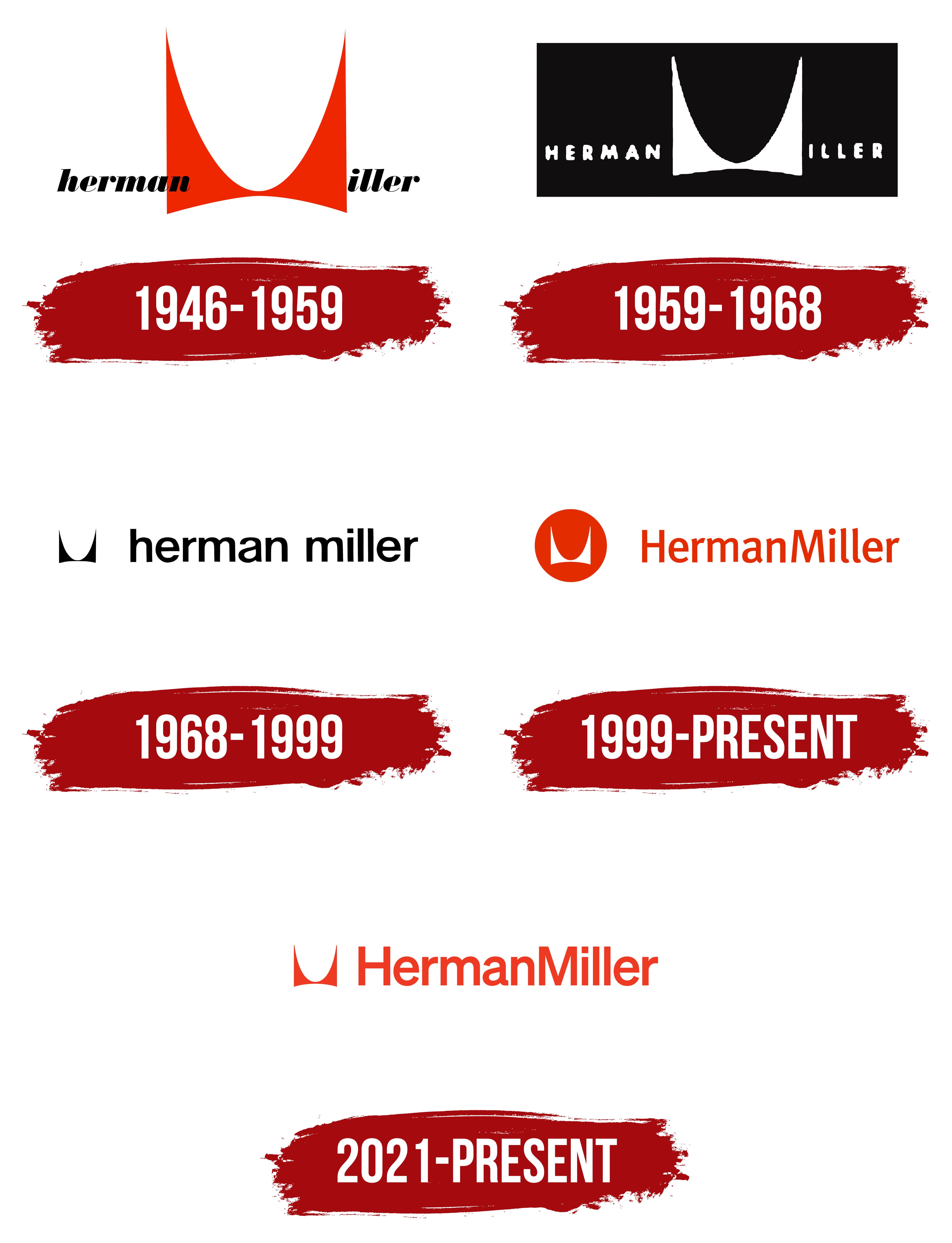
1946 – 1959
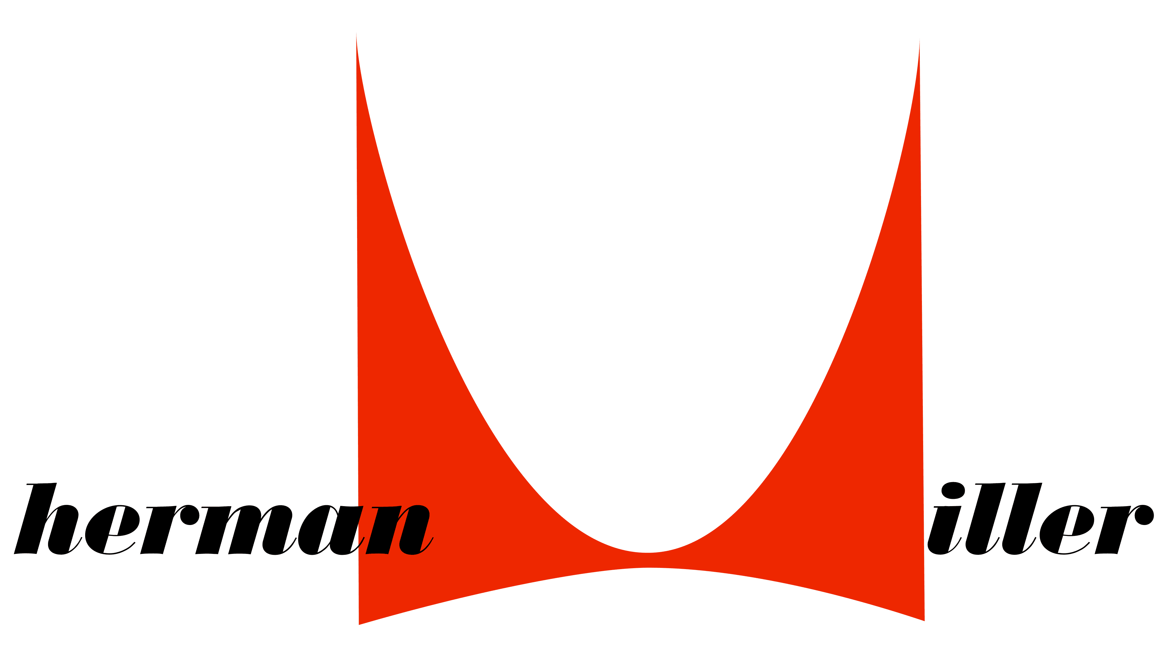
The central element of the logo is a graphic symbol placed between the two parts of the name. This image consists of two red symmetrical geometric shapes that form several significant elements:
- A stylized depiction of the letter “M,” the first letter of the surname of one of the company’s founders.
- A bow tie symbolizes nobility and aristocracy.
- A deep neckline adds a playful and daring element.
- A crown highlights the premium status of the brand’s products.
- Two chairs are shown in profile.
- The frame of an office chair backrest is the brand’s key and iconic invention.
This unique image was created by industrial designer Irving Harper, who actively participated in developing furniture for the company. The logo reflects the traits of avant-garde and experimentation, which are fundamental to the modernist style in Harper’s work. Modernism rejects outdated forms, striving toward the future and innovative solutions, making this symbol an embodiment of the company’s philosophy for many decades. Interestingly, the designer sketched the emblem for a furniture catalog in just 15 minutes. However, the seemingly simple image, consisting of smooth, sharp geometric lines, became one of Harper’s most famous works and an integral part of the brand’s identity.
The word “Herman” is written in lowercase letters in the script, and its design partially overlaps the logo image. “iller” continues this style, creating a cohesive, harmonious composition. This combination of script and visual elements emphasizes the brand’s uniqueness and originality, reflecting its commitment to individuality in every aspect.
It’s worth noting that Herman Miller was neither the founder nor the head of the company. His connection to the brand stems from his being the father-in-law of Dirk Jan De Pree, one of the presidents of Michigan Star Furniture. In 1923, with his father-in-law’s help, De Pree acquired 51% of the company’s shares. He led the company until the 1960s and decided to rename it after his father-in-law, Herman Miller. Interestingly, the company had already existed for 18 years before this acquisition. The logo, which became the company’s symbol, first appeared in 1946, when the brand entered the modern furniture market and solidified its position in this niche.
1959 – 1968
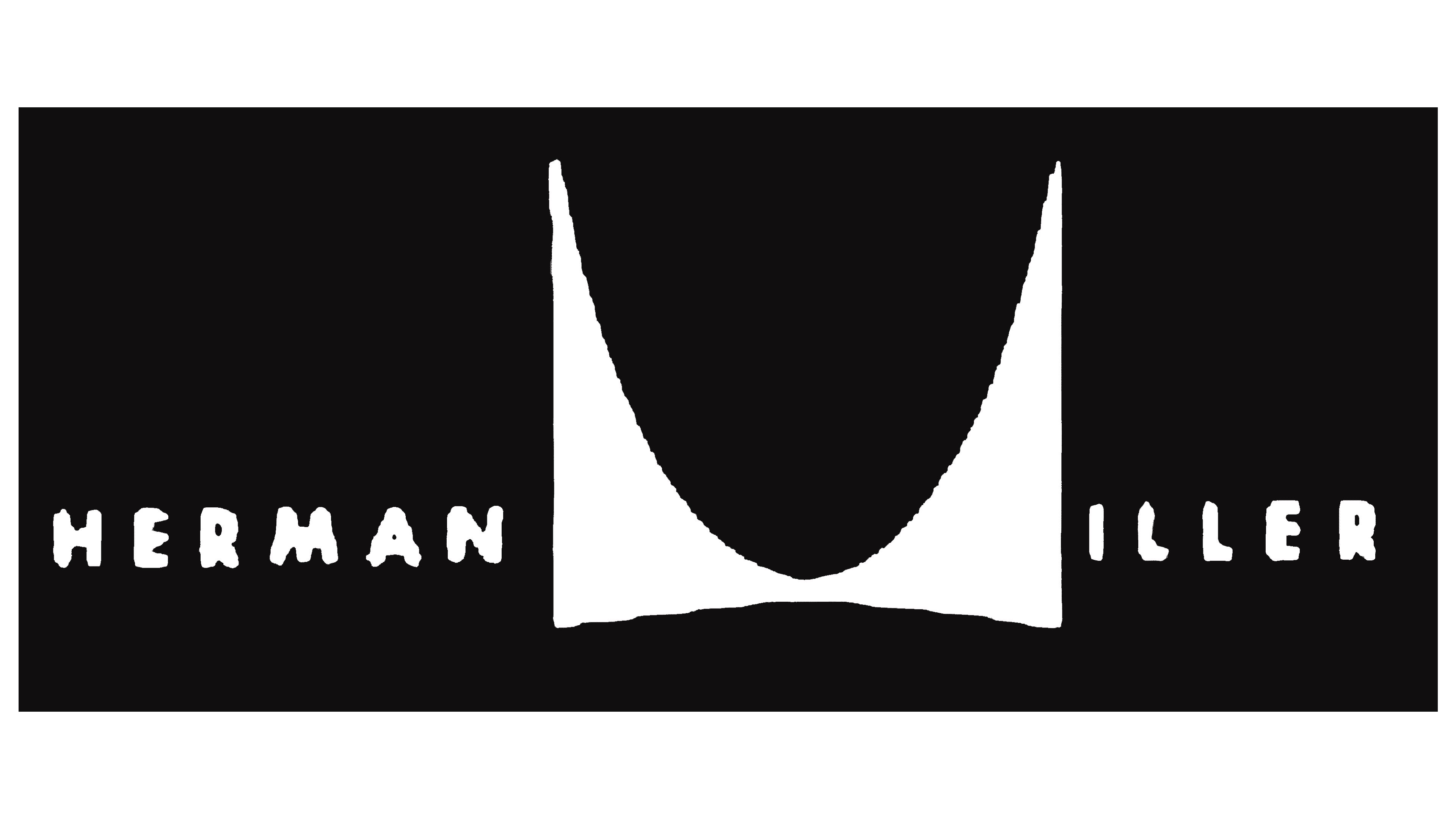
The company’s emblem changed when De Pree grew older and passed the leadership to his son. The new symbol retained the key elements of the previous one but was set against a black background, resembling a business card. The inscriptions and images were arranged in a strict sequence, forming a line. The brand name was now written in capital letters, symbolizing a new phase in its development. Herman Miller was no longer just the name of a real person; it had become the embodiment of a well-known and respected brand.
The updated logo’s black-and-white color palette is elegant and restrained. This choice perfectly emphasizes the company’s focus on producing high-quality office furniture. The contrasting colors add sophistication to the logo and align with the business style that distinguishes the brand’s products.
1968 – 1999
The new emblem was designed for the famous Action Office furniture series. A key feature of this symbol was the highlighting of the unique letter “M,” which was styled as a separate icon and placed before the text part of the logo. The size of this symbol was reduced to match the other letters, helping eliminate the visual imbalance characteristic of previous versions. As a result, the visual sign became more harmonious and neat.
However, with the new logo design, there was less individuality, and the sense of a bureaucratic style became more pronounced. This decision reflected the company’s focus on functionality and professionalism, which became its main emphasis. The first and last names in the emblem were written in lowercase, emphasizing attention to detail and care for customers’ comfort and convenience. This design choice gave the visual sign restraint and demonstrated that Herman Miller was committed to creating an environment centered on its clients’ needs.
1999 – today
The unique letter “M” was placed inside a red circle, creating the visual effect of it resting on a tabletop. This design emphasizes completeness and coherence, reflecting the brand’s commitment to creating not just individual pieces of furniture but harmonious office suites. The two words of the name are now written as one, symbolizing the unity and indivisibility of products designed for the full setup of a workspace.
The red color used in the logo also holds special significance. It represents the renewal of the collection, signaling the introduction of fashionable and modern approaches to furniture design. This shade conveys the energy and freshness of ideas that guide the company as it continuously evolves its products and adapts to the changing demands of the modern office.
2024 – today
The modern Herman Miller logo maintains continuity with previous versions while incorporating several significant changes that highlight the brand’s renewal. The recognizable letter “M” remains the primary element, but now it appears without the surrounding red circle, giving the symbol a more minimalist and concise look. This shift emphasizes the company’s focus on simplicity and functionality, values that have always been at the core of its design.
The brand’s identity’s red color has become brighter and lighter compared to previous versions, reflecting recent changes within the company. This color choice underscores the integration with Knoll, which became part of Herman Miller. The vibrant tone signals a new era for the company and its pursuit of a more modern, dynamic image. It symbolizes unity and continued growth following the merger of two major office and home furniture brands.
The emblem’s font is sans-serif, straight, and bold, emphasizing the brand’s confidence and professionalism. This typeface is easy to read and highly recognizable across all platforms and materials. The logo’s modern appearance underscores the company’s commitment to staying at the forefront of design and technology.
The overall visual style reflects the minimalism that has been a key philosophy of the company since its founding. This approach to logo design aligns with the company’s historical changes: its drive for expansion, its strengthening of its market position, and its continued traditions of quality and innovation.