



HONOR has added an open ring to its logo as it shifts from smartphone manufacturing toward an ecosystem of AI-powered devices. CEO Li Jian introduced the emblem on Weibo on July 23, 2026. Called the “HONOR Ring,” it appears beside the familiar five-letter uppercase wordmark. The company also introduced the tagline “Dare to Be,” replacing “Go Beyond.”
The update is tied to the Alpha Plan and the development of human-AI interaction technologies. The identity is intended to help HONOR communicate its expanding business and connect with younger audiences. In its message to users, the company focused on technology’s potential to help people realize their abilities.
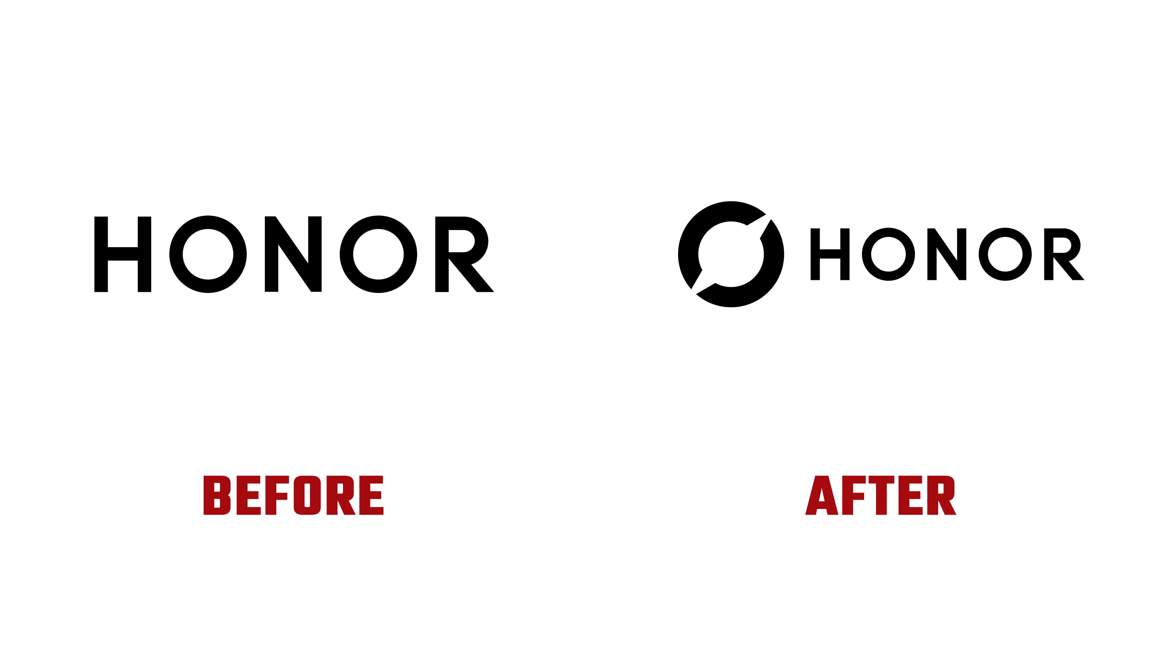
The emblem is a thick ring with two breaks along a diagonal rising from left to right. The arcs end in sharp, angled cuts, leaving the center open. In the horizontal version, the symbol sits to the left of the name and extends above and below the letters. The black-on-white version highlights the combination of a rounded outline and angular terminals.
HONOR explains the ring through the idea of perfection and the ambition to move beyond its boundaries. The breaks represent the exploration of internal capabilities and the pursuit of new directions. PConline connects the first theme to advances in connectivity, cameras, and foldable displays, and the second to international expansion and work in new areas of technology.

HONOR has retained its wordmark. Its history dates to December 2018, when lowercase honor became uppercase HONOR and a gradient color version was introduced. The update continued in January 2019 under the tagline “HONOR MY WORLD.” The current wordmark retains its uniform strokes, circular “O” letters, vertical stems in the “H” and “N,” and diagonal leg on the “R.” A large emblem now sits beside the letters, echoing the rounded shape of the “O.”
“Dare to Be” focuses on users’ individuality. The Chinese tagline translates as “Dare to think, dare to be different.” The short English phrase can be extended in advertising to develop the campaign’s theme. In the launch film, space imagery conveys the exploration of new possibilities. Satellites and rockets appear inside the ring, using its open center as a frame.

The identity guidelines include horizontal and vertical logo versions. Alongside black-and-white treatments, a blue ring can be paired with a black or white wordmark. HONOR Blue is specified as #009BFF, with RGB values of 0/155/255. The guidelines define the proportions, angles, and relative placement of the logo’s components. The horizontal version has a minimum height of 5 mm in print and 14 pixels on screen. Stores, packaging, and company materials will gradually adopt the identity. After the unveiling, users began comparing the HONOR Ring to the emblems of Grok, the game Honor of Kings, and the former Baidu browser icon.