Free flight and joy reflect the company’s symbol. The Hydro Flask logo alludes to the vacuum, which keeps products safe. The emblem shows the convenience of transportation and the service of the company’s products for the benefit of people.
Hydro Flask: Brand overview
Meaning and History
The company manufactures vacuum-insulated cookware using premium austenitic stainless steel. Its products are free of bisphenol A and other potentially harmful substances; since 2012, Hydro Flask has produced only environmentally friendly products. Flasks with a proprietary powder coating are excellent at keeping food cold.
However, high quality is not the only thing that makes a brand popular. No less important is a recognizable design, which is based on elements of visual identification. All food and drink utensils are adorned with the Jumping Man logo. This symbol was updated in the second half of 2015 when Hydro Flask relaunched the site and introduced the Fall Thermal Collection.
What is Hydro Flask?
It is a brand of water bottles that have a branded design. It was founded in 2009 by Travis Rosbach and Cindy Weber. Helen of Troy Limited now owns the trademark. Increased popularity came to her in 2019-2020.
2009 – 2015
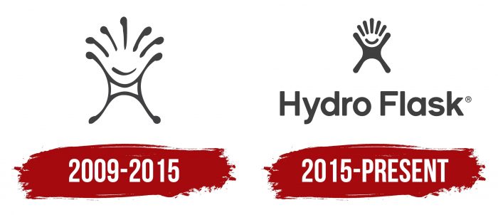
In 2009, Cindy Morse and Travis Rosbach upgraded the water bottles to keep them at the right temperature. This is how the Hydro Flask brand was born, and with it, the logo in the form of a cheerful little man. It looked like a blob with splashes on the sides. The inner part of the body was white and shaped like a rectangular pillow with concave sides. From each corner emerged one thin black line with a dot at the end – an imitation of arms and legs. At the top was a smile arc and five stripes representing hair.
Below the design was the black lettering “Hydro Flask.” The designers used a partially rounded font, with the lowercase letters “d,” “a,” and “r” missing some elements.
2015 – today
In 2015, the company changed its image and used crowdsourced creative services. She needed a better symbol reflecting increased sales, a wider range of products, and a drive for innovation. She looked at almost a thousand options until she chose a new logo, remarkably similar to the old one.
The drawing remained recognizable but acquired a bolder and cleaner design. Now, the inside of the man is painted over with black, and there are no dots at the ends of the improvised arms, legs, and hair. The smile looks more confident because the lines are thicker and more symmetrical. The lettering font has also changed slightly. The modern Hydro Flask branding was introduced along with an updated website and graced the product line launched in the fall.
Hydro Flask: Interesting Facts
Hydro Flask, started in 2009 in Bend, Oregon, has changed how we take drinks with us. Its founders, Travis Rosbach and Cindy Morse, wanted to keep their drinks cold on the beach and hot during work hours, which led to their insulated bottles.
- Start: Created to keep beverages at the right temperature during any activity.
- TempShield Technology: Their bottles can keep drinks cold for 24 hours or hot for 12 hours, thanks to a special double-wall vacuum insulation.
- Quality Materials: Made from strong, BPA-free stainless steel, ensuring drinks taste good without a metallic flavor.
- Colors and Customization: They offer a variety of colors and sizes, from small coffee mugs to big camping bottles, and offer customization options.
- Growth: The brand grew quickly and was bought by Helen of Troy Limited in 2016 for about $210 million, helping it reach more people worldwide.
- Eco-Friendly: Hydro Flask encourages the use of reusable bottles to reduce plastic waste. Its Parks For All program supports public parks.
- More Products: They now also make food flasks, wine bottles, beer growlers, and tote bags, all using the same insulation technology.
- Awards: The company has won awards, like the Red Dot Design Award, for its product design and business achievements.
- Patents: Their TempShield technology is patented, keeping them ahead in the market.
- Community: Hydro Flask fans love sharing their adventures with their bottles, highlighting the brand’s role in their active lifestyles.
Hydro Flask is beloved by outdoor fans, commuters, and those who care about the environment. Staying hydrated is a way of expressing personal values and lifestyle.
Font and Colors
The smiling little man conveys a feeling of joy and happiness. He jumps high, spreading his arms and legs. His hair resembles a spray of water, and his body is like a drop, so there is an associative connection with water. That is, the emblem symbolizes freshness, energy, and fun. Considering Hydro Flask positions itself as a manufacturer of products for an active lifestyle, this icon fits perfectly into its concept.
The typeface used by the designers has much in common with Galano Grotesque. It is a geometric sans-serif typeface based on classic standards. Its designer balanced the width and height of the letters and made all the strokes the same thickness, so the grotesque turned out to be low-contrast.
The official logo color is black. However, the pattern is often white on Hydro Flask bottles because the colorful background balances it.
FAQ
What does the Hydro Flask symbol mean?
The Hydro Flask logo is deeply connected to caring for the environment and improving personal health. The company uses reusable water bottles to help combat plastic waste. This approach benefits the consumer and helps the environment by reducing waste.
The logo symbolizes a community of people who care about health, an active lifestyle, and environmental friendliness. It acts as an icon for those who strive to make positive choices for themselves and the planet. The design showcases the brand’s uniqueness, especially with its unique technology that keeps drinks at the right temperature for longer. This is particularly useful for people who enjoy outdoor activities or sports. It represents a cleaner, healthier, and happier world.
Why is Hydro Flask so famous?
The brand is especially popular among young people and is known for its designs. The bottles feature double-walled vacuum insulation to help keep drinks hot or cold for hours. This makes them appealing to a wide range of people, from outdoor enthusiasts to daily commuters who like to drink beverages at a consistent temperature.
The company is famous for the quality and durability of its products. Made from stainless steel, the bottles keep drinks clean and fresh without adding flavor. The powder coating provides extra grip and durability, which is important for active users. Offering a reusable product that helps reduce environmental impact helps decrease the consumption of single-use plastic.
What is the Hydro Flask logo supposed to be?
The logo is unique and fun. It shows a small, happy figure jumping with its arms and legs wide open, resembling the letter “H.” This thoughtful design makes it stand out and ties it closely to the brand name.
The character’s hair looks like water rushing up, and its entire shape resembles a drop of water. These details highlight the brand’s focus on hydration and its relevance to water sports and healthy lifestyles. The logo conveys the brand’s essence, attracting younger shoppers looking for practical yet fun product elements.
What is Hydro Flask’s slogan?
The slogan “Let’s go! Hydro Flask – one life. Refill often” reflects the spirit of adventure and energy. It encourages people to refill their bottles frequently, promoting a life filled with memorable experiences. “Let’s go!” motivates users to take action, whether for outdoor adventures, busy days, or enjoying simple moments. This message resonates with young audiences looking to improve their health and the environment.
Did Hydro Flask remove its trademark?
The company, known for its insulated beverage containers, has changed its logo, removing the registered “R” trademark from the new product designs. Removal of a symbol does not affect the legal protection of the brand as long as the trademark remains registered with the relevant authorities. By presenting a logo without a registered trademark symbol, the brand can appear more accessible and recognizable.
Can you add a logo to Hydro Flask?
The company encourages customers to personalize their products. You can customize your bottles to reflect your style or preferences by adding images, logos, or text to the bottle’s surface.
The brand offers various design options. You can choose from different colors and patterns and upload personal images or logos to print on the bottle. This is great for self-expression and corporate branding. The brand provides an online customization tool on its website. You can upload the image or logo you want, adjust its size and position, and see how it will look on the bottle before placing your order. Custom bottles are popular as gifts, promotional items, or special event favors.


