![]() IATSE Logo PNG
IATSE Logo PNG
The IATSE logo represents the International Alliance of Theatrical Stage Employees. Its graphic design reflects the union’s professional solidarity, structure, and discipline, uniting technical workers in the entertainment industry.
The history of IATSE began in 1886 in New York, when stagehands went on strike to demand a $ 1-per-day wage. With the support of actors, their demands were met. By 1893, representatives from various cities had formed the National Alliance of Theatrical Stage Employees, which became international in 1902 with the addition of Canadian locals.
By 1903, prop workers’ pay increased to $35 a week. In 1912, the union introduced a “Yellow Card” system for touring theatrical crews. During the 1930s, organized crime influenced IATSE, but control returned to members after leaders were arrested in 1941. Hollywood set decorators briefly formed a separate union but later rejoined the larger International Alliance of Theatrical Stage Employees (IATSE).
In 1945, a major strike in Hollywood established IATSE as the leading union in the film industry. During the 1960s, the union supported Vietnam veterans and advocated for the protection of American jobs.
In 2008, Matthew Loeb became president, creating an education fund and the Young Workers Committee. The Pride Committee was formed in 2019 to support diversity. By 2024, IATSE represented over 168,000 theater, film, and TV workers across the U.S. and Canada, continuing to defend workers’ rights in the digital age.
Meaning and History
![]()
What is IATSE?
It is North America’s largest union, representing workers in the film, theater, and concert industries. Members include camera operators, sound engineers, lighting technicians, makeup artists, designers, and editors. The union negotiates working conditions, minimum wages, and safety standards. Its strikes can halt operations at major studios and theaters, forcing employers into negotiations. The union ensures fair conditions and rights for technical workers.
1910 – 1964
![]()
The emblem of the I.A.T.S.E. union appeared around 1910. It was used as a mark to indicate the union’s jurisdiction over theatrical and motion-picture production. The design presented a strict, symmetrical composition, intended for simple perception in cinema and print graphics of the first half of the twentieth century.
The mark consisted of a stylized star with sharp edges and a pentagonal module in the center containing the letters “IA.” The remaining characters of the abbreviation “I.A.T.S.E.” were distributed across the outer segments resembling rays or petals. The black-and-white color palette provided contrast and maximum clarity when reproduced at the beginning of films.
Accompanying inscriptions sometimes included the phrase “This picture made under the jurisdiction of” at the top and information about affiliation with the American Federation of Labor (AFL) at the bottom. The typefaces used for the mark were defined by strict geometry and the absence of decorative elements, thereby emphasizing the organization’s utilitarian and official character.
The use of a black-and-white design reflected the technology’s requirements in the era of black-and-white cinema. The strict geometry, characterized by sharp angles and a linear star structure, was associated with precision, control, and order, underscoring the union’s authority and its role as a guarantor of quality.
Different forms of reproduction of the mark were permitted: as a separate star without text, with an inverted palette, or with accompanying text placed horizontally. The primary format retained the version with inscriptions about jurisdiction and AFL affiliation, which most often appeared at the beginning of films and theatrical productions to emphasize official approval from the organization.
1910 – 1971
![]()
Used in parallel with the main I.A.T.S.E. mark, this version of the logo was executed in the form of a concise circular seal. It was used in the opening frames of films and theatrical productions, signaling the union’s control over production conditions and output quality.
Composed of a simplified geometric star with five rays, the emblem resembled the previous logo. At its center was a black-and-white pentagon containing the letters “IA,” while the remaining elements of the abbreviation (“T,” “S,” “E,” “I,” “A”) were placed around the perimeter on individual petals. The emblem was enclosed by a wide circular border with text blocks above and below. The upper inscription stated: “This picture made under jurisdiction of I.A.T.S.E.” At the same time, the lower fixed the affiliation with the American Federation of Labor (AFL).
The emblem’s typography was set in a geometric sans-serif typeface, characterized by thick, straight lines and strict letterforms. The spacing between letters was minimal, reinforcing the composition’s official tone. The black-and-white palette provided contrast and ease of use across different media, including film titles and printed materials.
The mark’s circular border and shape were associated with official seals, conveying a sense of professional oversight and unity within the union organization. Placing the abbreviation “IA” in the center emphasized the union’s focus on its key concepts. At the same time, the outward rays symbolized the consolidation of the organization’s various activities around a single core.
1916 – 1972
![]()
The emblem of the cartoonists’ union Local 839, part of I.A.T.S.E., was based on the Maltese cross used by the union from 1916 to 1972. Its form enabled the creation of an image with a hierarchical system of symbols, suitable for use in animated film credits and print materials. The mark emphasized the union’s control over animation production processes and its affiliation with the American Federation of Labor (AFL).
The emblem was a classic Maltese cross with five wide arms, on which the letters of the I.A.T.S.E. abbreviation were inscribed. In the center was a pentagon divided into four sectors by two intersecting lines. Each sector contained the letters M.P.S.C. (Motion Picture Screen Cartoonists). Between the lower arms of the cross appeared the number “839,” and beneath it a small inscription “A.F. of L.” The composition was defined by geometric rigor and symmetry, making it easier to perceive and reproduce.
The emblem’s typography was bold, using a geometric sans-serif font with uniform line thickness throughout the mark. The letter size and spacing were chosen to ensure clear legibility even at the smallest reproduction scale.
The black-and-white palette was designed to maximize contrast, reinforcing the mark’s perception as an official stamp. The absence of halftones, shadows, and other decorative techniques simplified printing and application to film stock and paper media.
Symbolically, the Maltese cross highlighted the unification of the union’s various components around its central core, represented by the abbreviation M.P.S.C. The number 839 identified the specific local division. At the same time, the additional inscription emphasized affiliation with the largest labor federation in the United States.
1952 – today
![]()
The modern version of the I.A.T.S.E. emblem, commonly known in the industry as the “IA bug” or “union bug,” was introduced in the early 1950s and remains in use today. The appearance of this mark in film credits and theatrical productions confirms compliance with the union’s jurisdiction over production conditions.
Designers retained the Maltese cross as a basis but, in this version, added a shield-shaped center containing the abbreviation “IA” (International Alliance). From the central element, five evenly spaced arms carry the letters “I,” “A,” “T,” “S,” “E,” forming the union’s abbreviation. Along the outer perimeter, the emblem was often accompanied by text: the upper part usually read “This picture made under the jurisdiction of.” In contrast, the lower part emphasized affiliation with the AFL–CIO or its equivalents.
The emblem’s typography was simple and geometric, sans serifs. The letters were bold and proportionally balanced, which made the symbols easy to recognize across all media.
Structurally, the mark conveyed the symbolism of protection and union unity through the shield-shaped central figure, representing professional solidarity and reliability. The outer circular inscription confirmed the union’s status and jurisdiction.
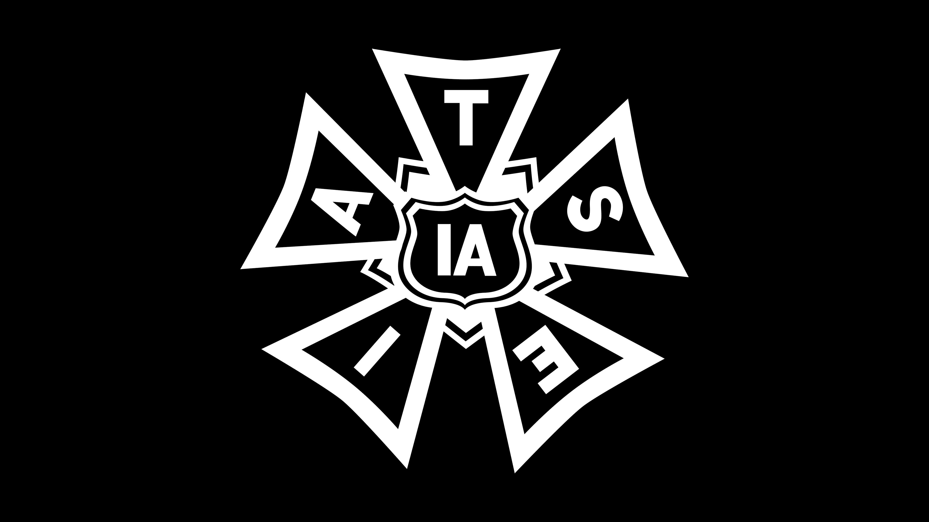
1957 – today
![]()
In creating a parallel version of the I.A.T.S.E. mark in 1957, the designers sought a more contemporary interpretation of the familiar image, one adapted to the visual standards of its time. The main change was altering the geometry of the rays, which acquired slightly different proportions and shapes, giving the cross a modernized appearance and visually distancing it from the rigidity of the previous version.
In the center, a pentagon remained, containing a stylized shield bearing the letters “IA.” The shield-like figure referenced heraldic motifs, symbolizing unity and protecting union members’ professional interests. The other letters of the abbreviation were placed on the rays extending from the center, creating the effect of outward movement.
The letters adopted a more modern style and proportions than the earlier version of the mark. The sans serif forms were simple and clear, with improved legibility at small sizes, making them suitable for reproduction under various usage conditions.
The black-and-white palette was preserved, continuing to serve as a means of contrast and facilitating reproduction across various media.
The mark continued to be used as a circular stamp with surrounding text indicating I.A.T.S.E. jurisdiction and affiliation with the AFL–CIO.