


![]() Indianapolis Indians Logo PNG
Indianapolis Indians Logo PNG
The Indianapolis Indians logo is based on the club’s historic role as Indianapolis’s first home of professional baseball since 1902. The updated look reflects early twentieth-century aesthetics and emphasizes the team’s continuity with the city’s and baseball’s heritage.
The Indianapolis Indians baseball team was founded in 1902 by William Watkins and Charles Ruschaupt as part of the American Association and quickly became a sports icon in Indianapolis. Early successes included championships in 1902 and 1908. In 1917, they won the Junior World Series against the Toronto Maple Leafs.
After moving to Perry Stadium (later renamed Bush Stadium) in 1931, the team continued to perform strongly, winning the Junior World Series again in 1956 against the Rochester Red Wings. Over the decades, the Indians have been affiliated with MLB teams such as the Pittsburgh Pirates, Cincinnati Reds, Boston Braves, and Cleveland Indians.
In 1996, the Indians moved to their current home, Victory Field, which is recognized as one of the best minor-league ballparks in the country. The club has won International League and Pacific Coast League titles. Currently affiliated with the Pittsburgh Pirates, the Indianapolis Indians remain one of the oldest and most successful minor-league teams.
Meaning and History
![]()
What is Indianapolis Indians?
It is a Triple-A baseball team from Indiana, affiliated with the Pittsburgh Pirates. Founded in the early 20th century, it is among the oldest and most decorated minor-league clubs. Over its history, the club has had several MLB affiliations and has won multiple championships, consistently ranking among league leaders. The team’s stadium is located in downtown Indianapolis, offering panoramic views of the city skyline.
1969 – 1981
![]()
The Indianapolis Indians logo used from 1969 to 1981 corresponds to the team’s return to the revived American Association. It marks the end of this stage in its visual history, before it joins the International League.
The design is a minimalist stylization of a baseball enhanced with symbolic elements of Native American imagery. The ball’s shape is simplified to its basic forms and outlines: a blue, semispherical base with distinctive red stitching representing a traditional baseball seam. Key additions include a white horizontal band across the ball and a neatly integrated red feather at the top of the image. The feather reflects Native American motifs, underscoring the team’s name and identity.
The color palette relies on bright, high-contrast colors: deep blue conveys confidence and stability, red accents add energy and vibrancy, and white serves as a neutral, unifying element. This combination aligns with traditional baseball colors and symbolizes a connection to Native American culture.
The logo stands out for its restrained, formal style, avoiding unnecessary detail and cartoonish qualities seen in other versions of the team’s branding. Its simplicity and graphic clarity make the composition memorable, functional, and fitting for professional sports, while maintaining national allusions throughout its period of use.
1985 – 1994
![]()
The Indianapolis Indians logo from 1985 to 1994 reflects the era’s sports visual culture. The emblem features a stylized Native American character depicted in a cartoon-like style, capturing the dynamism and energy of baseball.
The figure is shown mid-pitch, with a pose that conveys motion and sporting excitement. The character is presented without additional elements or text, in a black-and-white scheme that emphasizes line contrast and clarity.
The style differs from earlier and later periods in the club’s history, with its straightforward cartoon approach and clear focus on the character. This was typical of the 1980s, when sports design often emphasized recognizable anthropomorphic mascots that were easy for the public to understand and associate with the team and its personality.
The choice of a minimalist black-and-white palette was deliberate, highlighting the drawing’s form and character and enhancing its expressiveness and visual impact. This design also reproduced well in print and on merchandise, retaining its clarity and contrast.
This logo remains a notable example of sports symbolism from the era, reflecting the spirit and style of a time when emotional appeal, dynamism, and accessible visual imagery were especially important in sports branding.
1995 – 1997
![]()
The next Indianapolis Indians logo reflected the team’s new approach to visual identity, built on cultural and ethnic motifs and layered with symbolism. A traditional Navajo quilt pattern inspired the design. Geometric shapes formed a mask-like face, integrated into a stylized outline resembling a multi-pointed star, which emphasized the club’s connection to its ethnic heritage and character.
The color palette of this period was rich and bold. The main field was deep red, with contrasting black and yellow elements that highlighted certain accents and features of the abstract face. These colors evoked emotional energy, activity, and fighting spirit. A silver outline added a sense of completion and graphic precision.
The typography reinforced the team’s athletic nature. The words “Indianapolis” and “Indians” were set in a distinctive serif typeface typical of baseball graphics of that era, with the arches placed above and below them, respectively. This created recognizability and a visual identity that fans could easily connect with.
This design moved away from the cartoonish and simplified style of the previous club symbol, presenting a serious, abstract, and culturally conscious composition. The shift to an ethnically oriented design reflected an awareness of the importance of handling imagery associated with Native American heritage respectfully, while also signaling the club’s intent to present a more mature and responsible image to the public.
1998 – 2025
![]()
The current Indianapolis Indians emblem, used by the team since 1998, shows a refined evolution of the previous Navajo-inspired geometric pattern. The design’s contours were smoothed, angularity and sharpness reduced, and the overall shape became more harmonious and stable.
The most significant visual update was the change in color palette. The bright, aggressive red was replaced with a muted dark red, giving the emblem a sense of solidity and visual depth. Black and yellow elements remain in the design, but their role is now more of an accent than a dominant feature, underscoring the club’s measured, deliberate image.
The surrounding text is set in a classic sports serif font, maintaining baseball’s traditional aesthetics. “Indianapolis,” in black, arches above the central composition, while “Indians,” in muted red, is placed in a semicircle below. The lettering has been slightly condensed to maintain balanced proportions and reflect the professionalism of one of Minor League Baseball’s oldest teams.
The logo’s imagery conveys the club’s status in the Triple-A system, symbolizing the organization’s maturity and stability within the baseball hierarchy. The Navajo pattern expresses respect for cultural heritage. It highlights the team’s uniqueness, moving away from stereotypical, cartoonish depictions toward a serious, streamlined approach that aligns with the spirit of modern sports identity.
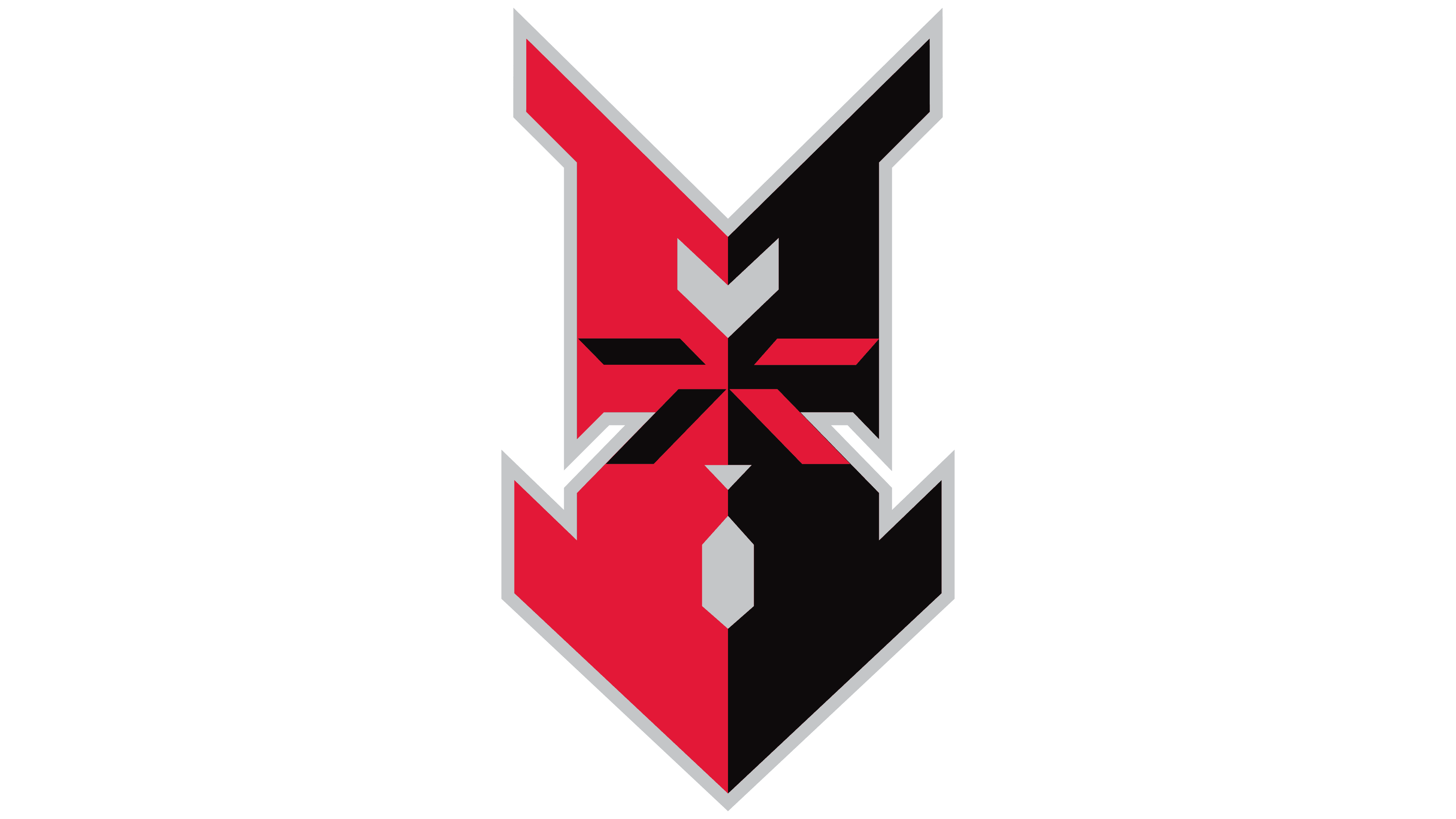
2026 – today
![]()
The Indianapolis Indians baseball club introduced a new mark that reflects its baseball history and identity dating back to 1902. The logo is designed as a circular emblem with a serrated outer edge resembling a seal. The city name and the word “Indians” are placed along the top and bottom arcs. The typeface is dense and geometric, set in uppercase sans serif letters.
On both sides of the emblem, the numbers 19 and 02 are highlighted in yellow. Together, they form the club’s founding year and serve as an additional compositional emphasis. At the center is a Gothic-style letter “I”, behind which diagonal diamond-shaped elements are visible, visually referencing a baseball field with its baselines and home plate.
The team significantly revised its visual presentation, moving away from Native American symbolism used since 1993. The primary focus has shifted to the club’s sporting heritage and its role in Indiana baseball history. In the new look, a subtle reference to Indigenous heritage appears as a ribbon with a distinctive ornament in the main version of the logo.
In addition to the primary logo, the club developed two secondary marks for its equipment. The first is an INDY monogram created in a baseball style that recalls classic forms from the early twentieth century. The second consists of a standalone Gothic letter “I”, used on team caps. The typographic approach of the new identity connects two historical traditions: early professional baseball and the style of the Fort Wayne Kekiongas, which played the first professional game in Indiana in 1871.
Font and Colors
The Indianapolis Indians’ logo color palette features red, black, silver, yellow, and white. The red, presented in a muted, restrained tone, symbolizes strength and energy tied to the club’s baseball tradition and also references Native American culture. Black serves as a contrasting accent, enhancing visual impact, and silver is used for precise outlining of elements, adding depth and a finished look to the composition. Yellow is applied sparingly, adding warmth and dynamism to the overall design. White serves as a neutral background, making the composition easier to perceive.
The logo’s font is a classic sports style, characterized by bold lettering and prominent serifs. The word “INDIANAPOLIS,” in black, is arched across the top of the composition, adding visual balance. The lower word “INDIANS,” in a deeper red, emphasizes the club’s primary name and is arranged in a semicircle, creating a harmonious contrast with the upper element. The use of serifs and slight contour softening in the lettering conveys confidence, stability, and a sense of sports tradition, reflecting the club’s long history and status.