Kenwood: Brand overview
Kenwood’s history began in 1946 when Katsumi Kasuga founded Kasuga Radio Co., Ltd. in Tokyo, Japan. Initially, the company produced radio parts and serviced radios. During Japan’s post-war rebuilding, the demand for radio equipment grew rapidly.
In 1947, the company started producing its radios. These early models were simple but reliable, quickly earning Kasuga Radio a reputation for high-quality equipment.
The company expanded rapidly in the 1950s. 1955, it released its first FM tuner, a major technological advancement. This product helped the company solidify its position in the Japanese audio market.
In 1960, the company changed its name to Trio Corporation. This change reflected its ambition to move beyond radios and diversify its product line. During the 1960s, Trio expanded internationally, shipping products to Europe and the US. With the American market in mind, the brand gained recognition among audio enthusiasts.
In 1963, Trio introduced its first transistor amplifier, another major technological leap that established the company in the hi-fi audio industry.
The product line continued to expand throughout the 1970s. The company began producing vinyl records, cassette decks, and other components for home audio systems and became well-known in the high-end audio market during this time.
The brand aggressively pursued the automotive audio industry in the 1980s. 1984, it launched several advanced products, including the world’s first CD player. This breakthrough helped solidify its position in the growing automotive audio market. In 1986, Trio officially became Kenwood Corporation, a move aimed at unifying the brand worldwide due to its growing international popularity.
Kenwood continued to innovate in the 1990s. In 1994, it introduced several new products, including the world’s first MiniDisc recorder/player for cars. The company also expanded its home theater division to meet the rising demand for multi-channel audio systems.
The 2000s saw a shift to digital technologies. In response to market changes, the company launched various digital audio products, such as MP3 players and systems compatible with digital formats.
A key event occurred in 2008 when the brand merged with JVC (Victor Company of Japan), forming JVC Kenwood Holdings (later renamed JVC Kenwood Corporation). This merger combined their resources and technological expertise, strengthening their position in the global electronics market.
After the merger, the focus shifted to core areas: consumer electronics, professional communication systems, and automotive electronics. The company prioritized the development of multimedia systems with smartphone integration and navigation features for the automotive market.
In the 2010s, it made strides in mobile device integration and wireless communication technology. The company introduced several car head units that supported Android Auto and Apple CarPlay, improving connectivity between smartphones and automotive systems.
In 2015, a new model with wireless smartphone screen projection was released, a major advancement in automotive multimedia systems. This was followed in 2018 by the launch of a multimedia system with wireless Android Auto connectivity.
In 2020, the company pushed forward in communication technology, unveiling a new line of professional radios with enhanced features and support for digital communication protocols.
By 2021, it will keep up the pace of in-vehicle electronics, launching new head units with improved screens and connectivity features. As a part of JVC Kenwood Corporation, it remained a leader in the home audio, professional communication, and automotive electronics markets.
In 2023, the brand further developed its core product lines, focusing on incorporating advanced digital technologies. It enhanced the intelligence and usability of its product interfaces to meet the growing needs of consumers in the communications and entertainment sectors.
From its humble beginnings as a small radio repair shop in Japan, the company has grown into one of the world’s leading audio and communication equipment producers. Its success comes from its dedication to innovation, high-quality products, and adaptability to market and technological changes.
Meaning and History
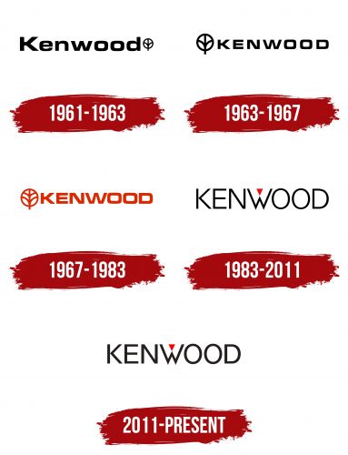
1961 – 1963
1963 – 1967
1967 – 1983
1983 – 2011
2011 – today
The Kenwood logo is sleek and stylish, perfectly fitting for a brand specializing in kitchen appliances. The focus is on the name, which dominates the entire space of the emblem. The letters are clear, smooth, and capitalized, emphasizing the brand’s reliability and authority and conveying a sense of trustworthiness.
The font is geometric and precise. The letters are simple yet confident, with a predominance of straight lines. The only exceptions are the two fully rounded “O” s and the partially rounded “D.” The rest of the letters have sharp, defined angles, creating an impression of strength and durability. This aligns with the company’s philosophy: the appliances they produce are meant to be functional and reliable.
The font color is black, adding seriousness and professionalism. Black is typically associated with solidity and stability, which aligns with the company’s long-standing reputation and respect in the market.
The red triangle above the “W” is a vibrant element that animates the logo and makes it stand out. The red triangle symbolizes dynamism and innovation, highlighting the company’s forward-thinking approach and constantly introducing new technologies.
The logo is minimalist, free from unnecessary details, and conveys the core ideas of reliability and quality. It’s an excellent example of how simplicity and strength can be combined in a single design.


