


 Keurig Logo PNG
The Keurig logo appears to be made of perfectly arranged coffee pods, creating the impression that you only need to reach out and press a button to enjoy an aromatic beverage. The emblem conveys a sense of technological perfection through its clean and sharp lines, emphasizing the brand’s modern approach. This symbol reflects high standards and underscores the company’s sustainable leadership in the U.S. market, where the brand has firmly established itself in its niche.
Keurig began in 1992, when engineer John Sylvan and Peter Dragone started developing a single-cup coffee system. Sylvan was frustrated by poor office coffee at Acuprint and wanted a machine that could brew one fresh serving at a time. After testing several methods, the founders adopted sealed pods with measured portions of ground coffee. The company secured its first patent in 1993.
The business first focused on offices. Its first commercial brewer appeared in 1998, followed by a partnership with Green Mountain Coffee Roasters in 2002. The agreement supplied pods and supported wider distribution. Keurig entered the home market in 2004, and Green Mountain acquired the company in 2006. A new brewer line followed in 2007.
Vue technology arrived in 2010, allowing users to adjust drink strength and temperature. Keurig 2.0 launched in 2014 with single-cup and carafe brewing, though its rejection of unlicensed pods drew criticism. The company entered cold beverages in 2014, but discontinued the system in 2016 after weak sales. New machines added strength control in 2017 and cappuccino and latte preparation in 2018.
JAB Holding bought Green Mountain for $13.9 billion in 2015. In 2018, the business merged with Dr Pepper Snapple Group. By 2020, Keurig remained a major home-brewer brand, while updates in 2021 and 2022 expanded drink options and product ranges. In 2023, the company continued selling brewers and pods across several price categories.
Meaning and History
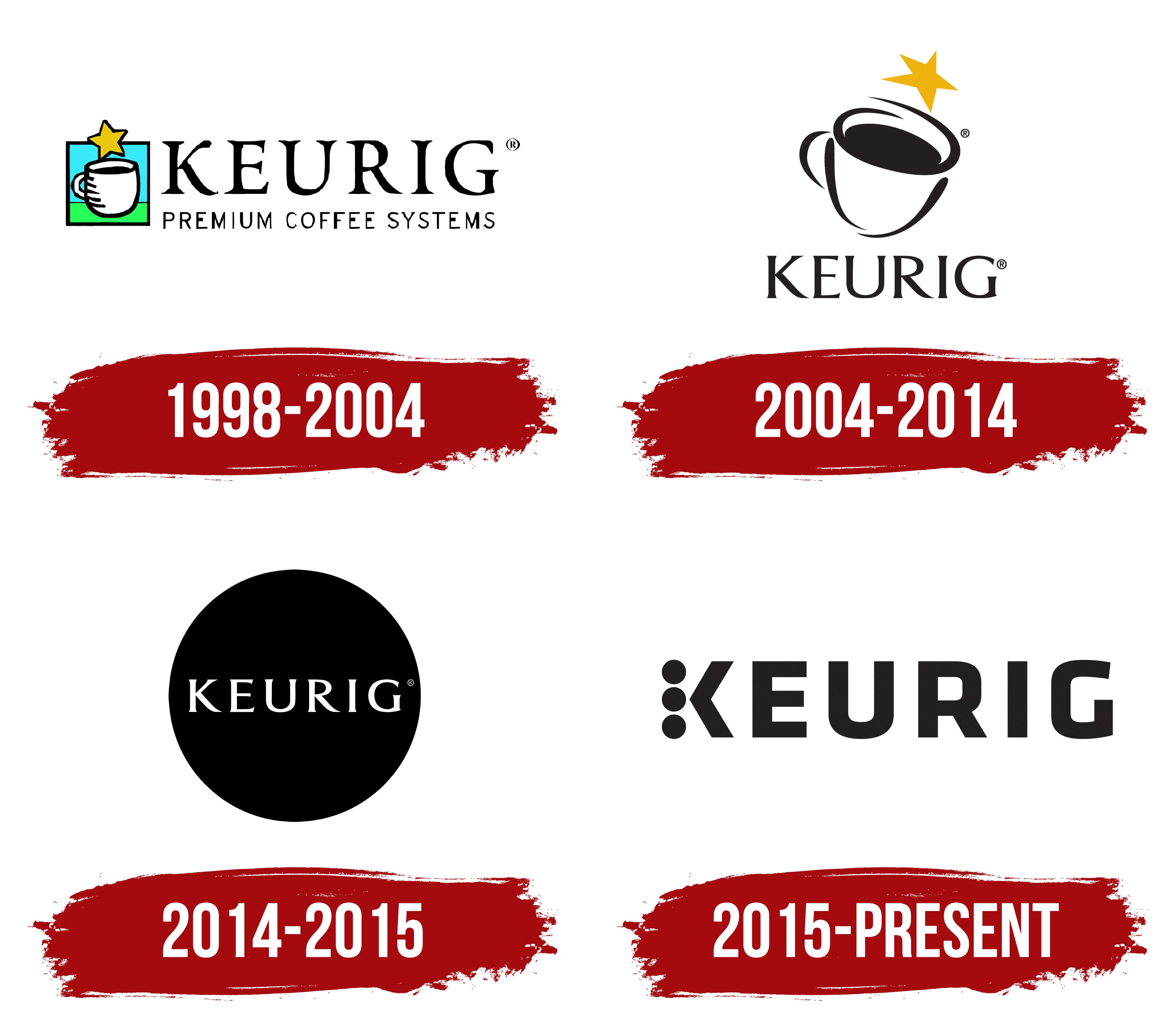
What is Keurig?
This popular brand has completely transformed how people brew and drink coffee at home and in offices. The brand has made beverage preparation easy and fast by bringing barista-style convenience to kitchen countertops worldwide with its iconic K-Cup capsules and single-serve coffee makers. In addition to coffee, the company’s brewing devices can produce tea, hot chocolate, and even cold beverages. The secret to its popularity lies in its ability to quickly and efficiently deliver reliable, easily customizable drinks, a feature that appeals to coffee enthusiasts and professionals. Through partnerships with well-known coffee shops and companies, the brand has expanded its consumer base and increased the variety of flavors and roasts.
1998 – 2004
The first emblem includes an image and text, clearly reflecting the company’s line of business. Against a blue-green background, a coffee cup is depicted. The background symbolizes natural freshness, evoking green grass and blue skies. This element emphasizes that the company’s coffee machines brew natural coffee from high-quality beans. The chosen color scheme affects the subconscious, evoking associations with purity and nature.
A star descends into the cup, symbolizing premium coffee brewed by Keurig machines. The star also points to the K-Cup Original capsules, which produce a rich, flavorful beverage. To the right of the image, the brand name is written in large letters, and below it is a product description: “Premium Coffee Systems.”
The company’s name comes from Dutch and means “neat” or “tidy.” The founder chose this word to find a term that best conveyed the idea of perfection and high product quality, aligned with the concept of “excellence.”
2004 – 2014
The 2004 emblem looks much more progressive and modern. The large coffee cup at the center of the logo resembles the Aquarius constellation in the night sky, as if ready to pour the world’s best coffee. Its tilt seems to symbolize the anticipation of the moment when the aromatic beverage is about to flow, emphasizing the product’s quality and uniqueness. The star, a symbol of perfection, further underscores the product’s premium nature.
The founder’s story, who drank up to 40 cups of coffee daily for the perfect taste, adds even more significance to the emblem. His pursuit of perfection is reflected in every detail of the logo. At the bottom of the emblem, the brand name is written in thin lines, stylistically echoing the contours of the cup, creating a unified and harmonious image.
2014 – 2015
The 2014 emblem depicts a K-Cup coffee pod, visually resembling a black circle symbolizing a top-down view of a coffee cup. This simple yet expressive image highlights the richness and strength of the beverage. Inside the circle, like the foam on the surface of freshly brewed coffee, the brand name is written in white, giving the logo a fresh and contrasting appearance. This design effectively showcases the drink’s strength and premium quality, emphasizing the excellence of every K-Cup brewed coffee.
2015 – today
The Keurig logo in the image stands out for its simplicity and thoughtful symbolism. The main focus is on the unique design of the letter “K,” which consists of three round dots. This element refers to coffee beans, highlighting the brand’s primary products: coffee and coffee machines. These dots also evoke buttons on automated coffee machines, visually reinforcing the association with modern coffee-brewing technology.
The black-and-white color palette gives the visual mark a sense of seriousness and style, but the departure from a “darker” design has made the emblem lighter and more approachable. The simplicity of the font conveys high technology, reliability, and innovation, which are the foundations of the brand’s reputation.
The company’s history is directly tied to the search for the perfect solution for fast and convenient coffee preparation. The logo’s minimalist and technical design symbolizes this rapid progress and reflects the company’s core values: convenience, quality, and modernity.
The emblem became part of the shift in coffee culture when automated coffee machines made a breakthrough in the market.