


 KPU Logo PNG
The KPU (Kwantlen Polytechnic University) logo impresses with its graphic design, unique use of geometry, and refined color palette. It represents the university’s reliability, a wide range of offered programs, and the highest level of education that students receive. This symbol brings together the key areas of work and development, as well as the educational institution’s exceptional potential. Thanks to these characteristics, the logo, created in 2008, will likely remain unchanged for many years.
This logo holds many qualities that make it truly unique. The creators chose the perfect color palette, where each shade harmonizes with the others. These colors are relevant and trendy, giving the logo a timeless quality that makes it relevant across different eras.
The three capital letters, rendered in strict black, stand against the light background. Their placement may seem simple, but it is a deliberate detail intended to demonstrate the reliability and strength of the university, founded in 1981. These letters occupy the logo’s lower part, while a symbol resembling an arrow or pointer rises above them. This burgundy element is not just decorative; it draws attention to the main text, emphasizing the importance and significance of each element in the overall composition.
Kwantlen Polytechnic University began in 1981, when Kwantlen College was created after the division of Douglas College. The new institution was designed to serve the growing population in southern Greater Vancouver, British Columbia, Canada. Its name honored the Kwantlen First Nation, connecting the college to the region’s history and culture.
The first campuses operated in Richmond and Surrey. The college offered vocational and technical programs, along with two-year transfer courses for students preparing to continue at universities. In 1990, Kwantlen opened a Langley campus, bringing higher education closer to the eastern Fraser Valley, an area with a rising population and growing demand for local study options.
A major change came in 1995, when the college became Kwantlen University College and gained the ability to offer its own bachelor’s degrees. In 2008, it received university status and became Kwantlen Polytechnic University. After that, KPU expanded its academic range with programs in design, sustainable agriculture, traditional Chinese medicine, and other applied fields.
The university opened a “Surrey City Centre” campus in 2012 and the Institute for Sustainable Horticulture and Food Security in 2013. Its first master’s program, the Master of Arts in Integrated Design, launched in 2015. Later milestones included the Wilson School of Design building in Richmond in 2018, a public safety bachelor’s program in 2019, online learning expansion in 2020, plans for an innovation and entrepreneurship center in 2021, a sustainability master’s program in 2022, and new university partnerships in Europe and Asia in 2023.
Meaning and History
What is KPU?
This polytechnic university is a multi-campus public postsecondary university in the Metro Vancouver area of British Columbia, Canada. It offers a wide range of programs covering professional and career-oriented courses and traditional academic degrees in the arts and sciences. The university offers a wide range of educational options to meet the needs of a diverse range of students and career goals, from certificates and diplomas to bachelor’s and master’s degrees. The university offers students opportunities to gain practical experience and engage in community engagement, fostering strong ties with local businesses and communities through applied learning and research.
Before 2007

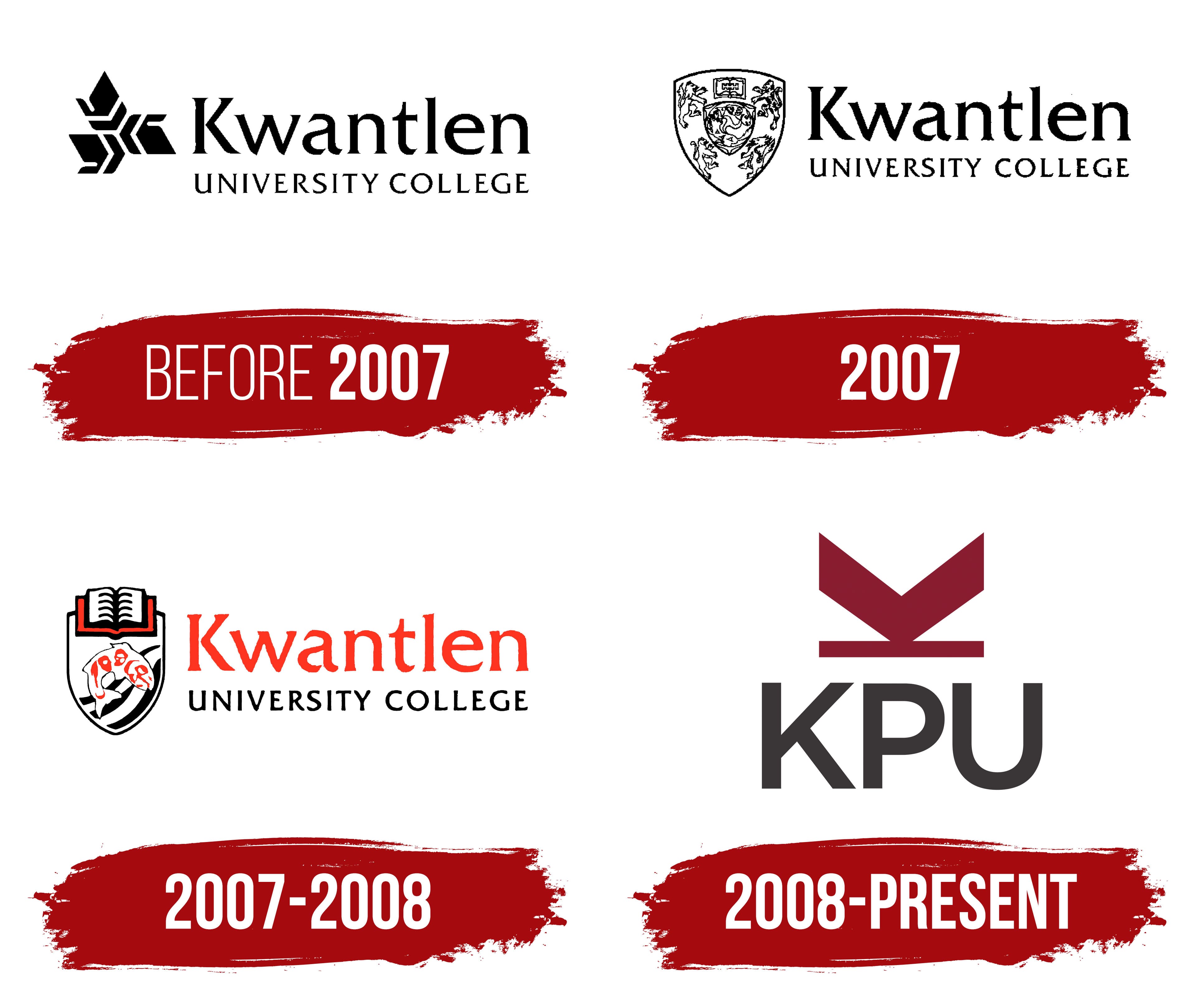
The very first logo of Kwantlen Polytechnic University is deservedly considered one of the most unusual. It fulfilled a key task representing the new university and introducing the public to its uniqueness. The emblem created at that time used various elements to increase recognition and highlight the organization’s features.
The identity of that period was characterized by strictness, with clear classical motifs present in every element. On a white background, black letters stood out, drawing attention. An additional graphic symbol placed on the left enhanced the visual effect. This symbol consisted of numerous details, giving it depth and scale. Sharp arrows from the geometric figure symbolize the wide range of programs KPU offers.
The name of the university was presented in three separate words. The first word, “Kwantlen,” was elevated above the other two, “University” and “COLLEGE,” which were positioned lower. The fonts were chosen differently to enhance visual contrast. The word “Kwantlen” appeared larger and more significant due to its height and width, while “University” and “COLLEGE” seemed more restrained but no less important in the overall composition.
2007

In 2007, the Kwantlen Polytechnic University logo retained its textual content but gained a new form and style. The fonts changed, becoming even more expressive and attention-grabbing. All three words of the logo were written in uppercase letters, giving them visual significance. As before, “Kwantlen” stood out for its larger size, while the other two words were placed on the lower row, receding into the background.
A significant update also affected the graphic element. Instead of the previous symbol, a shield appeared, looking much more impressive. This shield became the focal point, inside which many symbols and images could be found. The four animals on the shield symbolized the spirit’s strength, while the inner shield at its center represented the power and importance of knowledge. These elements emphasized the university’s mission and commitment to high educational standards.
2007 – 2008

The logo, introduced in late 2007, embodied modernity and became a memorable university symbol. It maintained continuity with previous versions but gained brightness and shine, reflecting the trends of its time. The color palette became richer, adding more shades and giving the logo depth and vibrancy. The identity remained recognizable while being refined, with attention to detail.
The new logo’s main focus was a shield featuring a fish and waves inside its borders. The symbol of a book, extending beyond the shield’s lines, represented the immortality of knowledge and its eternal significance. As a source of wisdom and understanding of life, the book became the central element, erasing temporal boundaries and emphasizing the importance of education.
The university’s name was again presented in two rows, positioned to the right of the shield. Most attention was drawn to the word “Kwantlen,” highlighted in bright red. The other two words remained black, but the font changed, giving the logo dynamism and visual movement. This effect emphasized the energy and drive for growth that the university embodies.
2008 – today
In 2008, minimalism and tradition became the key themes in the stylization of Kwantlen Polytechnic University’s identity. The logo gained simplicity and a classic color scheme, emphasizing sophistication and modernity. Only three colors were chosen to create this symbol, while the white background was retained as a tribute to the first logo. The black color is now slightly lighter and fades into a gray gradient, giving the logo a softer and more elegant appearance.
This time, the text was completely removed, and only the three letters KPU took the forefront, rendered in a beautiful, restrained format. The shield, which previously held the central position, was removed, and in its place, a complex graphic element appeared at the top of the logo. This element evokes associations with an arrow, symbolizing direction and purpose, and with a bird, representing freedom and the pursuit of knowledge. Some also suggest that this symbol might be a stylized inverted letter “K,” representing the first letter of “Kwantlen.”
The logo’s versatility and visual richness became key advantages of Kwantlen Polytechnic University’s new identity, reflecting the depth and significance of the brand.