


 Kurt Geiger Logo PNG
The Kurt Geiger logo is a model of refined elegance and modern design. The emblem showcases the breadth of creativity in creating new styles. The brand’s shoes are comfortable and designed with soft materials and stylish accessories to ensure comfort.
Kurt Geiger began in London in 1963, when Austrian designer Kurt Geiger opened his first shoe store on Bond Street and named the brand after himself. The shop focused on stylish footwear crafted from premium materials, helping it stand out in the city’s fashion retail scene.
In the 1970s, the company expanded across London and entered leading department stores, including Selfridges and Harrods. During the 1980s, it opened stores in other major UK cities and added a men’s line to its women’s footwear business. In 1991, House of Fraser acquired the brand, giving it stronger resources for growth.
In the 2000s, Kurt Geiger strengthened its position in British footwear with new lines such as KG, aimed at a younger and more affordable segment, and Carvela, focused on women’s shoes and accessories. International expansion began in 2005 with stores outside the UK, including France and Ireland. Graphite Capital bought the business in 2008, followed by Jones Group in 2011 and Sycamore Partners in 2014.
From 2015 onward, the company expanded its range to include bags, accessories, and later clothing. It marked its 55th anniversary in 2017 with a collection inspired by vintage models, then expanded in Asia and the Middle East in 2018. In 2020, it improved e-commerce and digital customer tools. In 2021, it introduced recycled-material footwear and accessories. The 60th anniversary collection followed in 2022, along with charity initiatives. In 2023, the brand opened more stores in China and Japan and launched its first full jewelry line.
Meaning and History
What is Kurt Geiger?
It is a renowned British luxury footwear and accessories brand headquartered in London. Founded by Kurt Geiger, the company has established itself as a leading name in the fashion industry and is known for its stylish and designer products. The company offers a wide range of products, including shoes, bags, and accessories for men and women, catering to various tastes, from classic elegance to contemporary chic. The brand is known for its high-quality craftsmanship, attention to detail, and use of quality materials. The company has expanded its presence outside the UK, opening stores and concessions in major cities worldwide and having a strong online presence. It continues to evolve, creating new collections with current global fashion trends.
Before 2011
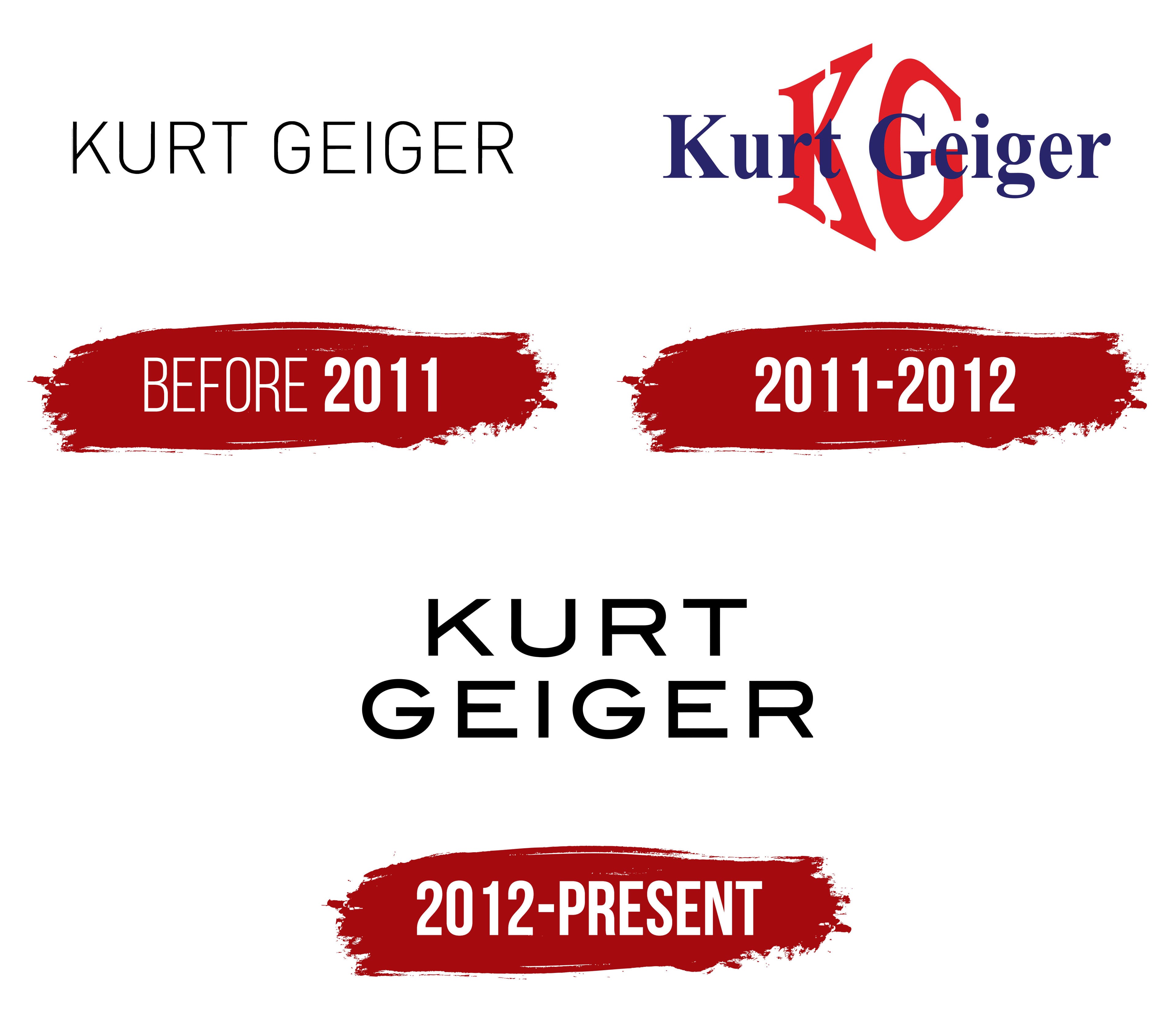
The first Kurt Geiger logo appears very thin. The glyph of each letter is barely visible against the white background. The emblem signifies the beginning of the brand’s journey and the desire to enhance the overall look without disrupting the style. The lines convey the immense lightness and weightlessness of the shoes, which are barely felt on the feet. The name was chosen after the Austrian designer-founder.
2011 – 2012
Changes to the emblem’s design marked the brand’s transition to management by its American owner, The Jones Group. The confident dark-blue serif font conveyed the manufacturer’s experience and professionalism. The capitalized first letters emphasized the real person behind the company’s founding, highlighting a personalized and customer-oriented approach.
In the background, the name’s initial letters are enlarged towards the center of the image. This design forms a rounded structure, indicating the harmony and comfort of the brand’s products. The bright red color signifies popularity and leadership among luxury brands.
The blue and red shades hint at the United Kingdom, the company’s origin.
2012 – today
The brand has established itself as a manufacturer of high-quality footwear and accessories. Its initial logo was more massive, but over time, the emblem’s design evolved toward minimalism and elegance, as reflected in its modern glyphs. This change is associated with the brand’s growing popularity and desire to align with current fashion trends.
The Kurt Geiger emblem consists of two lines featuring the uppercase letters of the brand’s name. The inscription is executed in strict and clear lines, emphasizing the premium nature of the brand’s products.
The emblem’s symbolism lies in its simplicity and elegance. Thin lines and increased spacing between letters create a sense of lightness and grace, evoking the brand’s exquisite footwear and accessories. The logo’s glyphs, reminiscent of high-heeled stiletto shoes, symbolize femininity and refinement.
The emblem conveys the brand’s core message of high quality and comfort in footwear. The clear and stable lines of the letters symbolize the products’ durability, reliability, and attractive appearance.
The font’s minimalism and strict geometry characterize it. It consists of thin, dense lines that give the letters a sense of solidity and stability. This style reflects the brand’s high standards regarding product quality and design.
The emblem is black, symbolizing elegance, strength, and luxury. The black color also underscores the brand’s versatility and classic style.