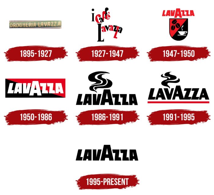
Buyers of the product can only exclaim in admiration. As the logo of Lavazza shows, the product retains rich aromas and unique taste regardless of the processing method. Therefore, the coffee is of the best quality.
Lavazza: Brand overview
| Founded: | 1895 |
| Founder: | Luigi Lavazza |
| Headquarters: | Turin, Italy |
| Website: | lavazza.com |
Meaning and History
A wide variety of logos is due to the sharp leaps in the development of Luigi Lavazza SpA. Each new milestone in the company’s history marked the renewal of the visual identity. This was partly due to marketing needs because there was a period when coffee was sold only by weight. The manufacturer had to print his logo on separate cards issued to each customer to make the “impersonal” product recognizable.
It was once the backbone of Lavazza’s advertising strategy, as the name of the coffee bean roaster was often hushed up. It did not matter since the sellers in the stores transferred loose coffee from one common container to regular bags and gave it to the final consumer in this form. In an effort to innovate, the company moved to the manufacture of pre-packaged products. Her vacuum packaging helped her break away from the competition because such coffee could be put on the shelf in any store, not just in the one where special conditions were created for its storage.
The use of packaging allowed the manufacturer to abandon promotional cards and place their logo directly on the product itself. From that moment, the history of the development of the Lavazza identity began. However, the word mark never changed significantly – the designers only added additional decorative elements to it and slightly modified the proportions of the letters.
1895 – 1927
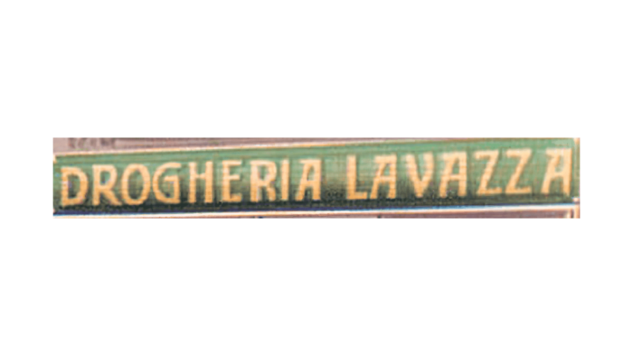
In 1895, Italian businessman Luigi Lavazza bought a small shop where he began selling hundreds of different products, including coffee. According to his recipes, he experimented with the degree of roasting of grains and mixed varieties. As far as is known, the sign of his outlet contained the inscription “DROGHERIA LAVAZZA” in a custom font. The golden letters stood out against the background of the green rectangle.
1927 – 1947
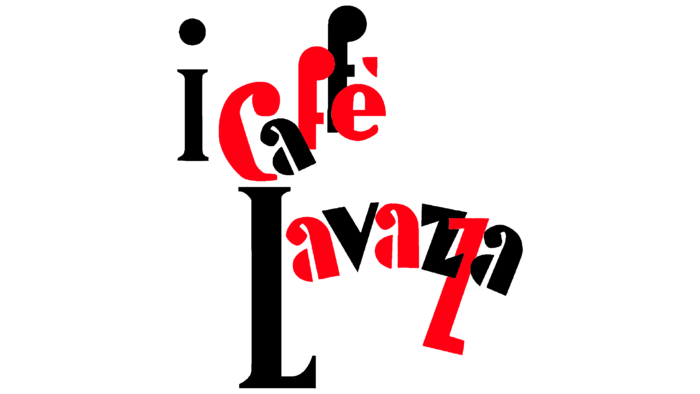
In 1927 Luigi Lavazza SpA was registered. At the same time, the grocery store, which became a company, had its first brand: “i caffé Lavazza.” Its name was featured on parchment packages used to preserve the flavor of the beans. The inscription was made in the avant-garde style: the letters ran over one another, and the words, arranged in two lines, bizarrely curved. At the same time, red and black symbols alternated between making the emblem look brighter.
1947 – 1950
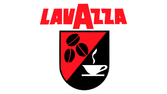
Immediately after the war, Lavazza acquired, in fact, its debut corporate logo. The then owner of the enterprise ordered its development from the Milanese designer Aerostudio Borghi. This is how the unusual inscription “LAVAZZA” appeared, where the middle “A” was enlarged and served as a kind of magnet: letters located on both sides leaned towards it. In the official version, the wordmark was red. A rectangular shield complemented it with a round base, divided diagonally into two parts. The top half, dyed red, contained three black coffee beans. The underside of the shield was black, and on it was a white cup with steam rising up.
At first, the logo was printed only on promotional cards distributed to customers since coffee was sold in bulk. In 1949, the graphic symbol began to be used on cans because Lavazza patented a new way of packaging the product under pressure and began to package ground grains during production.
1950 – 1986
In 1950, from all logo versions, the company chose the white inscription “LAVAZZA” inside a red and black rectangle divided diagonally into two multi-colored triangles. This design was seen before, but it became widespread in the middle of the 20th century: the graphic composition was found both on signs and vacuum packaging because it was easy to reproduce.
1986 – 1991
In 1986, a new milestone in the history of Lavazza began. In order to strengthen brand recognition in European markets, the company commissioned the development of a new logo from Maurizio Di Robilant. Design expert and founder of Robilant Associati has reimagined the wordmark. He kept the stylized inscription but added a cloud of steam above the third letter (“V”) as if alluding to a cup of hot coffee. All elements were black, and there was no permanent background. This emblem was used internationally, where Lavazza was positioned as the guardian of Italian traditions.
1991 – 1995
In the early 1990s, Maurizio Di Robilant has optimized the logo by slightly changing the lettering style. In the new version, all letters were straight – only the “L” had the slope. In addition, the designer modified the font with strokes of different widths and added a red underline below the word.
1995 – today
Emilio Lavazza, the fourth generation of Italian businessmen, asked his friend Armando Testa to update the logo of the coffee brand. In 1994 (according to another version – in 1995), Studio Armando introduced a wordmark without horizontal underlining and curly steam. The developer returned the characteristic slope of the letters so that they “pull” to the middle “A” and restored the typeface from 1986. This version of the design is used in Italy and abroad.
Font and Colors
The stylized inscription “LAVAZZA” has never changed, except for small experiments with the font’s shape. Throughout history, the middle “A” has remained almost one and a half times higher than the rest of the letters, which is the original idea of Aerostudio Borghi. In recent years, designers have only removed and added additional elements – first of all, wriggling lines that imitate steam over a hot mug of coffee. It was a hint at the exceptional flavor of the blended drink.
The inscription on the Lavazza logo is in capital bold sans-serif letters. The company uses a custom typeface developed from a post-war wordmark that Aerostudio Borghi came up with within the mid-1940s. The design of the inscription is traditional: the first “L,” “A” and “V” slope to the right, the middle “A” is flat (and enlarged), and the last “Z,” “Z” and “A” slope to the left.
The current version is completely black. This is one of the colors of the original emblem created in 1927 for “i caffé Lavazza.” The second color – white – is used as a background. But red, presented before 1995 in the form of a horizontal line, has not reached our time.
Lavazza color codes
| Black | Hex color: | #000000 |
|---|---|---|
| RGB: | 0 0 0 | |
| CMYK: | 0 0 0 100 | |
| Pantone: | PMS Process Black C |

