The brand’s cars are like pioneers, illuminating their way with headlights. The Lincoln logo exudes innovation and leadership. The emblem marked the creation of a new manufacturer with a great future.
Lincoln: Brand overview
Meaning and History
Lincoln cars have always been driven by members of the upper class of society, including prominent US statesmen. First, this concerns limousines, which have become the main means of transportation for the elite. The company’s logo is still considered a symbol of prestige, power, and wealth. It took on a modern form after another Ford division, Continental, was integrated into the Lincoln brand. Despite the evolution, the design remains recognizable thanks to the cruciform elements.
What is Lincoln?
This is a series of luxury cars owned by Ford. It was founded by the inventor Henry Martyn Leland.
1917 – 1922
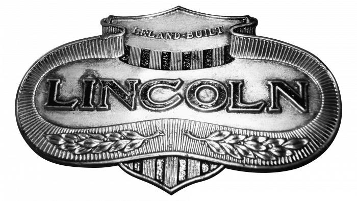
One of the first logos was stylized to resemble the White House facade, as evidenced by a triangular roof and columns. Above was the inscription “LELAND-BUILT,” and inside an uneven oval was the name of the trademark in the center. Along the edge was a ribbon with a striped pattern with many parallel lines.
The bottom was decorated with two olive branches – a symbol of peace. This refers to the Great Seal of the United States because the bald eagle also has an olive branch on its face. The designers tried to connect the Lincoln brand identity with a real politician.
1922 – 1939
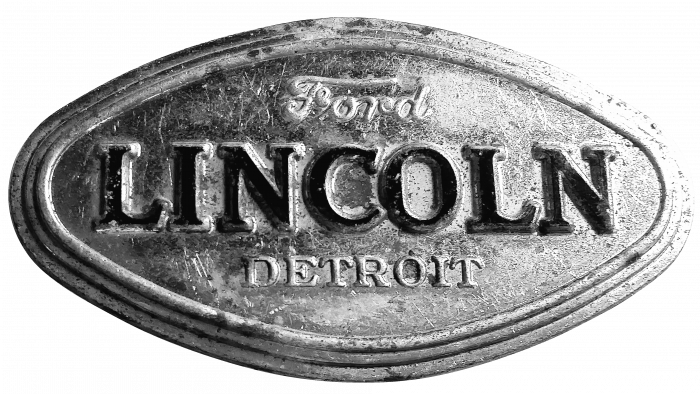
In 1922, Lincoln became one of the Ford divisions. To indicate this, the parent company’s name appeared on the logo. It was written inside an ellipse using a handwritten font. The luxury brand’s name was in the middle, and at the bottom was the word “DETROIT” (the city where the automaker’s plant was based). The patriotic motives disappeared as the new owner radically changed the brand’s image.
1939 – 1954
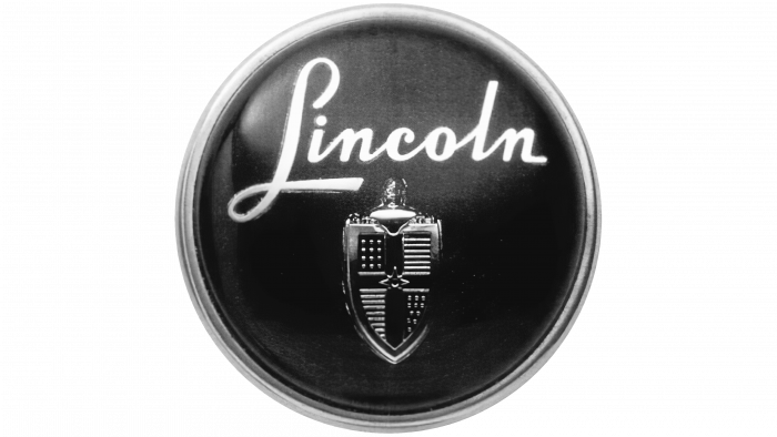
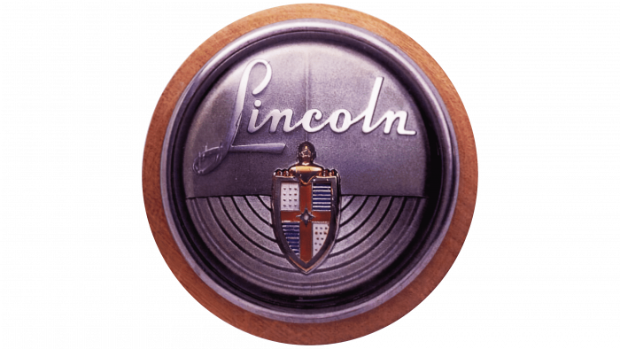
The emblem turned black and round. Of all the inscriptions, only the name Lincoln remained. The developers made it white and chose a different font – with an imitation of calligraphic handwriting. A triangular shield was depicted in the lower half, divided into four parts by two intersecting lines.
1954 – 1964
In 1954, the color scheme changed. The circle has a brown ring frame, while the inner part has acquired a silvery hue. In addition, the designers painted the shield: the cross turned red, and the horizontal lines inside the two segments were repainted blue.
1964 – 1972
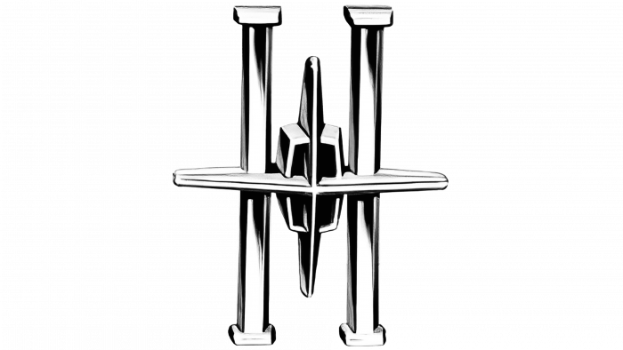
The Lincoln and Continental divisions needed a new brand name when they merged. The developers have adapted the Continental emblem (four-pointed star) by placing it inside the silver letter “H.” The image was three-dimensional and stylized as a figure on the radiator grille.
1972 – 2012
In 1972, the logo became two-part. At the top was a cross that crossed the rectangular frame at four points. At the bottom was the word LINCOLN — strict, black, and sans serif. All letters had the same line width. Another version of the logo used the same lettering but with a three-dimensional silver badge.
2012 – today
The designers have shortened the cross to fit perfectly into a rectangular frame with rounded edges. The graphic is on the left and separated by a thin vertical line from the phrase “THE LINCOLN MOTOR COMPANY.” The company name is split into two lines.
Lincoln: Interesting Facts
Lincoln, a luxury car brand that Ford owns, has a rich history dating back to the early 20th century.
- Start: Lincoln was created in 1917 by Henry M. Leland and his son, Wilfred. They named it after Abraham Lincoln, whom Henry admired a lot.
- Joining Ford: In 1922, Ford bought Lincoln during tough times for the company. Under Ford, Lincoln became its luxury division and took on other high-end car brands.
- The Lincoln Zephyr: Launched in 1936, the Zephyr was a hit for Lincoln. It was stylish and had a powerful V12 engine, mixing luxury with performance.
- Lincoln Continental: First seen in 1939, the Continental symbolized American luxury. It was made for Edsel Ford and is known for its elegant design.
- Presidential Rides: Lincoln was the choice for U.S. presidents, including the 1961 Continental Convertible, which President John F. Kennedy used when he was assassinated. This connection has helped Lincoln’s luxury image.
- Innovations: Lincoln has been ahead in adding comforts and safety features, like power windows in the 1940s, keyless entry, and adaptive headlights.
- The Navigator: Released in 1997, the Navigator set the standard for luxury SUVs, combining space with Lincoln’s luxury traits.
- New Directions: In the 2010s, Lincoln refreshed its brand, focusing on modern luxury and bringing back classic names like the Continental.
- Customer Experience: Lincoln aims to offer cars and a unique luxury experience with services like the Lincoln Concierge and Lincoln Black Label membership.
- Going Electric: Lincoln is moving towards electric cars, planning to introduce hybrids and electric models, showing its commitment to innovation and eco-friendly luxury.
Lincoln’s story is about blending classic luxury with modern tech, ensuring it stays relevant and appealing in today’s car market.
Font and Colors
There is a lot of controversy over the meaning of the Lincoln logo. Some are convinced that this is a compass that points in four directions. In this case, it should symbolize the company’s expansion and desire to sell cars worldwide. According to another version, the cross is a four-pointed star taken from the Continental brand after the merger of the two divisions. Then, he personifies prestige, luxury, comfort, and elegance in every detail. Another theory is that the cross was borrowed from the shield adorned by the 1950s Lincoln badge.
The thin, crisp, and neat font on the car brand’s logo is called Couture. At least he looks a lot like him. This is a development of the typographer Chase Babb. The color scheme is limited to black and white, making the brand stylish.
FAQ
Who made Lincoln cars?
Ford Motor Company, a major American automaker, manufactures Lincoln cars. Initially, the brand produced aircraft engines during the First World War and luxury cars after the war. The Lelands only ran the brand for a short time. Facing financial problems, they sold it to Ford in 1922. Henry Ford used this opportunity to enter the luxury car market, allowing his company to develop more sophisticated cars.
Is Lincoln a luxury car?
Ford Motor Company’s luxury division is known for its upscale cars and SUVs, which offer high quality, comfort, and advanced technology. Ford acquired the company in 1922, and the brand has become a key player in the luxury car market.
The brand is famous for its elegant and stylish cars, such as the Navigator and Nautilus. These models appeal to those who want a premium driving experience that combines great looks and performance. The company keeps pace with the market by constantly updating its models to meet customer expectations in the luxury car market.
What does the Lincoln logo mean?
The logo, called the Continental star, reflects the brand’s rich history, especially after the merger with the Continental division. This emblem represents the luxury and grandeur typical of Lincoln automobiles. The star symbolizes the excellence and high-quality workmanship the company strives to incorporate into every vehicle it produces. This positions the brand at the top of the luxury market, attracting customers seeking comfort, style, and cutting-edge technology.
What kind of cars does Lincoln make?
The company offers many luxury cars to suit different needs and preferences. The brand’s lineup includes compact and mid-size crossovers and full-size SUVs.
Compact and mid-size crossovers are great for those who want a vehicle that’s as easy to drive as a small car but still offers the space and versatility of an SUV. Lincoln’s full-size SUVs are designed for those who need more space and power. These larger vehicles have a spacious interior, making them ideal for families or individuals who travel frequently or need to carry a lot of cargo.
Is Lincoln a Ford car?
Ford’s luxury automobile division, Lincoln, specializes in creating high-end vehicles that showcase sophisticated design and advanced technology. Lincoln receives strong research, development, and technology support as part of Ford. This helps the brand meet the expectations of luxury buyers and maintain its reputation for quality and luxury in the competitive automotive industry.
What color is the Lincoln logo?
The logo features a gradient silver color that gives it an elegant and modern look, reflecting the brand’s luxury and advanced technology. The gradient adds depth, making the logo more dynamic and refined. In addition to the star, the text mark is usually black, which increases readability and provides a classic contrast with the silver. This black and silver combination symbolizes high quality and luxury, confirming the company’s reputation as a leading luxury automotive brand.

