


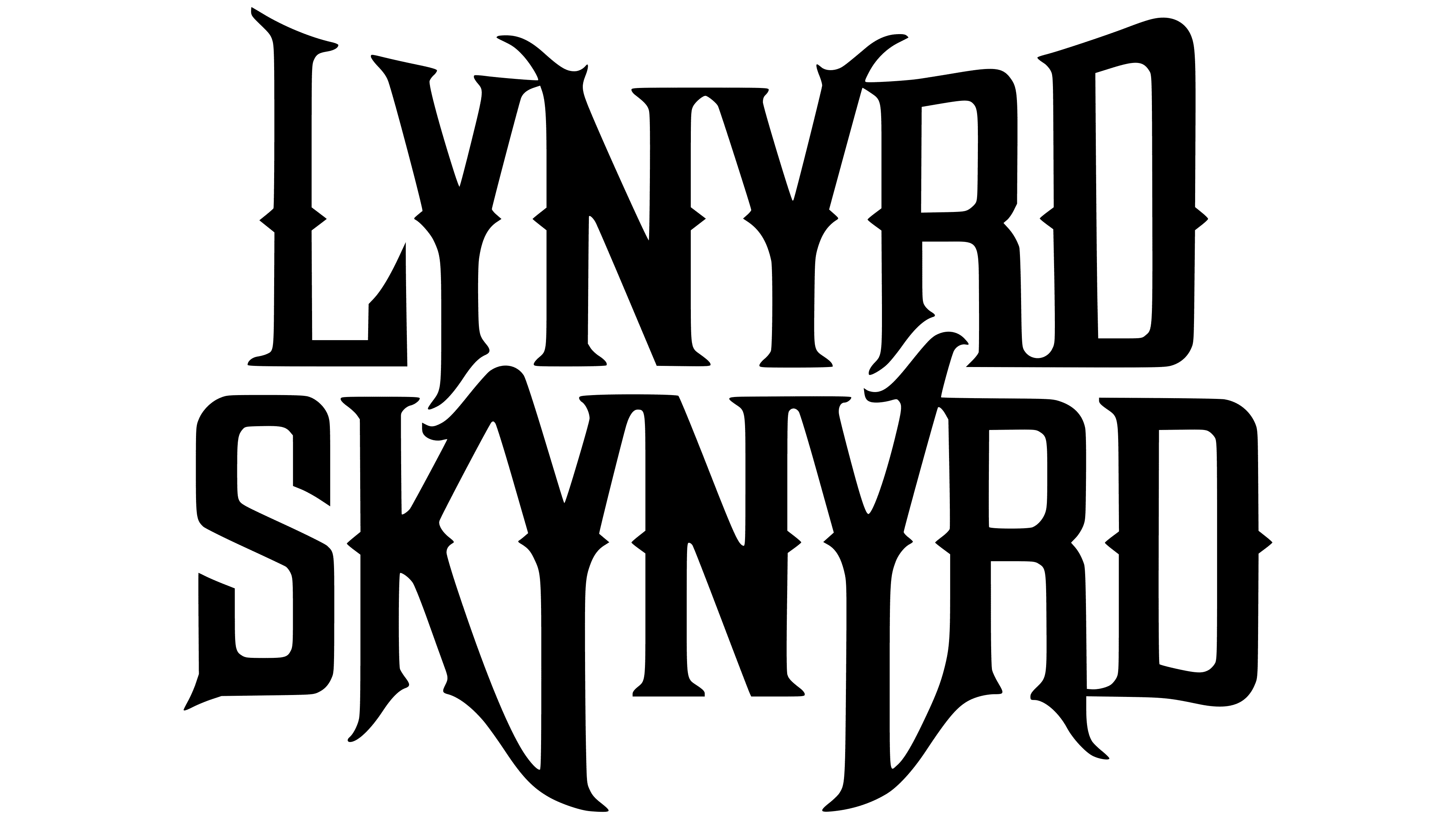
 Lynyrd Skynyrd Logo PNG
The Lynyrd Skynyrd logo visually reflects the musical style and identity of the southern rock band. It highlights the group’s recognition and its significance in the history of American music.
Lynyrd Skynyrd began in Jacksonville, Florida, in 1964, when teenagers Ronnie Van Zant, Bob Burns, and Gary Rossington formed a band first called My Backyard, then The One Percent. In 1969, they adopted their final name as a mocking reference to schoolteacher Leonard Skinner, known for punishing students with long hair.
The group blended blues, rock and roll, and country into a harder form of southern rock. Critics often compared them to The Allman Brothers Band. However, their music relied less on jazz improvisation and more on direct guitar-driven songs. Their 1973 debut, Pronounced ‘Lĕh-‘nérd ‘Skin-‘nérd, included Free Bird. Second Helping followed in 1974 and featured Sweet Home Alabama, written partly in response to Neil Young’s criticism of the South. Mid-1970s touring expanded their audience in the United States and Europe.
On October 20, 1977, the band’s plane crashed in Mississippi while flying from Greenville to Baton Rouge. Ronnie Van Zant, Steve Gaines, Cassie Gaines, and several others were killed. The surviving members suffered injuries, and the group stopped working for a decade.
Lynyrd Skynyrd reunited in 1987 with Johnny Van Zant, Ronnie’s younger brother, as lead singer. The band continued touring and recording despite repeated lineup changes. The Rock and Roll Hall of Fame inducted it in 2006. Founding guitarist Gary Rossington, a survivor of the 1977 crash, died in March 2023; the remaining musicians continued under the same name.
Meaning and History

What is Lynyrd Skynyrd?
It is a legendary American rock band known as a musical icon of the American South. The band’s style features vibrant guitar parts, long solos, and powerful choruses. A distinctive element is the interaction of three guitarists. The band’s initial career ended tragically in a plane crash that killed several members, but years later, the group reformed and resumed performing.
1964 – today

The first official Lynyrd Skynyrd logo has remained a constant part of the band’s brand and continues to be used without changes to this day. Since its first appearance on album covers, stage banners, merchandise, and promotional materials, the lettering has been a vital carrier of the group’s identity, reflecting the style of Southern rock and the lifestyle of the American South.
The band’s name is split into two lines: “LYNYRD” is placed above “SKYNYRD,” forming a visually balanced block with mirrored symmetry in certain letter elements. The typeface is based on Gothic typography, reinterpreted in a modern, dynamic form. The lettering is defined by heavy, solid strokes, minimal spacing between letters, and elongated, slightly pointed ends that resemble Gothic spires or peaks. There is no excessive ornamentation or unnecessary detailing; the focus is on proportion and the expressiveness of the letterforms.
The choice of typeface symbolically conveys the atmosphere of the band’s musical style, capturing the hardness and drive of rock music, the spirit of freedom, and the boldness of southern culture. The elongated verticals and pointed strokes metaphorically reflect the sharp, uncompromising character of the group’s sound, its energy, and directness. The letter construction evokes the feel of sharp guitar riffs, amplifying the emotional impact and associations with the band’s music.
The name “Lynyrd Skynyrd” in the logo carries a historical subtext, a satirical reference to Leonard Skinner, a high school gym teacher who prohibited students from wearing their hair long. This detail underscores the group’s bohemian and rebellious image, as well as its ironic approach to self-identity, adding symbolic depth through the embedded typography.
The monochrome black lettering was chosen for maximum visual contrast and versatility on any surface or medium, ensuring instant recognition of the logo. The structural and visual consistency of the lettering reflects confidence in style, culture, and musical heritage, creating a connection across generations of the band’s fans.
The Lynyrd Skynyrd lettering is regarded as an iconic attribute of rock culture, serving as a recognizable symbol of the band and the southern rock movement for over half a century.
Font and Colors
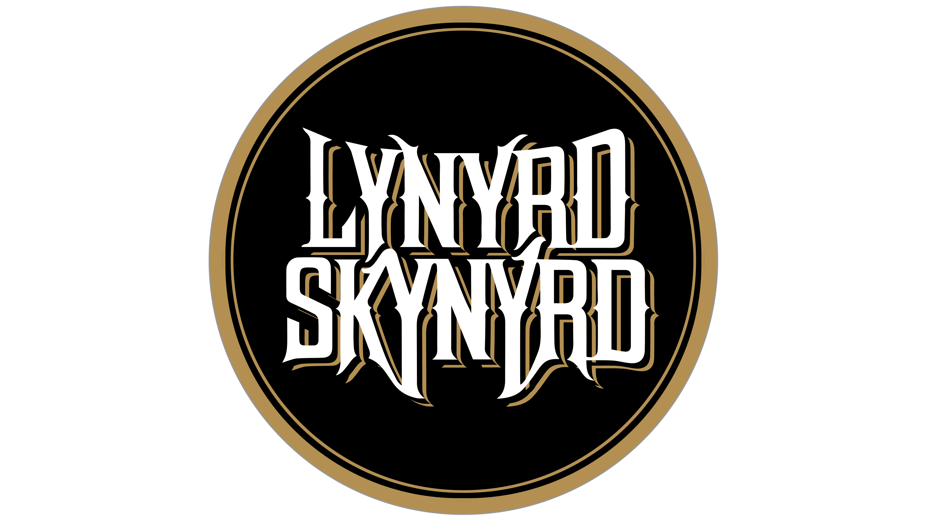
The typographic portion of the Lynyrd Skynyrd logo features custom lettering inspired by a reinterpretation of traditional Gothic typography. The letters are formed with dense, heavy strokes that have a noticeable calligraphic base, and their shapes feature sharp-angled serifs and elongated terminals. The distinct glyph design, abrupt transitions between stroke weights, and absence of standard rounded elements create an atmosphere of sharpness and expressiveness, visually conveying the rebellious and determined spirit of rock culture associated with the band.
A unique feature of this typeface is its ability to evoke the aesthetics of classic rock and vintage concert posters: the sharp angles of the letters resemble elements of cold steel or metal fragments, symbolically reflecting the hardness and power of the band’s sound. The minimal letter spacing enhances the impression of unity in composition and visual density.
The choice of black on a contrasting background is driven by the need to express the maximum emotional intensity and dramatic quality of the image. Black symbolizes rebellion, raw energy, and the emotional depth of the band’s lyrics, referencing themes of freedom, personal experience, and protest that are central to Lynyrd Skynyrd’s work. The use of a monochrome palette allows the logo to be perceived both as a classic emblem and as a modern symbol, free from association with a specific era.