


 Mango Logo PNG
The Mango logo is a commercial symbol with distinctive characteristics. It is easily memorable and recognizable, highlighting its individuality, just like each product from this brand.
The brand’s emblem holds a wealth of valuable information. Its identity is designed for its audience and its vast and diverse product range. Since its founding, the Spanish company has remained true to its goals and values. By offering designer items for children, women, and men, the brand has managed to resonate with every customer. This emotional connection is also present when modern buyers see the stylish logo. Memories of their favorite purchases and a desire to explore new collections come to mind.
The visual symbol itself looks impressive and stands out for its originality. Its monochrome palette enhances the brand’s status, while the clear and expressive presentation of the name creates a distinctive visual effect, evoking exclusively positive emotions and leaving a strong impression.
Mango was founded in Barcelona in 1984 by brothers Isak and Nahman Andic, who opened their first womenswear shop on Passeig de Gràcia. By 1985, four more stores were operating in the city, and the business adopted the Mango name because it was easy to pronounce across languages. Expansion beyond Barcelona began in 1988 with stores in Valencia.
International growth started in 1992 with openings in Portugal and France. Franchising supported faster entry into other European markets, while a company website appeared in 1995. Mango entered Asia in 2000 through Singapore, then expanded into China, Japan and nearby markets. Menswear launched in 2002 under HE, later renamed Mango Man.
Online retail began in 2006. Accessories followed in 2008, childrenswear in 2010, sportswear and lingerie in 2011, and a plus-size collection in 2013. A broader children’s line for ages 3 to 14 arrived in 2014. By its 30th anniversary in 2015, the company operated more than 2,700 stores in 109 countries. Investment in logistics during 2016 and 2017 included a large distribution center in Barcelona.
A collection using lower-impact materials appeared in 2018. During 2019 and 2020, Mango invested in omnichannel sales, its website and mobile app. From 2021 to 2022, it strengthened online operations, adjusted the store network and added new product lines and collaborations. By 2023, the business still operated through stores, franchises and e-commerce across international markets.
Meaning and History
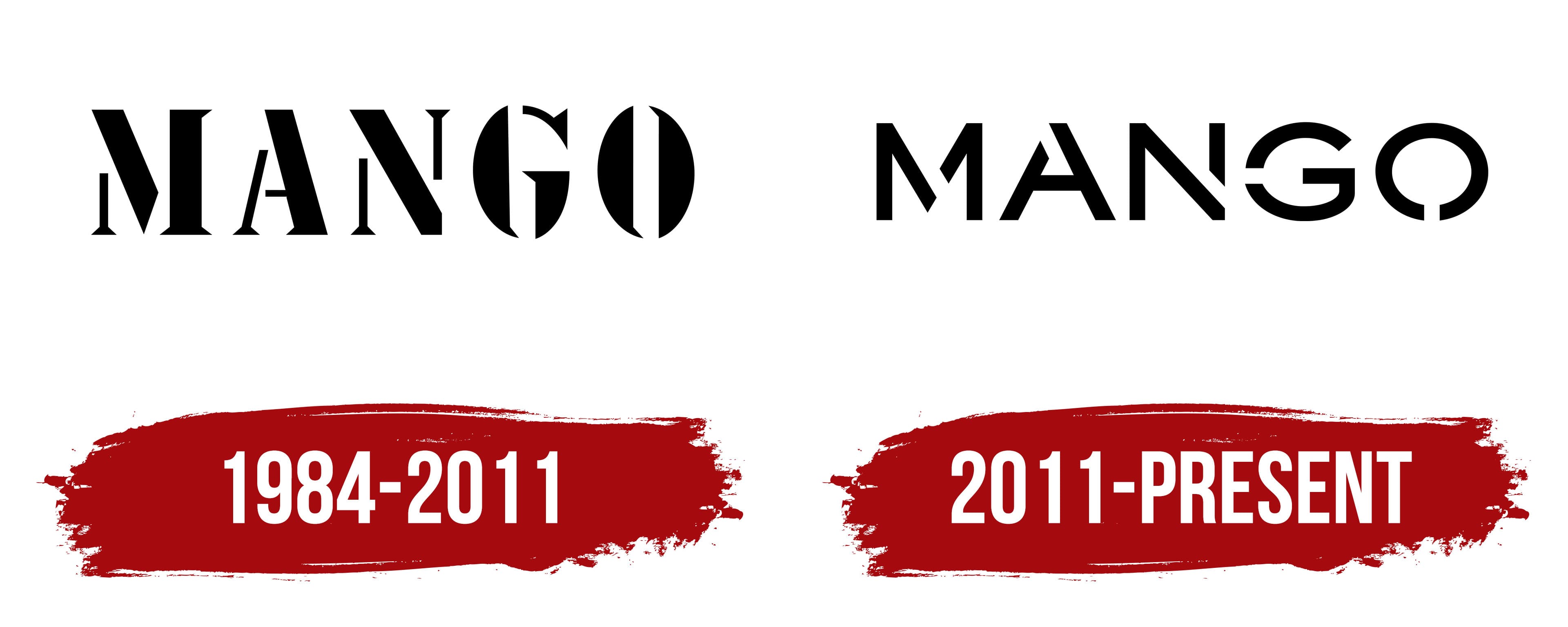
What is Mango?
This Spanish fashion giant in the fast fashion industry skillfully combines Mediterranean style with international trends. The brand is known for its elegant, versatile clothing and accessories, attracting customers who value style but have a limited budget. The collections offer an easy way to refresh wardrobes by combining classic elements with trendy new items. The clothing is characterized by clean lines, simplicity, and European sophistication, appealing to a range of age groups and styles. The brand has expanded its range beyond women’s clothing, adding men’s items, children’s products, and plus-size collections, making it a one-stop shop for many families.
1984 – 2011
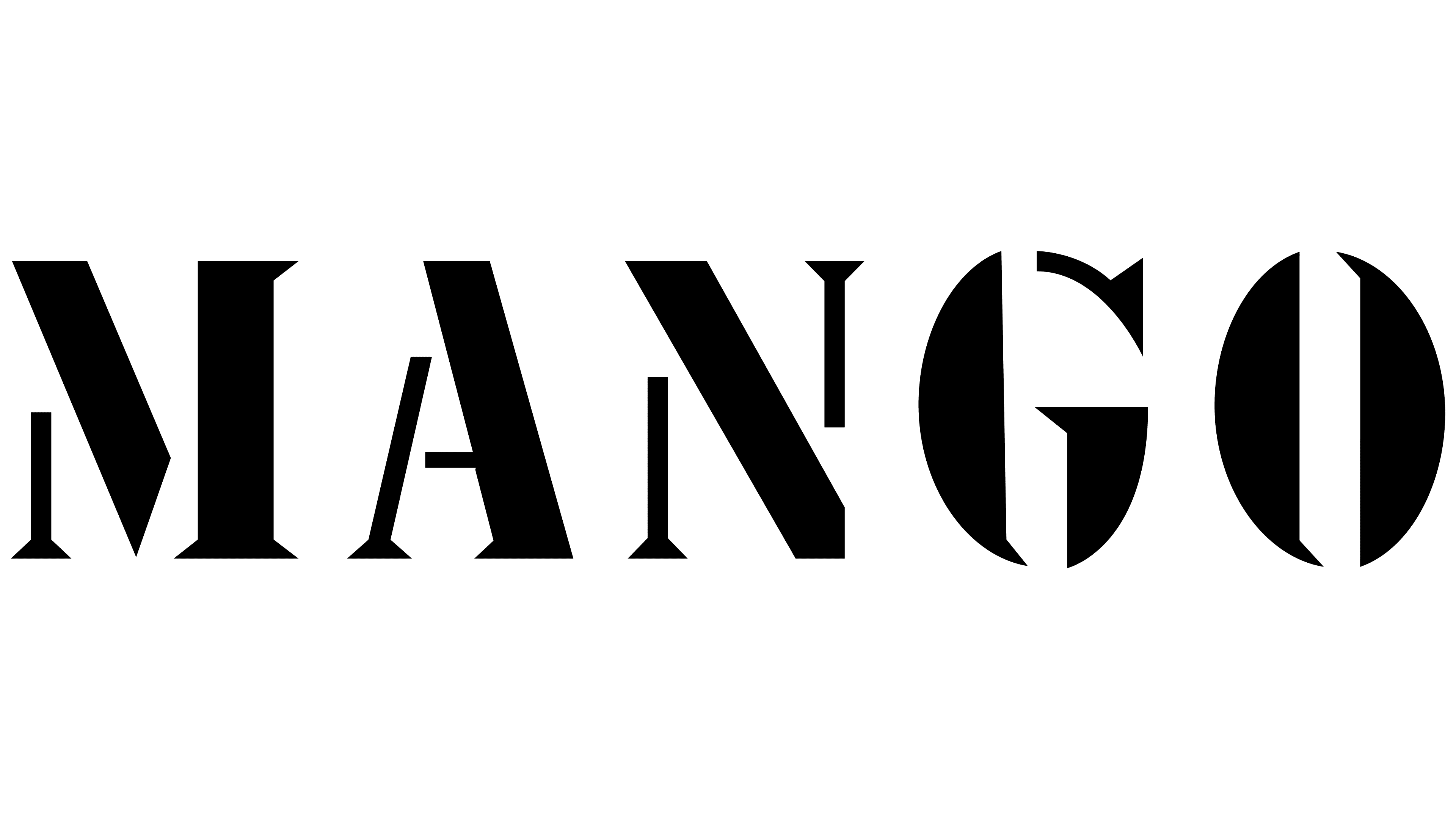
The company’s first identity presentation sparked curiosity because its logo stood out significantly from competitors’ logos. The designers chose a classic color palette as if looking into the future. The combination of black and white on a single emblem symbolized the brand’s potential, ambitions, and future success. This tone kept the logo relevant, smoothly transitioning from one decade to the next.
The white background created the effect of a blank canvas, with large, noticeable letters in an unconventional font placed directly in the center. This method of placing the key element was used when it was necessary to draw attention to a new brand and introduce it to a wide audience. The company effectively made its point with this visual mark, offering something unique to stylish, discerning customers.
One of the most successful decisions was using a font that instantly grabbed attention. Bold and expressive, it stood out because some letter elements appeared as independent visual objects. Dividing typographic characters into parts added dynamism, creating a sense of movement. This solution perfectly emphasized the brand’s constant development, as it aimed for growth and wasn’t planning to stop at what had already been achieved.
2011 – today
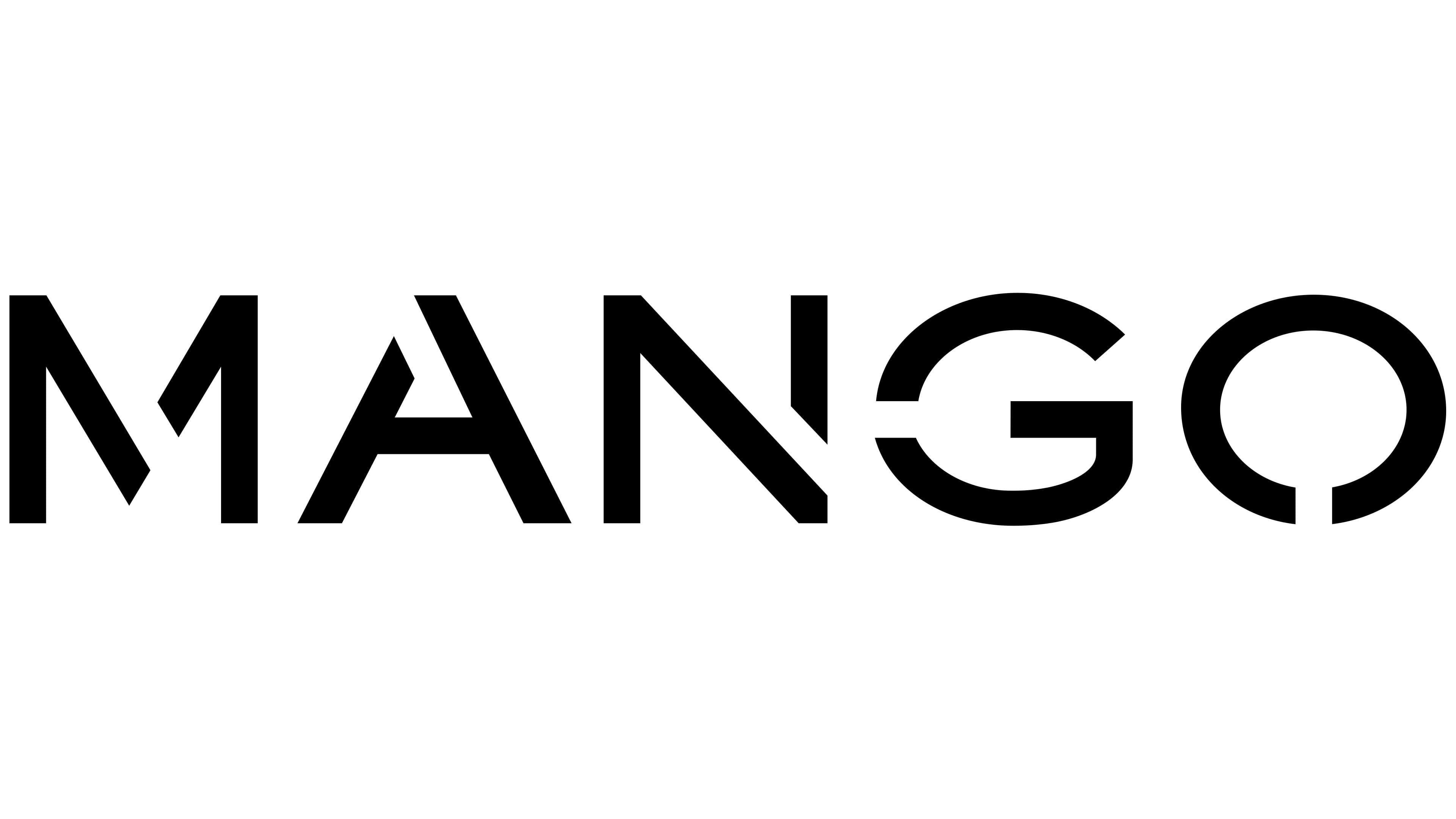
The Mango logo, updated in 2011, continues to represent the brand concisely and stylishly, emphasizing its modern values. The main changes affected not only the logo’s essence but also its visual style. By keeping the black-and-white palette, the company maintained its association with reliability and stability, which is crucial for a brand focused on creating fashionable yet affordable clothing.
“Mango” is written in black capital letters with sharp, angular lines. This font highlights minimalism and modernity, making the logo easy to perceive and memorable. The emblem is designed in the FM Bolyar Sans Pro 600 font, giving it a unique character and graphic quality. The letters are strict yet elegant, reflecting a philosophy of style and sophistication without unnecessary detail.
The black color of the letters symbolizes success and confidence. The simplicity and clarity of black on a white background create a sense of purity and harmony. This decision emphasizes the brand’s clothing’s versatility; it suits various occasions while always looking stylish.
Special attention should be given to the circular element in the visual mark, the final letter “O.” This letter is slightly unconventional: it represents an open circle. This adds originality and dynamism to the emblem, highlighting the brand’s desire for growth and forward movement while maintaining its identity.
The update was tied to the expansion of the product range and the brand’s elevated status on the global stage. The company decided to preserve the recognizable image but gave it a modern twist, making the logo more relevant to new markets and audiences.