The mechanical engineering company, famous for its tower cranes, keeps up with the times by offering innovative equipment. That’s why its logo looks bright and modern. The Manitowoc logo is a visual representation of strength, power, reliability, and dynamics.
Manitowoc: Brand overview
| Founded: | 1902 |
| Founder: | Charles West, Elias Gunnell |
| Headquarters: | Milwaukee, Wisconsin, United States |
| Website: | manitowoc.com |
Meaning and History
The brand’s visual identity is based on a unique logo. For the most part, it is known directly to the company’s target audience, and therefore many people might not know about the existence of Manitowoc. The company has been operating on the market for more than 120 years, and only two logos have been presented during this time. They differ somewhat in specifics, but a regular customer will find common features that are relevant to the American brand.
What is Manitowoc?
This is one of the oldest and most reputable companies involved in producing lifting solutions. Among the clients, there are not only US construction companies but also representatives of other countries.
Before 1999
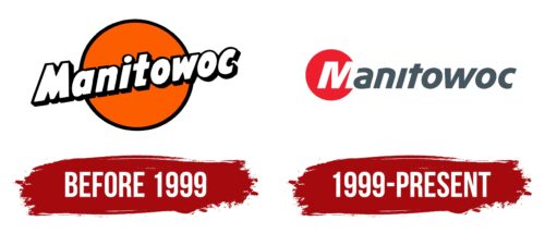
The initial version of the logo contained two elements: a word inscription and an orange circle, which in some way was used as a background. The brand name is written diagonally in white letters with a black outline. Due to the presence of the contour, a three-dimensional feeling of the image can be created. All letters, except for the initial one, are in lowercase, which should evoke friendly emotions. For the word inscription, a classic bold sans-serif font was used.
Interestingly, only half of the letters are inside the circle when the others are outside the frame. There is an association here with Manitowoc being willing to go beyond its limits.
Like the title block, the orange circle has a fairly thick black outline.
1999 – today
In 1999, the only redesign to date was introduced. Now only the first letter “M” was inside the red circle. Unlike other characters, the initial letter is in upper case. A more modern and elegant font was used for the brand name. A more tangible space appeared between the letters. The peculiarity of the style is minimalism. For example, consider the letter “t,” which does not have a rounded end.
In addition, an additional inscription appeared below, namely: “Marine Group.” The font is different from the company name. This is evidenced by the fact that there is a dot above the letter “i.” The letters are much smaller, which indicates that this line is additional.
In general, the logo looks modest and minimalist. It does not have additional details, but it conveys the confidence and strength of the brand.
Font and Colors
The company name “Manitowoc” uses a classic bold sans-serif typeface with a unique style for some of the letters. The inscription is easy to read on any surface, and the use of lowercase letters will attract the attention of potential customers.
The primary colors are red, white, and black. They perfectly contrast with each other, making the logo more confident and progressive. Many people associate red color with potential, development, passion, and confidence. In an earlier version, the company favored the orange color of the circle, which made it look like the sun.
Manitowoc color codes
| Imperial Red | Hex color: | #ee1f2f |
|---|---|---|
| RGB: | 238 31 47 | |
| CMYK: | 0 87 80 7 | |
| Pantone: | PMS Bright Red C |
| Marengo | Hex color: | #44555f |
|---|---|---|
| RGB: | 68 85 95 | |
| CMYK: | 28 11 0 63 | |
| Pantone: | PMS 7545 C |
