The Martinair logo conveys the dynamics of high-speed air transportation through bright colors, sharp shapes, and contrasting elements. The emblem reflects the company’s high responsibility and punctuality as it operates flights worldwide daily.
Martinair: Brand overview
In 1958, Martin Schroeder founded the Dutch cargo airline Martinair, which has since become a remarkable success story in the aviation industry. Starting with charter flights and air cab services, the company quickly developed into a renowned provider of exclusive travel services.
Expanding its operations in the 1960s, Martinair began operating scheduled passenger flights, offering travelers unique and exciting opportunities to explore Europe.
After realizing the market dynamics, Martinair decided to specialize in cargo. In 2011, it ended passenger operations and focused exclusively on air cargo transportation.
The airline operates scheduled cargo services and offers charter flights tailored to the specific needs of its customers.
Since 2008, Martinair has been a subsidiary of the renowned Air France-KLM group, benefiting from its extensive network, resources, and expertise.
Meaning and History
What is Martinair?
Martinair, legally known as Martinair Holland N.V., is a Dutch cargo and former passenger airline headquartered at Amsterdam Schiphol Airport. The airline, a subsidiary of Air France-KLM, has achieved significant success in the industry over the course of its existence. Established in 1958, the airline initially operated charter flights. Over time, the company switched to scheduled passenger transportation, and in 2011, it switched exclusively to cargo transportation.
1958 – 1971
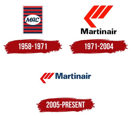
The original Martinair logo creates a dual impression. Its simplicity and two-dimensionality evoke subconscious trust. However, the designers paid close attention to small details to demonstrate the company’s meticulous approach to work.
The emblem is crafted in a flat geometric style, reflecting the 1950s. The foundation is a large vertical rectangle, symbolizing reliability and resilience. Inside it, numerous horizontal stripes are perfectly aligned in length and thickness, creating visual balance and representing the equilibrium between the speed of air transportation and the quality of services provided.
A large white oval in the center highlights the italicized “MAC” inscription. These letters correspond to the brand’s original name: Martin’s Air Charter. The capitalized bold font gives the text confidence, while the slight slant and rounded corners convey a sense of swift movement, linking the Martinair emblem to the aviation theme.
To show the company’s national affiliation, the designers used the official colors of the Dutch flag: red, white, and blue. This palette makes the logo easily recognizable internationally.
1971 – 2004
In 1971, Martinair fully transitioned to jet-engine aircraft and added a new element to its emblem—a stylized arrow. The three elongated stripes reflect the pursuit of technological progress, and their intense red color symbolizes the increased speed of air transportation. The streamlined shape of the geometric figures creates a sense of smooth gliding as if the flying airliner easily and swiftly cuts through the air.
The black “Martinair” text balances the bright graphic symbol. Its font resembles Ultimate Serial Xbold by SoftMaker: bold and sans-serif. The chosen style demonstrates the brand’s confidence, stability, and reliability. However, the typeface includes unique details that indicate a readiness for innovation. These details include square dots over the “i” and the absence of the left half of the horizontal stroke in the letter “t.”
2005 – today
The Dutch cargo airline’s logo emphasizes professionalism and experience. It features two main elements: a distinctive symbol and the company’s name.
The symbol consists of four equal-width stripes forming an arrow pointing left. On an airplane’s tail, it appears to point right. Two stripes are straight, and two converge to form a triangle. This geometric design is in vibrant red, a color associated with urgency and importance, fitting for a cargo airline focused on timely deliveries.
Next to the symbol, the company name is in a bold, geometric font. Most letters are lowercase, except for the capital “M,” which draws attention. The blue color of the text symbolizes reliability and trustworthiness, crucial traits in the transportation industry.
The arrow’s orientation in the logo represents the company’s flexibility and adaptability in logistics. The red arrow suggests speed, urgency, and the high importance of the cargo. The blue text provides a visual balance, creating a harmonious and striking logo.
The bold, blocky font conveys strength and stability, reinforcing the airline’s dependable service. The font’s geometric precision and overall design reflect the company’s meticulous attention to detail.
