


 Air France KLM Logo PNG
The Air France-KLM logo symbolizes the union of two major airlines, each with a rich heritage and experience in the aviation industry. The emblem’s simple and minimalist design emphasizes the company’s professionalism and reliability. The varying shades evoke a sense of stability and trust while associating the brand with the sky and flight.
KLM was founded on October 7, 1919, by Dutch lieutenant Albert Plesman, making it one of the oldest airlines still operating under its original name. Its first commercial flight took place on May 17, 1920, from London to Amsterdam. During the 1920s, the carrier expanded across Europe. It opened a long route to Indonesia in 1924, when the territory was still a Dutch colony.
Air France was founded on October 7, 1933, following the merger of several French airlines. Its first international route connected Paris and London. Both companies suffered losses during the Second World War, then rebuilt operations and route networks in the postwar years as European civil aviation recovered.
The jet age changed both fleets in the 1950s and 1960s. Air France introduced the Sud Aviation Caravelle in 1959 and the Boeing 707 in 1960, while KLM added the Douglas DC-8 in 1960. Wide-body aircraft followed in the 1970s, with Air France taking the Boeing 747 in 1970 and KLM in 1971. By 1976, both carriers were among the early Concorde operators.
In the 1980s and 1990s, stronger competition pushed both airlines toward partnerships and fleet renewal. KLM partnered with Northwest Airlines in 1999, and Air France helped create SkyTeam in 2000. The merger on May 5, 2004, formed a major airline group while preserving the Paris and Amsterdam bases. Later changes included the Alitalia stake in 2009, Transavia growth in 2012, Perform 2020 in 2015, ownership tensions in 2017, and an expanded venture with Delta Air Lines and Virgin Atlantic in 2018.
Meaning and History
What is Air France KLM?
This union of France’s national airline and the Netherlands’ flagship carrier formed one of the largest airline groups in Europe. This partnership connects major cities worldwide through one of the most extensive air transport networks. The airline group offers services for budget travelers and executives who prefer luxury, using a diverse fleet of aircraft from long-haul wide-body planes to regional jets. It is known for its strong route connections with Asia, America, and Africa, serving passengers through Europe.
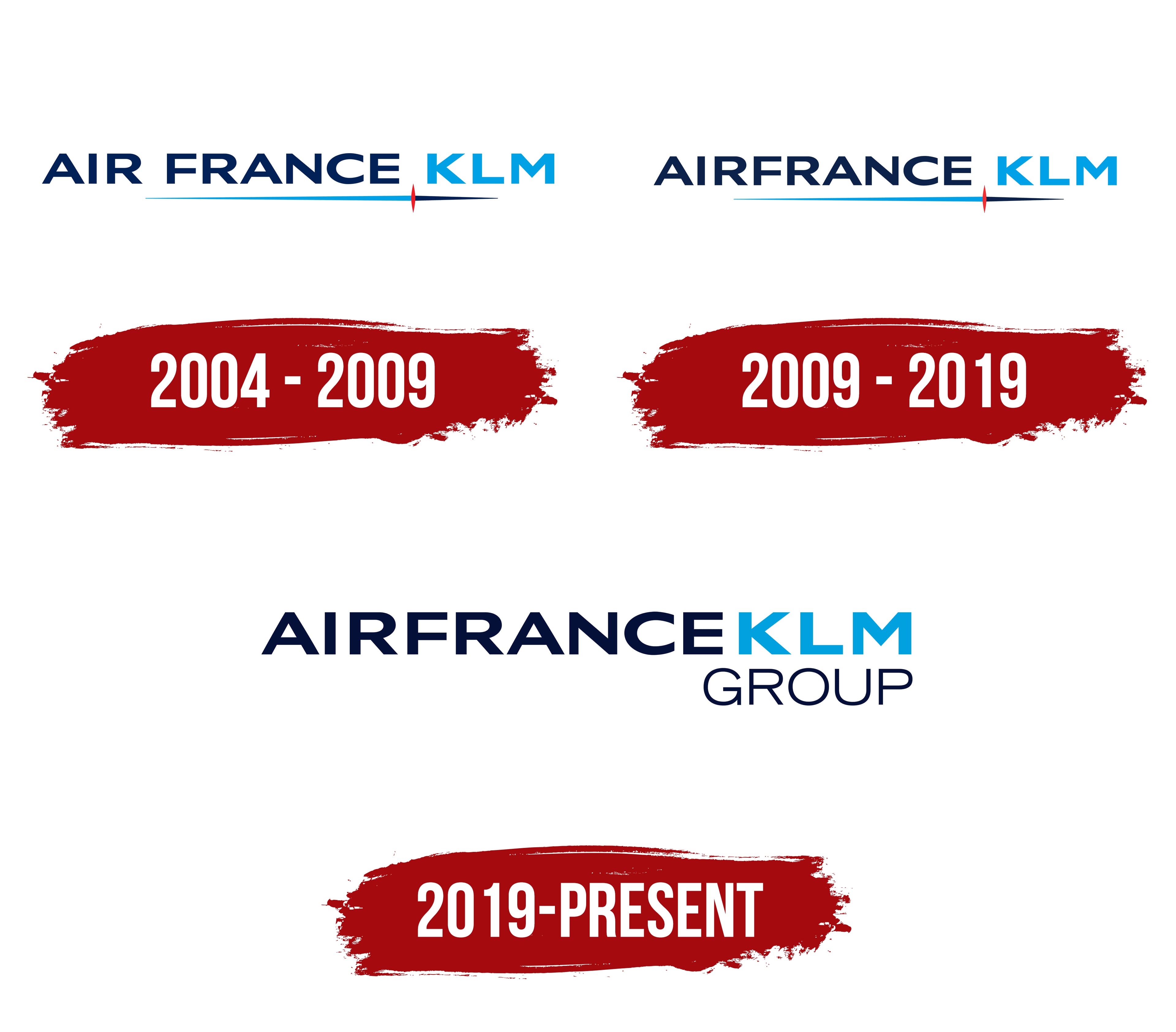
2004 – 2009
The logo that emerged after the merger appears simple, but every element conveys the meaning of uniting two powerful airlines. This was a significant event in the aviation industry when two major players decided to join forces, and their logo perfectly reflects this merger.
The logo’s font is strict and concise, highlighting the company’s reliability and stability. There are no unnecessary details or decorative elements; everything is straightforward and to the point. The company names are combined in a single visual line, signifying the equality of the two brands and their shared commitment to progress. They aim to show that they are now working together for the benefit of their passengers.
The dark blue color in “Air France” symbolizes trust, confidence, and stability. It’s a color associated with professionalism and high service standards, which are characteristics of the French airline. On the other hand, the light blue in “KLM” evokes the sky, flights, and lightness. This color is a signature of the Dutch company, emphasizing its traditions and connection to the sky.
However, the most interesting element is the horizontal line running under the name. This line seems to connect two worlds. It starts with a light blue shade and transitions into a deeper blue, symbolizing the smooth merging of two cultures. The red element in the middle of the line represents a passion for flight, dynamism, and movement. This small touch adds energy to the strict, reserved design, hinting that the company is not standing still but is constantly evolving.
2009 – 2019
The 2009 Air France-KLM logo resulted from a rebranding effort when Air France decided to update its brand identity, which consequently led to changes in the joint logo of the two airlines. The new logo reflects the modern trends of the time, as more companies sought minimalism and precision in their visual representation.
The font in the logo remains strict and free of unnecessary details, continuing to convey a sense of reliability and stability. The clean lines of the letters emphasize a business-like, modern style.
The color scheme remains classic: dark blue and light blue. The word “Air France” is written in dark blue, while light blue is used in the word “KLM,” maintaining the signature identities of both brands.
2019 – today
The modern Air France-KLM Group logo is the calling card of the union between two aviation legends. Every detail is carefully considered and reflects the merging of French and Dutch cultures. This visual mark conveys what both companies have become after their merger: scale, reliability, and confidence.
The font is strict and minimalist, without decorative elements, frills, or playful styling. The company’s focus on air transportation means that everything must be of the highest standard. The emblem sends a clear message: they are as serious about their work as their design; everything is straightforward and clear.
The dark blue color in “Air France” symbolizes trust and stability. Blue is often associated with reliability and professionalism.
“KLM” is highlighted in light blue. This is the company’s classic color, always used in its emblem and aircraft design. It’s associated with the sky, flight, and freedom. The light blue color adds lightness and shows that the brand maintains its identity despite the strict style. The light blue color adds a fresh touch to the logo, evoking dynamism and growth.
The lower part of the visual mark “GROUP” is in black font, emphasizing that this is a corporation, an alliance of two major companies under one roof. The word “GROUP” signifies that this is now a powerful and influential structure in the global market.
The logo contains nothing extra because it’s designed to speak to the essentials: reliability, professionalism, and a focus on the future. This is the union of two giants in aviation.