


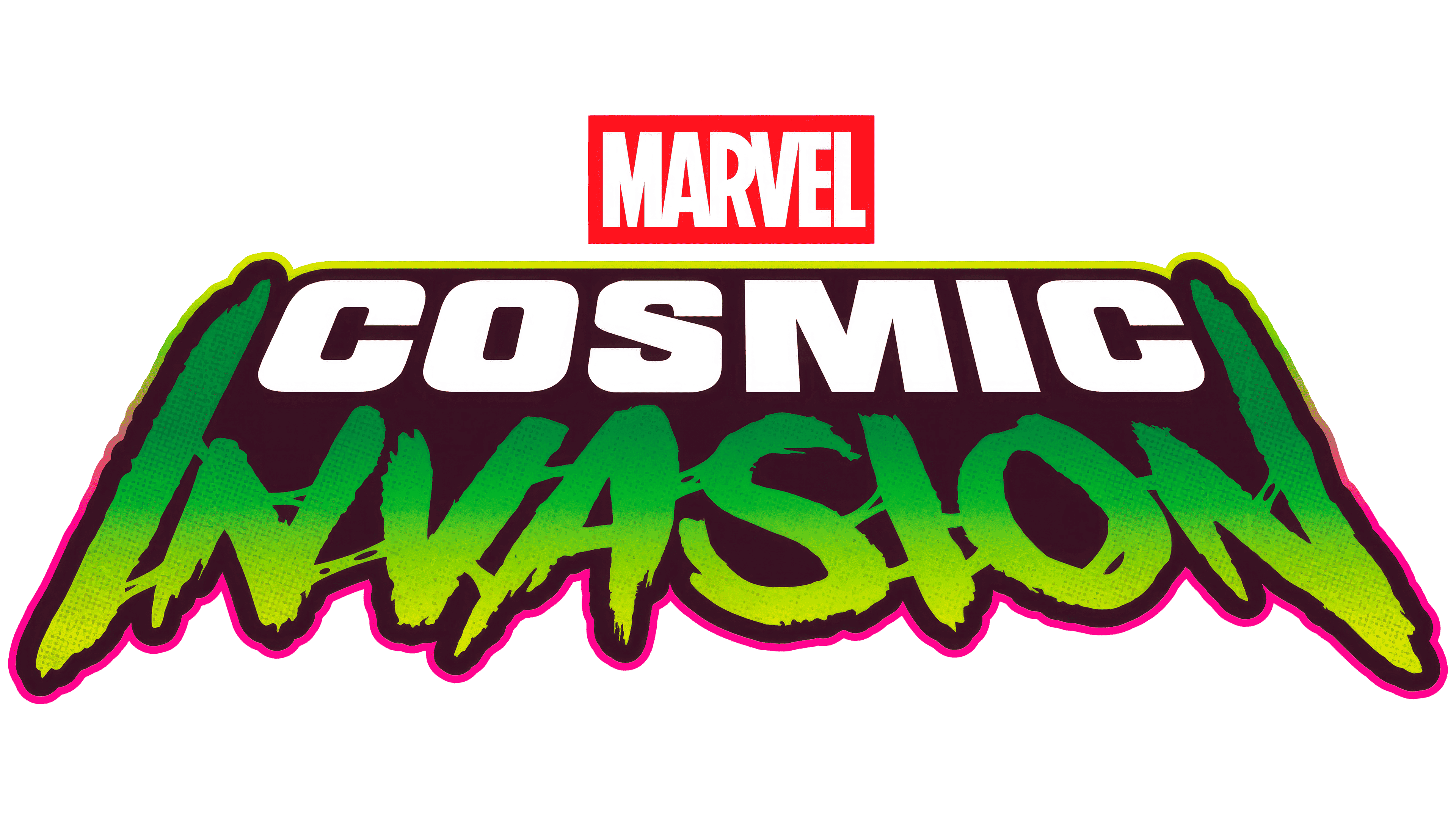
Stéphane Perez, known as Mardoch, explained how he combined science fiction with Annihilus’s appearance in his logo for Marvel Cosmic Invasion. Perez leads publisher Dotemu’s in-house creative team. An article published on July 11, 2026, after the game’s release, explored the creation of the original logo.
Tribute Games developed Marvel Cosmic Invasion in collaboration with Marvel Games. Dotemu announced the project on March 27, 2025, and the game launched on December 1. In this arcade-style beat them up, players fight through levels filled with enemies. Marvel’s Earth-based and cosmic heroes join forces against Annihilus and his Annihilation Wave. The game’s visuals draw inspiration from 1990s comics, while the logo references science-fiction films from earlier decades.
Perez began with the title before developing promotional artwork. The logo was intended to establish the direction for the game’s broader visual presentation. Beneath the required MARVEL logo, he arranged the title on two lines with distinct lettering styles. COSMIC represents the space adventure, while INVASION conveys the threat. The difference between the two styles expresses both sides of the story.
For the upper line, Perez developed Marvel Cosmic, a typeface intended for the logo and promotional campaign. Its heavy uppercase letters have slightly rounded corners and are distorted by perspective. He drew on title sequences from science-fiction films of the 1960s and 1970s. Creative Bloq also cites Forbidden Planet and Barbarella among his cinematic references. The perspective adds depth while maintaining a compact structure.
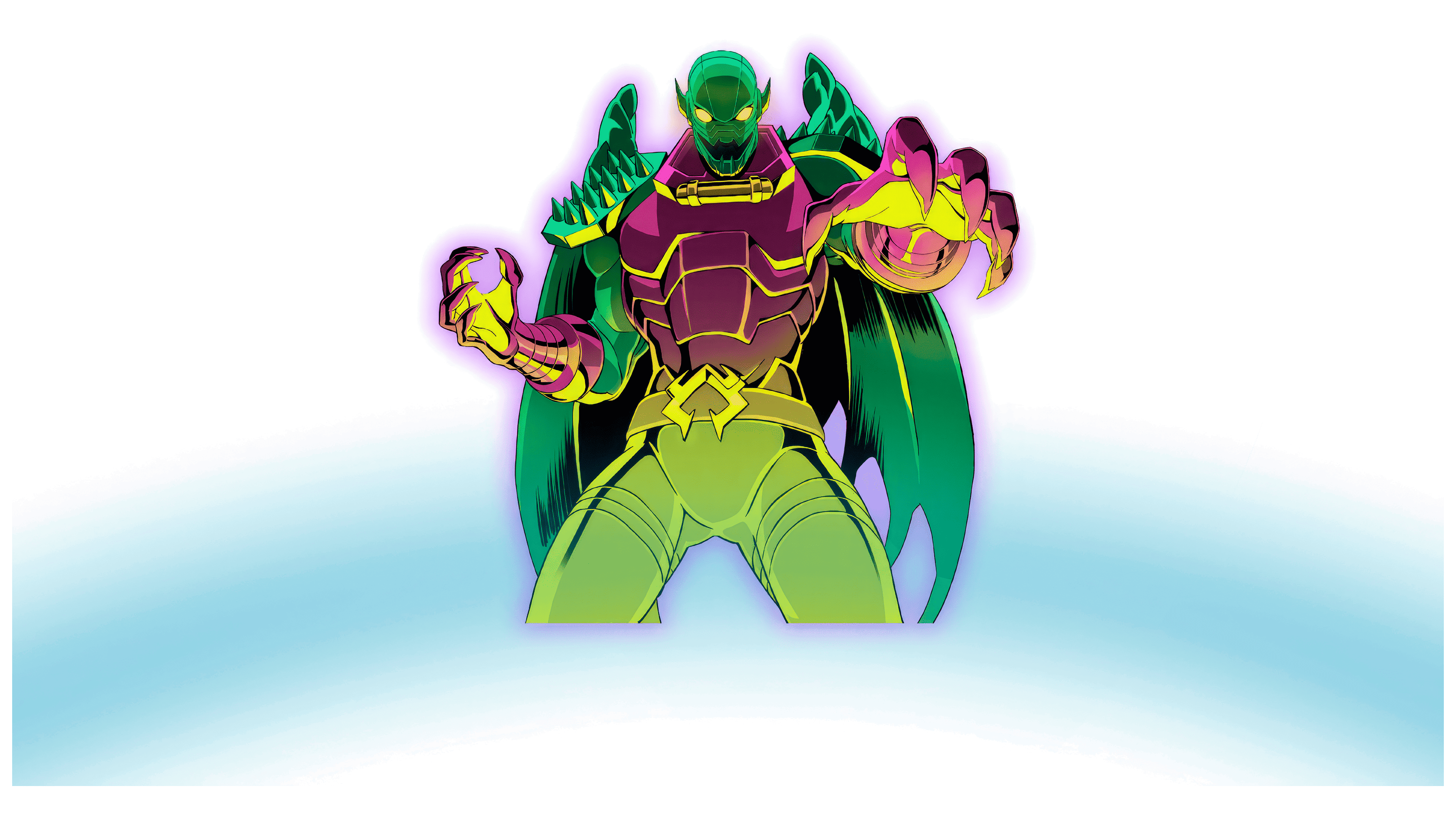
The INVASION lettering has irregular edges, elongated terminals, and strokes of varying thickness. Connections between the letters resemble a viscous substance. According to Perez, the lower line’s shapes relate to Annihilus’s insect-like appearance. An early sketch even placed the villain’s head inside the “O.” In the final version, the letterforms and texture convey his presence.
In the finished logo, white COSMIC lettering sits above a green-and-yellow INVASION. Strokes at the outer edges of the lower word extend upward, framing the upper line on both sides. A dark backing unites the two words. The outer border shifts from yellow-green to pink, creating a glow that recalls the saturated colors of cosmic comic books. A red box containing the white MARVEL name sits above the title.
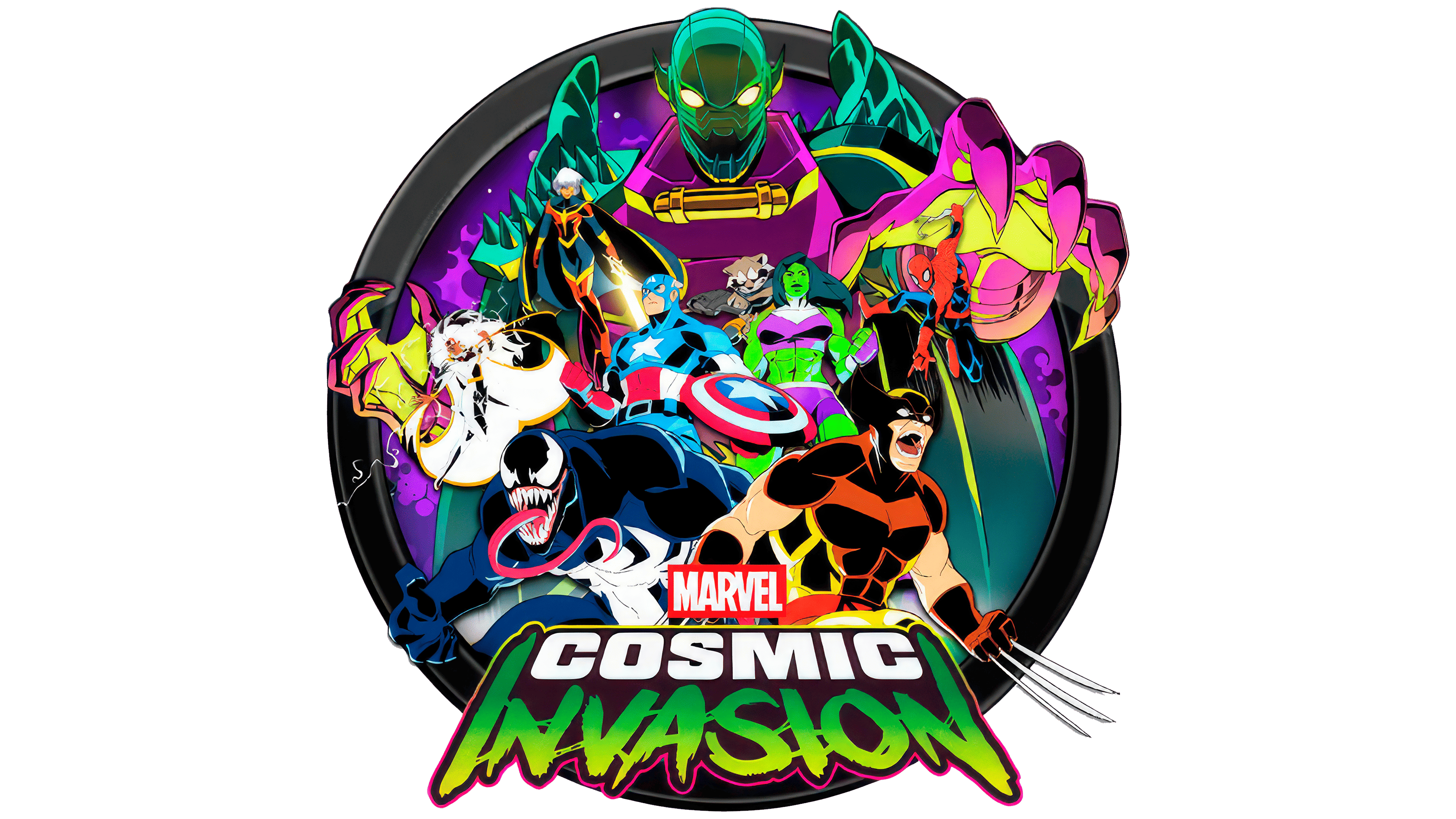
During refinement, Perez adjusted the relative sizes of the words, aligned their perspectives, and checked how the title held up at smaller sizes. One intermediate version included the superhero Nova’s star. It interfered with the lettering when reduced, so he moved the reference into the animation. The work went through several rounds of approval with the rights holders.
Perez then added a halftone texture reminiscent of printed comic books. He created it in Photoshop, separated it from the lettering, and converted the logo to vector format in Illustrator. This preparation allowed the artwork to scale across applications, from a small icon to packaging. He also ensured that the design would hold up in black and white.
In the animation, the two lines appear differently. Repeated trails follow the COSMIC letters, inspired by the opening titles of the 1980 film Flash Gordon. The arrival of INVASION references the title treatment of the 1982 film The Thing. At the end, a glint travels around the outline, and a small starburst appears, bringing back the Nova reference.
After completing the logo, Perez moved on to trailers, key art, packaging for physical editions, and Marvel Cosmic Invasion merchandise.