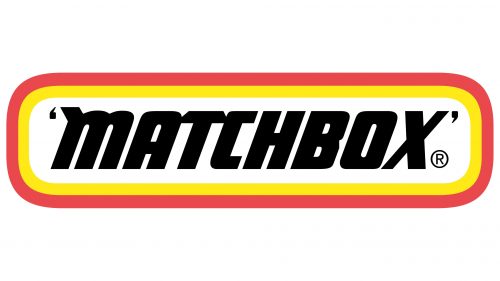
The Matchbox logo is an identifying mark and a visual representation of the brand’s core values: dynamism, reliability, and durability. Its vibrant design creates a cohesive company image and captures children’s attention, the toy manufacturer’s target audience.
Matchbox: Brand overview
The history of Matchbox began in 1953 when Leslie Smith and Rodney Smith (who were not related) founded Lesney Products in London, England. While the brand name came later, this company was the foundation for the iconic toy car line. The idea started simply: Jack Odell, a partner in Lesney, created a small toy that could fit inside a matchbox for his daughter, who could only bring toys of that size to school.
Lesney Products’ first successful item was a small brass road roller. This success led the company to continue making miniature vehicle models. In 1953, they released a popular replica of Queen Elizabeth II’s coronation coach.
In 1954, Lesney began producing the “1-75” model line, featuring 75 different vehicle models, each packaged in a matchbox-shaped box. This led to the creation of the brand name.
The company grew rapidly throughout the 1950s, increasing production and exporting its products worldwide. By the 1960s, the brand continued to innovate, launching the “Models of Yesteryear” line, featuring replicas of vintage vehicles that were particularly popular with adult collectors.
1968, the company faced new competition when the American brand Hot Wheels entered the market with faster, more colorful model cars. In response, the company introduced models with brighter designs and quicker wheels to stay competitive.
Throughout the 1970s, the product range expanded with the “Superfast” series, featuring cars with low-friction wheels for higher speeds. They also introduced new series like “Battle Kings” (military vehicles) and “Sky Busters” (airplanes).
In 1982, financial difficulties led to Lesney Products’ bankruptcy, and Universal Toys purchased the brand. While some changes in production and marketing occurred, the core concept remained intact.
1992, Tyco Toys acquired the brand, leading to further investments and an expanded product line. New series like “World Class” and “Premiere” were introduced, offering more detailed and high-quality models.
In 1997, Mattel acquired Tyco Toys, including Matchbox. Despite concerns from fans, Mattel kept the brand as a distinct product line, focusing on realistic models of everyday vehicles, setting it apart from the more whimsical designs of Hot Wheels.
In 2003, the brand celebrated its 50th anniversary with a special collection, recognizing its long history in the toy industry. In the 2010s, iconic series like “Models of Yesteryear,” rebranded as “Matchbox Collectibles,” returned, and the company focused more on licensed replicas of real automobiles.
The company celebrated its 65th anniversary in 2018 and continues to produce high-quality miniature-model cars. The brand remains popular with children and collectors, maintaining a strong presence in the toy and collecting industries.
Meaning and History
What is Matchbox?
It is a well-known brand of die-cast toy vehicles and miniature model cars. The toys originally produced by Lesney Products are known for their detailed and accurate replicas of real vehicles, including cars, trucks, buses, and construction equipment. The brand got its name because the original toys were packaged in boxes similar in size and style to matchboxes. Mattel, Inc. owns the brand and continues to be popular with collectors and children alike. It offers a wide range of miniature vehicles, playsets, and accessories.
1953 – 2001
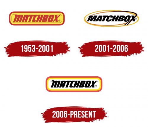
The old Matchbox logo perfectly conveys the key characteristics of children’s products: brightness, dynamism, and energy. It’s simple yet instantly recognizable. Its design evokes a retro style from the mid-20th century, sparking nostalgia in adults who played with small die-cast model cars as children. In this way, the emblem helps maintain a connection with multiple generations of customers.
The logo features the red “MATCHBOX” lettering inside a rectangle with rounded edges. This word not only represents the brand’s name but also reflects the nature of the product, as the toys were originally packaged in boxes resembling matchboxes.
The wordmark uses a large, bold font in a custom style. The letter spacing is so narrow that it gives an impression of completeness, unity, and compactness. However, this close arrangement of the glyphs has a downside—the logo can become unclear when reduced in size.
The text is slightly tilted to the right, creating associations with progress and motion. Another reason for the dynamic feel is the geometric font with a rectangular shape. It seems angular due to the sharp corners, yet many parts of the letters are rounded. This gives the word “MATCHBOX” a technological and modern appearance, making it visually striking. Some of the glyphs stand out due to their unique design:
- The only letter with a serif is the first “M,” which has an extended stroke at the top.
- The “T,” unlike the other characters, has ends cut at a sharp angle.
- The “X” is the most dynamic, with one line significantly thicker than the other.
All the glyphs have unconventional proportions, making the word look like a unified graphic element rather than a collection of individual characters. The brand name gives an impression of strength and heft associated with quality. At the same time, the pronounced tilt creates a sense of speed, which is crucial for a toy car manufacturer.
The wordmark is placed on a rectangular base with rounded corners, giving the emblem a neat and finished appearance. The designers made the interior yellow to contrast with the red text, enhancing its visibility. The logo has a multilayered border of lines of various colors and thicknesses. The most prominent stripe runs along the edge of the rectangle, framing the entire composition and visually holding the viewer’s focus on the text.
The emblem looks attractive due to the combination of bright colors, yellow and red, traditionally associated with energy, optimism, fun, and activity. This color palette is designed for children, the brand’s target audience. Red symbolizes speed and passion, aligning perfectly with the automotive theme. Yellow conveys a sense of happiness, as the company aims to elicit a positive emotional response from its customers.
2001 – 2006
In 2001, Matchbox introduced a new logo, which was less conceptual than the previous version. It appears darker due to the black lettering and less childlike because of the more formal font. The brand name is still in bold italics, but the letters have become more classic, reflecting a commitment to strict toy production standards. The changes affected every detail:
- The sharp cuts at the ends of the “T” are no longer present.
- The long serif on the “M” has been removed.
- The spacing inside the letters has increased.
- The curves of the “B” are more pronounced.
- The “M” and “A” are formed from sharp, angular lines.
These changes have stripped the Matchbox logo of the distinctive flair it once had, which was reflected in the finer details. The only aspect that hasn’t changed is the narrow spacing between the letters, making the word difficult to read.
Since Matchbox is a brand for children’s toys, the designers tried to add a playful element by altering the shape of the final “X.” In an experimental twist, one diagonal of the letter was extended into a long line that splits at the bottom and curves to the left at the top, forming an oval. Initially, the black line gradually turns orange to contrast the text. The logo also features a large yellow oval frame, replacing the familiar rectangle with rounded corners. The interior is white, as the black glyphs stand out better against this background.
The elongated part of the “X” symbolizes movement. It can be interpreted as both a road and the trail of a plane taking off, reflecting the company’s expanded product line, which now includes several aircraft models and a wide range of cars. The oval shape of the frame enhances the sense of dynamism and evokes the idea of infinity, hinting at the timelessness of Matchbox products.
2006 – today
In 2006, the company realized that its logo didn’t adequately reflect the creative concept related to children’s products. More vibrant colors and unconventional shapes were added to attract the target audience. The designers revived the old emblem before 2001, making a few adjustments.
The lettering returned in its original form. It still features bold, slanted letters, a geometric rectangular font, a long serif at the top of the “M,” sharp cuts at the horizontal ends of the “T,” and the contrasting thickness of the two diagonals in the “X.” However, the brand name became more striking due to the rich black color, which evokes a sense of reliability, seriousness, and professionalism. This formality appeals not so much to children as to their parents, who want assurance of the toys’ quality.
The word “MATCHBOX” is framed by single quotation marks on both sides. This stylistic choice enhances the logo’s visual appeal, giving it a cohesive and complete look. The quotation marks are a nod to the retro style of the 20th century, highlighting the company’s historical legacy and showcasing its significance and uniqueness. The two commas around the lettering also create symmetry, drawing even more attention to the brand name.
While quotation marks are typically associated with conservatism, formality, and standards, they fit well within the emblem’s playful design. The designers successfully blended elements of contrasting styles, achieving a harmonious eclecticism. The bold black lettering isn’t just set against a white background—it’s placed within a colorful frame of two multicolored lines.
The combination of red and yellow adds variety to the logo, emphasizing the company’s connection to children’s products. The rectangular shape with rounded corners brings a sense of dynamism, which, in the case of Matchbox, is associated with toy trains, cars, planes, boats, and trucks.
