Maxicare has moved from a separate HMO brand to the broader Maxicare Group structure. Maxicare Healthcare Corporation, Maxicare Clinics, and Maxicare Insurance were brought together under the master brand. The launch took place in September 2025.
The update shows the company’s next direction. Health plans, clinics, prevention, insurance, consultations, and support are presented as components of a single health care system.
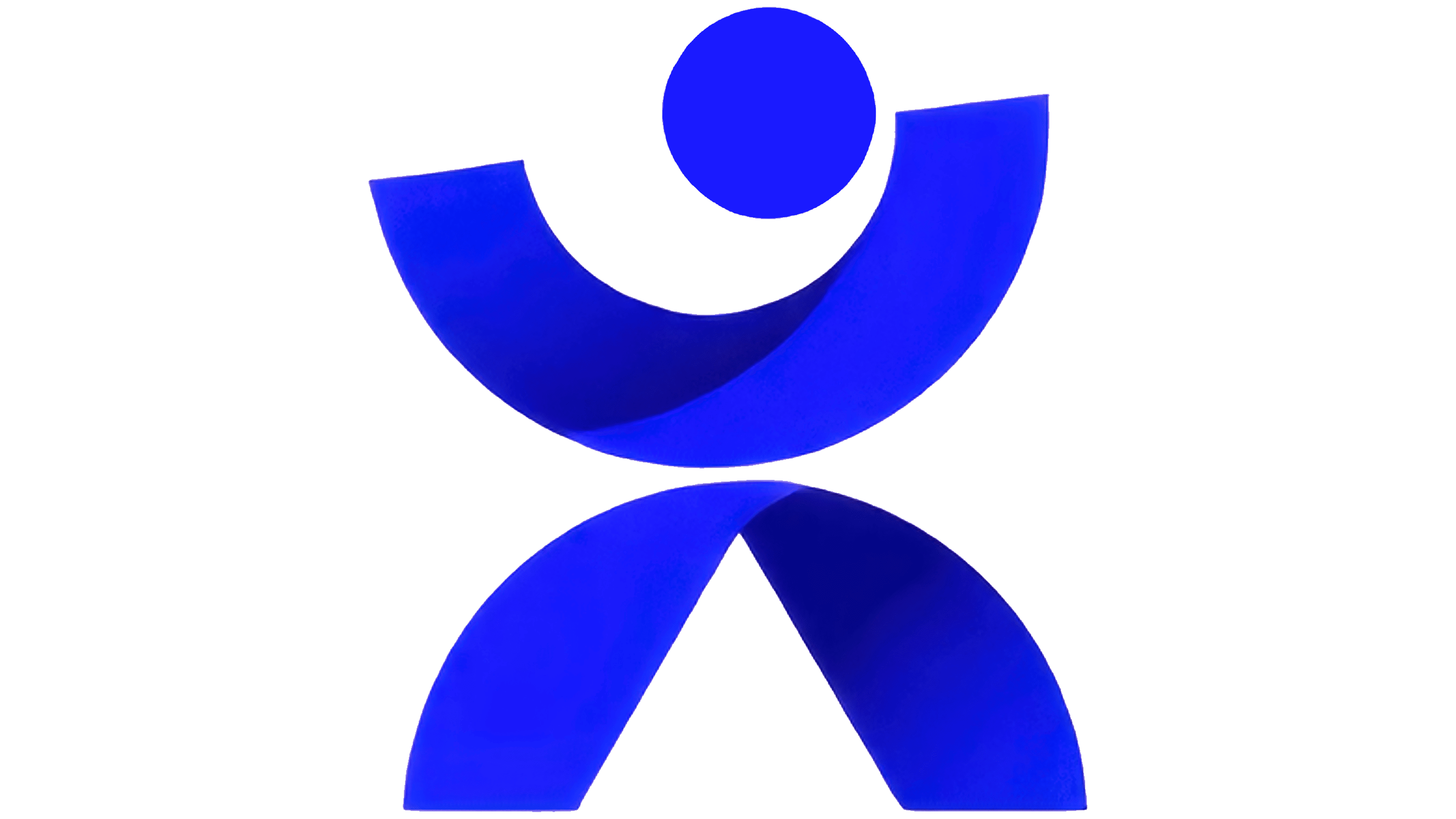
The main role in the logo is played by the letter “X.” In the new version, it resembles a person with raised arms. Through the human image, the focus shifts from a dry medical system to well-being, participation, and help at different stages of life.
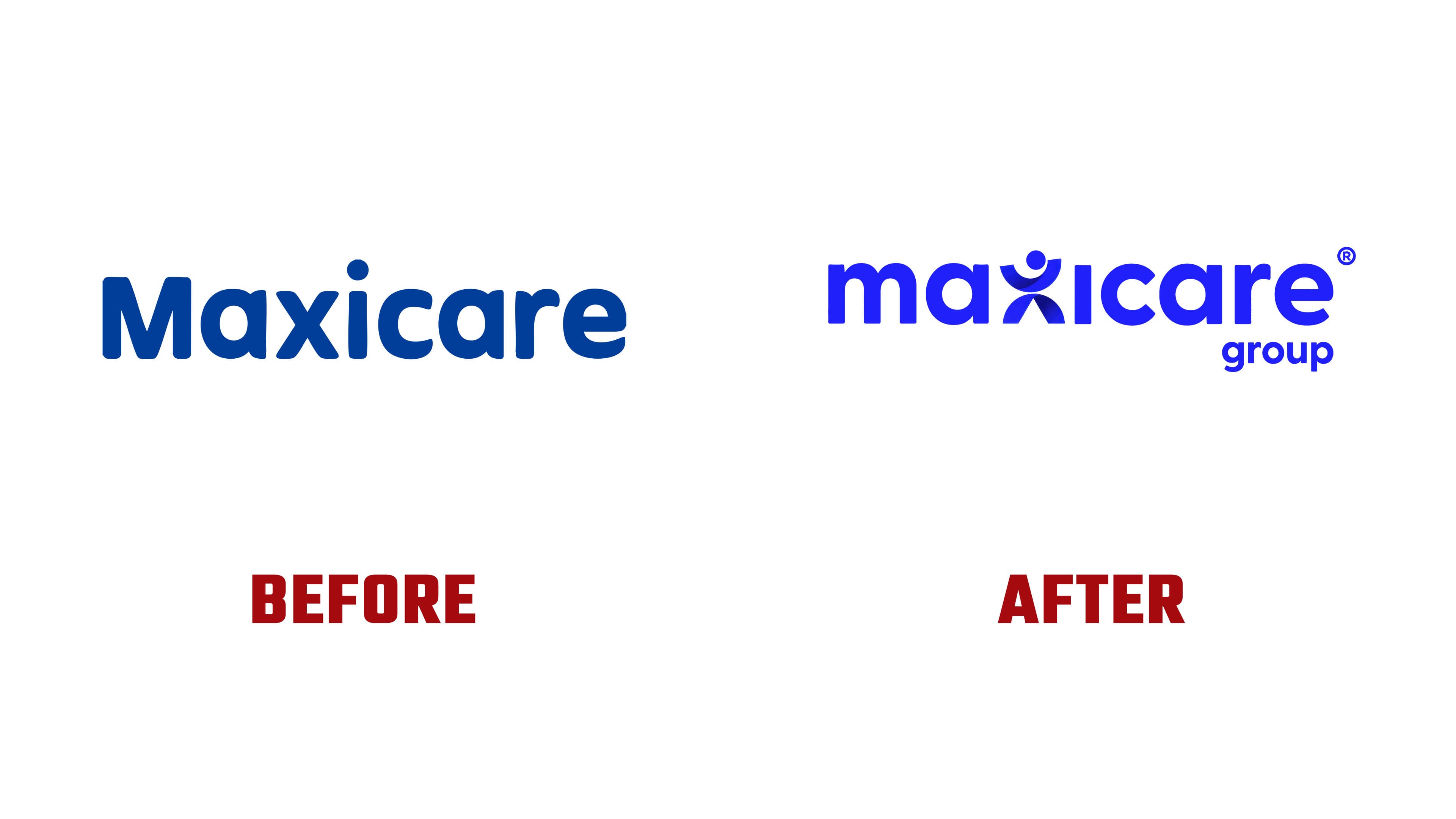
The Maxicare name kept the soft typography familiar to the audience. The word Group was added to reflect the company’s new scale and the unification of several areas under a single brand.
The previous logo looked like a calm healthcare mark with rounded letters and a familiar medical blue color. The new version became denser and brighter. Royal blue keeps the connection to the medical field, trust, quality of care, and a professional environment.
The letter “X” gives the brand a separate symbol. Maxicare Group receives an image related to the person, care, and the overall path within the health system.
The idea of complete care became the foundation of the update. Maxicare Group shows the client a unified path through health plans, primary care clinics, wellness services, and insurance protection. For people in the Philippines, the brand promises access to care through a network of 22,000 doctors, more than 1,000 hospitals and partner facilities, and a growing network of Maxicare Primary Care Clinics.
The new logo works as a sign of unification. It maintains medical simplicity, adds a human touch, and helps Maxicare speak on behalf of a comprehensive care group.