The Maytag logo speaks of reliability and durability. The emblem represents appliances capable of accompanying their owners throughout their lives, impressing with functionality and longevity. The symbol communicates stylish design and sturdy materials.
Maytag: Brand overview
| Founded: | 1893 |
| Founder: | Frederick Maytag |
| Headquarters: | United States |
| Website: | maytag.com |
In 1893, Frederick Maytag joined forces with three associates in Newton, Iowa, initially focusing on agricultural machinery. However, their first foray into home appliances came in 1907 with the introduction of the “Pastime” washing machine, marking a pivotal shift in the company’s trajectory. Then, in 1925, the organization formalized its structure by incorporating and making its shares publicly available on the New York Stock Exchange as the Maytag Company.
Over time, Maytag carved out a reputation for creating dependable, high-quality washing machines and later branched out into other household appliances, including refrigerators, ovens, and dishwashers. The brand came to be recognized for its durability, summed up by their catchphrase, “Maytag dependability.”
During the late 20th century, specifically the 1980s and 1990s, Maytag diversified its product lineup by purchasing other appliance brands like Hoover, Jenn-Air, and Amana. This expansion, however, eventually led to a significant change in 2006 when Whirlpool Corporation took over Maytag. Whirlpool opted to maintain the Maytag brand, given its established reputation for reliability.
The company’s foundational headquarters and manufacturing facility in Newton, Iowa, remained operational until 2007. At that point, Whirlpool decided to relocate the manufacturing processes to a different state, marking the end of an era for Maytag’s original home base.
Meaning and History
In 1893, the company was founded by four partners as Parsons Band-Cutter & Self Feeder Company, manufacturing in-demand threshing machines. One of the founders, Frederick Maytag, bought out the business in 1907 and renamed the enterprise after himself. That’s when the now-famous first Maytag emblem appeared.
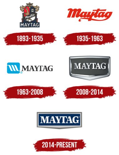
The brand’s logos have changed multiple times throughout its 130-year history. These signs vary in design. Their evolution can be identified as three periods connected with different ownership. The first emphasized the Maytag family’s principles. The second period is linked to the company going public and attracting new investors. Emblems from this period are formal, more standard, and strict. Whirlpool incorporated elements of reliability and strength into the logo design, underlining the main quality of Maytag that consumers have highly valued throughout its history.
What is Maytag?
An American brand initially produced agricultural machinery, later household appliances from Maytag, and washing machines, dryers, and dishwashers from Whirlpool. All products manufactured after 2017 come with a 10-year warranty.
1893 – 1935
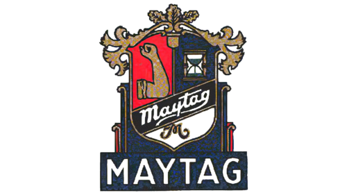
The first emblem featured a heraldic shield, likely inspired by the Maytag family history. The shield was custom-designed for the company. It displayed the core values the owner brought into the business. A raised fist symbolizes hard work and the quality of never giving up. An hourglass, on the other side, indicated time-tested quality.
A ribbon ran across the shield bearing the Maytag surname. The ribbon linked hard work and quality. At the bottom third of the shield, against a white background, was the letter ‘M,’ denoting the founder’s honorable name.
Another meaning of these images lay in reflecting the corporation’s mission to conserve consumers’ energy and time. The company’s machines eased people’s labor and reduced home chores time.
The logo was crowned with oak leaves, forecasting longevity and prosperity. The shield rested on a stand where a plaque displayed the company’s name.
This nod to heraldry was necessary to highlight a shift in the company’s policy. Products from Parsons Band-Cutter & Self Feeder Company weren’t always high quality. Thus, upon acquiring the company, Maytag sought to restore a good name to the products and focused particularly on machine reliability.
Interestingly, the founder’s family emigrated from Germany and changed their surname to Maitag in America. Frederick used the German pronunciation of the name.
1935 – 1963
1925, the company went public, leading to a gradual expansion and production growth. As a result, Maytag remained afloat during the Great Depression. Preserving the business and entering a new era were marked by rebranding.
The red uppercase letters with an extended tail on the “g,” emphasizing the word, radiated confidence and strength. The signs revealed the brand’s prosperity and profitability. The company offered appliances that cared for its customers.
The logo underwent minor transformations with the arrival of the founder’s grandson, Fred Maytag II, in management.
1963 – 2008
In 1962, following the death of Fred Maytag II, management passed from the Maytag family to George M. Umbreit. The change in leadership brought about a rebranding.
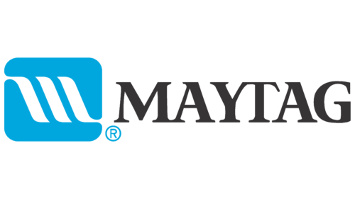
The emblem of 1963 consisted of a graphic element and an inscription in black uppercase letters. The design agency Chapman, Goldsmith, & Yamasaki worked on creating the logo.
A blue rectangle led the emblem; inside was a white letter “M,” stylized to look like three oblique lines. The image represented the company’s most common product—washing and drying machines. The rectangular shape corresponded to the shape of the machines. The blue indicated water, while the white lines represented the rinsing and spinning processes. The white color signifies the cleanliness of items after washing.
The graphic element also pointed to dishwashers. In this case, the three lines represented plates.
A distinctive feature of the inscription in its central part was that the left bar of the “T” in “YT” blended with the upper right half of the “Y.” This design choice made it difficult to separate the word into “May” and “tag,” emphasizing the pronunciation as a single word. By 1963, not all customers knew the history behind the brand name, so the emblem deliberately focused on the fact that the brand was a surname.
The contiguous spelling also served the opposite effect, drawing attention to the separation. “May” and “tag” pointed to personal choice and confirmed that customers had labeled the company’s products as the best and most reliable.
2008 – 2014
In 2006, the manufacturer was acquired by Whirlpool Corporation. The new owner decided to keep the brand but went through a rebranding process, introducing a new logo.
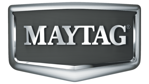
The symbol is in the form of an iron rectangular shield. The choice of metal trim resonates with the design of the appliances. Most Maytag products have stainless steel bodies.
The sturdy frame looks like a car bumper and speaks to increased durability. This choice draws a parallel between automobiles and the company’s household machines. The armored shield promises longevity and reliability.
The emblem also takes the viewer back to the beginning, the brand’s origins when the company produced agricultural machinery. It underscores a period of growth and popularity when Maytag issued small, single-seat racing cars for advertising (1934-1941). The shield is also in line with the brand’s first emblem.
Inside the frame, on a corrugated surface resembling a radiator, there’s a shiny metallic inscription in uppercase letters.
2014 – today
By 2014, the brand had nothing to do with its former company. Whirlpool decided to use the brand to promote its products actively. The advertising campaign included a revamped logo and a refreshed Maytag Man—a man who would symbolize the reliability of the machines in the commercials. The role was given to Colin Ferguson.
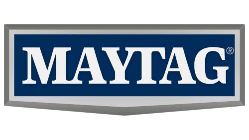
The character’s blue suit matched the new emblem. The shield shape of the logo appeared more rounded and stretched out sideways, resembling a plaque. The border remained metallic, emphasizing the durability of the appliances. The inscription on the dark background switched from metallic to white, highlighting the refreshment and the cleanliness of laundry after using Maytag.
Font and Colors
Dark blue is the primary color in the logo. This color signifies professionalism. Every machine precisely meets user needs and operates quietly, quickly, and efficiently. The palette communicates the reliability and longevity of the equipment.
Light letters convey the idea of cleanliness, which Maytag helps maintain.
The inscription’s font is unique due to the fusion of the letters “M” with “a” and “y” with “t”. This technique indicates compactness and the production of related appliances like washing machines and dryers.
Maytag color codes
| Cool Black | Hex color: | #012c5b |
|---|---|---|
| RGB: | 1 44 91 | |
| CMYK: | 99 52 0 64 | |
| Pantone: | PMS 648 C |
| Nickel | Hex color: | #747471 |
|---|---|---|
| RGB: | 116 116 113 | |
| CMYK: | 0 0 3 55 | |
| Pantone: | PMS 424 C |
| Medium Gray | Hex color: | #b4b4b5 |
|---|---|---|
| RGB: | 180 180 181 | |
| CMYK: | 1 1 0 29 | |
| Pantone: | PMS Cool Gray 5 C |
