The Miami Hurricanes logo is associated with all 15 of the university’s teams. Its versatility and recognizability are key aspects of each identity transformation. A single symbol must be clear and easily identifiable, so a concise and presentable logo option was chosen.
Today, one letter, made up of two parts, brightly shines on uniforms, backpacks, and other gear. It harmoniously combines asymmetry and symmetry. The two-tone letter creates a strong visual impression and enhances its presentability. Interestingly, this single letter on the logo gave the teams a second name. The Miami Hurricanes from the University of Miami are often simply called “U.” This phenomenon highlights the strength and uniqueness of the created identity.
Miami Hurricanes: Brand overview
The University of Miami launched its football program in 1926, marking the start of the Miami Hurricanes’ existence. The squad had Howard Buck as its inaugural coach, and its home games were played at a nearby municipal stadium. After a strong hurricane struck Miami in 1927, the moniker “Hurricanes” first surfaced. This moniker immediately became well-liked by fans and students, representing the strength and force of the local natural phenomenon.
The football program evolved slowly in its early years. The team didn’t get much national notice as it played against smaller universities and local rivals. In the 1960s, notable changes started to occur. The team participated in its first bowl game, the Liberty Bowl, in 1962. Despite the team’s defeat, its involvement signaled the start of a new phase for the initiative.
The squad grew during the 1970s. It attracted more skilled players, and they started playing in bowl games regularly. A true breakthrough came along in the 1980s. Under head coach Howard Schnellenberger, the team earned its first national championship in 1983. This triumph altered the program’s history, elevating it to a national level.
The 1980s and the first part of the 1990s were their prime. With Jimmy Johnson and Dennis Erickson as coaches, three more national titles were won in 1987, 1989, and 1991. The program rose to prominence during this time because of its aggressive style of play and plenty of gifted players, many of whom became NFL stars.
Coach Larry Coker guided the team to their fifth national title in 2001. This year’s squad is among the greatest in college football history. In one of the most memorable games in college football history, the team lost to Ohio State in extra overtime after making it to the national championship game once more in 2002.
The university joined the Atlantic Coast Conference (ACC) in 2003, leaving the Big East Conference—this choice aimed to raise the program’s stature and degree of competition. Under Larry Coker, the squad performed impressively from 2004 to 2006, consistently placing in the top 10 nationally.
But there was a coaching change in 2007. After being named head coach, Randy Shannon became the first African American to hold this role in the school’s history. Results from 2007 to 2010 were not consistently impressive. Despite playing in bowl games regularly, the team could not reach the level of national champions again.
Al Golden took over as head coach in 2011. His appointment coincided with the start of an NCAA investigation into rules infractions at the university, which resulted in sanctions imposed by the institution and the loss of multiple scholarships. Despite these challenges, the team persisted in its quest for the top ACC standings. The squad won the ACC Coastal Division for the first time in 2017 under the direction of new coach Mark Richt.
In 2018, among other changes, Manny Diaz was added as head coach. Under his direction, the team had a mixed record, with thrilling wins interspersed with shocking defeats. The program had success in other sports. The men’s and women’s basketball teams have made numerous trips to the NCAA tournament, and the baseball team frequently competes in the College World Series.
Under Manny Diaz’s direction, the squad had a mediocre season in 2019—it finished with a 6-7 record and was defeated in the Walk-On’s Independence Bowl. 2020 brought with it better outcomes. The program finished with an excellent 8-3 record despite having a truncated season. After finishing second in the ACC Coastal Division, the squad was invited to the Cheez-It Bowl, but they were defeated by Oklahoma State there.
2021 started with great hopes, but the team ran across problems. Manny Diaz lost his job as head coach following the team’s dismal opening to the campaign. An important development happened in December 2021 when Mario Cristobal, a former Miami player and accomplished Oregon Ducks coach, was named the team’s new head coach. Fans were excited about this appointment and thought it marked the start of a new chapter in the program’s history.
The first complete season under Cristobal’s direction came in 2022. Despite having a 5-7 record at the end of the regular season and missing out on a bowl game, this year was considered a transitional year for the squad as a new system and culture were being implemented. The team kept up their impressive play in other sports. The men’s and women’s basketball teams competed in the ACC, and the baseball team frequently made it to the NCAA Tournament.
The program was quite successful in sports other than football. The university’s baseball team won four national titles in 1982, 1985, 1999, and 2001. The men’s basketball team also performed admirably, regularly qualifying for the NCAA tournament and making it to the Sweet Sixteen in 2000 and 2013. The women’s teams were successful as well. The women’s volleyball team routinely won the conference, and the women’s basketball team frequently made it to the NCAA tournament.
The team gained notoriety throughout its existence for both its distinctive culture and athletic prowess. Football traditions like the “turnover chain” are among the team’s most well-known supporter bases. The program combines a rich past with an unwavering desire for new accomplishments and ranks among American collegiate sports’ most well-known and respected athletic departments.
Miami Hurricanes Logo
What is Miami Hurricanes?
They are an athletic team based in Coral Gables, Florida, representing the University of Miami. They compete in the Atlantic Coast Conference (ACC) and are recognizable for their mascot, Sebastian the ibis, and their eye-catching orange, green, and white colors. Miami’s athletic department has a rich history of achievement, especially in soccer, where they have produced many NFL players and won numerous national titles. The soccer team is known for its signature “turnover chain” celebration and aggressive play style. In addition to soccer, they have excelled in baseball, basketball, and track and field. The program is known for its rabid fans and lively atmosphere at home games, especially soccer games at Hard Rock Stadium.
The athletic department is called the Miami Hurricanes because the first game was postponed due to a hurricane. The 1926 event affected the university so much that the players chose this nickname to commemorate the tragedy. If legend is to be believed, the senior administration would name the team after native plants or animals. But its spokesman, Porter Norris, said the athletes wouldn’t like it and offered his version, the Hurricanes. According to another version, the players held a meeting in 1927 to vote on the name “Hurricanes.” It is argued that it was meant to demonstrate a willingness to win over opponents.
The team’s emblem has changed several times. The last time was in 1972 when the athletic department got a symbol as a green-orange “U.” It has remained the centerpiece of the Miami Hurricanes’ identity system ever since. And since 2009, the entire university. In 1979, Henry King Stanford attempted to update the emblem, but students launched a campaign to defend the “U.” In 1992, fans made a special gesture to support the players. They folded their fingers in such a way as to make a U-shaped figure. It is a globally recognized gesture known far beyond the United States.
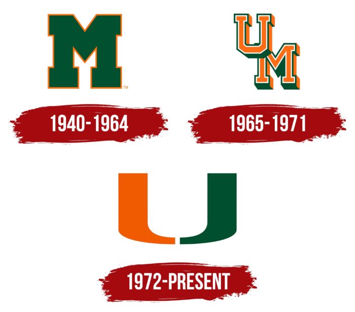
1940 – 1964
The “Miami Hurricanes” identity has always stood out for its originality among all other university teams. According to the creators’ intentions, just one letter was meant to be meaningful, recognizable, and bold. In 1940, the first letter symbol appeared, designed to distinguish the 15 teams of the University of Miami from others.
It was large and dimensional, conveying each participant and team’s strength and power. To enhance the expressiveness of the letter, a decision was made to fill its inner elements with a solid green color, which added originality. A bright orange outline, not too wide, amplified the visual appeal of the typography.
The lower elements of the letter are especially interestingly drawn and appear very stable. This foundation symbolizes the strength of the men’s and women’s teams, their successes, and their drive for victories. The identity is dominated by geometry, with noticeable squares, triangles, and sharp angles. All of this carries special symbolism—confidence, directness, and strength. The letter “M” represents Miami.
1965 – 1971
Having grown accustomed to the simple symbol, the concept of the logo changed significantly in 1965. Simplicity gave way to precision and bold graphics. The logo no longer looked like the word “Miami” as it did in the previous version. Now, without words and using just letters, the emblem accurately conveyed the essence of the “University of Miami.”
The new logo appeared quite interesting. The color scheme changed, becoming a mirror image of the previous version. The letters were bright orange, while the outline was green. The elements were arranged on two levels along a vertical line. The letter “U” was pushed forward and placed above the letter “M,” which was shifted downward. A bright shadow enhanced the letters’ presentability.
A new inner white outline elegantly emphasized the typography. The alignment of the two letters on the same plane symbolized unity and cohesion.
1972 – today
In the early 1970s, to address the confusion caused by several major colleges sharing the initials “UM,” designer Bill Bodenhamer proposed a solution for the University of Miami athletic department. He suggested removing the letter “M” and using only the letter “U.” Collaborating with Julian Cole, he created a logo where the letter “U” was divided into two parts: the left side in orange and the right side in green. This logo, introduced in 1972, has stood the test for over 50 years and is recognized as one of the most successful identity designs.
The minimalist design of the logo, consisting of a single letter with two mirrored parts, creates a bold and powerful symbol. The left side, highlighted in orange, represents resilience and strength, while the right side, in green, symbolizes success and outstanding results. White, used in the design, stands for dedication. Combining these colors forms a presentable and confident image of victory, establishing a unique identity that cannot be confused with any other university’s logo.
In addition to the iconic “U” logo, the Miami Hurricanes team also features a mascot logo depicting Sebastian, an anthropomorphic ibis. This small wading bird, known for its courage during storms, is believed to be unafraid of hurricanes, hiding last and emerging first when the storm is over. With an angry and determined expression, the ibis in the logo wears a green T-shirt with orange stripes and the word “miami” in white. His head is adorned with a beret featuring the iconic letter “U,” further tying the mascot to the university’s enduring symbol of individuality and strength.
