The Moskvitch logo emphasizes the capital city and reflects the grandeur of the Soviet automotive industry. The emblem showcases a series of successful models that gained immense popularity and graced the roads of cities nationwide.
Moskvitch: Brand overview
The Moskvitch brand, dating back to the 1930s, has a rich history in Soviet and Russian automotive production. Established in 1930 as the State Automobile Assembly Plant named after KIM (Communist Youth International), the facility initially focused on assembling Ford vehicles. 1940, it was renamed the Moscow Compact Car Plant (MZMA) and began producing the first Soviet compact car, the KIM-10.
During World War II, the plant shifted to manufacturing military equipment, including light tanks and armored vehicles. In 1946, post-war, car production resumed with the Moskvitch-400, modeled after the Opel Kadett. The following decades introduced several notable models, like the Moskvitch-402, Moskvitch-407, and the iconic Moskvitch-408, which gained popularity domestically and abroad.
The launch of the Moskvitch-412 in 1967 marked a milestone as one of the brand’s most successful models. That year, the plant celebrated producing its one-millionth vehicle. 1968 MZMA was renamed the Automobile Plant after Lenin Komsomol (AZLK). The 1970s and 1980s saw further developments with models such as the Moskvitch-2138, Moskvitch-2140, and Moskvitch-2141 (Aleko). During this period, the plant began collaborations with Western car manufacturers and received the Order of the Red Banner of Labor in 1974.
The company faced challenges in the 1980s due to outdated models and rising foreign competition. The 1990s brought economic turmoil after the collapse of the USSR, leading to severe difficulties for the brand. Efforts to modernize and collaborate with partners like Renault and Fiat did not yield significant results. The introduction of the Moskvitch-2142 “Prince Vladimir” in 1998 was short-lived due to financial difficulties.
In 2002, AZLK declared bankruptcy and ceased car production. The Moscow government acquired the Moskvitch brand in 2006. Attempts to revive the brand in collaboration with TagAZ in 2009-2010 did not materialize.
In 2022, after Renault’s exit from Russia, the former Renault Russia plant in Moscow was renamed the Moscow Automobile Plant “Moskvitch.” Plans were announced to restart production under the Moskvitch brand in partnership with KamAZ, including gasoline and electric models. Today, the Moskvitch brand continues its legacy, adapting to modern market demands and technological advancements.
Meaning and History
What is Moskvitch?
Moskvitch is a historic Russian automotive brand recognized for its wide array of passenger vehicles. Originating in the Soviet era, Moskvitch gained fame for its sturdy and practical cars, gaining popularity throughout the Eastern Bloc and beyond. The brand aims to produce reliable vehicles that endure diverse and challenging road conditions. With its emphasis on straightforward design and solid engineering, the company carved out a prominent place in the annals of Russian and Soviet automotive history.
1930 – 1945
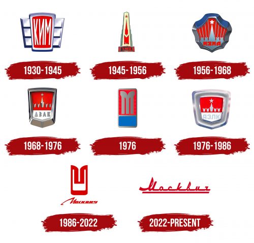
The manufacturer’s first logo resembled a stylized car bumper with radiator grilles. Each element gleamed with polished steel. In the center, the letters KIM were placed against a red background, symbolizing the flag of the USSR and the emblem of the Komsomol. The factory was initially named after the Communist International Youth.
The name reflected the need to start production, inspire people towards development, and rebuild the country. At that time, most cars were imported from the USA. The government aimed to develop its automotive industry. The state sought to engage the younger generation in active work and emphasize the joint effort of different nationalities within the USSR, focusing on friendship.
The emblem signified advanced technologies, hard work, and robust, premium-quality cars.
1945 – 1956
The logo developed by the factory after the war closely reflects reverence for fallen heroes and glorifies the Soviet Union and its ideology for the victory over fascism.
In the foreground is an obelisk, typically placed at burial sites. It features the Kremlin, with the building divided into two parts. The lower part is transformed into the letter M, emphasizing Moscow. In the background, stripes hint at the grand project of the Palace of the Soviets, which was meant to celebrate communism.
At the bottom of the emblem are a car bumper and the letters ZMA. In 1945, the production was renamed to the Small Car Factory. After restoring the destroyed production, the Moskvitch-400 began to be produced for the first time.
The lower ribbon’s red and black color scheme indicates that the country’s prosperity is possible due to the deaths and sacrifices of heroes and brave warriors.
All logo elements are majestic, evoking feelings of reverence and solemnity.
1956 – 1968
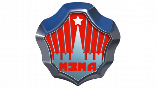
With the launch of the new Moskvich 402, 403, and 407 models, the factory introduced a new logo reflecting the company’s growth. The emblem’s shape mimicked the bumper of the new cars and also resembled a star, emphasizing Soviet symbolism and a commitment to high ideals.
The logo’s wide steel border indicated an improvement in the car’s exterior design, giving the emblem a more modern and technologically advanced appearance. Inside the emblem was an image of part of the Kremlin with a surrounding wall, depicted in light blue on a red background. This color combination created a striking contrast, drawing attention and highlighting the symbolic elements.
At the bottom of the logo was the abbreviation “MZMA,” which stands for Moscow Compact Car Factory. This name reinforced the factory’s connection to Moscow and emphasized its specialization in producing compact cars, marking an important step in developing the domestic automotive industry.
1968 – 1976
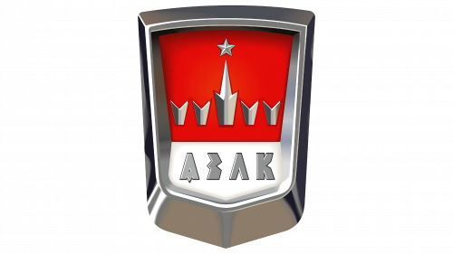
The factory’s name and logo changed again for the 50th anniversary of Komsomol. This update focused on the shield shape, framed by a wide steel border. This detail highlighted the strength and reliability of the factory’s products.
The Kremlin image on the new logo became more schematic, retaining only the top with a star and some of the crenellations. This minimalist approach gave the logo a modern and concise look while maintaining a connection to historical and cultural symbols.
The logo’s bottom was adorned with the large letters “AZLK,” which stood for the Lenin Komsomol Automobile Plant. This new name emphasized the factory’s connection to the Komsomol movement and reflected the important role of youth in developing the Soviet automotive industry.
1976
As new modifications of the Moskvich, starting with the 2138 model were released, the company updated its logo. The new logo featured a vertical minimalist design with a prominent letter “M.” The letter was placed on a red background, symbolizing the company’s dedication to its traditions and heritage.
The blue base added depth and contrast, making the logo look modern and eye-catching. The new logo resembled a road sign, emphasizing its connection to the automotive theme and highlighting the road as a fundamental element in every driver’s life.
1976 – 1986
The symbol was updated to give it a more premium look, matching the factory’s style. The new logo featured a massive yet compact shield with a wide border, emphasizing the company’s focus on automotive safety systems. This element made the logo visually powerful and stable, reflecting the reliability and durability of the factory’s products.
The inner design of the logo echoed the 1968 version, maintaining continuity and respect for tradition. However, the color of the Kremlin’s enclosure and the font of the inscription were updated. The new gray-blue shade for the enclosure created a sense of aspiration and a bright idea the company aims for. This color symbolizes purity, progress, and a forward-looking vision.
The font of the inscription also changed, becoming more modern and elegant, highlighting the factory’s drive for innovation and alignment with contemporary trends.
1986 – 2022
The new logo design retained a distant resemblance to the Kremlin’s enclosure, highlighting the factory’s Soviet past and years of experience. The logo elements included a modified letter “M,” reflecting the importance and significance of this symbol for the company.
Below it was the clear inscription “Moskvich.” The first letter was stylized to form a flight path, symbolizing the company’s past origins and its continuation through the realities of restructuring. This represented an unbreakable connection to history and indicated readiness for new achievements and adaptation to modern conditions.
2022 – today
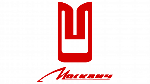
The factory’s modern logo subtly preserves the memory of the USSR, visible in elements reminiscent of the Soviet past. The connected lettering with an underline reflects a style common to many brands from the 1970s to the 1990s, such as Volga, ZiS, Moscow, Yuruzan, Orsk, and Zhiguli.
The red logo symbolizes the flag and the Kremlin, reminding us of the factory’s Soviet heritage. However, for someone unfamiliar with Soviet culture, this connection might not be noticeable. The logo does not focus on ideological aspects but uses color and graphic elements to convey the cars’ modern qualities.
The red color in the logo also represents the speed of the cars and the high quality of the factory’s products. The connected lettering emphasizes the company’s long development history, highlighting its stability and continuity of traditions.
