


Penguins are birds capable of surprising us, no less than exotic animals. They march across the Antarctic ice, warm each other during harsh winters, and charm us with their remarkable ability to stay together. These extraordinary creatures are sources of inspiration, and although they are rarely encountered in everyday life, they frequently appear on the logos and emblems of various companies.
Logos featuring penguins evoke a special affection, reflecting these birds’ simplicity, reliability, and team spirit. For brands, the penguin symbolizes cold weather or climate and serves as a metaphor for unity and confidence. Sometimes, designers choose penguins to convey a lighthearted, relaxed mood, as the image of these birds adds warmth and comfort to a corporate identity.
Companies that select penguins for their logos avoid obvious choices, demonstrating creative insight into their identities and highlighting the penguin as the protagonist of vivid, memorable stories told through visual design.
Penguin Patch
![]()
Penguin Patch is a wonderful school project filled with warmth and festive spirit. Its logo features a charming penguin wearing a bright scarf and a playful striped hat, with cheerfully open wings that invite children into an atmosphere of magic and joy. The cute bird dressed in winter clothes evokes memories of family holidays, cozy gifts, and children’s satisfaction when choosing their own presents. Students learn to make responsible financial decisions and experience the joy of giving.
Kinder Pingui
![]()
Kinder Pingui is a popular dessert from the famous confectionery giant Kinder, and it’s no surprise a penguin was chosen as its emblem. The lines forming the bird’s silhouette harmonize with the brand name, while the letter “i” cleverly transforms into part of the penguin’s image, adding completeness and a playful touch. The penguin symbolizes the treat’s lightness and coolness, emphasizing its fresh, crisp flavor. This successful design hints at the joy and childlike spontaneity associated with the product. Blue enhances the sense of coolness and freshness, naturally complementing the concept.
PrestaShop
![]()
French e-commerce platform PrestaShop selected a penguin as its logo, reflecting a friendly, welcoming, and open character. The vibrant bird is rendered in a contemporary style, featuring geometric shapes, and is depicted as a colorful shopkeeper wearing a neat apron. The symbol reflects the platform’s character: accessibility, ease of use, and a positive approach to online business. The penguin has become a sign of how easy it is to launch an e-commerce project, uniting entrepreneurs worldwide into a friendly community.
Pittsburgh Penguins
![]()
When it comes to hockey, it’s hard to find a symbol more intriguing than a penguin holding a hockey stick on ice. This is exactly the image chosen by the Pittsburgh Penguins, a National Hockey League team. The penguin on the logo surges forward, gripping a hockey stick in gloves, ready for a shot and decisive action. The yellow triangle behind the bird references the “Golden Triangle,” Pittsburgh’s famous downtown district, underscoring the team’s connection to its hometown. The penguin symbol captures the spirit and energy of the hockey team: perseverance, strength, and excitement, qualities cherished by Penguins fans worldwide.
Tencent QQ
![]()
Tencent QQ’s penguin is a true celebrity in China’s digital world, becoming the recognizable and beloved symbol of one of the largest instant messaging platforms. Created in the late ’90s, this character emerged alongside the rise of online communication and won the hearts of millions of users. Its cheerful, friendly look, featuring a red scarf and a playful wink, symbolizes the ease and positivity the brand offers each user. The penguin embodies sociability, joy, and emotional closeness, becoming the lively face of virtual communication.
SmartCentres
![]()
The logo of the Canadian company SmartCentres features a minimalist, expressive penguin symbol in a modern style. Only the bird’s profile is placed against a contrasting red circle, creating a feeling of dynamism and determination. The penguin is a metaphor for the company’s principles of friendliness, convenience, and comfort in developing shopping malls and real estate properties. This Canada-wide chain emphasizes the simplicity and accessibility of its spaces, while the penguin, subtly integrated into the image, reinforces this impression.
Blue Penguin Car Wash
![]()
Blue Penguin Car Wash takes a serious approach to its business, yet the logo conveys ironic playfulness. The penguin in the image appears as a true professional, wearing a baseball cap and a bright scarf, ready to get any car into perfect shape. He stands beside the company’s name, expressing friendliness and expertise. The company’s name and the penguin image symbolically convey cleanliness and freshness, which are fundamental to this car wash chain. The service packages offered to customers showcase the company’s personalized approach to car care and its commitment to every customer.
Linux
![]()
Tux the penguin is a legendary figure in the tech world, having become nearly iconic among Linux fans. Created in 1996 by programmer Linus Torvalds, Tux appears good-natured, slightly shy, and cozily familiar. It is said that Torvald chose the penguin after being bitten by one of these cute yet feisty residents of the Southern Hemisphere during a trip to Australia. As a result, the symbol of Linux became a cheerful, slightly awkward, yet always friendly penguin. The image embodies the open, free, and endlessly positive community spirit.
Original Penguin
![]()
The history of the Original Penguin brand began with a small accident: once, the founder of Munsingwear jokingly attached a penguin image to his golf shirt during a vacation. The joke was so well received that the bird became the brand’s permanent emblem, underscoring its relaxed, casual style. The penguin looks elegant and ironic, capturing the retro spirit of the clothing and accessories that have made the brand famous since 1955. The penguin symbol recalls carefree times and the easy-going character of American vintage, becoming a hallmark for casual style enthusiasts.
Pontofrio
![]()
Brazilian retail chain Pontofrio, specializing in household appliances, creatively played with the image of a penguin associated with coolness and freshness. The brand name translates as “cold point,” suggesting comfort and technological sophistication in the company’s products. The minimalist logo, with the elegant penguin silhouette subtly complementing the concise red lettering, hints at freshness and product quality. The bird’s image conveys subtle confidence, gently complementing the company’s identity and making it friendlier and more memorable.
Penguin Air, Plumbing & Electrical
![]()
The U.S.-based company Penguin Air, Plumbing & Electrical decided to portray the penguin in its logo as an unusual hero, ready to tackle any household issue. The bird wearing sunglasses and a purple cape highlights the brand’s message that its technicians are always ready to assist with air conditioning, heating, plumbing, and electrical problems. The penguin symbolizes reliability, speed, and adaptability, helping customers feel comfortable and at ease when entrusting their home care to professionals.
Scranton Penguins
![]()
The Scranton Penguins’ emblem of the American hockey club leaves no doubt about the team’s attitude on the ice. An aggressive, muscular penguin with fiery eyes and a hockey stick poised to attack symbolizes the athletes’ fighting spirit and ambition. The yellow background, shaped like an inverted triangle, references their Pittsburgh affiliate team, underscoring their close sports connection. Since the club’s founding, the team has used the fighting penguin as its symbol, an image fans appreciate for its energy and charisma. The penguin demonstrates the seriousness and dedication players bring to every game.
Tencent Pictures
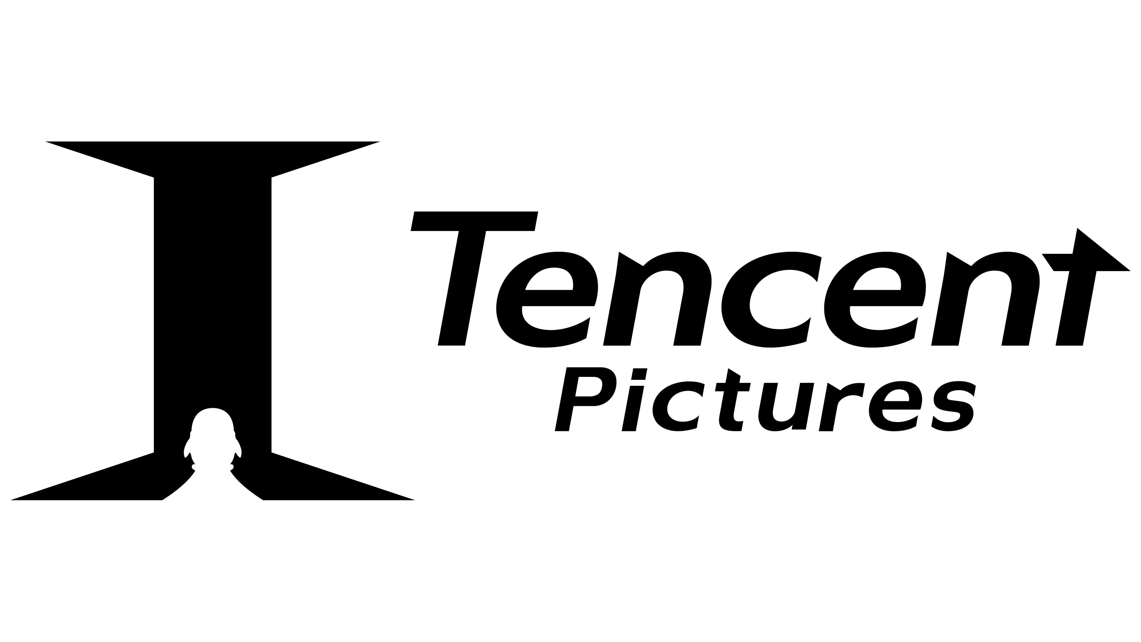
The Chinese film studio Tencent Pictures offers viewers an intriguing visual play with the penguin subtly hidden in its logo. A white bird silhouette is positioned at the base of the letter “I,” resembling a beam of light piercing through a dark cinema hall. This image symbolizes the viewer’s journey of discovery and impression formation as they watch films. The penguin is a subtle reference to the parent company, which has long used the bird’s image in its projects. This makes the emblem mysterious and appealing for a studio producing films full of intrigue and vibrant emotions.
Antarctica
![]()
Antarctica is an icy continent where the penguin embodies nature’s harshness and the beauty of the cold. The logo, featuring two emperor penguins, symbolically captures the spirit of a place dominated by eternal winter. The two penguins face each other, signifying unity and mutual support in the planet’s most extreme conditions. The bright red background of the oval medallion resembles a flame of life, steadily burning amid endless snow. The silver heraldic wreath surrounding the composition adds a sense of formal seriousness, underscoring Antarctica’s importance to science and to all humanity.
Pingu
![]()
Pingu the penguin is a famous children’s cartoon hero beloved by millions for his spontaneity and curiosity. In the logo, the bird appears as a small traveler confidently marching toward adventure, with a small bundle slung over its shoulder. His black-and-white coloring is accented by vivid red and orange details, highlighting the character’s liveliness. The penguin symbolizes curiosity, sincerity, and a child’s openness to the world. The cartoon first appeared in Switzerland in 1990, winning viewers’ hearts worldwide with its simple stories and charming protagonist.
South Pole
![]()
The Swiss company South Pole chose a penguin for its logo to symbolize its primary mission: climate care and the maintenance of natural balance. The polar bird is presented in elegant minimalism, underscoring the need to protect the world we live in. The image directly conveys purity and transparency in environmental matters, reflecting the company’s commitment to combating climate change. The company has implemented numerous initiatives to reduce its carbon footprint, and the penguin logo naturally complements its eco-friendly reputation.
Penguin Books
![]()
The legendary British publisher Penguin Books selected the penguin as its symbol in 1935. Company founder Allen Lane wanted to produce accessible, high-quality literature for readers, and Penguin’s simple, friendly image perfectly matched this idea. The black-and-white penguin on a bright orange background symbolizes intellectual freedom, accessibility, and openness to knowledge. The books are recognized worldwide for their appealing design, which ensures engaging, high-quality reading. The penguin serves as a guide to engaging literature.
The Little Penguin
![]()
Australian wine brand The Little Penguin draws inspiration from the smallest penguin on the planet, which lives on Australia’s southeastern shores, amid vineyards and ocean waves. As with the wines, the elegant bird in the company’s logo conveys a sense of ease and relaxation. The area where the bird lives features a mild climate and rich soil, enabling the brand to produce wines noted for their smooth taste and vibrant aroma. The penguin symbolizes friendliness and openness, inviting everyone to a pleasant, easygoing introduction to Australian wines.
McVitie’s Penguin
![]()
The British brand McVitie’s Penguin became famous for its chocolate biscuits, named after the charming birds. The penguins in the logo appear cheerful and slightly mischievous, reinforcing the biscuit’s name, written in large letters on a bright yellow ribbon. The symbolism is simple and clear: penguins represent coolness, energy, and lightness, which complement the product image, often served chilled. This playful image has brought smiles and joy to sweet lovers in the UK and beyond for decades, highlighting the brand’s fun-loving character.
Penguin Pick-Up
![]()
The Canadian delivery service Penguin Pick-Up’s logo is styled like a location pin, featuring a smiling penguin playfully winking at users. Using a location marker to depict the bird emphasizes the company’s functionality: convenient package pickup and shipment at any suitable location. The penguin symbolizes friendliness and reliability, making the service popular in Canada. The logo underscores the ease of parcel pickup, bringing a smile and a sense of ease to customers’ daily lives.
Pingviini
![]()
The Finnish ice cream brand Pingviini, meaning “penguin,” introduced the world to a highly positive and joyful character. The penguin on the logo looks cheerful and carefree, spreading its wings in pursuit of delicious pleasure. The blue-and-white palette evokes the dessert’s refreshing coolness, and the bird’s image creates a carefree, celebratory atmosphere. In Finland, where ice cream is beloved even during the coldest days, the penguin symbolizes the small joys adults and children enjoy year-round.
Penguin Point
![]()
Penguin Point is a cozy, family-owned fast-food restaurant chain from Indiana, where penguins are considered part of local history and family traditions. The company’s logo is positive and homey: a large adult penguin in a stylish tuxedo leads three cheerful baby chicks. The family imagery symbolizes comfort, care, and hospitality, essential to the restaurant, where locals have gathered for generations to enjoy food and friendly conversation. The symbols are complemented by dynamic lettering that highlights the company’s energetic, welcoming nature and its 1950 founding by the Stouder family.
Jotun
![]()
Northern company Jotun, a renowned paints and protective coatings manufacturer, features an unusual penguin in its logo, standing in front of a stylized globe. The bird’s image suggests the protection and durability of the company’s products, as penguins are known to survive in the harshest conditions. The white-and-blue globe forms a wing for the penguin, lending it confidence and symbolizing the brand’s global recognition and distribution. The color palette of bright yellow, rich red, and deep blue represents reliability, durability, and warmth, all of which are highly valued in the cold regions where penguins live.
Pinguin
![]()
The Czech brand Pinguin, known for outdoor and camping equipment, chose a stylish, proud penguin as its logo. The bird’s minimalist shape underscores the reliability and ease of use of the company’s products. Clean lines depicting a black-and-white penguin on a bright blue background convey freshness and clarity qualities sought by adventure and travel enthusiasts facing extreme conditions. The penguin symbolizes resilience, adaptability, and freedom, traits the brand has embodied since its founding in 1989.
Conclusion
The penguin in brand logos is a symbol that tells stories without words. This bird, accustomed to conquering icy landscapes and warming its flock, harmoniously fits into a range of concepts, from sports and fashion to technology and restaurants. A penguin emblem communicates that the company can withstand challenges, maintain team spirit, and delight with a subtle sense of humor. Logos featuring this bird differs from that for other animals, as it nearly always conveys goodwill combined with understated seriousness. This unique combination positions penguins as a distinctive element of companies’ visual identities, reminding everyone of the power of unity, confidence, and natural simplicity. That’s why, when we encounter another penguin in a brand’s logo, we involuntarily smile, sensing the ease, openness, and friendly atmosphere behind the image of this extraordinary bird.