 Motorway Logo PNG
The Motorway logo is a metaphor for continuous progress, innovation, and the unwavering drive forward. Every detail of the emblem highlights the company’s core idea: always staying connected and providing reliable solutions for its clients. The logo reflects the essence of the brand, emphasizing modernity and accessibility.
Motorway began in July 2017, when Tom Leathes, Alex Buttle, and Harry Jones launched a platform for selling used cars in the UK. Before that, the founders had worked on online projects such as TopTableGames and Zoopla. The idea came from their own difficulties selling cars, where prices, buyers, and paperwork often made the process slow and unclear.
In the first few months, the team built the technology behind the service and established partnerships with car dealers. Motorway launched at the end of 2017 as a platform that gathered offers from online car buyers, allowing sellers to compare bids. Its valuation algorithm used data such as make, model, year, mileage, and condition.
In 2018, Motorway raised £2.75 million from Alex Chesterman, LocalGlobe, and Marchmont Ventures. The funding helped the company hire staff, improve its platform, and expand dealer partnerships across the UK. In 2019, it introduced Motorway Pro, which gave professional dealers direct access to online used-car auctions. The same year, Marchmont Ventures and LocalGlobe invested another £11 million.
In 2020, Motorway moved fully online as the car market changed. A £25 million Series B round followed in June, led by Index Ventures and Autotech Ventures. In 2021, the company raised another £48 million from Index Ventures and Iconiq Growth, reached a valuation above $1 billion, and ended the year with more than £500 million in annual revenue and over 8,000 cars sold each month. By 2022, its dealer network had grown to more than 5,000, while AI-based vehicle condition tools were added to the platform.
Meaning and History
What is Motorway?
It is a UK-based online platform that facilitates the sale of used cars. The platform connects private car sellers with dealerships and buyers, simplifying car selling. Sellers can quickly estimate their car’s value, list it on the platform, and receive offers from a verified dealer network. The company makes selling a car fast, easy, and transparent by offering better prices than traditional car-selling methods. The platform provides all logistics, including free car pickup and secure payment, giving sellers and buyers a hassle-free experience.
2017 – 2019
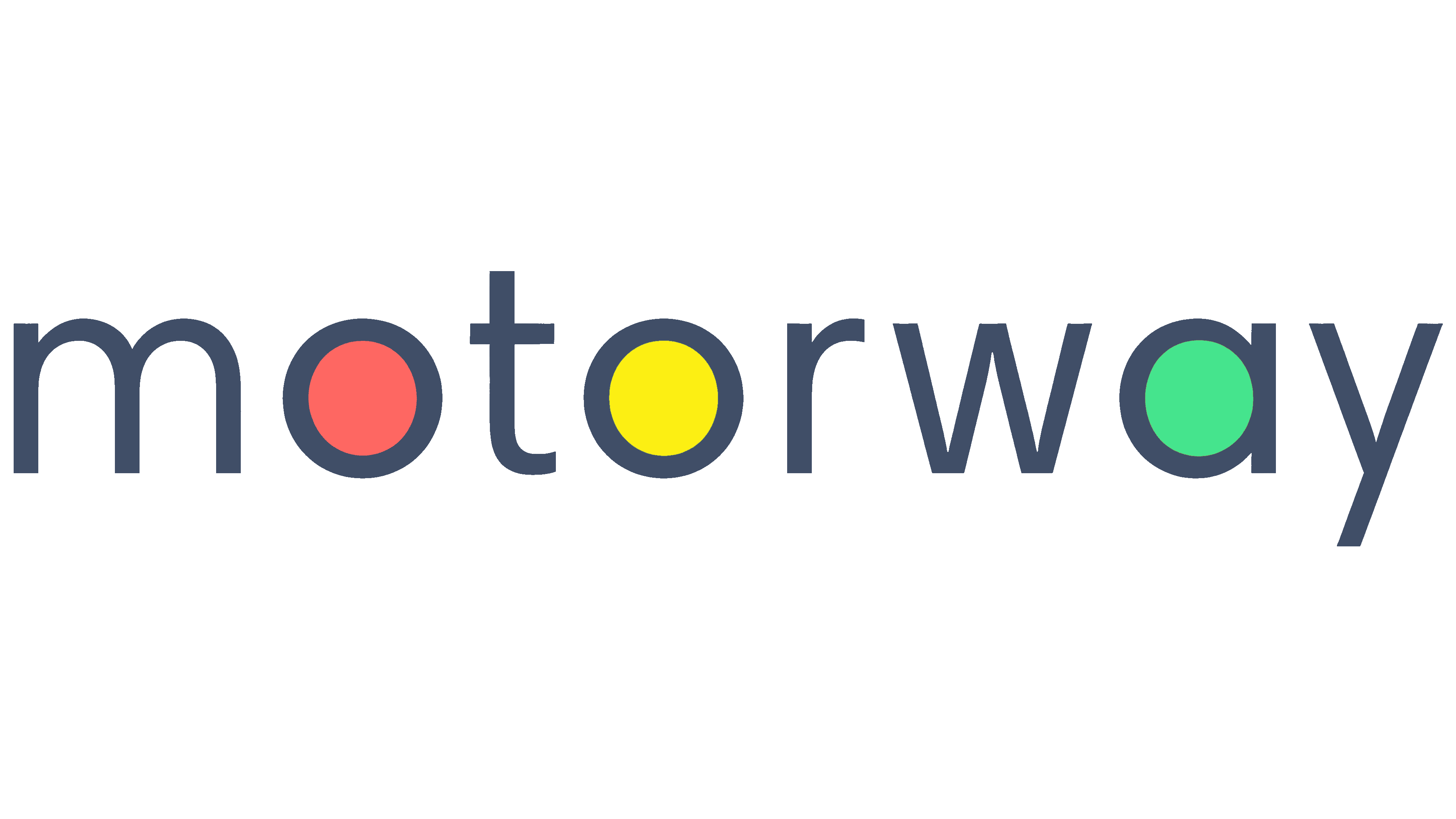
When the Motorway online platform first launched, designers created a universal logo inspired by its short name. The result was a sleek wordmark that reflects the startup’s connection to the automotive industry but doesn’t explicitly indicate its specific business focus: from the name alone, it’s hard to tell that the company helps people sell their used cars.
The logo features a simple font, hinting at the website’s ease of use, clarity of functions, and accessibility of services. The minimalist appearance is achieved through basic geometric shapes, consistent line thickness, and the absence of serifs or other decorative elements.
The font resembles Churchward Isabella Light from BluHead Studio, but Motorway’s version lacks horizontal cuts at the ends of letters; all strokes are straight, clean, and confident. While this might take away some of the creativity, it reinforces the platform’s seriousness and reliability, aiming to instill trust among car owners.
The brand name is written in lowercase glyphs, which gives it a more approachable feel. The designers intentionally used lowercase letters, introducing three circular counters within the word just the right number to resemble a traffic light. Each circle is colored differently:
- The first is red,
- The second is yellow,
- The third is green.
This combination truly resembles a traffic light, which regulates road traffic. The Motorway logo highlights the company’s connection to vehicles and symbolizes punctuality, safety, and reliability. The traffic light emphasizes the importance of following rules when selling used cars, while signaling that the perfect moment has arrived to close a great deal and move forward.
The red, yellow, and green add variety to the emblem, breaking up the otherwise dull gray color of the letters. This contrasting palette was designed to draw attention to the online platform, which was relatively unknown at launch and needed effective marketing tools.
2019 – today
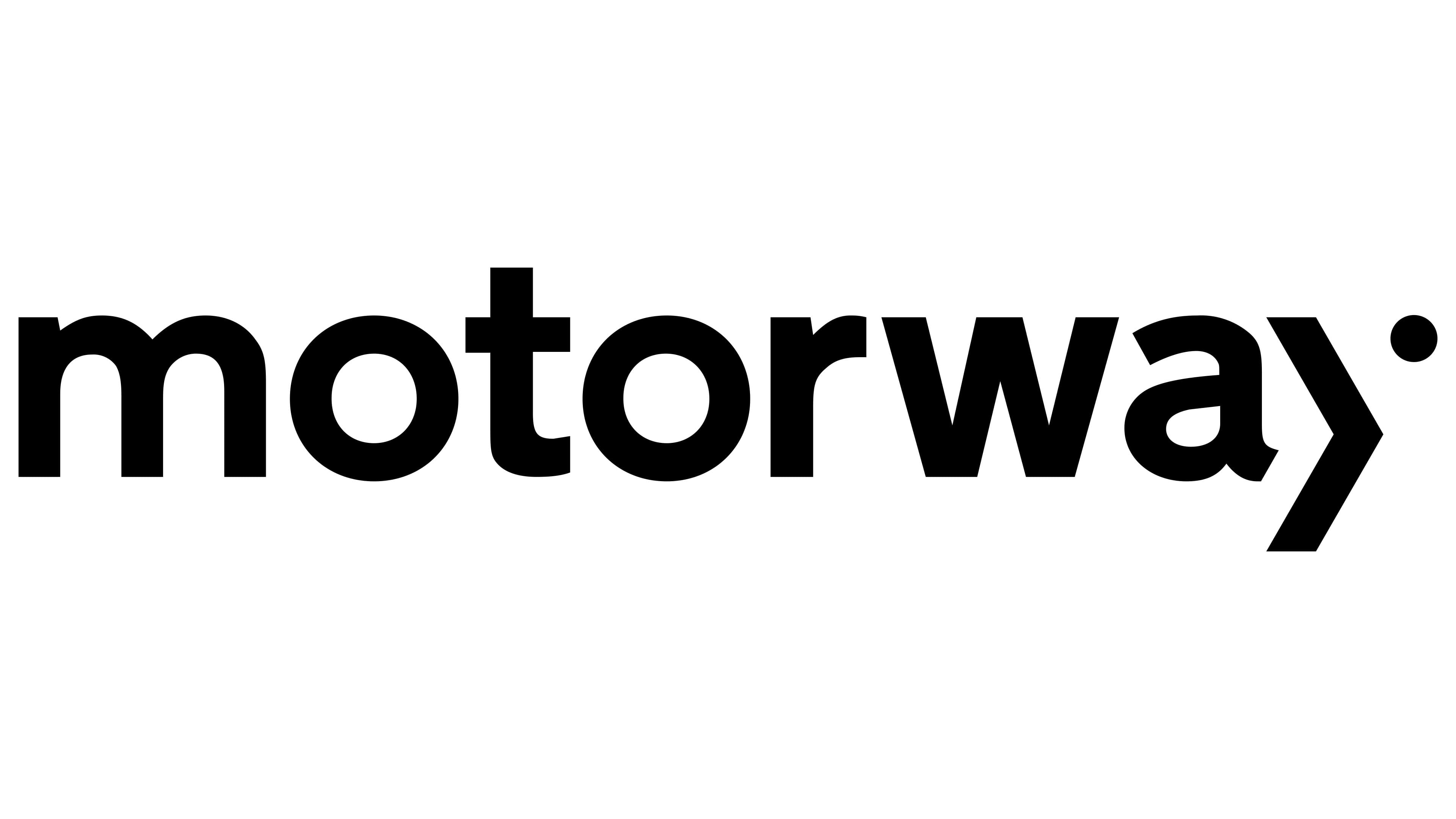
Two years after entering the used car market, Motorway realized it needed a new look. The company had evolved from an unremarkable startup into a sought-after source of vehicles. As its popularity grew, more people saw its outdated logo, which no longer aligned with modern trends.
Designers addressed this issue by reimagining the wordmark and making it more minimalist. Removing the improvised traffic light eliminated the childlike elements that had made the brand feel less serious. Now, the company’s name appears 100% solid and professional, thanks to:
- A bold black color that creates an aura of prestige and confidence,
- A classic letterform free from unnecessary decorative elements,
- A harmonious combination of straight lines, angles, and smooth curves.
The new logo was first introduced in 1958 and was inspired by the UK’s road signs. All the text on these signs is in the iconic Transport typeface. Bold, progressive, simple, and somewhat futuristic, this font was designed to make it easy for drivers to read signs without losing focus.
The designers of the Motorway emblem made slight modifications to the Transport font, adding individuality while maintaining the lettering’s clarity and readability. The bold lines convey the confidence the online platform seeks to instill in its clients. The glyphs remain lowercase, helping Motorway maintain the image of a simple, open, and approachable company.
Only one element in the logo hints at the brand’s creativity: the “disassembled” letter “y.” It comprises a small circle and a large stroke resembling a closing angle bracket. This composition was also inspired by the UK’s road sign system, specifically the direction arrow. The designers reinterpreted this symbol, making it the star of Motorway’s visual identity. It seems to point in the right direction, inviting users to list used cars on the online platform.
As part of the “y,” the broken line injects energy into the lettering, drawing attention to the company’s name. The circular dot doesn’t appear static, either; it sits at the top, distanced from the other elements, evoking a sense of movement. The designers managed to link the wordmark to the concepts of speed, dynamism, and continuous growth. The strict black color of the logo prevents it from becoming too expressive, as the brand aims to maintain a serious image in its customers’ eyes.